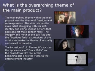
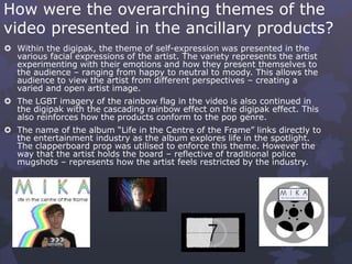
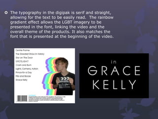
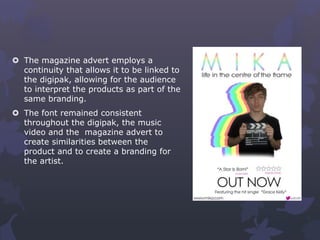
HOW EFFECTIVE IS THE
COMBINATION OF YOUR
MAIN PRODUCT AND
ANCILLARY TEXTS?
Evaluation Question 3 – Holly Morsley
When working on my main and ancillary products, it was vital that
the products looked professional by employing continuity throughout.
It was also important that they differed from other products within
the same genre so that it gave a niche, unique appearance.
In order to make my product effective, it was important that they
key themes presented in the video were represented throughout the
products as to create a consistent branding for the artist and the
company, overall making the appearance of the product look more
professional and to create a positive brand identity.
Why is it important to have
an effective combination?
What is the overarching theme of
the main product?
The overarching theme within the main
product was the theme of freedom and
self-expression. The video shows the
main artist struggling with his self-
identity and doing various actions that
goes against male gender roles. The
imagery and motif of the gay flag and
the flirtatious facial expressions of the
artist also evoke the theme of sexuality
and sexual expression.
The inclusion of old film motifs such as
the appearance of “Grace Kelly” and
the countdown film reel at the
beginning also links the video to the
entertainment industry.
How were the overarching themes of the
video presented in the ancillary products?
 Within the digipak, the theme of self-expression was presented in the
various facial expressions of the artist. The variety represents the artist
experimenting with their emotions and how they present themselves to
the audience – ranging from happy to neutral to moody. This allows the
audience to view the artist from different perspectives – creating a
varied and open artist image.
 The LGBT imagery of the rainbow flag in the video is also continued in
the digipak with the cascading rainbow effect on the digipak effect. This
also reinforces how the products conform to the pop genre.
 The name of the album “Life in the Centre of the Frame” links directly to
the entertainment industry as the album explores life in the spotlight.
The clapperboard prop was utilised to enforce this theme. However the
way that the artist holds the board – reflective of traditional police
mugshots – represents how the artist feels restricted by the industry.
 The typography in the digipak is serif and straight,
allowing for the text to be easily read. The rainbow
gradient effect allows the LGBT imagery to be
presented in the font, linking the video and the
overall theme of the products. It also matches the
font that is presented at the beginning of the video.
 The magazine advert employs a
continuity that allows it to be linked to
the digipak, allowing for the audience
to interpret the products as part of the
same branding.
 The font remained consistent
throughout the digipak, the music
video and the magazine advert to
create similarities between the
product and to create a branding for
the artist.

EVALUATION - QUESTION 2 - HOLLY MORSLEY

  • 1.
    HOW EFFECTIVE ISTHE COMBINATION OF YOUR MAIN PRODUCT AND ANCILLARY TEXTS? Evaluation Question 3 – Holly Morsley
  • 2.
    When working onmy main and ancillary products, it was vital that the products looked professional by employing continuity throughout. It was also important that they differed from other products within the same genre so that it gave a niche, unique appearance. In order to make my product effective, it was important that they key themes presented in the video were represented throughout the products as to create a consistent branding for the artist and the company, overall making the appearance of the product look more professional and to create a positive brand identity. Why is it important to have an effective combination?
  • 3.
    What is theoverarching theme of the main product? The overarching theme within the main product was the theme of freedom and self-expression. The video shows the main artist struggling with his self- identity and doing various actions that goes against male gender roles. The imagery and motif of the gay flag and the flirtatious facial expressions of the artist also evoke the theme of sexuality and sexual expression. The inclusion of old film motifs such as the appearance of “Grace Kelly” and the countdown film reel at the beginning also links the video to the entertainment industry.
  • 4.
    How were theoverarching themes of the video presented in the ancillary products?  Within the digipak, the theme of self-expression was presented in the various facial expressions of the artist. The variety represents the artist experimenting with their emotions and how they present themselves to the audience – ranging from happy to neutral to moody. This allows the audience to view the artist from different perspectives – creating a varied and open artist image.  The LGBT imagery of the rainbow flag in the video is also continued in the digipak with the cascading rainbow effect on the digipak effect. This also reinforces how the products conform to the pop genre.  The name of the album “Life in the Centre of the Frame” links directly to the entertainment industry as the album explores life in the spotlight. The clapperboard prop was utilised to enforce this theme. However the way that the artist holds the board – reflective of traditional police mugshots – represents how the artist feels restricted by the industry.
  • 5.
     The typographyin the digipak is serif and straight, allowing for the text to be easily read. The rainbow gradient effect allows the LGBT imagery to be presented in the font, linking the video and the overall theme of the products. It also matches the font that is presented at the beginning of the video.
  • 6.
     The magazineadvert employs a continuity that allows it to be linked to the digipak, allowing for the audience to interpret the products as part of the same branding.  The font remained consistent throughout the digipak, the music video and the magazine advert to create similarities between the product and to create a branding for the artist.