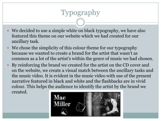
How effective is the combination of
 your main product and ancillary
               text?

         EVALUATION QUESTION 2
Colour

 For both our main product and ancillary texts we combined the theme
  of colour to match and mirror on our products. Our main product uses
  bright colours for flashbacks in contrast to the black and white colour
  theme we have chosen to use for the present time frame within the
  narrative.
 For our ancillary tasks we adjusted the colour filters on photoshop to
  match the specific colour manipulation we used in our main product
  (music video).
Typography

 We decided to use a simple white on black typography, we have also
  featured this theme on our website which we had created for our
  ancillary task.
 We chose the simplicity of this colour theme for our typography
  because we wanted to create a brand for the artist that wasn’t as
  common as a lot of the artist’s within the genre of music we had chosen.
 By reinforcing the brand we created for the artist on the CD cover and
  on the website, we create a visual match between the ancillary tasks and
  the music video. It is evident in the music video with use of the present
  narrative featured in black and white and the flashbacks are in vivid
  colour. This helps the audience to identify the artist by the brand we
  created.
Why is this your particular chosen aesthetic?

 We have chosen this particular aesthetic because we
  wanted the colour scheme and typography to be
  rather simplistic.
 The running theme for our artist is simple to keep
  the attraction and attention on the artist and his
  work.
 This is because the theme we used is unconventional
  to the genre of our artist so we used this particular
  technique to help draw in the attention of the
  audience because of the unique branding we have
  created for our artist.
CONTINUED

 However, in order to attract the audience we have also included the
  burst of bright colours to connote a happier, brighter convention to the
  vast contrast of the dullness from the black and white colour scheme.
 We featured the bright, vivid colours in sparse durations and we
  haven’t used this technique in an over the top way, in order to keep the
  attraction on the unconventional branding from the use of black and
  white for our artist.
                                                                The burst of
                                                                colour is evident
                                                                on pages
                                                                throughout our
Here you can see the                                            website and CD
simplicity of our branding in                                   cover.
the white on black
typography. And the clear
link to our media product
with a screenshot from the
actual product.
CONTINUED

 Our website is linked to the artist’s twitter feed and the artist’s
  facebook.
                                                         We felt that the intertexuality
                                                         between different social
                                                         networking sites really
                                                         created a more popular
                                                         branding because of the
                                                         accessible nature the artist
                                                         has with the fans.


 We’ve also featured our personal own media product (music video) and
  the artist’s own professional music video in order to show the difference
  between both videos.
        Our music video


      Artist’s real music video
CONTINUED

 This is a great way to show how we have challenged
  the conventions of the genre’s music videos.
 This also helps to link in all elements of our media
  products to the audience and to further reinforce our
  particular aesthetic and brand we have created for
  our artist.

Evaluation question 2

  • 1.
    How effective isthe combination of your main product and ancillary text? EVALUATION QUESTION 2
  • 2.
    Colour  For bothour main product and ancillary texts we combined the theme of colour to match and mirror on our products. Our main product uses bright colours for flashbacks in contrast to the black and white colour theme we have chosen to use for the present time frame within the narrative.  For our ancillary tasks we adjusted the colour filters on photoshop to match the specific colour manipulation we used in our main product (music video).
  • 3.
    Typography  We decidedto use a simple white on black typography, we have also featured this theme on our website which we had created for our ancillary task.  We chose the simplicity of this colour theme for our typography because we wanted to create a brand for the artist that wasn’t as common as a lot of the artist’s within the genre of music we had chosen.  By reinforcing the brand we created for the artist on the CD cover and on the website, we create a visual match between the ancillary tasks and the music video. It is evident in the music video with use of the present narrative featured in black and white and the flashbacks are in vivid colour. This helps the audience to identify the artist by the brand we created.
  • 4.
    Why is thisyour particular chosen aesthetic?  We have chosen this particular aesthetic because we wanted the colour scheme and typography to be rather simplistic.  The running theme for our artist is simple to keep the attraction and attention on the artist and his work.  This is because the theme we used is unconventional to the genre of our artist so we used this particular technique to help draw in the attention of the audience because of the unique branding we have created for our artist.
  • 5.
    CONTINUED  However, inorder to attract the audience we have also included the burst of bright colours to connote a happier, brighter convention to the vast contrast of the dullness from the black and white colour scheme.  We featured the bright, vivid colours in sparse durations and we haven’t used this technique in an over the top way, in order to keep the attraction on the unconventional branding from the use of black and white for our artist. The burst of colour is evident on pages throughout our Here you can see the website and CD simplicity of our branding in cover. the white on black typography. And the clear link to our media product with a screenshot from the actual product.
  • 6.
    CONTINUED  Our websiteis linked to the artist’s twitter feed and the artist’s facebook. We felt that the intertexuality between different social networking sites really created a more popular branding because of the accessible nature the artist has with the fans.  We’ve also featured our personal own media product (music video) and the artist’s own professional music video in order to show the difference between both videos. Our music video Artist’s real music video
  • 7.
    CONTINUED  This isa great way to show how we have challenged the conventions of the genre’s music videos.  This also helps to link in all elements of our media products to the audience and to further reinforce our particular aesthetic and brand we have created for our artist.