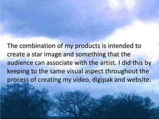
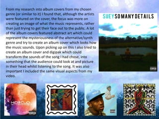
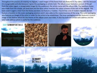
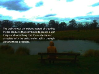
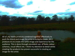
The document discusses the creation of various media products including a video, album packaging, and website for a musician. The goal was to create a consistent visual style and "star image" across all products that audiences could associate with the artist. Specific design elements like forest imagery, typefaces, and color schemes were carried over from the video to the album packaging and website to reinforce the artist's brand identity. Consistency of visuals and easy navigation were prioritized to improve the audience experience across all of the artist's media.
2. The combination of my products is intended to
create a star image and something that the
audience can associate with the artist. I did this by
keeping to the same visual aspect throughout the
process of creating my video, digipak and website.
3. From my research into album covers from my chosen
genre (or similar to it) I found that, although the artists
were featured on the cover, the focus was more on
creating an image of what the music represents, rather
than just trying to get their face out to the public. A lot
of the album covers featured abstract art which could
represent the mysteriousness of the alternative/synth
genre and try to create an album cover which looks how
the music sounds. Upon picking up on this I also tried to
create an album cover and digipak which could
transform the sounds of the song I had chose, into
something that the audience could look at and picture
in their head whilst listening to the song. It was also
important I included the same visual aspects from my
video.
4. Throughout the process of creating my digipak, I used images of the forest that was featured in my video, I did this because
it is recognizable and also because it gives the packaging an artistic look. The album cover features a picture of the girl
from the video (again, a recognizable image for the audience), the artists name and the album title. The typeface choice
was made from the simple, yet bold look and the blue colour matches the colour scheme of the rest of the digipak. The
back cover is again a shot from the forest and does not feature a tracklist. I found that a lot of modern digipaks do not
feature a tracklist on the outer packaging anymore and it also adds to the mysteriousness of the song. The outer packaging
also features an image of the artist in order for the artist to be established. The inner packaging and disc features a stretch
image of the skyline which fits the theme of the album cover and video. It also has both the artists web address and the
label web address which is useful for the audience.
5. The website was an important part of creating
media products that combined to create a star
image and something that the audience can
associate with the artist and establish through
viewing these products.
6. During the research process for designing my website, I looked at various
artist’s sites to get a feel of a how an artist’s site should look in 2014.
Although I researched websites from a wide range of genres, I found that
many sites featured similar conventions. A lot of artists’ sites featured a single
image background for all pages, a colour scheme throughout, links to social
media pages etc. I tried to include as many of these conventions as possible
but still included some original ideas.
7. The homepage for site features just one post; the option to purchase the
album, the front and back cover art and links to share the album on social media.
The background is the actual cover art for the album, I chose this because it is a
recognizable image I used throughout the media products I created. I made the
decision to only feature one post on the homepage because I discovered that this
is what a lot of artists do when promoting a new album.
8. The header for my site is simple and easy to use which makes for a better
experience for the audience. The header features easy to use links to pages
within the sire and the artists name
Keeping to the album promotion
aspect, the “Music” page features
another iTunes download link and
also a Spotify stream option. The
stream is embedded within the site
the user does not have to leave the
page to listen to the album which is
useful because, as an artist, you
want the audience to stay on your
page for as long as possible.
A
On the same page features the option to listen to 2
tracks through Soundcloud. I found that artists will
only usually include 2 or 3 of their latest tracks for the
audience to listen to on their site, this may be the
case so that if the audience wants to hear more they
have to visit the artist’s Soundcloud page which is a
good way of promotion. The option to like or tweet
the link to the song is also featured next to the
Soundcloud widget which encourages the audience to
share the song which means the artist becomes
exposed to new audiences.
9. The “Tour” page on the site lists the dates the artist will be on tour and the location and
venue. I made the all the tour dates sold out because it shows the artist is popular and
in demand. The “Buy Tickets” option takes the user to the Ticketmaster page.
The tour page also states that the artist will be touring North America which again
shows that the artist is popular and has branched out internationally
10. The “Contact” page features the names and email addresses of the artists
management and booking agent. I found that these two positions were regularly
featured in the contact pages of a lot of artists’ pages.
There is also the option to sign up to a mailing list which will give the user email
updates for the site. They can also send a message to the site. There are also 3 buttons
which link to the artists social media sites which will encourage the audience to follow
the artist.
11. All of ,my media products combined together effectively to
push the brand and image the artist is trying to create. All 3
products try to create the same image and experience for the
audience. This is done through consistent use of fonts, colour
schemes, visual effects etc. I think my attention to detail whilst
creating the products has proven successful in creating an
image for the artist.