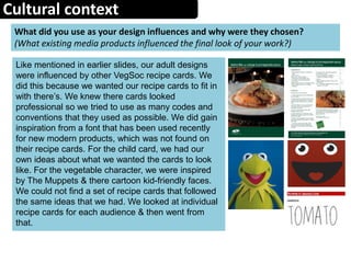
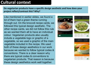
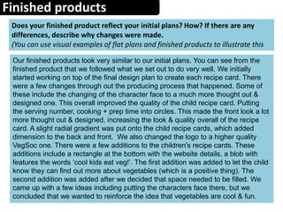
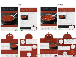
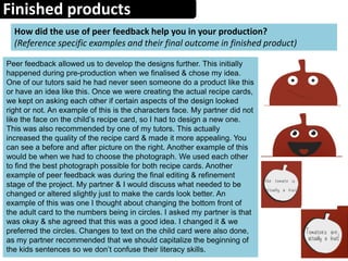
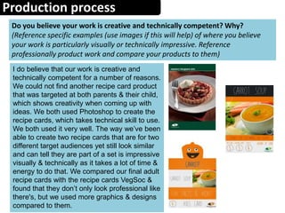
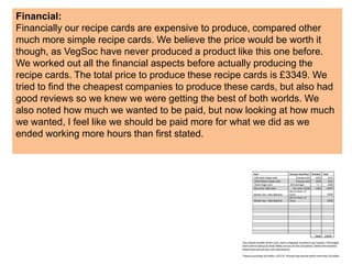
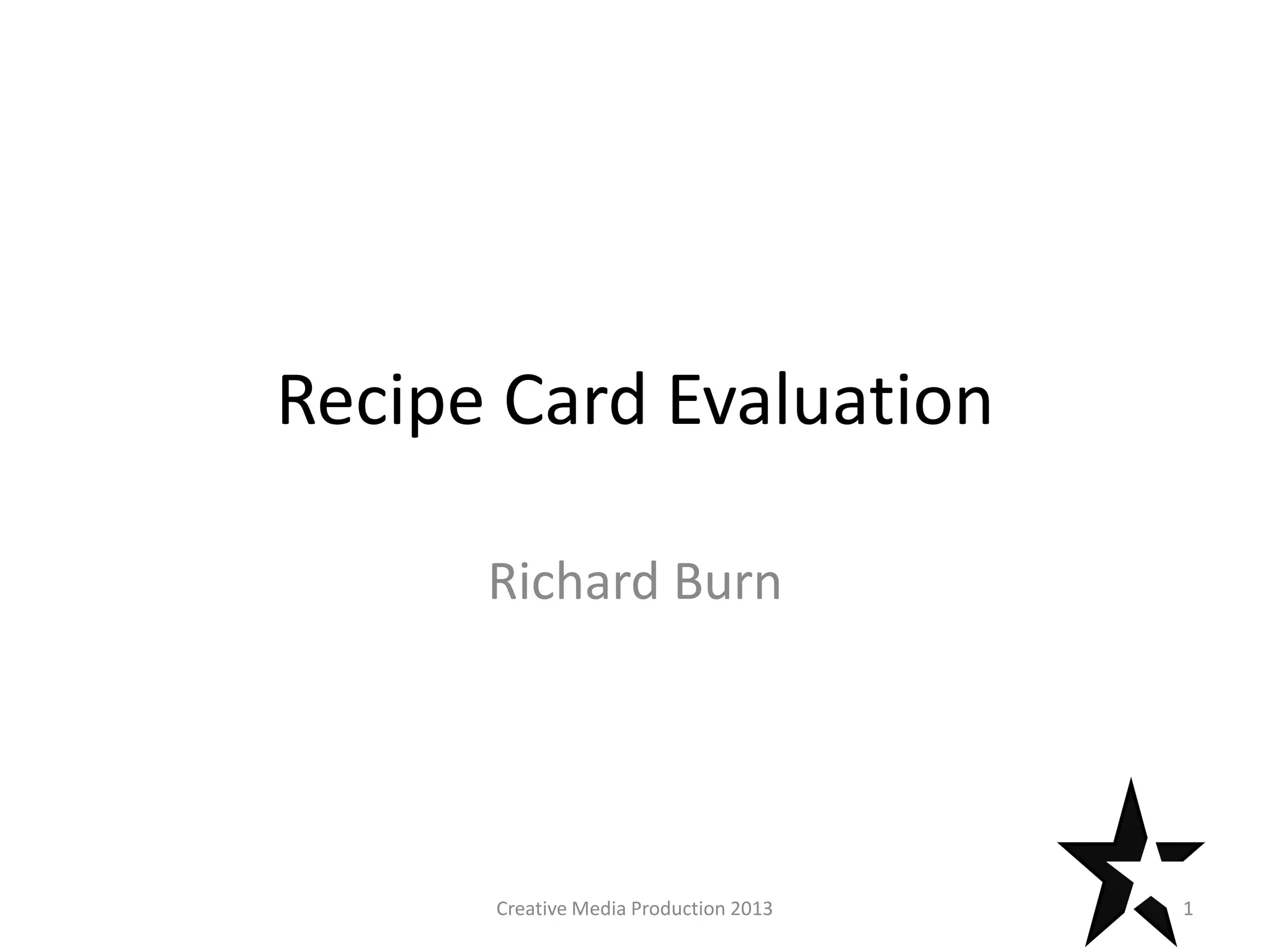
Recipe Card Evaluation
Richard Burn
1Creative Media Production 2013
Producing Print Based Media
2
Visual Language
How have you chosen to set out your designs and why? (Reference
layout, image/text ratio, busy/simplistic etc)
We decided to set out our designs based on our research of
other VegSoc recipe cards. We wanted our adult card to look
similar to the cards already available from VegSoc. The VegSoc
cards have a simple & clear layout & design. This would allow
the consumer to find information easier & made the recipe
cards a lot more easy on the eye as they were not busy. There
are a lot graphics & design aspects to our adult recipe cards,
the average ratio for image:text is 60:40. This is again similar to
the VegSoc recipe cards already made. With the child cards,
we wanted them to use the a vegetable used in the dish as
design inspiration e.g. the shape of a tomato is used on the
tomato based recipe card. This was then turned into a cartoon
aspect. This cartoon aspect can be found on a lot of products
aimed specifically at children e.g. the TV show SpongeBob
SquarePants. We wanted the design of the kids card to be fun
& child-friendly, which we believe we succeeded doing. The
child card is also quite minimalist & simple in design, similar to
its parent card. It can also The ratio of image:text is around
65:35, slightly more than the adult card, as we wanted the
design aspect to be a major feature that should make the kids
want to use it more.
Visual Language
Content we used on our recipe cards was based upon what vegetable was featured.
For example, if the main ingredient for the recipe was broccoli, the photograph of the
food, graphics of vegetable & colour scheme would be based around that one
vegetable. This is the same for the adult & child recipe card. All the images of food used
on the recipe cards are stock images. We decided to do this because we are not trained
in food photography, we are not professional chefs & we couldn’t find time in our
schedule. We found four images we think work really well with our colour schemes. We
actually used the main colour found in the image to use for the colour blocks & text. We
found this made the colours look more natural which worked well with our idea of using
a dark grey & off white colours instead of just black & white. This makes the recipe
cards less harsh on the eye. The natural theme of the colours works well because
vegetables are also natural. The use of the colours of the vegetables can also be found
when looking at existing products & when we asked people in our questionnaire, some
people mentioned colours of the vegetables (this helped us come up with our idea). The
use of a vegetable graphic on each recipe card allowed a constant graphic to be found
on the kids & adult recipe card. This strengthens the fact that they are part of a set. The
text was a standard recipe we found during our pre-production work. We found that the
recipes on existing VegSoc products were straight forward, so we wanted ours to be
also. On the child recipe card, we used less text, but we didn’t want to dumb what we
were saying down (which we found could sometimes be used with other products aimed
at kids), we just made it as straight forward as possible by only including tasks they will
be able to do safely)
Discuss the contents of your final images and reflect upon decisions
made. (Content used- image/text/graphic, use of colour, original or stock
images. Compare to existing products.)
Visual Language
Discuss the semiotics and connotations created from the content you have
included.(What meaning or suggestions are created from the
images/colours/designs you have used? You could reference how they were used
in products you look at during the project.)
The colour green was used often in products we looked at before, which
were all targeted at a vegetarian audience. We concluded that the colour
green connoted meanings like natural & fresh, which is what the producers
of a lot of other recipe cards wanted. The connotations natural & fresh link
with every kind of vegetable, so we took this on board when creating our
content. It was one of the reasons why we used the colour of the
vegetables on each recipe card. Thinking about meaning, the images used
of the food were used to entice the consumer to use the recipe cards. This
worked particularly well with the adult recipe cards. With the child recipe
card, we wanted the layout & graphics to entice them into eating their
vegetables. Because we used a character type graphic for the child card,
this connotes that vegetables are fun & cool. This is further strengthened
by the text ‘cool kids eat veg’. We also found graphics were used on other
children’s products, including within the food industry. I believe they used
there character for the same reason as us.
Audiences
Create an audience profile of your chosen demographic
(Age, gender, psychographic, geodemographic, NRS Social Grade, hobbies,
sexuality [if appropriate] etc)
We have a main target audience of a parent & child. We would assume that the
adult would be the child's parent.
Age: For the adult, 25-35. The recipe cards have a modern look to them & we
would expect that the child would be old enough to help the parent when the adult
is between the ages stated above. For the child, 6-10. The cartoon aspect is
particularly targeted at this age of children. Although kids grow up fast & will be
different between the ages of 6-10, there are aspects like the cartoon that they
would still enjoy.
Gender: During our questionnaire, we found that slightly more women were
vegetarian. Although we found this out, we tried to make the design of the adult
cards to be as gender neutral as possible, so that we were not closing off a
particular gender. With the child card, there are again no strict gender specifics
that we stuck to. By doing this, we feel like we have broadened our audience of an
already niche audience, which is a positive.
Psychographic: looking at the main 7 categories of psychographics, I would say
that our audience fits in with the aspirer category because they are aspiring to
make the food. Following a recipe & wanting your child to be involved is something
to aspire to. The audience only loosely fits into that category though.
AS Media Studies 2009 7
Geodemographic: As VegSoc is a UK based society, you would assume that the
geodemographic of the recipe cards would be in the UK. You would find the recipe
cards nationwide, not favouring an urban or countryside setting.
NRS Social Grade: ABC1. We are aiming our product at a middle class audience.
We found that quite a few vegetarian products are targeted at middle class people,
so we wanted to stick with this because we felt that the recipe cards were already
had a different enough target audience (unlike anything we had seen before).
Some of the ingredients are slightly more expensive as they are high quality, which
a C2DE may struggle to find the money for.
Hobbies: The adult will be into cooking food from scratch and wanting to follow a
recipe. The child might want to help the adult out as children sometimes like to get
involved with cooking.
Other things you could say about the audience is that there are two of them & they
have to work well with one another.
Two adults could be working from the same recipe card together: it could be
something the whole family do together.
The adult may want the child to be vegetarian like themselves or are just trying a
fun way of trying to get the kids to eat their vegetables.
Audiences
How have you constructed your work to appeal to this audience?
Include an annotated copy of an example of your work to help illustrate how you
have done this.
The main appeal of our work was the adult & child concept that we had not
seen done before as one product. We had to construct both cards so that
they looked similar, but also had features that both target audiences would
enjoy. We also wanted the child cards to appeal to the adults because it
would be the adults finding & choosing which recipes they wanted their
child to use.
Adult: With the adult card, we constructed it in a way that would look
similar to other VegSoc recipe cards we looked at, but had a modern flair
which would be seen on both the child and adult card. You can see how
we constructed it on the next slide.
Child: With the child card, we constructed it to have features from the adult
card & also have some of its own features that clearly showed they were
made for a child. You can see hoe we constructed them on the next slide.
We wanted this card to have a
similar design to the VegSoc
recipe cards that they already
produce.
We used colour blocks to
separate information. This can
be found on most products.
This was also used on the child
card.
The font choice is very in style at the
moment. We used it so our cards
would look modern. We also found
the font worked well on the child card
as well.
The number 3
represents what
number it is in the
set.
Social media
links that we
would expect
our adult
target
audience to
have.
Facebook &
twitter not
included on
child recipe
card as they
should not at
their age have
these.
Photograph of food
used twice on
adult recipe card &
very large on the
adult card. The
image should
entice the adult
into wanting the
food. Image more
important on adult
card compared to
child card.
A lot of
information
compared to
the child
recipe card. All
info needed
can be found
because the
adult is the
one actually in
charge of the
food.
Vegetable graphic used to link it
back in with the child card. No
character found on this card,
because characters are typically
childish graphics/features.
Cartoon character face: appeals to
young audience. Used to make kids like
vegetables more. Cartoon face not used
on adult card.
Fun facts to keep
the kids
interested. These
are not included
on the adult
card. Gives kid
opportunity to
tell the adult the
fact.
Strong & bright colour
scheme to catch the
eye of the child.
Simple instructions for the kid(s) to
follow & are safe for them to do.
Simple tasks that the kid will also
understand to do.
‘Cool kids eat
veg’ – further
enforces the
point recipe
cards (trying to
make veg fun for
kids). Also blob
shape behind to
make it this part
of the recipe
card eye
catching.
Two separate fonts used to create a
clear & easy difference for the child.
One of the fonts is also used on the
adult card – continuity.
Cool fact put inside of the small peppers.
This draws attention to them & fills up
the recipe card in a visual way. Dark grey
shadow background again draws more
attention. Also used on boxes.
Smaller photo of food on child
recipe card, compared to the
adult one, because it has less
importance. The child isn’t
attracted to the actual food.
Website link
included if
he/she wants to
go on it – parent
can help child to
do this. This is
also included on
the adult card,
but this gives the
kid the chance to
ask for
themselves. The
adult will know
from this if their
kid is now
interested in
vegetables.
The number 3
represents what
number it is in the
set.
Cultural context
What did you use as your design influences and why were they chosen?
(What existing media products influenced the final look of your work?)
Like mentioned in earlier slides, our adult designs
were influenced by other VegSoc recipe cards. We
did this because we wanted our recipe cards to fit in
with there’s. We knew there cards looked
professional so we tried to use as many codes and
conventions that they used as possible. We did gain
inspiration from a font that has been used recently
for new modern products, which was not found on
their recipe cards. For the child card, we had our
own ideas about what we wanted the cards to look
like. For the vegetable character, we were inspired
by The Muppets & there cartoon kid-friendly faces.
We could not find a set of recipe cards that followed
the same ideas that we had. We looked at individual
recipe cards for each audience & then went from
that.
Cultural context
Do vegetarian products have a specific design aesthetic and how does your
project reflect/contrast this? Why?
Like mentioned in earlier slides, we found a
lot of them had a green theme running
through out. On the broccoli recipe cards, we
followed this typical design aesthetic. The
other recipe cards, we did not follow this rule
as we wanted them all to have an individual
colour. Vegetarian products also usually
include a vegetable logo or graphic of a
vegetable, so we used a graphic of the main
vegetable included in the recipe. We used
both of these design aesthetics in our work
because we wanted to follow typical codes &
conventions. There is a clear reason why
there are typical codes & conventions to
vegetarian products. That reason is because
these design aesthetics work well together.
Finished products
Does your finished product reflect your initial plans? How? If there are any
differences, describe why changes were made.
(You can use visual examples of flat plans and finished products to illustrate this
Our finished products look very similar to our initial plans. You can see from the
finished product that we followed what we set out to do very well. We initially
started working on top of the final design plan to create each recipe card. There
were a few changes through out the producing process that happened. Some of
these include the changing of the character face to a much more thought out &
designed one. This overall improved the quality of the child recipe card. Putting
the serving number, cooking + prep time into circles. This made the front look a lot
more thought out & designed, increasing the look & quality overall of the recipe
card. A slight radial gradient was put onto the child recipe cards, which added
dimension to the back and front. We also changed the logo to a higher quality
VegSoc one. There were a few additions to the children's recipe cards. These
additions include a rectangle at the bottom with the website details, a blob with
features the words ‘cool kids eat veg!’. The first addition was added to let the child
know they can find out more about vegetables (which is a positive thing). The
second addition was added after we decided that space needed to be filled. We
came up with a few ideas including putting the characters face there, but we
concluded that we wanted to reinforce the idea that vegetables are cool & fun.
AS Media Studies 2009 14
Test Finished
Finished products
How did the use of peer feedback help you in your production?
(Reference specific examples and their final outcome in finished product)
Peer feedback allowed us to develop the designs further. This initially
happened during pre-production when we finalised & chose my idea.
One of our tutors said he had never seen someone do a product like this
or have an idea like this. Once we were creating the actual recipe cards,
we kept on asking each other if certain aspects of the design looked
right or not. An example of this is the characters face. My partner did not
like the face on the child’s recipe card, so I had to design a new one.
This was also recommended by one of my tutors. This actually
increased the quality of the recipe card & made it more appealing. You
can see a before and after picture on the right. Another example of this
would be when we had to choose the photograph. We used each other
to find the best photograph possible for both recipe cards. Another
example of peer feedback was during the final editing & refinement
stage of the project. My partner & I would discuss what needed to be
changed or altered slightly just to make the cards look better. An
example of this was one I thought about changing the bottom front of
the adult card to the numbers being in circles. I asked my partner is that
was okay & she agreed that this was a good idea. I changed it & we
preferred the circles. Changes to text on the child card were also done,
as my partner recommended that we should capitalize the beginning of
the kids sentences so we don’t confuse their literacy skills.
Finished product
Discuss the strengths and weaknesses of your final product regarding its
technical qualities.
Use box below for text or page space to include an annotated copy of your work to help illustrate how you have done this.
Reference what you like and dislike about the work with consistent reference to correct terminology of tools/effects used. Reference existing
products.
The use of rotoscoping can sometimes leave rough or
pointy edges on some graphics. I tried using the eraser
tool found on Photoshop, but this only helped slightly. I
ended up not liking & not happy with the quality of the
vegetable graphics, but I still had to use them in the work.
Some of them came out better than others, as you can
see from the comparison to the right.
I used a subtle radial gradient on the kids recipe cards to
add dimension. I believe using the gradient is a strength
when you think of technical skills. I like this about the
work. We used Photoshop to create the work, so we had
industry standard to work with. This would give us the
tools to make our work technical. Our work looked
technical as everything was in placed in the same area as
the card before it. There was no major creative changes
between each adult card or each child card.
Finished product
Discuss the strengths and weaknesses of your final product regarding its
aesthetical qualities.
Use box below for text or page space to include an annotated copy of your work to help illustrate how you have done this. Reference
what you like and dislike about the work with consistent reference to correct terminology. You can reference existing products here and
compare your work to them.
Aesthetically, I believe our product is very pleasing.
Our use of colour was is very pleasing to the eye, as
the colours work well together & none of them are
very harsh. We wanted the colours to be the same as
the main vegetable featured & I believe we did this.
The use of the same colours being used on the adult
& child card strengthen the overall house style we
had. One aesthetic weakness we did find on some of
the adult recipe cards is the white space under the
ingredients list. An example of this would be on the
pepper adult recipe card. There is nothing we could
do about this white space because it was not on
every adult recipe card, if we had added something
that wasn’t on the others they wouldn’t all look
identical.
Finished products
What skills/knowledge have you gained/developed in this project? How could
these be applied in future practice?
At the beginning of this project, we were taught how to use Adobe
InDesign which will give me skills if I have to use it in the future. Tools on
InDesign I now know about include grids, which I will also be able to use
now on Photoshop. It is useful to know when you’re trying to make sure
specific parts of your work are lined up or are within certain lines. It also
furthers my knowledge of Adobe software overall. I have developed my
skills in Photoshop by using tools such as rotoscoping. Although I already
knew how to use this, using it again strengthens my knowledge and how
well I use it. If I was to get a job where I had to use Photoshop I could
confidently say I can use it. I’ve also developed my research skills &
techniques. This will help me in future projects. If I had to do a piece of
work about vegetarians again I now have knowledge on this subject. We
also learnt at the very beginning of this project, we learnt about visual
hierarchy. We used this in our work & I will be sure to use this in projects in
the future e.g. a poster.
Production process
Do you believe your work is creative and technically competent? Why?
(Reference specific examples (use images if this will help) of where you believe
your work is particularly visually or technically impressive. Reference
professionally product work and compare your products to them)
I do believe that our work is creative and
technically competent for a number of reasons.
We could not find another recipe card product
that was targeted at both parents & their child,
which shows creativity when coming up with
ideas. We both used Photoshop to create the
recipe cards, which takes technical skill to use.
We both used it very well. The way we’ve been
able to create two recipe cards that are for two
different target audiences yet still look similar
and can tell they are part of a set is impressive
visually & technically as it takes a lot of time &
energy to do that. We compared our final adult
recipe cards with the recipe cards VegSoc &
found that they don’t only look professional like
there's, but we used more graphics & designs
compared to them.
Production process
How effectively did you manage your time?
(Could you have used time more wisely? Did a particular aspect of the project
take longer than expected? Did you complete everything on schedule?)
We completed our recipe cards on time & to schedule. We used our
contingency time to make our products look even better than they already
did. Nothing went wrong as well, which gave us time to improve the
quality. If something had gone wrong though, we would have had to use
the contingency time to sort this out. We could have worked more
efficiently if we had focused on the recipe cards & if we didn’t have any
distractions e.g. YouTube, but overall I feel like that didn’t effect the quality
of the recipe cards overall. One part of the work that took longer than I
thought it would was producing the vegetable graphics. These took me a
long time to create (because I was rotoscoping them) & to make sure they
were of a high standard (each graphic was being used more than once &
in varying sizes).
Production process
If you could repeat the process what would you do differently?
If we were to repeat the process again, I think I would have given my
partner some more control over the final designs & the final recipes cards,
as I felt I was coming up with the ideas & she was agreeing with them. I
would also have changed how well we worked together when we were
refining & improving the recipe cards. I felt I was doing all of this
refinement whilst my partner was just agreeing with what I wanted to
change & not actually helping. Although I understand I may have been
slightly controlling over this part of the work. Although I did come up with
more than 1 idea, I feel like I already knew which one I wanted to do.
Because I knew this, I didn’t look into the other ideas as in much detail as
a possibly should have. I am happy with the idea chosen, I feel like it was
possible if I looked into another it could have been an even better one.
Working to a brief
22
Constraints
What constraints did you encounter and how did you consider/avoid them?
Legal:
There are a few legal constraints that could be encountered. We had to
gain permission for the use of certain aspects of the recipe cards. We had
to have permission from the person who was selling the stock images to
actually use the images for commercial use. Otherwise we would be
breaking a copyright law, as they do own the image. We then had to pay
extra for the commercial use of the image. Another aspect was the use of
the recipes. We had to ask for the permission to use the recipe cards
commercially, otherwise we may have been breaking copyright again. We
asked & were granted with the use to use them.
There are two health & safety legislations we needed to follow during the
production of our recipe cards. The first being The Health and Safety at
Work etc. Act 1974. We work at computers to produce our work, so the
Health and Safety (display screen equipment) Regulations 1992 are the
most important piece of legal legislation. It tells us how long we should
work for, how far back & high our chairs are & when we should take a
break – employers have to legally follow this piece of legislation.
Regulatory:
The main regulatory body for our recipe cards is the ASA (Advertising
Standards Authority). As we are targeting a product at parents who have
children there are many different rules we need to follow. Although we tried
to follow their rules, there are a few that our products borderline don’t
follow.
The first two are ‘5.2.1 children must not be made to feel inferior or
unpopular for not buying the advertised product’ & ‘5.2.2 children must
not be made to feel that they are lacking in courage, duty or loyalty if they
do not buy or do not encourage others to buy a product’. The first point
being that is says on the back of our cards ‘cool kids eat veg’, which
conflicts with what 5.2.1 states. We will not remove this from our recipe
cards because 1). The recipe cards are not only targeted at the child & 2).
it is meant to encourage kids & not to make them feel bad.
There are some other rules we have to follow like our photographs used
must depict what the food will actually look like & must include the same
ingredients, or this would be lying to the consumer.
Financial:
Financially our recipe cards are expensive to produce, compared other
much more simple recipe cards. We believe the price would be worth it
though, as VegSoc have never produced a product like this one before.
We worked out all the financial aspects before actually producing the
recipe cards. The total price to produce these recipe cards is £3349. We
tried to find the cheapest companies to produce these cards, but also had
good reviews so we knew we were getting the best of both worlds. We
also noted how much we wanted to be paid, but now looking at how much
we wanted, I feel like we should be paid more for what we did as we
ended working more hours than first stated.
Management
How did you work as part of a group?
(Did you lead the project? What parts of the project did you take charge of? Did
you enjoy working as part of a group? Why?)
Management
How important is communication when working in a group?
(Use specific examples from working in a group on this project)
Management
What have you learnt about working in a group and how will you apply this to
future practice?

Evaluation pro forma

  • 1.
    Recipe Card Evaluation RichardBurn 1Creative Media Production 2013
  • 2.
  • 3.
    Visual Language How haveyou chosen to set out your designs and why? (Reference layout, image/text ratio, busy/simplistic etc) We decided to set out our designs based on our research of other VegSoc recipe cards. We wanted our adult card to look similar to the cards already available from VegSoc. The VegSoc cards have a simple & clear layout & design. This would allow the consumer to find information easier & made the recipe cards a lot more easy on the eye as they were not busy. There are a lot graphics & design aspects to our adult recipe cards, the average ratio for image:text is 60:40. This is again similar to the VegSoc recipe cards already made. With the child cards, we wanted them to use the a vegetable used in the dish as design inspiration e.g. the shape of a tomato is used on the tomato based recipe card. This was then turned into a cartoon aspect. This cartoon aspect can be found on a lot of products aimed specifically at children e.g. the TV show SpongeBob SquarePants. We wanted the design of the kids card to be fun & child-friendly, which we believe we succeeded doing. The child card is also quite minimalist & simple in design, similar to its parent card. It can also The ratio of image:text is around 65:35, slightly more than the adult card, as we wanted the design aspect to be a major feature that should make the kids want to use it more.
  • 4.
    Visual Language Content weused on our recipe cards was based upon what vegetable was featured. For example, if the main ingredient for the recipe was broccoli, the photograph of the food, graphics of vegetable & colour scheme would be based around that one vegetable. This is the same for the adult & child recipe card. All the images of food used on the recipe cards are stock images. We decided to do this because we are not trained in food photography, we are not professional chefs & we couldn’t find time in our schedule. We found four images we think work really well with our colour schemes. We actually used the main colour found in the image to use for the colour blocks & text. We found this made the colours look more natural which worked well with our idea of using a dark grey & off white colours instead of just black & white. This makes the recipe cards less harsh on the eye. The natural theme of the colours works well because vegetables are also natural. The use of the colours of the vegetables can also be found when looking at existing products & when we asked people in our questionnaire, some people mentioned colours of the vegetables (this helped us come up with our idea). The use of a vegetable graphic on each recipe card allowed a constant graphic to be found on the kids & adult recipe card. This strengthens the fact that they are part of a set. The text was a standard recipe we found during our pre-production work. We found that the recipes on existing VegSoc products were straight forward, so we wanted ours to be also. On the child recipe card, we used less text, but we didn’t want to dumb what we were saying down (which we found could sometimes be used with other products aimed at kids), we just made it as straight forward as possible by only including tasks they will be able to do safely) Discuss the contents of your final images and reflect upon decisions made. (Content used- image/text/graphic, use of colour, original or stock images. Compare to existing products.)
  • 5.
    Visual Language Discuss thesemiotics and connotations created from the content you have included.(What meaning or suggestions are created from the images/colours/designs you have used? You could reference how they were used in products you look at during the project.) The colour green was used often in products we looked at before, which were all targeted at a vegetarian audience. We concluded that the colour green connoted meanings like natural & fresh, which is what the producers of a lot of other recipe cards wanted. The connotations natural & fresh link with every kind of vegetable, so we took this on board when creating our content. It was one of the reasons why we used the colour of the vegetables on each recipe card. Thinking about meaning, the images used of the food were used to entice the consumer to use the recipe cards. This worked particularly well with the adult recipe cards. With the child recipe card, we wanted the layout & graphics to entice them into eating their vegetables. Because we used a character type graphic for the child card, this connotes that vegetables are fun & cool. This is further strengthened by the text ‘cool kids eat veg’. We also found graphics were used on other children’s products, including within the food industry. I believe they used there character for the same reason as us.
  • 6.
    Audiences Create an audienceprofile of your chosen demographic (Age, gender, psychographic, geodemographic, NRS Social Grade, hobbies, sexuality [if appropriate] etc) We have a main target audience of a parent & child. We would assume that the adult would be the child's parent. Age: For the adult, 25-35. The recipe cards have a modern look to them & we would expect that the child would be old enough to help the parent when the adult is between the ages stated above. For the child, 6-10. The cartoon aspect is particularly targeted at this age of children. Although kids grow up fast & will be different between the ages of 6-10, there are aspects like the cartoon that they would still enjoy. Gender: During our questionnaire, we found that slightly more women were vegetarian. Although we found this out, we tried to make the design of the adult cards to be as gender neutral as possible, so that we were not closing off a particular gender. With the child card, there are again no strict gender specifics that we stuck to. By doing this, we feel like we have broadened our audience of an already niche audience, which is a positive. Psychographic: looking at the main 7 categories of psychographics, I would say that our audience fits in with the aspirer category because they are aspiring to make the food. Following a recipe & wanting your child to be involved is something to aspire to. The audience only loosely fits into that category though.
  • 7.
    AS Media Studies2009 7 Geodemographic: As VegSoc is a UK based society, you would assume that the geodemographic of the recipe cards would be in the UK. You would find the recipe cards nationwide, not favouring an urban or countryside setting. NRS Social Grade: ABC1. We are aiming our product at a middle class audience. We found that quite a few vegetarian products are targeted at middle class people, so we wanted to stick with this because we felt that the recipe cards were already had a different enough target audience (unlike anything we had seen before). Some of the ingredients are slightly more expensive as they are high quality, which a C2DE may struggle to find the money for. Hobbies: The adult will be into cooking food from scratch and wanting to follow a recipe. The child might want to help the adult out as children sometimes like to get involved with cooking. Other things you could say about the audience is that there are two of them & they have to work well with one another. Two adults could be working from the same recipe card together: it could be something the whole family do together. The adult may want the child to be vegetarian like themselves or are just trying a fun way of trying to get the kids to eat their vegetables.
  • 8.
    Audiences How have youconstructed your work to appeal to this audience? Include an annotated copy of an example of your work to help illustrate how you have done this. The main appeal of our work was the adult & child concept that we had not seen done before as one product. We had to construct both cards so that they looked similar, but also had features that both target audiences would enjoy. We also wanted the child cards to appeal to the adults because it would be the adults finding & choosing which recipes they wanted their child to use. Adult: With the adult card, we constructed it in a way that would look similar to other VegSoc recipe cards we looked at, but had a modern flair which would be seen on both the child and adult card. You can see how we constructed it on the next slide. Child: With the child card, we constructed it to have features from the adult card & also have some of its own features that clearly showed they were made for a child. You can see hoe we constructed them on the next slide.
  • 9.
    We wanted thiscard to have a similar design to the VegSoc recipe cards that they already produce. We used colour blocks to separate information. This can be found on most products. This was also used on the child card. The font choice is very in style at the moment. We used it so our cards would look modern. We also found the font worked well on the child card as well. The number 3 represents what number it is in the set. Social media links that we would expect our adult target audience to have. Facebook & twitter not included on child recipe card as they should not at their age have these. Photograph of food used twice on adult recipe card & very large on the adult card. The image should entice the adult into wanting the food. Image more important on adult card compared to child card. A lot of information compared to the child recipe card. All info needed can be found because the adult is the one actually in charge of the food. Vegetable graphic used to link it back in with the child card. No character found on this card, because characters are typically childish graphics/features.
  • 10.
    Cartoon character face:appeals to young audience. Used to make kids like vegetables more. Cartoon face not used on adult card. Fun facts to keep the kids interested. These are not included on the adult card. Gives kid opportunity to tell the adult the fact. Strong & bright colour scheme to catch the eye of the child. Simple instructions for the kid(s) to follow & are safe for them to do. Simple tasks that the kid will also understand to do. ‘Cool kids eat veg’ – further enforces the point recipe cards (trying to make veg fun for kids). Also blob shape behind to make it this part of the recipe card eye catching. Two separate fonts used to create a clear & easy difference for the child. One of the fonts is also used on the adult card – continuity. Cool fact put inside of the small peppers. This draws attention to them & fills up the recipe card in a visual way. Dark grey shadow background again draws more attention. Also used on boxes. Smaller photo of food on child recipe card, compared to the adult one, because it has less importance. The child isn’t attracted to the actual food. Website link included if he/she wants to go on it – parent can help child to do this. This is also included on the adult card, but this gives the kid the chance to ask for themselves. The adult will know from this if their kid is now interested in vegetables. The number 3 represents what number it is in the set.
  • 11.
    Cultural context What didyou use as your design influences and why were they chosen? (What existing media products influenced the final look of your work?) Like mentioned in earlier slides, our adult designs were influenced by other VegSoc recipe cards. We did this because we wanted our recipe cards to fit in with there’s. We knew there cards looked professional so we tried to use as many codes and conventions that they used as possible. We did gain inspiration from a font that has been used recently for new modern products, which was not found on their recipe cards. For the child card, we had our own ideas about what we wanted the cards to look like. For the vegetable character, we were inspired by The Muppets & there cartoon kid-friendly faces. We could not find a set of recipe cards that followed the same ideas that we had. We looked at individual recipe cards for each audience & then went from that.
  • 12.
    Cultural context Do vegetarianproducts have a specific design aesthetic and how does your project reflect/contrast this? Why? Like mentioned in earlier slides, we found a lot of them had a green theme running through out. On the broccoli recipe cards, we followed this typical design aesthetic. The other recipe cards, we did not follow this rule as we wanted them all to have an individual colour. Vegetarian products also usually include a vegetable logo or graphic of a vegetable, so we used a graphic of the main vegetable included in the recipe. We used both of these design aesthetics in our work because we wanted to follow typical codes & conventions. There is a clear reason why there are typical codes & conventions to vegetarian products. That reason is because these design aesthetics work well together.
  • 13.
    Finished products Does yourfinished product reflect your initial plans? How? If there are any differences, describe why changes were made. (You can use visual examples of flat plans and finished products to illustrate this Our finished products look very similar to our initial plans. You can see from the finished product that we followed what we set out to do very well. We initially started working on top of the final design plan to create each recipe card. There were a few changes through out the producing process that happened. Some of these include the changing of the character face to a much more thought out & designed one. This overall improved the quality of the child recipe card. Putting the serving number, cooking + prep time into circles. This made the front look a lot more thought out & designed, increasing the look & quality overall of the recipe card. A slight radial gradient was put onto the child recipe cards, which added dimension to the back and front. We also changed the logo to a higher quality VegSoc one. There were a few additions to the children's recipe cards. These additions include a rectangle at the bottom with the website details, a blob with features the words ‘cool kids eat veg!’. The first addition was added to let the child know they can find out more about vegetables (which is a positive thing). The second addition was added after we decided that space needed to be filled. We came up with a few ideas including putting the characters face there, but we concluded that we wanted to reinforce the idea that vegetables are cool & fun.
  • 14.
    AS Media Studies2009 14 Test Finished
  • 15.
    Finished products How didthe use of peer feedback help you in your production? (Reference specific examples and their final outcome in finished product) Peer feedback allowed us to develop the designs further. This initially happened during pre-production when we finalised & chose my idea. One of our tutors said he had never seen someone do a product like this or have an idea like this. Once we were creating the actual recipe cards, we kept on asking each other if certain aspects of the design looked right or not. An example of this is the characters face. My partner did not like the face on the child’s recipe card, so I had to design a new one. This was also recommended by one of my tutors. This actually increased the quality of the recipe card & made it more appealing. You can see a before and after picture on the right. Another example of this would be when we had to choose the photograph. We used each other to find the best photograph possible for both recipe cards. Another example of peer feedback was during the final editing & refinement stage of the project. My partner & I would discuss what needed to be changed or altered slightly just to make the cards look better. An example of this was one I thought about changing the bottom front of the adult card to the numbers being in circles. I asked my partner is that was okay & she agreed that this was a good idea. I changed it & we preferred the circles. Changes to text on the child card were also done, as my partner recommended that we should capitalize the beginning of the kids sentences so we don’t confuse their literacy skills.
  • 16.
    Finished product Discuss thestrengths and weaknesses of your final product regarding its technical qualities. Use box below for text or page space to include an annotated copy of your work to help illustrate how you have done this. Reference what you like and dislike about the work with consistent reference to correct terminology of tools/effects used. Reference existing products. The use of rotoscoping can sometimes leave rough or pointy edges on some graphics. I tried using the eraser tool found on Photoshop, but this only helped slightly. I ended up not liking & not happy with the quality of the vegetable graphics, but I still had to use them in the work. Some of them came out better than others, as you can see from the comparison to the right. I used a subtle radial gradient on the kids recipe cards to add dimension. I believe using the gradient is a strength when you think of technical skills. I like this about the work. We used Photoshop to create the work, so we had industry standard to work with. This would give us the tools to make our work technical. Our work looked technical as everything was in placed in the same area as the card before it. There was no major creative changes between each adult card or each child card.
  • 17.
    Finished product Discuss thestrengths and weaknesses of your final product regarding its aesthetical qualities. Use box below for text or page space to include an annotated copy of your work to help illustrate how you have done this. Reference what you like and dislike about the work with consistent reference to correct terminology. You can reference existing products here and compare your work to them. Aesthetically, I believe our product is very pleasing. Our use of colour was is very pleasing to the eye, as the colours work well together & none of them are very harsh. We wanted the colours to be the same as the main vegetable featured & I believe we did this. The use of the same colours being used on the adult & child card strengthen the overall house style we had. One aesthetic weakness we did find on some of the adult recipe cards is the white space under the ingredients list. An example of this would be on the pepper adult recipe card. There is nothing we could do about this white space because it was not on every adult recipe card, if we had added something that wasn’t on the others they wouldn’t all look identical.
  • 18.
    Finished products What skills/knowledgehave you gained/developed in this project? How could these be applied in future practice? At the beginning of this project, we were taught how to use Adobe InDesign which will give me skills if I have to use it in the future. Tools on InDesign I now know about include grids, which I will also be able to use now on Photoshop. It is useful to know when you’re trying to make sure specific parts of your work are lined up or are within certain lines. It also furthers my knowledge of Adobe software overall. I have developed my skills in Photoshop by using tools such as rotoscoping. Although I already knew how to use this, using it again strengthens my knowledge and how well I use it. If I was to get a job where I had to use Photoshop I could confidently say I can use it. I’ve also developed my research skills & techniques. This will help me in future projects. If I had to do a piece of work about vegetarians again I now have knowledge on this subject. We also learnt at the very beginning of this project, we learnt about visual hierarchy. We used this in our work & I will be sure to use this in projects in the future e.g. a poster.
  • 19.
    Production process Do youbelieve your work is creative and technically competent? Why? (Reference specific examples (use images if this will help) of where you believe your work is particularly visually or technically impressive. Reference professionally product work and compare your products to them) I do believe that our work is creative and technically competent for a number of reasons. We could not find another recipe card product that was targeted at both parents & their child, which shows creativity when coming up with ideas. We both used Photoshop to create the recipe cards, which takes technical skill to use. We both used it very well. The way we’ve been able to create two recipe cards that are for two different target audiences yet still look similar and can tell they are part of a set is impressive visually & technically as it takes a lot of time & energy to do that. We compared our final adult recipe cards with the recipe cards VegSoc & found that they don’t only look professional like there's, but we used more graphics & designs compared to them.
  • 20.
    Production process How effectivelydid you manage your time? (Could you have used time more wisely? Did a particular aspect of the project take longer than expected? Did you complete everything on schedule?) We completed our recipe cards on time & to schedule. We used our contingency time to make our products look even better than they already did. Nothing went wrong as well, which gave us time to improve the quality. If something had gone wrong though, we would have had to use the contingency time to sort this out. We could have worked more efficiently if we had focused on the recipe cards & if we didn’t have any distractions e.g. YouTube, but overall I feel like that didn’t effect the quality of the recipe cards overall. One part of the work that took longer than I thought it would was producing the vegetable graphics. These took me a long time to create (because I was rotoscoping them) & to make sure they were of a high standard (each graphic was being used more than once & in varying sizes).
  • 21.
    Production process If youcould repeat the process what would you do differently? If we were to repeat the process again, I think I would have given my partner some more control over the final designs & the final recipes cards, as I felt I was coming up with the ideas & she was agreeing with them. I would also have changed how well we worked together when we were refining & improving the recipe cards. I felt I was doing all of this refinement whilst my partner was just agreeing with what I wanted to change & not actually helping. Although I understand I may have been slightly controlling over this part of the work. Although I did come up with more than 1 idea, I feel like I already knew which one I wanted to do. Because I knew this, I didn’t look into the other ideas as in much detail as a possibly should have. I am happy with the idea chosen, I feel like it was possible if I looked into another it could have been an even better one.
  • 22.
    Working to abrief 22
  • 23.
    Constraints What constraints didyou encounter and how did you consider/avoid them? Legal: There are a few legal constraints that could be encountered. We had to gain permission for the use of certain aspects of the recipe cards. We had to have permission from the person who was selling the stock images to actually use the images for commercial use. Otherwise we would be breaking a copyright law, as they do own the image. We then had to pay extra for the commercial use of the image. Another aspect was the use of the recipes. We had to ask for the permission to use the recipe cards commercially, otherwise we may have been breaking copyright again. We asked & were granted with the use to use them. There are two health & safety legislations we needed to follow during the production of our recipe cards. The first being The Health and Safety at Work etc. Act 1974. We work at computers to produce our work, so the Health and Safety (display screen equipment) Regulations 1992 are the most important piece of legal legislation. It tells us how long we should work for, how far back & high our chairs are & when we should take a break – employers have to legally follow this piece of legislation.
  • 24.
    Regulatory: The main regulatorybody for our recipe cards is the ASA (Advertising Standards Authority). As we are targeting a product at parents who have children there are many different rules we need to follow. Although we tried to follow their rules, there are a few that our products borderline don’t follow. The first two are ‘5.2.1 children must not be made to feel inferior or unpopular for not buying the advertised product’ & ‘5.2.2 children must not be made to feel that they are lacking in courage, duty or loyalty if they do not buy or do not encourage others to buy a product’. The first point being that is says on the back of our cards ‘cool kids eat veg’, which conflicts with what 5.2.1 states. We will not remove this from our recipe cards because 1). The recipe cards are not only targeted at the child & 2). it is meant to encourage kids & not to make them feel bad. There are some other rules we have to follow like our photographs used must depict what the food will actually look like & must include the same ingredients, or this would be lying to the consumer.
  • 25.
    Financial: Financially our recipecards are expensive to produce, compared other much more simple recipe cards. We believe the price would be worth it though, as VegSoc have never produced a product like this one before. We worked out all the financial aspects before actually producing the recipe cards. The total price to produce these recipe cards is £3349. We tried to find the cheapest companies to produce these cards, but also had good reviews so we knew we were getting the best of both worlds. We also noted how much we wanted to be paid, but now looking at how much we wanted, I feel like we should be paid more for what we did as we ended working more hours than first stated.
  • 26.
    Management How did youwork as part of a group? (Did you lead the project? What parts of the project did you take charge of? Did you enjoy working as part of a group? Why?)
  • 27.
    Management How important iscommunication when working in a group? (Use specific examples from working in a group on this project)
  • 28.
    Management What have youlearnt about working in a group and how will you apply this to future practice?