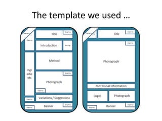
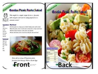
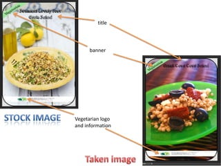
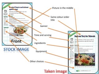
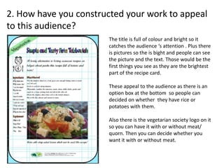
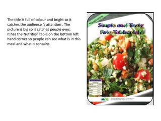
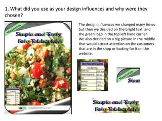
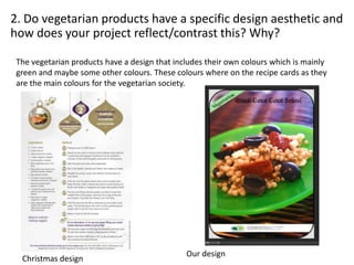
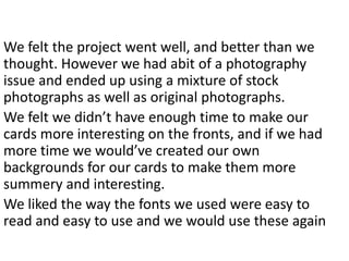
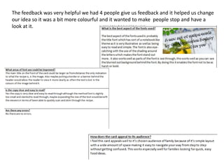
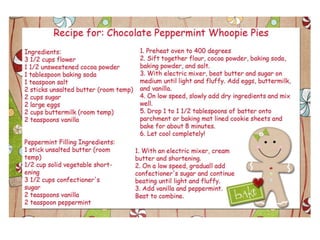
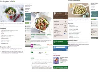
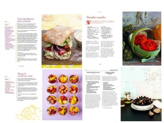
The document discusses the design process for creating recipe cards. It describes choosing a layout with a large central picture and additional information like ingredients and instructions. User testing found people preferred more text over pictures. The final design balanced text and a large, clear picture to catch attention. Images included both original photos and stock images due to challenges capturing all photos. The design uses the green color and logo from the Vegetarian Society branding guidelines to appeal to their audience. Overall, the process helped create bright, easy to read cards but left a desire for more creative backgrounds and designs with more development time.


![Question 3 evaulation [recovered] [recovered]](https://cdn.slidesharecdn.com/ss_thumbnails/question3evaulationrecoveredrecovered-160229161753-thumbnail.jpg?width=640&height=640&fit=bounds)


![T shirt%20 designs%20pro-forma(1)[1]](https://cdn.slidesharecdn.com/ss_thumbnails/t-shirt20designs20pro-forma11-130515100634-phpapp01-thumbnail.jpg?width=640&height=640&fit=bounds)

![Working%20to%20a%20 brief%20pro forma[1]](https://cdn.slidesharecdn.com/ss_thumbnails/working20to20a20brief20pro-forma1-130305032432-phpapp02-thumbnail.jpg?width=640&height=640&fit=bounds)


![Initial%20 ideas%20and%20feedback[1]](https://cdn.slidesharecdn.com/ss_thumbnails/initial20ideas20and20feedback1-130312040804-phpapp01-thumbnail.jpg?width=640&height=640&fit=bounds)


![Working%20to%20a%20 brief%20pro forma[1]](https://cdn.slidesharecdn.com/ss_thumbnails/working20to20a20brief20pro-forma1-130520073744-phpapp01-thumbnail.jpg?width=640&height=640&fit=bounds)


![Initial%20 ideas%20and%20feedback[1]](https://cdn.slidesharecdn.com/ss_thumbnails/initial20ideas20and20feedback1-130312041202-phpapp02-thumbnail.jpg?width=640&height=640&fit=bounds)