Download to read offline

![Audiences
Create an audience profile of your chosen demographic
(Age, gender, psychographic, geodemographic, NRS Social Grade, hobbies,
sexuality [if appropriate] etc)
Age: Adult – middle aged, 30-45. Child – 6-10
Gender: Adult – female. Child – gender neutral
Geodemographics: Outer suburbs
NRS social grade: Middle class/ABC1
Occupation: Stay at home mum/house wife
Hobbies: Cooking/walking/reading
Lifestyle: Reformer
This is Elizabeth, a middle aged, middle class, stay at home mum/house wife who lives
in the outer suburbs of Harrogate with her husband, James, two children, Isabella, 8,
and Thomas, 13, and the family dog, Pippin. Her husband James, works as an
accountant in York. In her spare time Elizabeth enjoys walking Pippin, reading and
cooking.](https://image.slidesharecdn.com/toemailevaluation-140521101241-phpapp02/85/To-email-evaluation-6-320.jpg)
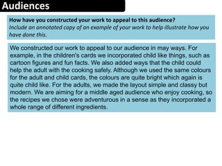
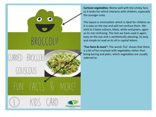


The document is a reflection on recipe cards created for VegSoc. It discusses the design choices made, including keeping the layout simple and minimalistic. Images were chosen to represent different vegetables in the recipes. Feedback was incorporated from VegSoc's existing cards. The final products included adult and children's cards. While collaboration worked well overall, in the future the student would be more assertive about including their own design ideas.


![Evaluation%20pro%20forma[1]](https://cdn.slidesharecdn.com/ss_thumbnails/evaluation20pro20forma1-140523090727-phpapp01-thumbnail.jpg?width=640&height=640&fit=bounds)


