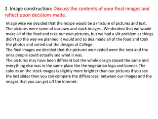
The document discusses the design process and outcomes of creating recipe cards. It describes:
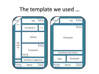
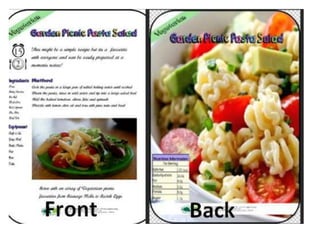
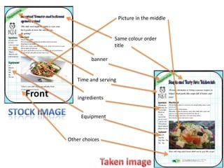
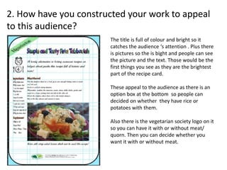
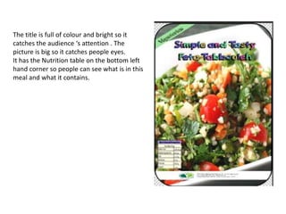
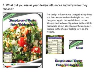
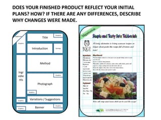
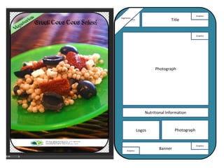
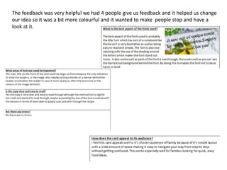
- Choosing a design with a large picture and nutrient table on the back, with ingredients, instructions, and a smaller picture on the front based on audience feedback.
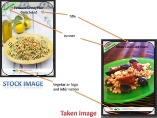
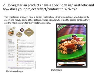
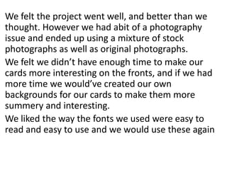
- Issues taking original photos led to using some stock images, though the overall design stayed consistent.
- The use of colors like green and bright hues to catch attention and match the vegetarian society branding.
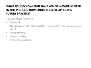
- Skills gained include teamwork, planning alternatives, critical thinking, decision making, and cooperative working that could be applied to future projects.


![Working%20to%20a%20 brief%20pro forma[1]](https://cdn.slidesharecdn.com/ss_thumbnails/working20to20a20brief20pro-forma1-130520073744-phpapp01-thumbnail.jpg?width=640&height=640&fit=bounds)

![T shirt%20 designs%20pro-forma(1)[1]](https://cdn.slidesharecdn.com/ss_thumbnails/t-shirt20designs20pro-forma11-130515100634-phpapp01-thumbnail.jpg?width=640&height=640&fit=bounds)


![Initial%20 ideas%20and%20feedback[1]](https://cdn.slidesharecdn.com/ss_thumbnails/initial20ideas20and20feedback1-130312041202-phpapp02-thumbnail.jpg?width=640&height=640&fit=bounds)
![Initial%20 ideas%20and%20feedback[1]](https://cdn.slidesharecdn.com/ss_thumbnails/initial20ideas20and20feedback1-130312040804-phpapp01-thumbnail.jpg?width=640&height=640&fit=bounds)
