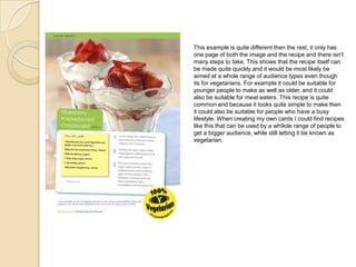
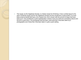
Vegetarian Recipe Cards
Jess
ď‚— With this recipe card the layout is quite simple. This card has been made by the vegetarian society,
so it would be a good card to look at first so we can understand what the company generally look for.
In this card the colour scheme is quite simple, for example there is only whites, greens and yellows
used. These could have been used because they tie in with the photograph of the soup. These
colours could have also been used because they fit in with the logo. These colours are also
associated with vegetarians, because of the earthy tones. The layout of this card is quite minimalistic.
For example it has the finished product on the left in the form of a photograph, and on the right there
is the recipe itself. The Vegetarian Society have used this template for most of their recipe cards, and
this would most likely be a typical card from them. This layout would make it easier for people
reading this card to understand it, because there isn’t any fancy writing or bold colours. The words
have been laid out on a white background using the green colour that has been used for the rest of
the card. This shows that the card was easy to design and the design team decided to use the same
colours throughout. This recipe card also looks like it’s professionally made, and that the card has
been printed on matte card so it doesn’t lose any colour or become worn. The photograph that has
been used also looks professionally made. It looks like it has been taken on an SLR camera by a
professional, paid photographer. This makes the overall look of the card better and the effect is what
we would have to try to copy in our own cards. The copy that has been used in this card is quite clear
and also easy to read, showing that maybe this card wasn’t aimed at a specific group, just any
vegetarian who wanted ideas for meals. This is also shown in the use of the simplistic layout, which
would attract a wider audience. When looking at other recipe cards made by the Vegetarian Society, I
found that they all followed this same pattern. The layout is the same and the copy is easy to read.
There are a few exceptions when the cards have been made for special occasions, but overall the
layout is the same.
This next example isn’t from a recipe card, its from a recipe book but the layout is the same. It has the
finished product illustrated as a photograph on one side of the page, and the recipe on the other. This
example is even more simplistic then the first. There isn’t any sophisticated fonts or lettering, and there
isn’t any real colour apart from the colour of the photograph. This type of design and layout would be used
in most recipe books, and even with some the photograph itself is also in black and white. This is useful to
a company that is creating books because it is simple enough to design and print, and it won’t take up a lot
of time and money so they can print it and get it sold as soon as possible. This would be useful to most
companies that are making recipe cards because they could send the finished products out sooner so they
can make a profit. However if the company wanted cards that looked like they have been planned out and
made over a long period of time, then they would have to include better fonts and a colour scheme. They
might also have to print the cards with more expensive card, so the overall look is better. This layout
however is the type of layout that would be useful to use in the recipe cards that we are making ourselves
because this would make it easier for viewers to understand. This is also the layout that every recipe book
and card generally uses, so it would be a good idea to keep to this template. This example seems to have a
very general audience if you look at the layout, but if you look at the actual copy you can see that only
people who like spicy food will use this recipe card. This shows that the book might have a specific
audience, but since the layout is quite simple, the book might cater for different tastes. This could be the
same for any recipe card, the card could be quite simple so that it appeals to many different people, but one
card could also have a specific audience.
 This recipe card isn’t from the vegetarian society, but it has the same layout and design. This card has
the photograph of the finished product on the first page and the recipe on the second. There is a
consistent colour scheme throughout, and the words are the same colour as the banner on the top and
the bottom of the card. This card also has a professional feel to it, and it looks like it could have been
made with the same type of card as the first example to get this matte effect. The main colour that has
been used for this card is red, which is also the colour of the finished product in the photograph. I’ve
noticed that most recipe cards have a sophisticated font on the right side of the back page, which adds
a professional feel to it. This shows that if I want to get professional cards that work when finished then
I'm going to have to make sure that my colour scheme for my cards are the same colour as the
photograph. I could do this by taking or collecting the photographs, then choosing a colour scheme
that will go with them. There is also a lot of copy used in this example, and it is clearly laid out and is
quite easy to understand. This is generally how the text should look, however it depends on what type
of audience the recipe card is aimed at. For example a company could produce cards aimed
specifically at children. In this case the photography would be done step by step, and there would most
likely be less words and less steps to follow. The recipe books and cards that are aimed at a higher
adult audience who have more money, the ingredients would become more sophisticated and more
expensive, and there would most likely be only one photograph of the finished product. Since looking at
recipe cards for two different companies I found that the layout is always the same. The logo is in the
same place, the image, the copy and everything else is too. This shows that if I want to stick to the brief
then I’m going to have to stick to these templates, since this layout is what has been described in the
brief.
ď‚— This recipe is from the Vegetarian Society. It has the same layout as the others and the recipe itself
follows the same pattern. There isn’t any real differences between the other recipe and this one, and
most of the others that I have looked at from the Vegetarian Society are the same. There is the same
green and white colour scheme as the other card, and the font is the same. The photograph itself also
looks professionally made and the overall card looks like it would have been printed on matte card. The
audience for this particular card would be quite broad. It would be aimed at vegetarian adults, meat
eaters, people on a budget and people who want to make something special for after dinner. Having a
broad target audience is helpful when making recipe cards because then they could appeal to more
people, and if these cards are being sold then they would sell more and make a bigger profit. Even with
this card I’ve found there is a colour scheme that is used even in the image, however the difference is
that there is only a small amount of green on the image, but this would still look better than an image
that doesn’t follow the colour scheme.
ď‚— This card from the Vegetarian Society is different however. It still has the finished product
photographed onto the front of the card and the recipe on the back, but it doesn’t have the same layout
or colour scheme. With this example the photograph takes up the whole front page, and it leaves a
small amount of space at the bottom for the logo. This attracts the eye to the photograph and it looks
less bold than the others. There is also the use of the stars and baubles. This gives it a seasonal feel to
it, which is what the company would have wanted since the recipe is for a Christmas pie. Another
aspect that is different is the use of colour on the back page. There is a blue colour that is used for the
background, and still no border. This makes the overall look more festive and there still isn’t any bold
colours used. Since this recipe card is for a seasonal food then the overall look is more creative.
ď‚— This example was taken from a recipe book for seasonal recipes. It is quite simple and it only takes a
few steps to make. The layout of this recipe is also quite simple; there is the photograph of the finished
product on one page, and the recipe on the next. There isn’t any fancy fonts used in this example and
background is really plain. This shows that the target audience would be adults because there wouldn’t
need to be any creative elements added in. from looking at the photograph I could say that the recipe is
aimed at people on a budget. This is because there are objects in the photograph that people can use
daily. It isn’t taken at an expensive restaurant and it could mean that the ingredients would be quite
cheap. Overall this example would be aimed at adults on a budget, because the style and colour
scheme is quite simplistic, but the photography looks quite professional.
ď‚— This example was taken from recipe book for children, and it shows with the use of creative aspects
like the notebook background and the drawings. This example uses a colour scheme of green and
orange, and even though they aren’t primary colours they are used in blocks and they are all quite bold.
The layout is quite creative, something that you see in everything that is designed for kids, but there is
also the same basic layout as the rest. By this I mean that the photograph is on one page and the
recipe is on the next. This is where the similarities end however because the words that are used label
each stage more clearly and there is the use of headings that would illustrate more clearly to a child
exactly what it is they are doing. Breaking down the recipe into sections would be common in a
children's recipe card, and if I was to aim a recipe at a younger audience I would use this method and
use more illustrations and pictures to show them how to do it.
ď‚— This example is quite similar to the last, it has the same colour scheme; green and orange, and it also
has the same layout. This is taken form the same recipe book and it shows that the whole book is
consistent in the way it lays out a page. The recipe is on one page, with the title at the top, and the
recipe at the bottom. There is also drawings and other aspects to this example that you would only find
in a recipe targeted at children, for example the post it note. This would make it more appealing to
children because there is a lot of block colours and interesting and creative aspects that would draw
them in. If a company wanted to creative recipe cards for children and they made them in black and
white with barely any pictures and a lot of text, then they would become uninterested and they would
stop reading. So using bold colours and drawings would be necessary for a company making children's
recipe cards. Another aspect in this example that would be a necessity for recipe designed for children
would be the use of children's cutlery in the final photograph. In a recipe card that is designed for adults
there would most likely be a wine glass with expensive looking kitchen utensils, unlike a recipe card
that would be designed for kids where there would be kids sized knives and forks with maybe a face on
them like in this image.
This example is quite different then the rest, it only has
one page of both the image and the recipe and there isn’t
many steps to take. This shows that the recipe itself can
be made quite quickly and it would be most likely be
aimed at a whole range of audience types even though
its for vegetarians. For example it could be suitable for
younger people to make as well as older, and it could
also be suitable for meat eaters. This recipe is quite
common and because it looks quite simple to make then
it could also be suitable for people who have a busy
lifestyle. When creating my own cards I could find recipes
like this that can be used by a wh9ole range of people to
get a bigger audience, while still letting it be known as
vegetarian.
ď‚— This recipe, by the Vegetarian Society, is a festive recipe for Christmas. It has a similar layout to the
other Christmas recipe card for the Vegetarian Society and the overall look is quite similar. It is most
likely aimed at adults that have a lot of spare time, this is shown with the amount of steps that have
been put in. the overall look is quite sophisticated; it doesn’t have any bold and contrasting colours and
the font is quite fancy. The photograph that has been used looks like it has been taken by a
photographer and it looks like it has been taken in quite a posh setting.
 To sum up the recipe cards that I have looked at I’ve found that most of them use the same template.
This is the same for many different companies, they all use the same layout. Most of them have a
colour border, the images are in the same place and the copy is always on the second page. There is a
colour scheme that goes through the whole card, and they always look like they have been made for a
very general audience. However there is a few cards out there that have been made for special
occasions, for example Christmas, and these cards are more creative. I’ve also found that the recipes
that have been taken from books have the same layout and design as the cards. the only real
exception to this would be the recipes that are aimed at children. They have brighter colours and the
overall look is more busy. The copy is normally quite bold and simple, there would be more numbers
then normal to break up the stages, and the recipe itself would be easy to do. This is different to recipe
cards that are aimed at adults because they could try out more complex recipes.

Presentation1

  • 1.
  • 3.
     With thisrecipe card the layout is quite simple. This card has been made by the vegetarian society, so it would be a good card to look at first so we can understand what the company generally look for. In this card the colour scheme is quite simple, for example there is only whites, greens and yellows used. These could have been used because they tie in with the photograph of the soup. These colours could have also been used because they fit in with the logo. These colours are also associated with vegetarians, because of the earthy tones. The layout of this card is quite minimalistic. For example it has the finished product on the left in the form of a photograph, and on the right there is the recipe itself. The Vegetarian Society have used this template for most of their recipe cards, and this would most likely be a typical card from them. This layout would make it easier for people reading this card to understand it, because there isn’t any fancy writing or bold colours. The words have been laid out on a white background using the green colour that has been used for the rest of the card. This shows that the card was easy to design and the design team decided to use the same colours throughout. This recipe card also looks like it’s professionally made, and that the card has been printed on matte card so it doesn’t lose any colour or become worn. The photograph that has been used also looks professionally made. It looks like it has been taken on an SLR camera by a professional, paid photographer. This makes the overall look of the card better and the effect is what we would have to try to copy in our own cards. The copy that has been used in this card is quite clear and also easy to read, showing that maybe this card wasn’t aimed at a specific group, just any vegetarian who wanted ideas for meals. This is also shown in the use of the simplistic layout, which would attract a wider audience. When looking at other recipe cards made by the Vegetarian Society, I found that they all followed this same pattern. The layout is the same and the copy is easy to read. There are a few exceptions when the cards have been made for special occasions, but overall the layout is the same.
  • 5.
    This next exampleisn’t from a recipe card, its from a recipe book but the layout is the same. It has the finished product illustrated as a photograph on one side of the page, and the recipe on the other. This example is even more simplistic then the first. There isn’t any sophisticated fonts or lettering, and there isn’t any real colour apart from the colour of the photograph. This type of design and layout would be used in most recipe books, and even with some the photograph itself is also in black and white. This is useful to a company that is creating books because it is simple enough to design and print, and it won’t take up a lot of time and money so they can print it and get it sold as soon as possible. This would be useful to most companies that are making recipe cards because they could send the finished products out sooner so they can make a profit. However if the company wanted cards that looked like they have been planned out and made over a long period of time, then they would have to include better fonts and a colour scheme. They might also have to print the cards with more expensive card, so the overall look is better. This layout however is the type of layout that would be useful to use in the recipe cards that we are making ourselves because this would make it easier for viewers to understand. This is also the layout that every recipe book and card generally uses, so it would be a good idea to keep to this template. This example seems to have a very general audience if you look at the layout, but if you look at the actual copy you can see that only people who like spicy food will use this recipe card. This shows that the book might have a specific audience, but since the layout is quite simple, the book might cater for different tastes. This could be the same for any recipe card, the card could be quite simple so that it appeals to many different people, but one card could also have a specific audience.
  • 7.
     This recipecard isn’t from the vegetarian society, but it has the same layout and design. This card has the photograph of the finished product on the first page and the recipe on the second. There is a consistent colour scheme throughout, and the words are the same colour as the banner on the top and the bottom of the card. This card also has a professional feel to it, and it looks like it could have been made with the same type of card as the first example to get this matte effect. The main colour that has been used for this card is red, which is also the colour of the finished product in the photograph. I’ve noticed that most recipe cards have a sophisticated font on the right side of the back page, which adds a professional feel to it. This shows that if I want to get professional cards that work when finished then I'm going to have to make sure that my colour scheme for my cards are the same colour as the photograph. I could do this by taking or collecting the photographs, then choosing a colour scheme that will go with them. There is also a lot of copy used in this example, and it is clearly laid out and is quite easy to understand. This is generally how the text should look, however it depends on what type of audience the recipe card is aimed at. For example a company could produce cards aimed specifically at children. In this case the photography would be done step by step, and there would most likely be less words and less steps to follow. The recipe books and cards that are aimed at a higher adult audience who have more money, the ingredients would become more sophisticated and more expensive, and there would most likely be only one photograph of the finished product. Since looking at recipe cards for two different companies I found that the layout is always the same. The logo is in the same place, the image, the copy and everything else is too. This shows that if I want to stick to the brief then I’m going to have to stick to these templates, since this layout is what has been described in the brief.
  • 9.
     This recipeis from the Vegetarian Society. It has the same layout as the others and the recipe itself follows the same pattern. There isn’t any real differences between the other recipe and this one, and most of the others that I have looked at from the Vegetarian Society are the same. There is the same green and white colour scheme as the other card, and the font is the same. The photograph itself also looks professionally made and the overall card looks like it would have been printed on matte card. The audience for this particular card would be quite broad. It would be aimed at vegetarian adults, meat eaters, people on a budget and people who want to make something special for after dinner. Having a broad target audience is helpful when making recipe cards because then they could appeal to more people, and if these cards are being sold then they would sell more and make a bigger profit. Even with this card I’ve found there is a colour scheme that is used even in the image, however the difference is that there is only a small amount of green on the image, but this would still look better than an image that doesn’t follow the colour scheme.
  • 11.
     This cardfrom the Vegetarian Society is different however. It still has the finished product photographed onto the front of the card and the recipe on the back, but it doesn’t have the same layout or colour scheme. With this example the photograph takes up the whole front page, and it leaves a small amount of space at the bottom for the logo. This attracts the eye to the photograph and it looks less bold than the others. There is also the use of the stars and baubles. This gives it a seasonal feel to it, which is what the company would have wanted since the recipe is for a Christmas pie. Another aspect that is different is the use of colour on the back page. There is a blue colour that is used for the background, and still no border. This makes the overall look more festive and there still isn’t any bold colours used. Since this recipe card is for a seasonal food then the overall look is more creative.
  • 13.
     This examplewas taken from a recipe book for seasonal recipes. It is quite simple and it only takes a few steps to make. The layout of this recipe is also quite simple; there is the photograph of the finished product on one page, and the recipe on the next. There isn’t any fancy fonts used in this example and background is really plain. This shows that the target audience would be adults because there wouldn’t need to be any creative elements added in. from looking at the photograph I could say that the recipe is aimed at people on a budget. This is because there are objects in the photograph that people can use daily. It isn’t taken at an expensive restaurant and it could mean that the ingredients would be quite cheap. Overall this example would be aimed at adults on a budget, because the style and colour scheme is quite simplistic, but the photography looks quite professional.
  • 15.
     This examplewas taken from recipe book for children, and it shows with the use of creative aspects like the notebook background and the drawings. This example uses a colour scheme of green and orange, and even though they aren’t primary colours they are used in blocks and they are all quite bold. The layout is quite creative, something that you see in everything that is designed for kids, but there is also the same basic layout as the rest. By this I mean that the photograph is on one page and the recipe is on the next. This is where the similarities end however because the words that are used label each stage more clearly and there is the use of headings that would illustrate more clearly to a child exactly what it is they are doing. Breaking down the recipe into sections would be common in a children's recipe card, and if I was to aim a recipe at a younger audience I would use this method and use more illustrations and pictures to show them how to do it.
  • 17.
    ď‚— This exampleis quite similar to the last, it has the same colour scheme; green and orange, and it also has the same layout. This is taken form the same recipe book and it shows that the whole book is consistent in the way it lays out a page. The recipe is on one page, with the title at the top, and the recipe at the bottom. There is also drawings and other aspects to this example that you would only find in a recipe targeted at children, for example the post it note. This would make it more appealing to children because there is a lot of block colours and interesting and creative aspects that would draw them in. If a company wanted to creative recipe cards for children and they made them in black and white with barely any pictures and a lot of text, then they would become uninterested and they would stop reading. So using bold colours and drawings would be necessary for a company making children's recipe cards. Another aspect in this example that would be a necessity for recipe designed for children would be the use of children's cutlery in the final photograph. In a recipe card that is designed for adults there would most likely be a wine glass with expensive looking kitchen utensils, unlike a recipe card that would be designed for kids where there would be kids sized knives and forks with maybe a face on them like in this image.
  • 18.
    This example isquite different then the rest, it only has one page of both the image and the recipe and there isn’t many steps to take. This shows that the recipe itself can be made quite quickly and it would be most likely be aimed at a whole range of audience types even though its for vegetarians. For example it could be suitable for younger people to make as well as older, and it could also be suitable for meat eaters. This recipe is quite common and because it looks quite simple to make then it could also be suitable for people who have a busy lifestyle. When creating my own cards I could find recipes like this that can be used by a wh9ole range of people to get a bigger audience, while still letting it be known as vegetarian.
  • 20.
     This recipe,by the Vegetarian Society, is a festive recipe for Christmas. It has a similar layout to the other Christmas recipe card for the Vegetarian Society and the overall look is quite similar. It is most likely aimed at adults that have a lot of spare time, this is shown with the amount of steps that have been put in. the overall look is quite sophisticated; it doesn’t have any bold and contrasting colours and the font is quite fancy. The photograph that has been used looks like it has been taken by a photographer and it looks like it has been taken in quite a posh setting.
  • 21.
     To sumup the recipe cards that I have looked at I’ve found that most of them use the same template. This is the same for many different companies, they all use the same layout. Most of them have a colour border, the images are in the same place and the copy is always on the second page. There is a colour scheme that goes through the whole card, and they always look like they have been made for a very general audience. However there is a few cards out there that have been made for special occasions, for example Christmas, and these cards are more creative. I’ve also found that the recipes that have been taken from books have the same layout and design as the cards. the only real exception to this would be the recipes that are aimed at children. They have brighter colours and the overall look is more busy. The copy is normally quite bold and simple, there would be more numbers then normal to break up the stages, and the recipe itself would be easy to do. This is different to recipe cards that are aimed at adults because they could try out more complex recipes.