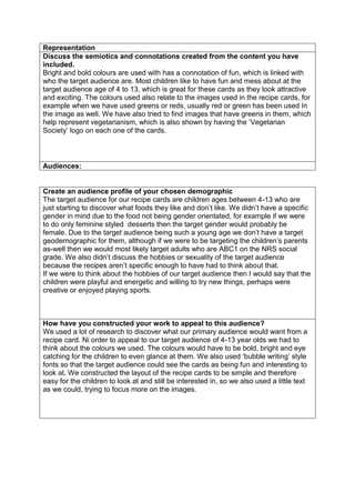
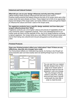
The document describes the process of designing recipe cards for children ages 4-13. It discusses designing 5 different layouts and choosing a simple design with the recipe image on the back and ingredients/method on the front. Bright, bold colors were used to attract children. Stock images were chosen to make the cards look professional. Feedback confirmed the enlarged back image was favored. Skills in Photoshop and group work were developed through managing time well and completing the project on schedule while meeting the brief.
The document provides details about the design and production process for a set of recipe cards aimed at children ages 4-13. The designer chose simple, colorful layouts with a balance of images and text to appeal to the target audience. Feedback from peers informed changes like adjusting fonts for readability. Overall the process involved extensive planning, research on the target demographic, and iterations based on feedback to create technically competent and creative final products that met the project brief.
The layout of the recipe cards has been kept simple yet professional, featuring minimal information on the front such as the title, image, and logo. The back contains the full recipe and a small decorative image. Consistency is maintained across cards through similar layout, colors, fonts, and logo/image placement. Some areas could be improved, such as ensuring consistent image and font sizes. The images are a mix of original photos and stock images to balance quality with limited time and resources. Colors, themes, and images aim to appeal to the target audience of teenage girls by featuring heart shapes, the word "love", and the symbolism of Cupid.
The document summarizes the production process of creating recipe cards for vegetarians. It discusses how the initial plans for bright colors and stock images did not work cohesively as a set. The team then simplified the design with a white background and two consistent colors from the logo. Feedback noted the need for consistent layouts and font placement. While some stock images stood out, the overall set reflected the goal of appealing to a general audience with a basic design. The document evaluates skills learned around planning, photography, and using feedback to improve the final products.
This document summarizes a student's recipe card project evaluation. The student discusses designing the recipe cards to look like realistic school work with busy details. Photos were taken by the student and stock images were used. Colors, fonts, and added details like ink splotches were meant to evoke the feeling of doing school work. The intended audience is middle-aged adults who would feel nostalgic looking at school-themed cards. Influences included actual school materials like blackboards. The theme appeals to the target demographic and influences included the client, the Vegetarian Society.
Vegetarian products have developed some common design aesthetics over time:
- Natural/organic: Many vegetarian brands emphasize natural, organic, and plant-based ingredients. Designs often feature images of fresh produce, grains, and herbs to convey these qualities. Earth tones like greens, browns and beiges are frequently used.
- Minimalist: Since vegetarian products aim to remove animal ingredients, designs sometimes take a minimalist approach focusing only on the core plant ingredients. Typography and imagery are clean and simple. Additional information is kept to a minimum.
- Wellness/health: Emphasizing the perceived wellness benefits of vegetarianism, designs may feature words like "healthy," "nutritious"
Evaluation (print based media and working to brief)chamahan
This document summarizes a student's design project creating recipe cards for a vegetarian organization. The student discusses their design process, including initial plans, changes made based on feedback, and reflections on the final products. Key points include using a scrapbook theme to appeal to older audiences, choosing images and colors carefully, and structuring recipes consistently across cards. The student evaluates strengths like the cohesive scrapbook aesthetic and weaknesses such as inconsistent sizing of some elements. Lessons learned include planning templates more thoroughly and considering different target audiences.
The document summarizes the design choices made for a set of recipe cards targeting both adult and child audiences. For the adult cards, a simple layout with a 60:40 image to text ratio was used, similar to existing recipe cards from VegSoc. The child cards feature more images and graphics inspired by the recipes' main vegetables to make them fun and engaging for kids. Color schemes were based on the vegetables featured to seem natural. Stock images were used for consistency. The cards were designed to appeal to both parents and children to encourage cooking vegetables together.
- The document discusses the design process for a set of recipe cards aimed at a general vegetarian audience.
- Initial designs used brighter colors but didn't work cohesively, so the designs were simplified and a consistent color palette was adopted.
- Images were gathered from online stock photos when suitable photos couldn't be taken, but some stock images didn't match the style.
- Feedback was gathered and the designs were refined to have consistent layouts, fonts, and color schemes to create a cohesive set.
- The final cards follow a simple, easy to read design informed by existing vegetarian recipe cards to appeal to a broad audience.
This document summarizes a student's recipe card project evaluation. The student chose a simple yet interesting layout for the cards to appeal to busy audiences. Images, fonts, and colors were selected to convey creativity and happiness. The target audiences of working parents and students are described, along with how the design appeals to them through simplicity, guidance, and visual appeal. Influences including existing recipe cards were analyzed. The finished cards reflect the initial theme of quick meals but layout changes were made for clarity. The project meets the criteria of being interesting, creative designs focused on easy vegetarian recipes.
The document summarizes the design choices for recipe cards targeted at both adult and child audiences. For the adult cards, a simple layout with a 60:40 image to text ratio was used, similar to existing recipe cards. The child cards feature cartoon graphics inspired by the recipes' main vegetables to make them fun and child-friendly. Color schemes were based on the vegetables' natural hues to convey a sense of freshness. Both card designs aim to appeal to their intended audiences through visual elements while also maintaining consistency as part of a set.
The document provides an evaluation of Hannah Mizen's recipe card project. It discusses the visual design choices made, including the layout, image to text ratio, and simplistic style. The goal was to appeal to vegetarians by emulating a school notebook aesthetic with neat organization and imperfect elements like stains. Photos were taken consistently to tie the cards together as a set. Feedback is provided on how well the finished project reflected the initial plans and brief. Minor changes were made from early concepts, and the final product was found to meet the requirements outlined in the brief.
The document summarizes the design choices made for a set of vegetarian recipe cards. The layout is simple with boxes and images for a neat yet imperfect "school book" feel. Images and text are in equal ratio. Photography was used to keep lighting and feelings consistent across cards. Font, sizing, and color are consistent to look handwritten. Influences included existing recipe cards for layout and information placement, but the design aims to have a nostalgic "school" theme with ripped edges, ink splotches and a lined paper background to seem less serious. The goal was a relaxed yet professional look to appeal to a middle-aged, family-oriented audience interested in healthy eating.
The document summarizes the design choices made for a set of vegetarian recipe cards. The layout is simple with boxes and images to give a school-like feel. Images and text are in equal proportion. Photography was used to keep lighting and feelings consistent across cards. Font, sizing, and color are consistent to look handwritten. Influences included existing recipe cards for their simple structures but the designs aimed to have a nostalgic, homemade theme through additions like ink splotches. The goal was to appeal to a middle-aged, family-oriented audience interested in healthy eating through gender-neutral, easy-to-follow designs.
This document discusses the production of recipe cards. It describes the design choices made, including using 4 images on each card to show ingredients and the finished product. Feedback was incorporated, such as adding more images to the front of cards. The finished products matched the brief of creating a unique, creative set of vegetarian recipe cards. Peer feedback helped improve the design by making text more readable. Strengths included a consistent theme and layout, while weaknesses were using similar colors and not clearly conveying the summer theme. Time management and following a schedule were important to complete the project on time.
The document discusses the design and layout of recipe cards. It describes setting up the cards with 4 images on the front showing ingredients and the finished product, with text on the back. It considers balancing images and text. Photos were chosen from Google and edited to be high quality, focused shots to clearly show ingredients and meals. Colors, circles, and borders were used consistently across the cards to represent the summer theme. Influences included existing recipe websites and cards, which informed the color scheme and addition of tips. The target audience was defined as vegetarians aged 15-40, and design elements aimed to make the cards look professional, fun, and appeal to both genders.
The document is a reflection on recipe cards created for VegSoc. It discusses the design choices made, including keeping the layout simple and minimalistic. Images were chosen to represent different vegetables in the recipes. Feedback was incorporated from VegSoc's existing cards. The final products included adult and children's cards. While collaboration worked well overall, in the future the student would be more assertive about including their own design ideas.
The document discusses the design choices made for a set of vegetarian recipe cards. It describes opting for a clean, simple layout with balanced text and images. Research including surveys informed the card content, which includes methods, ingredients lists, and photos. Original photos were intended but stock images had to be used due to time constraints. Color was added minimally for visual interest. The intended audience is described as early twenties, middle-class individuals interested in healthy lifestyles and spending time with friends and family.
The document summarizes the design process and decisions made for creating recipe cards for a vegetarian client. Key details include:
- The designs are busy with small details to look realistic, using more text than images depending on the recipe.
- Photographs were taken by the designers and stock photos were used, with details like tape and shadows added in Photoshop.
- The green color and messy details are meant to evoke nostalgia for childhood and school. Recipes also reference traditional school meals.
- The target audience is middle-aged adults who would feel nostalgic about their school experiences, and the designs appeal to this group through theme and language used.
Stephanie Westerman provided initial ideas and received feedback for recipe cards with different themes. The key ideas proposed color schemes, printing methods, fonts, layouts, media, foods, and target audiences. Feedback agreed the vegetarian card's colors and meal/dessert suited the theme. Developing the girly card's font was disagreed with as too fancy for young girls. Stephanie's favorite ideas were the wedding/Christmas card for its reusability and the organic card for its all year use by both genders.
This document discusses the production of recipe cards for a vegetarian audience. The author outlines their design process, including using consistent formatting, high quality images, and bright colors to represent the summer theme. Feedback was incorporated, such as adding more images to the front of cards for clarity. While the finished products matched the brief, the author reflects that the summer theme could have been more evident. Skills developed include managing timelines, suiting designs to audiences, and gaining experience working to a brief.
- The document discusses the design choices made for a set of recipe cards promoting international cuisine. It includes three images and separates ingredients and instructions into columns for clarity. Icons and flags representing each country were included.
- Original photos were taken and edited for the cards. Multiple angles and crops were used to showcase the food. Colors were balanced to attract attention.
- The theme of global cuisine was chosen to showcase unusual recipes that are affordable and approachable for teenagers and adults. Iconic illustrations represented each country's cuisine and culture.
- The target audience is middle class families ages 16 to adult, appealing to both genders with an emphasis on lifestyle, culture and interests over occupation. Formatting and balanced design elements make
The document discusses the design choices made for recipe cards targeting children and parents. The designer chose a simple layout with touches like borders to make it more professional without being boring. Images were taken by the designer and edited to look more professional. A large image on the front grabs attention while a smaller image on the back provides contrast. Text and images are balanced. Peer feedback helped improve readability by changing some background colors. Overall, the designer learned skills like using clipping masks and custom fonts that could be applied to future projects. Communication and working alone versus in a group are discussed.
The document proposes three different themes for recipe cards:
1. "Vegetarianism for Dummies" featuring simple recipes like pastas, pizzas, and casseroles appealing to new vegetarians aged 18-30. The cards will have a yellow and black color scheme in the style of "For Dummies" books.
2. Recipes aimed at children becoming vegetarian or whose parents are vegetarian, featuring foods like pizzas, muffins, and finger foods. The cards will use bright primary colors and feature child-friendly images and fonts.
3. An "Easter" themed set of cards shaped like eggs featuring recipes like curries and roasts. The cards will use past
This document discusses the design choices made for a set of recipe cards produced for the Vegetarian Society. It reflects on the layout, images, colors, fonts, and other design elements used and how they appeal to the target audience. The cards were aimed at a mass market without gender bias, using neutral colors and a professional style. Feedback was gathered through various prototypes to produce cards that provided clear instructions while looking exciting enough to attract potential buyers to vegetarianism. Semiotics of the design elements were considered to convey meanings of health, nature, and trustworthiness.
Hayley Roberts has proposed 5 ideas for recipe cards targeted at different age groups.
Idea 5 targets children below age 10 with Easter themed recipes that are fun and allow customization. The cards would use bright colors and bold, informal text sized for children. The card design would be die-cut into fun Easter shapes like eggs or bunnies.
This document analyzes the layout, design, and target audiences of various recipe cards and books. It finds that most have a simple layout with the finished product photo on one page and the recipe on the facing page. Colors are usually muted earth tones and layouts are minimalistic. Target audiences can range from families to busy adults to those on a budget. Children's recipes use bolder colors, illustrations and simpler instructions. The document examines differences in recipes for specific audiences like holidays or vegetarians. Overall the analysis provides guidance on effective recipe design for different groups.
The document discusses the creation of a dance music magazine. It covers choosing a target audience of 15-30 year olds interested in dance music, festivals, and new artists. Potential distributors like Development Hell and EMAP are considered due to their previous success distributing similar magazines. Photoshop skills were developed to enhance photos for the magazine. Creating a blog helped with preparation and allowed flexibility to update from any location. Various software programs and camera techniques were utilized to achieve a professional look and structure for the magazine.
El municipio de El Ejido se encuentra en la provincia de Almería, Andalucía. Su población se ha duplicado desde 1994 debido a la agricultura y el sector servicios. Más del 30% de la población son inmigrantes de países en desarrollo que trabajan principalmente en la agricultura. El fracaso escolar es más común entre los estudiantes de escuelas públicas y los niños, especialmente en regiones como Baleares y la Comunidad Valenciana. Para mejorar el rendimiento escolar de los hijos de inmigrantes,
The document is a presentation about a company called Podology that sells garden pods. It showcases their range of garden pods including deluxe summerhouses and rotating loungers/seaters that come in various sizes, colors, and configurations. The pods can be customized and are designed to allow people to enjoy their garden year-round. Contact information is provided at the end for anyone interested in purchasing a pod or learning more.
Este documento resume los cálculos para determinar el coste de la educación primaria en un centro escolar privado. Calcula el sueldo de un maestro en 980€ al mes y los gastos de mantenimiento del centro en aproximadamente 380€ al mes. Esto daría un coste total para los padres de unos 102€ mensuales por alumno. También analiza el entorno socioeconómico local con datos demográficos y laborales para evaluar la viabilidad del proyecto. Finalmente, propone una oferta educativa innovadora con talleres extra
ESTA PRESENTACIÓN FUE UTILIZADA PARA EL SEMINARIO SONRE TECOLOGIAS Y FAMILIA ORGANIZADO POR EL INSTITUTO DE CIENCIAS DE LA FAMILIA DE LA UNIVERSIDAD DE LOS ANDES
Este documento presenta conceptos básicos de electrónica como resistencias, condensadores, diodos, fuentes de alimentación, transformadores, rectificadores, filtros, estabilizadores, transistores y sus aplicaciones en diferentes montajes como amplificadores de sonido, control de motores y sensores. Explica características y símbolos de componentes electrónicos clave así como conceptos de polarización y circuitos equivalentes de transistores.
Este documento resume los principales aspectos de la industria, minería y ferrocarril en España en el siglo XIX. La industria enfrentó problemas como la falta de capacidad de compra, inversores, transporte y energía. La siderurgía estuvo presente en Andalucía, Asturias y el País Vasco. La industria textil fue importante en Cataluña. La minería extrajo plomo, cobre, mercurio, cinc y carbón. El ferrocarril tuvo una estructura radial y favoreció el transporte de
The document outlines a plan to create a healthier version of a restaurant's best-selling burger. It identifies the bun and cheese as areas to reduce calories, fat, and carbohydrates. Alternative buns and cheese are presented with improved nutrition profiles that significantly reduce the total calories, fat, and carbs of the redesigned "Better Burger" compared to the original "Best Seller".
The document summarizes the production process of creating a set of vegetarian recipe cards for a general audience. Key points:
- The initial designs used bright colors but did not work cohesively, so a simpler color scheme was adopted using greens.
- Images were taken but some were low quality, so stock images were also used. Not all images matched well.
- Feedback noted the cards did not work as a set due to varying colors, so a consistent design was applied.
- Planning and managing time well allowed feedback to be incorporated and the standard required to be met. Better planning of images is needed for future projects.
The document discusses the design process for creating recipe cards. It describes choosing a layout with a large central picture and additional information like ingredients and instructions. User testing found people preferred more text over pictures. The final design balanced text and a large, clear picture to catch attention. Images included both original photos and stock images due to challenges capturing all photos. The design uses the green color and logo from the Vegetarian Society branding guidelines to appeal to their audience. Overall, the process helped create bright, easy to read cards but left a desire for more creative backgrounds and designs with more development time.
The document discusses the design process for creating recipe cards. It describes choosing a template with a large picture and smaller picture, with most of the information on the front for ease of reading. Testing found audiences preferred more instructions over pictures. Images were a mix of original photos and stock photos due to challenges capturing all photos. The final design featured bright colors and fonts to catch attention, with key information like ingredients and nutrition prominently displayed. Feedback helped add more color to engage passersby. The design reflected vegetarian branding with green and other colors from the Vegetarian Society logo.
The document discusses producing print-based media for an afternoon tea theme targeted towards elderly people. It describes choosing a layout with one main image and close-ups to show detail. Most images were photographed to give a homely feel. Recipes were tested with different backgrounds and shapes to make the text clear while avoiding busyness. Ingredients were made bold for ease of reading. Stickers and boxes were used to frame images and text. The finished products reflected initial plans through experimenting with fonts, colors, and imagery to appeal to elderly audiences.
The document discusses the design process and outcomes of creating recipe cards. It describes:
- Choosing a design with a large picture and nutrient table on the back, with ingredients, instructions, and a smaller picture on the front based on audience feedback.
- Issues taking original photos led to using some stock images, though the overall design stayed consistent.
- The use of colors like green and bright hues to catch attention and match the vegetarian society branding.
- Skills gained include teamwork, planning alternatives, critical thinking, decision making, and cooperative working that could be applied to future projects.
The student created recipe cards targeting older audiences. They conducted research which found older people prefer simple, sophisticated designs. The cards have a white background for ease of reading, and feature a large main image and additional close-up shots to make the design more creative. Text is in a single column divided into paragraphs. Images on the back continue the theme while changing opacity levels. The design reflects the target audience and theme of afternoon tea.
The document discusses the finished recipe cards and how they reflect the initial plans and brief. It notes that the plans were largely followed, with only minor changes such as experimenting with different image layouts on the back of the cards. It also addresses how the finished products match the requirements in the brief, such as including preparation and cooking times, formatting the ingredients and method clearly, and having a cohesive theme of afternoon tea across all the cards. Peer feedback helped in the production process by providing input on design elements like the image presentation.
The document discusses the design choices made for a set of recipe cards aimed at students. It describes laying out the designs with plenty of white space between elements for easy navigation. Images and text are separated using block shapes as banners. Imagery dominates over text to showcase the recipes visually. Pictures of students were included to relate to the target demographic. The final designs used sourced images for simplicity, though taking their own photos would have allowed more control. Colors were chosen to match the sourced images and appeal to students. Nutritional information and QR codes linking to video tutorials were included to further engage the audience.
The document discusses research conducted to design recipe cards for a target audience of students and vegetarians. A survey found that emphasizing healthy eating and including 5 servings of fruits and vegetables each day would appeal to vegetarians. The cards were designed to include easy to make recipes featuring finished food images to entice the audience. Fonts, color schemes, recipe selections, and additional features like QR codes were chosen to match the target demographics. Overall the design accomplished the goals but fonts could potentially be more appealing to students.
Evaluation (print based media and working to brief)savannahryan11
The document discusses Ryan Goldsmith's evaluation of a set of recipe cards he produced for a project. It summarizes the design choices made for the cards, including placing the title, image, method, and ingredients in specific locations. It also discusses using primary colors and fonts to appeal to children. Peer feedback suggested changing the font to improve readability. The project matched the brief of creating recipe cards to promote vegetarian options for children and families. Working in a group required good communication and balancing workloads.
- The document is an evaluation of recipe cards created for a visual language project.
- The student chose to layout the recipe cards in a creative but formal way, adding curves to banners while keeping text flat and easy to read.
- Images were taken by the student for 3 cards but one used a stock image as the finished product did not look presentable.
- The target audience was children at parties to get parents to listen to what children want, using bright colors and stars.
- Design influences included looking at existing media products but not directly copying them. The finished products reflected the initial plans with some changes.
Evaluation pro forma (with improvements) cloestead
The document provides an evaluation of recipe cards created by Chloe Stead for a creative media production course. The cards were designed to look like realistic school work, with busy details including images, text, ink splodges, and tape overlays. The text was formatted to fit on lined paper, with titles at the top and a branding strip at the bottom as is typical of school work. Feedback was incorporated throughout the design process to refine the theme and layout. The final products matched the brief of including branding, recipes, and nutritional information, though some recipes included imperial measurements instead of metric.
The document provides an evaluation of recipe cards that were designed for a client. It discusses the process of designing the cards, including choosing designs, taking photos, and making final decisions. Feedback from testers is also summarized, noting that the font on the back could be improved and preparation/cooking times should be added. While the finished cards matched the client brief, the author notes they aren't very creative and more time would have allowed for better designs. Skills learned include teamwork, planning alternatives, critical thinking, decision making, and cooperative working.
The document summarizes the design choices made for a set of recipe cards. It discusses choosing a simple layout that stands out from competition. Large images were used on the front of each card to attract attention, with instructions and ingredients on the back where more space was needed. Original photos were taken to show different angles of each dish and control lighting/editing, though stock photos may have been better for consistency. A clipping mask was used to overlay country symbols on macro shots, adding interest while keeping the design clear. Overall the goal was an eye-catching yet straightforward design informed by research on existing successful cards.
The document summarizes the design choices made for a set of recipe cards. It discusses choosing a simple layout that stands out from competition. Large images were used on the front of each card to attract attention, with ingredients and instructions on the back. Original photos were taken to show different angles of the foods and control lighting/editing. A clipping mask technique was used to overlay country symbols on macro shots, adding visual interest while keeping the design clear. Some photos did not turn out as professionally as hoped. In the future, stock images may be preferable for consistency and time management.
The student created recipe cards for VegSoc that were designed to appeal to a target audience of middle-aged, middle-class people, mainly women. Key design elements included stock photographs of dishes, a repeated foliage graphic chosen for its connotations of nature and health, and a balanced use of color picked from the photographs. Feedback from peers helped improve elements like making the VegSoc logo more prominent. Overall, the technical quality of the final products is strong as they form a cohesive set while still allowing for individual color schemes on each card. The design reflects the brief's request for "interesting and creative designs" and matches the typical aesthetic of vegetarian products through its use of natural colors and nature imagery.
The document discusses an advertising campaign created for the charity SASH to prevent youth homelessness. The campaign includes three products: a bookmark, park bench advertisement, and two posters. The author believes the products are fit for purpose because they relate to the charity's goals, use bright colors to catch attention, and look cohesive as part of the same campaign. The products are also deemed appropriate for the target 16-24 year old audience through use of engaging fonts, colors, and simple designs. However, the author notes the products could more clearly communicate the charity's message and services provided.
This document contains 6 mood boards created for charity products for the organization SASH. Mood board one establishes a green color scheme with variations and addition of red and blue. Mood board two features images of happy families to convey positive messages. Mood board three uses images depicting different types of homelessness. Mood board four showcases sans-serif fonts that are clear and readable. Mood board five features serif fonts that stand out and draw attention. Mood board six combines texts, images, and colors from the previous boards to represent a unified set of products.
The document discusses resubmitting a brainstorming assignment for a social action course. It contains ideas for improving an initial brainstorming submission by focusing the ideas into specific, actionable proposals that could create positive change in the community. The revised submission should outline concrete plans with clear goals and steps that are feasible to implement.
The document lists 4 final products: a poster, park bench advert, bookmark, and social action for LO3 resubmissions. These appear to be creative works or community engagement projects turned in for a class.
This document appears to be a record of recipe card submissions by Savannah Hardwick, showing an original design that was refined followed by multiple resubmissions with new designs until an unknown final submission.
This document summarizes Savannah Hardwick's evaluation of her final project where she created three print products - a broadsheet front cover, tabloid front cover, and fanzine. Savannah feels she managed her time well to complete all tasks on schedule. She reviewed her work in progress to ensure it met the briefs and looked like real products. Savannah learned new skills using InDesign and tailored each product to its target audience. Overall, she believes the finished products met her goals and showed the development of her technical, creative, and time management skills.
The document provides feedback on three layout designs: a broadsheet newspaper, tabloid newspaper, and fanzine.
For the broadsheet, the feedback notes that the main headline font is too informal and would be better suited for a tabloid. It also suggests adding more content like advertisements.
Regarding the tabloid, the feedback praises the attention-grabbing headline font and realistic holiday advert design. It notes a minor issue with the number of asterisks used in the headline.
For the fanzine, the feedback appreciates the consistent color scheme, cropped photo style, and title fonts fitting the punk theme. It recommends using a single-colored font for readability and reducing the number of fonts used.
The document provides feedback on designs for different newspaper layouts: a broadsheet, tabloid, and fanzine.
For the broadsheet design, the feedback notes that the main headline font is too informal and would be better suited for a tabloid. It also suggests adding more content like advertisements.
Regarding the tabloid design, the feedback praises the attention-grabbing headline font but notes a minor issue with the number of asterisks used.
For the fanzine designs, the feedback appreciates the consistent color scheme and cropped photo style. However, it suggests using a clearer font color and reducing the number of fonts for better readability.
This document contains sections on existing punk fanzines, style sheets for fonts and images, flat plans or layouts for a fanzine, and experiments in designing a fanzine. It includes research on punk fanzines, guidelines for typography and visual design, mockups of fanzine pages, and work samples from developing a fanzine concept.
Savannah Hardwick created experiments for a tabloid front cover layout. She designed style sheets for fonts used in the masthead, headlines, and copy. Flat plans were made for different sections. The document describes her first experiment with a tabloid front cover layout that uses a bold headline, colorful masthead, and holiday advertisement to catch readers' attention. Savannah was happy with the overall layout and bold headline that draws readers into the story.
This document discusses the process of designing a broadsheet newspaper page layout. It includes examples of style sheets and flat plans that were created. The author notes that their first attempt at a layout was difficult to work with and they disliked the image placement. They experimented with different designs before settling on a final layout that did not use a flat plan but instead placed elements within basic grid guides. The author notes some elements like the large image could be improved and provides an overview of their final broadsheet design.
This document summarizes an experimental photography student's photomontage projects. For the first project, the student created a photomontage from photos of an artistic map, experimenting with brightness, saturation, and adding a blue stroke around each layer. They moved the images to distort the original image. For the second project, the student was inspired by David Hockney's photomontages and created one from photos of a corridor at different angles and layers. The student evaluated their work and discussed technical qualities like post-production techniques as well as areas for improvement such as composition and original photo quality.
This document outlines 9 experiments conducted as part of a task. Each experiment is given its own header but no other details are provided about the purpose, methods, or results of the individual experiments. The document provides only a high-level structure with experiment headers but no other substantive information.
This document discusses 4 experiments related to a factual page layout task. Each experiment is given a heading but no other details are provided about the purpose, methods, or results of the individual experiments. The document provides a high-level structure but lacks specifics about the content and outcomes of the experiments.
This document outlines 6 experiments conducted using InDesign page layouts with grids. Each experiment is labeled and involves using grids for the page layout in InDesign.
This document outlines the layout elements for different types of publications, including magazine double page spreads, newspaper front covers, and magazine double page spreads. It identifies common elements such as grids, columns, headlines, pull quotes, captions, and white space that structure the content and flow of information across pages. Standard design conventions like orientation, margins, and baselines are also noted to achieve a coherent aesthetic across a publication.
This how-to guide provides simple instructions for making paleo pancakes. The guide uses a muted color palette of greys and features images showing each step of the recipe alongside short, clear instructions in a simple font. The images and formatting help make the recipe easy to follow visually and through short, declarative sentences. The guide aims to provide accurate instructions for readers to interpret and follow as they wish to make the paleo pancakes.
This document summarizes a how-to guide for making paleo pancakes. The guide uses simple images and minimal text written in an informal register. The color palette is muted greys and the images are emphasized with grey borders. Important text like the title and ingredients are written in a darker, capitalized grey to stand out. Overall, the guide has a simple, easy-to-follow design to clearly instruct readers on the paleo pancake recipe.
The document summarizes the student's experimental photography assignments exploring photomontage techniques. For the first image, the student manipulated brightness, saturation, and added a blue stroke around layered images of a map. They found this abstract approach most successful. The second image aimed to emulate David Hockney's style by layering corridor photos and editing colors. For the third, the student created a Hockney-inspired grid with individual square manipulations like opacity and overlays. Overall, the assignments explored locations through photomontage, with influences from Hockney, to fulfill the theme of discovery through experimental photography.
The student plans to create photomontages using images taken around York College from February 5th-7th 2014 with a Canon EOS Rebel T3i DSLR camera. The images will be of various locations on and around campus and will be combined in Photoshop using the photomontage technique to rearrange the scenes in disjointed or collaged compositions. The goal is to create three images - one where the location is clearly visible, one where it is less clear, and one that is highly disjointed and unclear. Mixed media may also be added to the printed photomontages. Post-production work like manually moving images and altering colors will be done to further disjoint some of the images. A variety
1. Evaluation
Producing Print Based Media
Visual Language:
Composition
When choosing how to set out my recipe cards I designed 5 different layouts, each
one was different from the other. The layout I chose to do was very basic but would
be effective for the target audience. The layout I chose was very simple, having an
enlarged image of the recipe on the back of the card with a ‘chef’s tip’ on the bottom
of the page. The front page of the card had the title on the top left corner, an image
of the food on the right hand corner, and the ingredients and method underneath it. I
chose to keep the layout very simple so that it would be easy to look at, due to the
target audience being young children aged 4-13. I think that the recipe cards have a
good image/text ratio because each side has both an image and text. The first side is
mainly text due to it being where the method and ingredients are, but we still
managed to feature an image in the top right hand corner. By having an image on
the side where the majority of the page was text, it helped to separate the text apart
and was effective at making the page look more attractive. The second side was
very simplistic, having the entire side be an enlarged image of the recipe and having
a small piece of writing at the very bottom of the page. We decided to do this so that
the recipe card was even more effective at being attractive to the target audience;
we also discovered in our first drafts of layouts that this design (having the image
enlarged on the back) was favourited by the people who gave us feedback.
Image Construction
From the start we always wanted the images to taken from stock images, we
decided this because it would be easier for us to make the cards seem more
professional and more like a set than if we had both gone off and photographed
unprofessional looking images. We tried to make sure that each image we used
looked like they were part of the same set of photos taken, which for the most part
we did, only a few of the images don’t look that way. The colours we used on the
recipe cards vary a lot, we decided to use bright and bold colours that would be
appealing to our target audience. By having eye catching colours, the children would
be more likely to grab the cards and want to look at them, and then decided if they
wanted to try the food on them. The use of colour is a way for the cards to grab the
attention of people who might otherwise ignore the cards. Each card is a different
card, with different colours used for the fonts. We wanted the text to stand out apart
from the cards so by using even more colour on the cards for the text, the bright and
clashing colours were attractive. This was proved for us when we received peer
feedback and each person had said that they loved the use of ‘eye popping colours
to draw the audience in’’.
2. Representation
Discuss the semiotics and connotations created from the content you have
included.
Bright and bold colours are used with has a connotation of fun, which is linked with
who the target audience are. Most children like to have fun and mess about at the
target audience age of 4 to 13, which is great for these cards as they look attractive
and exciting. The colours used also relate to the images used in the recipe cards, for
example when we have used greens or reds, usually red or green has been used In
the image as well. We have also tried to find images that have greens in them, which
help represent vegetarianism, which is also shown by having the ‘Vegetarian
Society’ logo on each one of the cards.
Audiences:
Create an audience profile of your chosen demographic
The target audience for our recipe cards are children ages between 4-13 who are
just starting to discover what foods they like and don’t like. We didn’t have a specific
gender in mind due to the food not being gender orientated, for example if we were
to do only feminine styled desserts then the target gender would probably be
female. Due to the target audience being such a young age we don’t have a target
geodemographic for them, although if we were to be targeting the children’s parents
as-well then we would most likely target adults who are ABC1 on the NRS social
grade. We also didn’t discuss the hobbies or sexuality of the target audience
because the recipes aren’t specific enough to have had to think about that.
If we were to think about the hobbies of our target audience then I would say that the
children were playful and energetic and willing to try new things, perhaps were
creative or enjoyed playing sports.
How have you constructed your work to appeal to this audience?
We used a lot of research to discover what our primary audience would want from a
recipe card. Ni order to appeal to our target audience of 4-13 year olds we had to
think about the colours we used. The colours would have to be bold, bright and eye
catching for the children to even glance at them. We also used ‘bubble writing’ style
fonts so that the target audience could see the cards as being fun and interesting to
look at. We constructed the layout of the recipe cards to be simple and therefore
easy for the children to look at and still be interested in, so we also used a little text
as we could, trying to focus more on the images.
3. We created mood boards filled with colours,
images and ‘buzz’ words that children would
be attracted to. This helped us to see which
colours we should be using on our recipe
cards and which colours went well together.
By looking at different images, both cartoon
images and professional photographs, we
decided that professional looking images
were more suited to our recipe cards, even
though cartoon images would’ve have been
better for our target audience.
We created more mood boards that were
filled with different fonts and colours of
texts that children would be attracted to.
This helped us to see which colours we
should be using on our recipe cards and
which fonts were easily readable and
easy to see. By seeing the fonts large, we
had a clear idea of what fonts we would
want to feature on our recipe cards and
what colours they should be.
We designed around 5 different layouts
for our recipe cards, each was very
different form the other. By doing this we
got a chance to ask for peer feedback on
them to see which they though out target
audience would prefer. By doing this, it
helped us to narrow down our designs
and choose the final one we wanted to
use.
4. Historical and Cultural Context:
What did you use as your design influences and why were they chosen?
(What existing media products influenced the final look of your work?)
Existing media products that helped influence the look of my recipe cards were other
recipe cards that were already out there. These helped me to think of an appropriate
layout and design of the recipe cards, but mainly children’s books and games helped
to influence the colours and fonts I used on the recipe cards.
Do vegetarian products have a specific design aesthetic and how does your
project reflect/contrast this? Why?
Vegetarian products use a lot of green colours and pictures of vegetables which are
very commonly used in vegetarian products. This is very stereotypical and in our
recipe cards we tried to do the opposite of this, due to our target audience not being
a typical vegetarian. Our recipe cards are a very different from the typical recipe card
due to them being very colourful and not just using greens as the primary colour
used.
Finished Products:
Does your finished product reflect your initial plans? How? If there are any
differences, describe why changes were made.
Our final product reflects our initial planning exactly, by having a very though out
post production plan we knew exactly were we wanting things to go on our recipe
cards.
You can see from our original
flat plan designs that our first
page of our recipe cards is
exactly the same as how we
designed it, with one change.
The only change is that we
added a ‘prep time, cooking
time and how many it serves’
underneath the main title in
order to meet the brief.
5. Does your finished product match what you were set in the brief? How?
Our final product meets the brief that we were originally set. We made sure of this by
constantly going back and checking the brief in order to make sure we met the
requirements. One thing that we hadn’t done on our recipe cards was to make sure
that we had put how many it serves, was it vegan , how long it takes to cook and
how long it takes to prepare. When we saw hat we hadn’t done this we went back to
our recipe cards and made sure we found space for them and added them in.
How did the use of peer feedback help you in your production?
A major part of the peer feedback that helped us was to do with the font we used.
We had originally used two different fonts for the method and the ingredients, the
feedback had told us that the method was very difficult to read and you had to really
concentrate on the text to see it. Taking in this feedback we decided to change the
font to the same font as the ingredients. We then asked for feedback again and the
feedback said that the fonts were much easier to read and generally looked better.
Another piece of peer feedback that helped in our production was when the feedback
told us that the colours of the recipe cards and the colours of the texts were
sometimes difficult to read or see due to the brightness of them. We then went and
changed the difficult to read colours to ones that were easier to see.
Discuss the strengths and weaknesses of your final product regarding its
technical and aesthetical qualities.
I think the strengths of our recipe cards are that they are very colourful and therefore
attractive to the target audience. This is a major strength because it will help the
recipe cards become popular and get used. Another strength is that they are easy to
read and clear, this makes them strong as a set of recipe cards because of the
audience we targeted. Another strength is that each recipe card looks like it is part of
the same set, which is really great considering 4 were done by a different person. I
think that because they look like such a good set it shoes how well our post
production work was, if our planning hadn’t as been as good as it was the cards
might have come out looking differently. A weakness of the cards is that on some of
them, there is much more text on the page than there are on others, and although
that is because the recipe is slightly harder or has slightly more things to do it in, for
our target audience this could be annoying and prevent them from wanting to read
the cards or look at them. I think that the cards are aesthetically pleasing to our
target audience, the cards use bright, bold and eye catching colours that will draw
the target audience into the cards.
What skills/knowledge have you gained/developed in this project? How could
these be applied in future practice?
I feel that my skills in photo-shop have been much further developed whilst doing this
project. I have also learnt how to work more efficiently in a group, including how to
plan more effectively. By planning very well we were able to complete the production
of our recipe card efficiently and effectively. I will be able to apply these things in the
future, when using photo-shop or when working as part of a team and especially
when planning projects.
6. Production Processes
Do you believe your work is creative and technically competent? Why?
(Reference specific examples (use images if this will help) of where you believe your
work is particularly visually or technically impressive)
I think the recipe cards were creative due to the colours and images we used on
them. The colours were bold, bright and attractive to the audience. I think they were
technically competent because they do the job they are designed to do, they are
recipe cards and feature the ingredients, method and prep time needed to know how
to make the recipe on the cards, as well as showing images of the food.
How effectively did you manage your time?
(Could you have used time more wisely? Did a particular aspect of the project take
longer than expected? Did you complete everything on schedule?)
We made ourselves a very strict schedule to work by and I feel that we did so well.
By working to this we found that we completed our recipe cards ahead of schedule
and were able to go back and receive even more feedback for us to improve our
recipe cards. I think we used our time very well, and due to the extensive planning
we did, we completed our project on time and were able to hand in complete. The
project didn’t take longer than we had expected, it actually took less time then we
had anticipated, but we used the time to go back and edit bits of the cards.
If you could repeat the process what would you do differently?
If I were to repeat the process I would try and be more creative in what we put on the
recipe cards, perhaps make the images more interesting and try to use less text. I
think that by using less chunks of text on the cards they will be even more attractive
to the target audience.
I might also change the theme of the recipe cards, maybe making the food on them
much more specific, for example, just desserts or just finger foods. I think that by
doing that it would make the recipe cards more niche and purposely for a specific
type of vegetarian.
Working to a Brief in the Creative Media Industries
Constraints Experienced:
What constraints did you encounter and how did you consider/avoid them?
Legal Constraints
The legal constraints we would’ve come across would be copyright of the images
and text used. The recipes we used were not our own and we found them on the
internet, which were accompanied by the pictures we used.
7. Regulatory Constraints
We didn’t feel that we have encountered any regulator constraints.
Financial Constraints
Financial constraints we would’ve come across would be the cost of producing such
a large amount of recipe cards and how much it would cost to send them worldwide,
as well as the printing costs, and also the wages of the people helping to create the
cards.
Management:
How did you work as part of a group?
(Did you lead the project? What parts of the project did you take charge of? Did you
enjoy working as part of a group? Why?)
For the most part I have enjoyed working as part of a group because we were able to
share ideas. We were good at diving jobs between each other and make sure we
were both doing an equal amount. I didn’t enjoy it when my partner didn’t turn up n
days when we needed to complete big tasks, such as actually making the recipe
cards, I then had to make sure I was getting regular emails with the updated versions
of things. This was very off putting for me, as I usually like to work independently and
this kind of confirmed that for me. I didn’t like have to reply on someone else for the
work and I felt like I had to do the majority of it anyways. We split the work equally
which was effective because then one of us wasn’t stuck with the majority of the
work, even though my partner wasn’t here a lot and I had to do it anyways.
How important is communication when working in a group?
(Use specific examples from working in a group on this project)
Communication is very important when working as part of a group, especially on a
project like this because we had to make sure that our recipe cards looked exactly
the same and that we were both doing the set work given to us, as well as deciding
who should do each piece of work or whether we were going to work together.
What have you learnt about working in a group and how will you apply this to
future practice?
I have learnt that you need to be very clear about what it is you are doing and that
you need to constantly be communication between each other. Otherwise the work
you produce might be different to each others. I will apply this to future practice by
ensuring that who ever I am working with and myself know exactly what we are
doing, when it needs to be done by and how it needs to be done.
What have you learnt about working in to a brief and how will you apply this to
future practice?
By working to a brief I have learnt that the client wants a very specific thing and you
must do the project exactly how they want it doing. It was good for me to be more
disciplined in what I was able to do but sill be able to be creative and put my own
spin on it. I will apply this to future practice by making sure that when I receive a
8. brief, I make sure i work to it and make sure I do what the brief wants in my work.