SlideShare a Scribd company logo
Evaluation
Producing Print Based Media
Visual Language:
Composition
How have you chosen to set out your designs and why?
The layout of our recipe cards are in the styles of
a scrapbook. We have does this because it gives
the effect that it is an original, traditional recipe
that has been past down through the
generations. This fits in with our theme and
target audience, since they are part of the older
generation they would be used to the scrapbook
kind of recipe books that their mothers most
probably made.
The cards is mostly images, when researching
we found out that most people would prefer more images to text so we took this
information on board whilst designing the layout. They also said they‟d prefer a
simple and sophisticated card meaning we had had to include all the images and text
but still make it look clear and simple. I think we achieved a nice, clean looking card
which will appeal to our target audience greatly. We wanted the front to be at least
90% images. Using images, particularly large ones, will catch the audience‟s eye.
The stripes bring a nice amount of colour to the card, we did try using a block colour
but it was too overpowering. Using the stripes as banners brought the attention to
that area which held important information like the name of the recipe and how many
people it feeds. We placed the vegetarian society logo at the bottom since it is the
last place the consumer will look leaving the logo in their memory for longer.
Image Construction
Discuss the contents of your final images and reflect upon decisions made.
The images we used were taken ourselves. Charlotte and Hannah took the images
and I helped to position the food in order for it to look its best and most appetising.
We took multiple images of each item to add a bit of variety to the card. I used
different images on the same card to give the audience chance to see the food from
different angles. The other people in my group didn‟t do this as much as I did and
just used the same picture but cropped it to produce close ups. This is a negative
about the finished products but it is very hard to notice.
However, some of the images we took didn‟t look to a high enough standard to be on
the recipe cards, they made the cards look less professional so we opted to use
sourced images.
We used colours that complemented the food. We picked light/pastel colours so it
doesn‟t stand out too much, we wanted the colour to catch people attention but not
be in your face at the same time. I think the images are the main thing on the page
that catches people‟s attention and the stripes are a subtle way to keep the attention
on the card. Also the pictures and text are the most
important part of the card so we didn‟t want a bright
colour theme to draw attention away from them.
Furthermore, we used a darker colour for the headings
on the reverse of the card. This is so the titles stand out
more and the consumer knows where to start reading.
Representation
Discuss the semiotics and connotations created from the content you have
included.
The use of the rectangles that look like thin strips of tape help give a scrapbook look
to the card. The text also follows this trend because it is in a handwritten style. I think
this will successfully appeal to the older generation since they are from a time where
everything was hand written.
The images we use suggest the way the food should be
presented. For example, the image for the Tomato,
Mozzarella and Basil sandwiches suggests to serve the
sandwich as an opensandwich meaning there is no bread
on top. You could serve the sandwich with two slices of
bread but most of the audience won‟t and will copy the
image on the card. It also tells you to serve it with a chilli sauce but the older
generation don‟t like spicy food so they will most probably miss that part out.
Audiences:
Create an audience profile of your chosen demographic
Age: 50+ who enjoy shopping at places like Waitrose or Marks and Spenser‟s since
they have the money to spend on luxuries like going to cafes like Betty‟s. While
researching we found out that the younger generation are getting into afternoon tea
too so we kept them in mind while designing the card, they were a secondary target
audience.
Gender: Both male and female but afternoon is more traditional a female thing to do,
the cards have more of a female touch to it, it was inevitable with three women
designing the cards.
Geodemographic: Our target audience would live in more rural areas, they are the
people with most spare time since there is less to do compared to big cities. They
also have better access to higher quality foods that are organic and fresh.
Hobbies: Some hobbies our target audience might have is gardening, going to
church, knitting, reading or playing cards/board games.
NRS Social Grade: ABC1, Since they are part of the older generation they live off of
their pension, they most probably live by themselves so they have no kids at home
meaning they don‟t have to spend a load of money. This concludes to them having a
lot of spare money to spend on luxuries like going to cafes and restaurants, however
they won‟t always have the money to afford this so these recipe cards will help them
be able to enjoy the same food but for cheaper.
Sexuality/Ethnicity: Our cards are aimed at all types of religion and sexualities.
How have you constructed your work to appeal to this audience?
The text and colours appeal to the target audience by being
elegant and sophisticated. We used a
font called „fishfingers‟ which will appeal
to the younger generation, that are our
secondary target audience, because it is
unique and creative bringing an edgy look to the card.However
the other texts help to create the elegant look. The curly hand
written text adds class while the other fonts are basic and easy
to read whilst still adding a sophisticated look.
The images we used on the front of the card are large, this is so it
is easy of people to see what the food looks like, this particularly
helps the older generatiion as they have poor eye site. The image
takes up most of the page and the copy on the front is also large
so it is easier for the elderly to read.
The recipe themselves are aimed at our target audience.
Afternoon tea is a very british thing and the older generation are very patrotic so they
enjoy british food most this means that our choice of an afternoon tea menu will be
very appealing towards them.
Historical and Cultural Context:
What did you use as your design influences and why were they chosen?
While researching recipe cards we found some with little quotes about the card that
added a bit of humour. We thought it would be a good thing to add these to our own
cards as the elderly enjoy an innocent little pun joke.
Another influence was the vegetarian society‟s past cards. Since they
had to be for this company we thought that we should check out there old
cards and how they usually set the cards out. We found out that on the
front of all the cards there is a large image of the food. We wanted to
include this in our own cards but we also wanted the cards to stand out
as a collection so we included close ups on the front page too. The
banners along the top and bottom of the cards were also inspired by the vegetarian
society‟s recipe cards.
Do vegetarian products have a specific design aesthetic and how does your
project reflect/contrast this? Why?
Vegetarian products usually have the colour scheme of green to represent the
vegetables and eco-friendly aspect to the product. They also include bright colours to
show how healthy and energising the food is.
We used pale pastel colours to appeal to our target audience, bright colours would
be too over facing for the older generation. However, we did base the colours on the
ingredients in that certain recipe, reflecting on the link between the food and the
colours other products use.
Finished Products:
Does your finished product reflect your initial plans? How? If there are any
differences, describe why changes were made.
The finished product is very different to the first draft. The
first draft was mostly about the layout and what would be the
best places to have the copy and images. We discovered
that having the card all one block colour made it look boring
and uninteresting.
We then tried to use the image of the food as the
background and layered boxes over the top as
banners for the title and other information about the
recipe. We also tried to use images for the bullet
points and separators. As you can
see from the example to the right we
used blueberries because it was a
main ingredient in the recipe making
the whole card link together. We got the idea from a recipe card by
the vegetarian society.I think it looked very effective and professional
but we decided against it for the final product as it didn‟t look
sophisticated enough causing the card to lack in elegance. We need
the card to look this way instead so it would appeal to our target
audience.
We also tried to turn the card horizontally and
mess around with the effects Photoshop allowed
us to create. We turned parts of the images black
and white. This was so the
colour part stood out more. I
think this effect would have
made our card stand out against the rest as they
aren‟t as creative and unique as the ones we
created with the black and white parts. However,
an all colour card is more likely to catch
someone‟s eye and that is a very important
factor for the cards. We tried different ways of
presenting the cooking information, turning it to the side and placing it different
places. One of the ways was apart of the design, we placed it in a one of the many
lines that went down the page. We thought this merged too much into the card and
that it would be easier for our target audience to find and read if we placed it under
the title. Our target audience are part of the older generation so they don‟t want to be
turning their head and damaging their neck to be able to see the information they
need.
Does your finished product match what you were set in the brief? How?
The brief required that “interesting and creative designs” were to be createdfor their
new series of recipe cards. I believe that the recipe cards we have product are in fact
interesting and creative. The design is very different from professional cards helping
it to stand out.
“We need designs on both the front and the back of the card. There should be a
clear theme across all the cards so it is apparent that they are a set” We have
followed this by creating a template that we used for all of the cards causing them to
have the same design. We just changed the colour scheme on all of them so you
can easier tell them apart. This will also help the customer pick the right recipe card
if they keep them in the folder we also designed. The different colours will also help
the collection to be more interesting.
Our cards have also met the presentation needs that are stated in the brief. “List all
ingredients separately on a new line, in the order in which they are used in the
method. Use metric rather than imperial measurements” We have also numbered the
method but not the ingredients and have set out the measurements and oven heats
in the way that is asked on the brief.
How did the use of peer feedback help you in your production?
One of the things we changed because of the peer feedback was the font for the
cooking information on the front of the card and the lists on
the back. The first text we used for the cooking information
was too computerised and didn‟t fit in with our theme. Our
tutor suggested that we use „dafont.com‟ to find a suitable
font. We decided on a font called „fishfingers‟ as we thought
it was still keeping in with the handwritten font we chose for the title.
Discuss the strengths and weaknesses of your final product regarding its
technical and aesthetical qualities.
A strength about our cards is the theme and how well each aspect joins together to
create the finished scrapbook look. The drop shadow on the thin strips of tape helps
to give a 3D affect giving the card more of a real feel to it. Making the tape look 3D
helps to make the scrapbook look, lookreal and not just a design. The clipping mask
I think the lines that go across the picture on the back of the card adds a
graphic aspect and makes the card more interesting but I believe it isn‟t
necessary. Maybe if the opacity of the lines was lowered it might look more
subtle and technical.
I like the fact that I have included a
second recipe on the card. Instead of
having another image of the food on the
card I decided to add another recipe that
would be a good alternative to tea in the
summer months. We thought that this
was a good idea since it is close to
summer. The striped background helps to
separate the two recipes whilst keeping in
with the theme that is spread out through
all of the cards.
The stripes are a nice way to add
colour to the card without it being
overpowering. The stripes are
sourced images off the internet
meaning there wasn‟t much
technical work behind them.
Although it was hard to make sure
that the stripes were similar sizes.
It might have been best to create
our own stripe template to ensure
the stripes are the same size and
that all the cards look the same.
allowed us it ensure the pictures looked the right size.
What skills/knowledge have you gained/developed in this project? How could
these be applied in future practice?
I have developed on my Photoshop skills, I already knew how to create the effects
we used on the cards but doing them over again has enabled me to produce the
effect quicker.
Production Processes
Do you believe your work is creative and technically competent? Why?
(Reference specific examples (use images if this will help) of where you believe your
work is particularly visually or technically impressive)
I think that most of our card looks very creative,
especially the scrapbook aspect we have given it
by adding the rectangles to the corners of the
pictures making it look like the image had been
stuck onto the page with tape. The drop shadow
helps with the 3D aspect which makes the card
also look technically impressive. The back of the
cards also show some technical work with the
clipping masks making the images turn into
circles. The stripes going through the picture
helps to bring the graphics on the card to the next level. The image at the bottom on
the back of the card also looks technically impressive. Changing the opacity of an
image is very easy to change but it creates a very impressive effect and adds an
extra bit of elegance to the card.
How effectively did you manage your time?
This unit took quicker than expected. The schedule included contingency time which
we did not need. This meant that we had two weeks scheduled for production but we
only needed a week, therefore we used this extra time to make sure our cards look
very similar and to make sure everything was written the same way.
If you could repeat the process what would you do differently?
If I could repeat this process I would make sure that the template doesn‟t get altered
too much. On some of the cards the circle
has been morphed to allow room of the
ingredients and method. A way to prevent
this is to make sure we use recipes with
similar sized methods. Some of them
are a lot smaller than others, we fixed it
by adding an image to the bottom of the
card but this has made some of the cards look different to the others and the brief
ask for them to be similar.
I would also make sure that all the close up images on the front of the card were the
same size and in the same order. Some are longer than others and some are more
stretched out. This means the template has been altered again to make sure things
fit onto the card. This makes them look less professional. A way to fix this problem is
to create a clipping mask so the images are cut off in the right places and to make
sure they are the same size.
The photography for the cards has been taken in to different locations since one of
our team members could not get to the location. This caused us to split the recipes
up so she could do the same amount of work as the rest of us. This means that the
pictures of different backgrounds making it obvious that they are not from the same
shoot. Since the cards are part of a collection they need to be part of the same shoot
in order to show a clear link and that they will all go together nicely.
Another think I might change is to aim the cards at students or the younger
generation. This is because we have a better understanding of the target audience
as we are part of it. I would also add in some meat substitutes into the recipes to
make the meals more nutritious and balance the meal out a bit more. This will be
more appealing the people who are trying out vegetarian food to be healthier.
The last thing I would change is maybe the font for the title, I think it is a nice font
that fits in well with out theme but I believe that we could of found a nicer one off
„dafont.com‟ that would look more traditional and handwritten.
Working to a Brief in the Creative Media Industries
Constraints Experienced:
What constraints did you encounter and how did you consider/avoid them?
Legal Constraints
Something that could constraint us is the sourced images we used. If they are
copyrighted then we need to either get in contact with the company who copyrighted
them and ask if we can use them or try to find another image that isn‟t copyrighted.
We avoided this on most of our cards by using our own images.
Regulatory Constraints
This is about making sure the product is up to advertising standard, this means that
the cards need to be very neutral and make sure we don‟t put anything offensive on
the cards.
Some recipe cards have nutritious value on the card so the public who care about
that information can have easy access to it. However, if you lie about this information
then that false advertising and is against the law. We avoided this by not including
the nutritious values on the card as we would not know if they were true ourselves.
Financial Constraints
We had to buy the food ourselves. We made sure we could afford the ingredients by
using the cheapest items available. Although we did find out from our questionnaire
that people would buy products that are medium priced we opted for the cheapest to
ensure we could get hand of all the ingredients required.
I also had to pay for the transport to college. We had to come to college in order to
use Photoshop since none of us have Photoshop on a home computer.
Something that in constrict us was how much it costs to hire people, like chefs and
graphic designers. This meant we had to do it ourselves in order to save money to
stay on budget.
Management:
How did you work as part of a group?
We all worked nicely as a team, completing most of the work together and putting all
of our opinions together to create a product we were all happy with. I was mostly in
charge with the cooking between Charlotte and myself. Hannah worked by herself
because she was unable to attend due to illness.
I did enjoy working as a group because the workload didn‟t feel as much and the
work didn‟t feel difficult to do since I help from the other team members. On the other
hand I think the project will look more similar if one person made all the cards.
Making them look more similar makes them look more professional.
How important is communication when working in a group?
Communication is very important when working in a group. If someone doesn‟t like
an aspect of the product then they need to say something about it. If they don‟t like
that aspect then there is a good chance that other people won‟t and they might
belong to our target audience. Also there is no point making a product that not
everyone in the group is happy with.
What have you learnt about working in a group and how will you apply this to
future practice?
I‟ve learnt that working as a group can be easy when you are friends with the people
but it might be a different case if you aren‟t. I think that when you are working with
friends you are less likely to point out things that are wrong with the work they‟ve
done. This will lower the standard of your work, causing the finished product to
lookslightly different from each other, if each card looks slightly different from the
other then it would no longer fit the brief.
In the future I won‟t be afraid to point things out that aren‟t correct. Getting the
product done to a high standard is more important than trying to keep everyone in
the group happy.
What have you learnt about working in to a brief and how will you apply this to
future practice?
I learnt that you need to have a copy of the brief visible while designing and creating
the required product. Whilst writing this evaluation I found out that there was a lot
more requirements than I thought, luckily we had followed them anyway and no
changes needed to be made but this has caused me to pay more attention to the
brief in the future.

More Related Content

What's hot

Evaluation
EvaluationEvaluation
Evaluation
savannahryan11
 
Evaluation
EvaluationEvaluation
Evaluation
savannahryan11
 
Evaluation
EvaluationEvaluation
Evaluation
AbbeyAndJess
 
Recipe card evaluation powerpoint
Recipe card evaluation powerpointRecipe card evaluation powerpoint
Recipe card evaluation powerpoint
bekkiasquith
 
Evaluation (print based media and working to brief)
Evaluation (print based media and working to brief)Evaluation (print based media and working to brief)
Evaluation (print based media and working to brief)
katiesteph5
 
Evaluation (print based media and working to brief)
Evaluation (print based media and working to brief)Evaluation (print based media and working to brief)
Evaluation (print based media and working to brief)
katiesteph5
 
Idea Development
Idea DevelopmentIdea Development
Idea Development
hayleylou11
 
Idea Development
Idea DevelopmentIdea Development
Idea Development
hayleylou11
 
Evaluation pro forma (with improvements)
Evaluation pro forma (with improvements) Evaluation pro forma (with improvements)
Evaluation pro forma (with improvements)
cloestead
 
Evaluation
EvaluationEvaluation
Evaluation
veggieburgers4lyf
 
Jonah
JonahJonah
Evaluation pro forma
Evaluation pro formaEvaluation pro forma
Evaluation pro forma
OliviaBolt
 
Evaluation pro forma
Evaluation pro formaEvaluation pro forma
Evaluation pro forma
OliviaBolt
 
Initial ideas and feedback
Initial ideas and feedbackInitial ideas and feedback
Initial ideas and feedback
katiesteph5
 
Treatments
TreatmentsTreatments
Treatments
savannahryan11
 
Print based evaluation final
Print based evaluation finalPrint based evaluation final
Print based evaluation final
veggieburgers4lyf
 

What's hot (16)

Evaluation
EvaluationEvaluation
Evaluation
 
Evaluation
EvaluationEvaluation
Evaluation
 
Evaluation
EvaluationEvaluation
Evaluation
 
Recipe card evaluation powerpoint
Recipe card evaluation powerpointRecipe card evaluation powerpoint
Recipe card evaluation powerpoint
 
Evaluation (print based media and working to brief)
Evaluation (print based media and working to brief)Evaluation (print based media and working to brief)
Evaluation (print based media and working to brief)
 
Evaluation (print based media and working to brief)
Evaluation (print based media and working to brief)Evaluation (print based media and working to brief)
Evaluation (print based media and working to brief)
 
Idea Development
Idea DevelopmentIdea Development
Idea Development
 
Idea Development
Idea DevelopmentIdea Development
Idea Development
 
Evaluation pro forma (with improvements)
Evaluation pro forma (with improvements) Evaluation pro forma (with improvements)
Evaluation pro forma (with improvements)
 
Evaluation
EvaluationEvaluation
Evaluation
 
Jonah
JonahJonah
Jonah
 
Evaluation pro forma
Evaluation pro formaEvaluation pro forma
Evaluation pro forma
 
Evaluation pro forma
Evaluation pro formaEvaluation pro forma
Evaluation pro forma
 
Initial ideas and feedback
Initial ideas and feedbackInitial ideas and feedback
Initial ideas and feedback
 
Treatments
TreatmentsTreatments
Treatments
 
Print based evaluation final
Print based evaluation finalPrint based evaluation final
Print based evaluation final
 

Similar to Evaluation (print based media and working to brief)

Evaluation
EvaluationEvaluation
Evaluation
chamahan
 
Evaluation
EvaluationEvaluation
Evaluation
AbbeyAndJess
 
Evaluation
EvaluationEvaluation
Evaluation
savannahryan11
 
Evaluation
EvaluationEvaluation
Evaluation
chamahan
 
Evaluation
EvaluationEvaluation
Evaluation
chamahan
 
Evaluation Pro orma
Evaluation Pro ormaEvaluation Pro orma
Evaluation Pro orma
cloestead
 
Evaluation pro forma!!
Evaluation pro forma!!Evaluation pro forma!!
Evaluation pro forma!!
AlanSmith96
 
Evaluation Powerpoint Bea
Evaluation Powerpoint BeaEvaluation Powerpoint Bea
Evaluation Powerpoint Bea
BayaSteph
 
Task 10 Evaluation
Task 10 EvaluationTask 10 Evaluation
Task 10 Evaluation
Mel Storey
 
Evaluation pro forma
Evaluation pro formaEvaluation pro forma
Evaluation pro forma
shaniajane
 
Evaluation pro forma
Evaluation pro formaEvaluation pro forma
Evaluation pro forma
shaniajane
 
Ryans treatments
Ryans treatmentsRyans treatments
Ryans treatments
savannahryan11
 
Evaluation (print based media and working to brief)
Evaluation (print based media and working to brief)Evaluation (print based media and working to brief)
Evaluation (print based media and working to brief)
katiesteph5
 
Evaluation (print based media and working to brief)
Evaluation (print based media and working to brief)Evaluation (print based media and working to brief)
Evaluation (print based media and working to brief)
katiesteph5
 
Evaluation (print based media and working to brief)
Evaluation (print based media and working to brief)Evaluation (print based media and working to brief)
Evaluation (print based media and working to brief)
katiesteph5
 
Evaluation pro forma
Evaluation pro forma Evaluation pro forma
Evaluation pro forma
RichardBurnn
 
Evaluation pro forma
Evaluation pro forma Evaluation pro forma
Evaluation pro forma
RichardBurnn
 
My Evaluation Pro Forma
My Evaluation Pro FormaMy Evaluation Pro Forma
My Evaluation Pro Forma
TheJellehKed
 
Evaluation final
Evaluation finalEvaluation final
Evaluation final
BayaSteph
 

Similar to Evaluation (print based media and working to brief) (19)

Evaluation
EvaluationEvaluation
Evaluation
 
Evaluation
EvaluationEvaluation
Evaluation
 
Evaluation
EvaluationEvaluation
Evaluation
 
Evaluation
EvaluationEvaluation
Evaluation
 
Evaluation
EvaluationEvaluation
Evaluation
 
Evaluation Pro orma
Evaluation Pro ormaEvaluation Pro orma
Evaluation Pro orma
 
Evaluation pro forma!!
Evaluation pro forma!!Evaluation pro forma!!
Evaluation pro forma!!
 
Evaluation Powerpoint Bea
Evaluation Powerpoint BeaEvaluation Powerpoint Bea
Evaluation Powerpoint Bea
 
Task 10 Evaluation
Task 10 EvaluationTask 10 Evaluation
Task 10 Evaluation
 
Evaluation pro forma
Evaluation pro formaEvaluation pro forma
Evaluation pro forma
 
Evaluation pro forma
Evaluation pro formaEvaluation pro forma
Evaluation pro forma
 
Ryans treatments
Ryans treatmentsRyans treatments
Ryans treatments
 
Evaluation (print based media and working to brief)
Evaluation (print based media and working to brief)Evaluation (print based media and working to brief)
Evaluation (print based media and working to brief)
 
Evaluation (print based media and working to brief)
Evaluation (print based media and working to brief)Evaluation (print based media and working to brief)
Evaluation (print based media and working to brief)
 
Evaluation (print based media and working to brief)
Evaluation (print based media and working to brief)Evaluation (print based media and working to brief)
Evaluation (print based media and working to brief)
 
Evaluation pro forma
Evaluation pro forma Evaluation pro forma
Evaluation pro forma
 
Evaluation pro forma
Evaluation pro forma Evaluation pro forma
Evaluation pro forma
 
My Evaluation Pro Forma
My Evaluation Pro FormaMy Evaluation Pro Forma
My Evaluation Pro Forma
 
Evaluation final
Evaluation finalEvaluation final
Evaluation final
 

More from chamahan

Evaluation
EvaluationEvaluation
Evaluation
chamahan
 
Task 9-Fanzine
Task 9-FanzineTask 9-Fanzine
Task 9-Fanzine
chamahan
 
Task 8 tabloid
Task 8  tabloidTask 8  tabloid
Task 8 tabloid
chamahan
 
Task 7 flat plans
Task 7  flat plansTask 7  flat plans
Task 7 flat plans
chamahan
 
Task6
Task6Task6
Task6
chamahan
 
Task 5
Task 5Task 5
Task 5
chamahan
 
Task4
Task4Task4
Task4
chamahan
 
Task3
Task3Task3
Task3
chamahan
 
Task1
Task1Task1
Task1
chamahan
 
Contact sheet
Contact sheetContact sheet
Contact sheetchamahan
 
On going evaluation
On going evaluationOn going evaluation
On going evaluation
chamahan
 
Proposal
ProposalProposal
Proposal
chamahan
 
Task 1 expermental photography
Task 1 expermental photographyTask 1 expermental photography
Task 1 expermental photography
chamahan
 
Planning scanography
Planning scanographyPlanning scanography
Planning scanography
chamahan
 
Planning photography
Planning photographyPlanning photography
Planning photography
chamahan
 
Planning mixed media
Planning mixed mediaPlanning mixed media
Planning mixed media
chamahan
 
Task 4
Task 4Task 4
Task 4
chamahan
 
Proposal
ProposalProposal
Proposal
chamahan
 
Experiments evidence template
Experiments evidence templateExperiments evidence template
Experiments evidence template
chamahan
 
Task 1 expermental photography
Task 1 expermental photographyTask 1 expermental photography
Task 1 expermental photography
chamahan
 

More from chamahan (20)

Evaluation
EvaluationEvaluation
Evaluation
 
Task 9-Fanzine
Task 9-FanzineTask 9-Fanzine
Task 9-Fanzine
 
Task 8 tabloid
Task 8  tabloidTask 8  tabloid
Task 8 tabloid
 
Task 7 flat plans
Task 7  flat plansTask 7  flat plans
Task 7 flat plans
 
Task6
Task6Task6
Task6
 
Task 5
Task 5Task 5
Task 5
 
Task4
Task4Task4
Task4
 
Task3
Task3Task3
Task3
 
Task1
Task1Task1
Task1
 
Contact sheet
Contact sheetContact sheet
Contact sheet
 
On going evaluation
On going evaluationOn going evaluation
On going evaluation
 
Proposal
ProposalProposal
Proposal
 
Task 1 expermental photography
Task 1 expermental photographyTask 1 expermental photography
Task 1 expermental photography
 
Planning scanography
Planning scanographyPlanning scanography
Planning scanography
 
Planning photography
Planning photographyPlanning photography
Planning photography
 
Planning mixed media
Planning mixed mediaPlanning mixed media
Planning mixed media
 
Task 4
Task 4Task 4
Task 4
 
Proposal
ProposalProposal
Proposal
 
Experiments evidence template
Experiments evidence templateExperiments evidence template
Experiments evidence template
 
Task 1 expermental photography
Task 1 expermental photographyTask 1 expermental photography
Task 1 expermental photography
 

Recently uploaded

Divertidamente SLIDE muito lindo e criativo, pptx
Divertidamente SLIDE muito lindo e criativo, pptxDivertidamente SLIDE muito lindo e criativo, pptx
Divertidamente SLIDE muito lindo e criativo, pptx
lunaemel03
 
定制(uow毕业证书)卧龙岗大学毕业证文凭学位证书原版一模一样
定制(uow毕业证书)卧龙岗大学毕业证文凭学位证书原版一模一样定制(uow毕业证书)卧龙岗大学毕业证文凭学位证书原版一模一样
定制(uow毕业证书)卧龙岗大学毕业证文凭学位证书原版一模一样
0md20cgg
 
Meet Dinah Mattingly – Larry Bird’s Partner in Life and Love
Meet Dinah Mattingly – Larry Bird’s Partner in Life and LoveMeet Dinah Mattingly – Larry Bird’s Partner in Life and Love
Meet Dinah Mattingly – Larry Bird’s Partner in Life and Love
get joys
 
高仿(nyu毕业证书)美国纽约大学毕业证文凭毕业证原版一模一样
高仿(nyu毕业证书)美国纽约大学毕业证文凭毕业证原版一模一样高仿(nyu毕业证书)美国纽约大学毕业证文凭毕业证原版一模一样
高仿(nyu毕业证书)美国纽约大学毕业证文凭毕业证原版一模一样
9u08k0x
 
Matt Rife Cancels Shows Due to Health Concerns, Reschedules Tour Dates.pdf
Matt Rife Cancels Shows Due to Health Concerns, Reschedules Tour Dates.pdfMatt Rife Cancels Shows Due to Health Concerns, Reschedules Tour Dates.pdf
Matt Rife Cancels Shows Due to Health Concerns, Reschedules Tour Dates.pdf
Azura Everhart
 
Authenticity in Motion Pictures: How Steve Greisen Retains Real Stories
Authenticity in Motion Pictures: How Steve Greisen Retains Real StoriesAuthenticity in Motion Pictures: How Steve Greisen Retains Real Stories
Authenticity in Motion Pictures: How Steve Greisen Retains Real Stories
Steve Greisen
 
Snoopy boards the big bow wow musical __
Snoopy boards the big bow wow musical __Snoopy boards the big bow wow musical __
Snoopy boards the big bow wow musical __
catcabrera
 
The Unbelievable Tale of Dwayne Johnson Kidnapping: A Riveting Saga
The Unbelievable Tale of Dwayne Johnson Kidnapping: A Riveting SagaThe Unbelievable Tale of Dwayne Johnson Kidnapping: A Riveting Saga
The Unbelievable Tale of Dwayne Johnson Kidnapping: A Riveting Saga
greendigital
 
Barbie Movie Review - The Astras.pdfffff
Barbie Movie Review - The Astras.pdfffffBarbie Movie Review - The Astras.pdfffff
Barbie Movie Review - The Astras.pdfffff
theastras43
 
The Evolution of the Leonardo DiCaprio Haircut: A Journey Through Style and C...
The Evolution of the Leonardo DiCaprio Haircut: A Journey Through Style and C...The Evolution of the Leonardo DiCaprio Haircut: A Journey Through Style and C...
The Evolution of the Leonardo DiCaprio Haircut: A Journey Through Style and C...
greendigital
 
Everything You Need to Know About IPTV Ireland.pdf
Everything You Need to Know About IPTV Ireland.pdfEverything You Need to Know About IPTV Ireland.pdf
Everything You Need to Know About IPTV Ireland.pdf
Xtreame HDTV
 
哪里买(osu毕业证书)美国俄勒冈州立大学毕业证双学位证书原版一模一样
哪里买(osu毕业证书)美国俄勒冈州立大学毕业证双学位证书原版一模一样哪里买(osu毕业证书)美国俄勒冈州立大学毕业证双学位证书原版一模一样
哪里买(osu毕业证书)美国俄勒冈州立大学毕业证双学位证书原版一模一样
9u08k0x
 
I Know Dino Trivia: Part 3. Test your dino knowledge
I Know Dino Trivia: Part 3. Test your dino knowledgeI Know Dino Trivia: Part 3. Test your dino knowledge
I Know Dino Trivia: Part 3. Test your dino knowledge
Sabrina Ricci
 
Orpah Winfrey Dwayne Johnson: Titans of Influence and Inspiration
Orpah Winfrey Dwayne Johnson: Titans of Influence and InspirationOrpah Winfrey Dwayne Johnson: Titans of Influence and Inspiration
Orpah Winfrey Dwayne Johnson: Titans of Influence and Inspiration
greendigital
 
From Swing Music to Big Band Fame_ 5 Iconic Artists.pptx
From Swing Music to Big Band Fame_ 5 Iconic Artists.pptxFrom Swing Music to Big Band Fame_ 5 Iconic Artists.pptx
From Swing Music to Big Band Fame_ 5 Iconic Artists.pptx
Swing Street Radio
 
Top IPTV UK Providers of A Comprehensive Review.pdf
Top IPTV UK Providers of A Comprehensive Review.pdfTop IPTV UK Providers of A Comprehensive Review.pdf
Top IPTV UK Providers of A Comprehensive Review.pdf
Xtreame HDTV
 
原版制作(Mercer毕业证书)摩斯大学毕业证在读证明一模一样
原版制作(Mercer毕业证书)摩斯大学毕业证在读证明一模一样原版制作(Mercer毕业证书)摩斯大学毕业证在读证明一模一样
原版制作(Mercer毕业证书)摩斯大学毕业证在读证明一模一样
mul1kv5w
 
240529_Teleprotection Global Market Report 2024.pdf
240529_Teleprotection Global Market Report 2024.pdf240529_Teleprotection Global Market Report 2024.pdf
240529_Teleprotection Global Market Report 2024.pdf
Madhura TBRC
 
Christian Louboutin: Innovating with Red Soles
Christian Louboutin: Innovating with Red SolesChristian Louboutin: Innovating with Red Soles
Christian Louboutin: Innovating with Red Soles
get joys
 
Unveiling Paul Haggis Shaping Cinema Through Diversity. .pdf
Unveiling Paul Haggis Shaping Cinema Through Diversity. .pdfUnveiling Paul Haggis Shaping Cinema Through Diversity. .pdf
Unveiling Paul Haggis Shaping Cinema Through Diversity. .pdf
kenid14983
 

Recently uploaded (20)

Divertidamente SLIDE muito lindo e criativo, pptx
Divertidamente SLIDE muito lindo e criativo, pptxDivertidamente SLIDE muito lindo e criativo, pptx
Divertidamente SLIDE muito lindo e criativo, pptx
 
定制(uow毕业证书)卧龙岗大学毕业证文凭学位证书原版一模一样
定制(uow毕业证书)卧龙岗大学毕业证文凭学位证书原版一模一样定制(uow毕业证书)卧龙岗大学毕业证文凭学位证书原版一模一样
定制(uow毕业证书)卧龙岗大学毕业证文凭学位证书原版一模一样
 
Meet Dinah Mattingly – Larry Bird’s Partner in Life and Love
Meet Dinah Mattingly – Larry Bird’s Partner in Life and LoveMeet Dinah Mattingly – Larry Bird’s Partner in Life and Love
Meet Dinah Mattingly – Larry Bird’s Partner in Life and Love
 
高仿(nyu毕业证书)美国纽约大学毕业证文凭毕业证原版一模一样
高仿(nyu毕业证书)美国纽约大学毕业证文凭毕业证原版一模一样高仿(nyu毕业证书)美国纽约大学毕业证文凭毕业证原版一模一样
高仿(nyu毕业证书)美国纽约大学毕业证文凭毕业证原版一模一样
 
Matt Rife Cancels Shows Due to Health Concerns, Reschedules Tour Dates.pdf
Matt Rife Cancels Shows Due to Health Concerns, Reschedules Tour Dates.pdfMatt Rife Cancels Shows Due to Health Concerns, Reschedules Tour Dates.pdf
Matt Rife Cancels Shows Due to Health Concerns, Reschedules Tour Dates.pdf
 
Authenticity in Motion Pictures: How Steve Greisen Retains Real Stories
Authenticity in Motion Pictures: How Steve Greisen Retains Real StoriesAuthenticity in Motion Pictures: How Steve Greisen Retains Real Stories
Authenticity in Motion Pictures: How Steve Greisen Retains Real Stories
 
Snoopy boards the big bow wow musical __
Snoopy boards the big bow wow musical __Snoopy boards the big bow wow musical __
Snoopy boards the big bow wow musical __
 
The Unbelievable Tale of Dwayne Johnson Kidnapping: A Riveting Saga
The Unbelievable Tale of Dwayne Johnson Kidnapping: A Riveting SagaThe Unbelievable Tale of Dwayne Johnson Kidnapping: A Riveting Saga
The Unbelievable Tale of Dwayne Johnson Kidnapping: A Riveting Saga
 
Barbie Movie Review - The Astras.pdfffff
Barbie Movie Review - The Astras.pdfffffBarbie Movie Review - The Astras.pdfffff
Barbie Movie Review - The Astras.pdfffff
 
The Evolution of the Leonardo DiCaprio Haircut: A Journey Through Style and C...
The Evolution of the Leonardo DiCaprio Haircut: A Journey Through Style and C...The Evolution of the Leonardo DiCaprio Haircut: A Journey Through Style and C...
The Evolution of the Leonardo DiCaprio Haircut: A Journey Through Style and C...
 
Everything You Need to Know About IPTV Ireland.pdf
Everything You Need to Know About IPTV Ireland.pdfEverything You Need to Know About IPTV Ireland.pdf
Everything You Need to Know About IPTV Ireland.pdf
 
哪里买(osu毕业证书)美国俄勒冈州立大学毕业证双学位证书原版一模一样
哪里买(osu毕业证书)美国俄勒冈州立大学毕业证双学位证书原版一模一样哪里买(osu毕业证书)美国俄勒冈州立大学毕业证双学位证书原版一模一样
哪里买(osu毕业证书)美国俄勒冈州立大学毕业证双学位证书原版一模一样
 
I Know Dino Trivia: Part 3. Test your dino knowledge
I Know Dino Trivia: Part 3. Test your dino knowledgeI Know Dino Trivia: Part 3. Test your dino knowledge
I Know Dino Trivia: Part 3. Test your dino knowledge
 
Orpah Winfrey Dwayne Johnson: Titans of Influence and Inspiration
Orpah Winfrey Dwayne Johnson: Titans of Influence and InspirationOrpah Winfrey Dwayne Johnson: Titans of Influence and Inspiration
Orpah Winfrey Dwayne Johnson: Titans of Influence and Inspiration
 
From Swing Music to Big Band Fame_ 5 Iconic Artists.pptx
From Swing Music to Big Band Fame_ 5 Iconic Artists.pptxFrom Swing Music to Big Band Fame_ 5 Iconic Artists.pptx
From Swing Music to Big Band Fame_ 5 Iconic Artists.pptx
 
Top IPTV UK Providers of A Comprehensive Review.pdf
Top IPTV UK Providers of A Comprehensive Review.pdfTop IPTV UK Providers of A Comprehensive Review.pdf
Top IPTV UK Providers of A Comprehensive Review.pdf
 
原版制作(Mercer毕业证书)摩斯大学毕业证在读证明一模一样
原版制作(Mercer毕业证书)摩斯大学毕业证在读证明一模一样原版制作(Mercer毕业证书)摩斯大学毕业证在读证明一模一样
原版制作(Mercer毕业证书)摩斯大学毕业证在读证明一模一样
 
240529_Teleprotection Global Market Report 2024.pdf
240529_Teleprotection Global Market Report 2024.pdf240529_Teleprotection Global Market Report 2024.pdf
240529_Teleprotection Global Market Report 2024.pdf
 
Christian Louboutin: Innovating with Red Soles
Christian Louboutin: Innovating with Red SolesChristian Louboutin: Innovating with Red Soles
Christian Louboutin: Innovating with Red Soles
 
Unveiling Paul Haggis Shaping Cinema Through Diversity. .pdf
Unveiling Paul Haggis Shaping Cinema Through Diversity. .pdfUnveiling Paul Haggis Shaping Cinema Through Diversity. .pdf
Unveiling Paul Haggis Shaping Cinema Through Diversity. .pdf
 

Evaluation (print based media and working to brief)

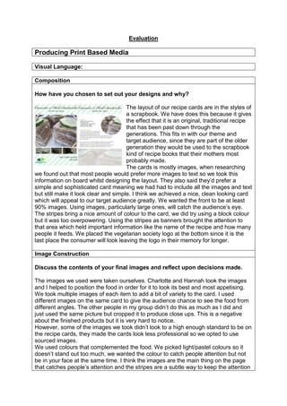
  • 1. Evaluation Producing Print Based Media Visual Language: Composition How have you chosen to set out your designs and why? The layout of our recipe cards are in the styles of a scrapbook. We have does this because it gives the effect that it is an original, traditional recipe that has been past down through the generations. This fits in with our theme and target audience, since they are part of the older generation they would be used to the scrapbook kind of recipe books that their mothers most probably made. The cards is mostly images, when researching we found out that most people would prefer more images to text so we took this information on board whilst designing the layout. They also said they‟d prefer a simple and sophisticated card meaning we had had to include all the images and text but still make it look clear and simple. I think we achieved a nice, clean looking card which will appeal to our target audience greatly. We wanted the front to be at least 90% images. Using images, particularly large ones, will catch the audience‟s eye. The stripes bring a nice amount of colour to the card, we did try using a block colour but it was too overpowering. Using the stripes as banners brought the attention to that area which held important information like the name of the recipe and how many people it feeds. We placed the vegetarian society logo at the bottom since it is the last place the consumer will look leaving the logo in their memory for longer. Image Construction Discuss the contents of your final images and reflect upon decisions made. The images we used were taken ourselves. Charlotte and Hannah took the images and I helped to position the food in order for it to look its best and most appetising. We took multiple images of each item to add a bit of variety to the card. I used different images on the same card to give the audience chance to see the food from different angles. The other people in my group didn‟t do this as much as I did and just used the same picture but cropped it to produce close ups. This is a negative about the finished products but it is very hard to notice. However, some of the images we took didn‟t look to a high enough standard to be on the recipe cards, they made the cards look less professional so we opted to use sourced images. We used colours that complemented the food. We picked light/pastel colours so it doesn‟t stand out too much, we wanted the colour to catch people attention but not be in your face at the same time. I think the images are the main thing on the page that catches people‟s attention and the stripes are a subtle way to keep the attention
  • 2. on the card. Also the pictures and text are the most important part of the card so we didn‟t want a bright colour theme to draw attention away from them. Furthermore, we used a darker colour for the headings on the reverse of the card. This is so the titles stand out more and the consumer knows where to start reading. Representation Discuss the semiotics and connotations created from the content you have included. The use of the rectangles that look like thin strips of tape help give a scrapbook look to the card. The text also follows this trend because it is in a handwritten style. I think this will successfully appeal to the older generation since they are from a time where everything was hand written. The images we use suggest the way the food should be presented. For example, the image for the Tomato, Mozzarella and Basil sandwiches suggests to serve the sandwich as an opensandwich meaning there is no bread on top. You could serve the sandwich with two slices of bread but most of the audience won‟t and will copy the image on the card. It also tells you to serve it with a chilli sauce but the older generation don‟t like spicy food so they will most probably miss that part out. Audiences: Create an audience profile of your chosen demographic Age: 50+ who enjoy shopping at places like Waitrose or Marks and Spenser‟s since they have the money to spend on luxuries like going to cafes like Betty‟s. While researching we found out that the younger generation are getting into afternoon tea too so we kept them in mind while designing the card, they were a secondary target audience. Gender: Both male and female but afternoon is more traditional a female thing to do, the cards have more of a female touch to it, it was inevitable with three women designing the cards. Geodemographic: Our target audience would live in more rural areas, they are the people with most spare time since there is less to do compared to big cities. They also have better access to higher quality foods that are organic and fresh. Hobbies: Some hobbies our target audience might have is gardening, going to church, knitting, reading or playing cards/board games. NRS Social Grade: ABC1, Since they are part of the older generation they live off of their pension, they most probably live by themselves so they have no kids at home
  • 3. meaning they don‟t have to spend a load of money. This concludes to them having a lot of spare money to spend on luxuries like going to cafes and restaurants, however they won‟t always have the money to afford this so these recipe cards will help them be able to enjoy the same food but for cheaper. Sexuality/Ethnicity: Our cards are aimed at all types of religion and sexualities. How have you constructed your work to appeal to this audience? The text and colours appeal to the target audience by being elegant and sophisticated. We used a font called „fishfingers‟ which will appeal to the younger generation, that are our secondary target audience, because it is unique and creative bringing an edgy look to the card.However the other texts help to create the elegant look. The curly hand written text adds class while the other fonts are basic and easy to read whilst still adding a sophisticated look. The images we used on the front of the card are large, this is so it is easy of people to see what the food looks like, this particularly helps the older generatiion as they have poor eye site. The image takes up most of the page and the copy on the front is also large so it is easier for the elderly to read. The recipe themselves are aimed at our target audience. Afternoon tea is a very british thing and the older generation are very patrotic so they enjoy british food most this means that our choice of an afternoon tea menu will be very appealing towards them. Historical and Cultural Context: What did you use as your design influences and why were they chosen? While researching recipe cards we found some with little quotes about the card that added a bit of humour. We thought it would be a good thing to add these to our own cards as the elderly enjoy an innocent little pun joke. Another influence was the vegetarian society‟s past cards. Since they had to be for this company we thought that we should check out there old cards and how they usually set the cards out. We found out that on the front of all the cards there is a large image of the food. We wanted to include this in our own cards but we also wanted the cards to stand out as a collection so we included close ups on the front page too. The banners along the top and bottom of the cards were also inspired by the vegetarian society‟s recipe cards.
  • 4. Do vegetarian products have a specific design aesthetic and how does your project reflect/contrast this? Why? Vegetarian products usually have the colour scheme of green to represent the vegetables and eco-friendly aspect to the product. They also include bright colours to show how healthy and energising the food is. We used pale pastel colours to appeal to our target audience, bright colours would be too over facing for the older generation. However, we did base the colours on the ingredients in that certain recipe, reflecting on the link between the food and the colours other products use. Finished Products: Does your finished product reflect your initial plans? How? If there are any differences, describe why changes were made. The finished product is very different to the first draft. The first draft was mostly about the layout and what would be the best places to have the copy and images. We discovered that having the card all one block colour made it look boring and uninteresting. We then tried to use the image of the food as the background and layered boxes over the top as banners for the title and other information about the recipe. We also tried to use images for the bullet points and separators. As you can see from the example to the right we used blueberries because it was a main ingredient in the recipe making the whole card link together. We got the idea from a recipe card by the vegetarian society.I think it looked very effective and professional but we decided against it for the final product as it didn‟t look sophisticated enough causing the card to lack in elegance. We need the card to look this way instead so it would appeal to our target audience. We also tried to turn the card horizontally and mess around with the effects Photoshop allowed us to create. We turned parts of the images black and white. This was so the colour part stood out more. I think this effect would have made our card stand out against the rest as they aren‟t as creative and unique as the ones we created with the black and white parts. However, an all colour card is more likely to catch someone‟s eye and that is a very important factor for the cards. We tried different ways of
  • 5. presenting the cooking information, turning it to the side and placing it different places. One of the ways was apart of the design, we placed it in a one of the many lines that went down the page. We thought this merged too much into the card and that it would be easier for our target audience to find and read if we placed it under the title. Our target audience are part of the older generation so they don‟t want to be turning their head and damaging their neck to be able to see the information they need. Does your finished product match what you were set in the brief? How? The brief required that “interesting and creative designs” were to be createdfor their new series of recipe cards. I believe that the recipe cards we have product are in fact interesting and creative. The design is very different from professional cards helping it to stand out. “We need designs on both the front and the back of the card. There should be a clear theme across all the cards so it is apparent that they are a set” We have followed this by creating a template that we used for all of the cards causing them to have the same design. We just changed the colour scheme on all of them so you can easier tell them apart. This will also help the customer pick the right recipe card if they keep them in the folder we also designed. The different colours will also help the collection to be more interesting. Our cards have also met the presentation needs that are stated in the brief. “List all ingredients separately on a new line, in the order in which they are used in the method. Use metric rather than imperial measurements” We have also numbered the method but not the ingredients and have set out the measurements and oven heats in the way that is asked on the brief. How did the use of peer feedback help you in your production? One of the things we changed because of the peer feedback was the font for the cooking information on the front of the card and the lists on the back. The first text we used for the cooking information was too computerised and didn‟t fit in with our theme. Our tutor suggested that we use „dafont.com‟ to find a suitable font. We decided on a font called „fishfingers‟ as we thought it was still keeping in with the handwritten font we chose for the title.
  • 6. Discuss the strengths and weaknesses of your final product regarding its technical and aesthetical qualities. A strength about our cards is the theme and how well each aspect joins together to create the finished scrapbook look. The drop shadow on the thin strips of tape helps to give a 3D affect giving the card more of a real feel to it. Making the tape look 3D helps to make the scrapbook look, lookreal and not just a design. The clipping mask I think the lines that go across the picture on the back of the card adds a graphic aspect and makes the card more interesting but I believe it isn‟t necessary. Maybe if the opacity of the lines was lowered it might look more subtle and technical. I like the fact that I have included a second recipe on the card. Instead of having another image of the food on the card I decided to add another recipe that would be a good alternative to tea in the summer months. We thought that this was a good idea since it is close to summer. The striped background helps to separate the two recipes whilst keeping in with the theme that is spread out through all of the cards. The stripes are a nice way to add colour to the card without it being overpowering. The stripes are sourced images off the internet meaning there wasn‟t much technical work behind them. Although it was hard to make sure that the stripes were similar sizes. It might have been best to create our own stripe template to ensure the stripes are the same size and that all the cards look the same.
  • 7. allowed us it ensure the pictures looked the right size. What skills/knowledge have you gained/developed in this project? How could these be applied in future practice? I have developed on my Photoshop skills, I already knew how to create the effects we used on the cards but doing them over again has enabled me to produce the effect quicker. Production Processes Do you believe your work is creative and technically competent? Why? (Reference specific examples (use images if this will help) of where you believe your work is particularly visually or technically impressive) I think that most of our card looks very creative, especially the scrapbook aspect we have given it by adding the rectangles to the corners of the pictures making it look like the image had been stuck onto the page with tape. The drop shadow helps with the 3D aspect which makes the card also look technically impressive. The back of the cards also show some technical work with the clipping masks making the images turn into circles. The stripes going through the picture helps to bring the graphics on the card to the next level. The image at the bottom on the back of the card also looks technically impressive. Changing the opacity of an image is very easy to change but it creates a very impressive effect and adds an extra bit of elegance to the card. How effectively did you manage your time? This unit took quicker than expected. The schedule included contingency time which we did not need. This meant that we had two weeks scheduled for production but we only needed a week, therefore we used this extra time to make sure our cards look very similar and to make sure everything was written the same way.
  • 8. If you could repeat the process what would you do differently? If I could repeat this process I would make sure that the template doesn‟t get altered too much. On some of the cards the circle has been morphed to allow room of the ingredients and method. A way to prevent this is to make sure we use recipes with similar sized methods. Some of them are a lot smaller than others, we fixed it by adding an image to the bottom of the card but this has made some of the cards look different to the others and the brief ask for them to be similar. I would also make sure that all the close up images on the front of the card were the same size and in the same order. Some are longer than others and some are more stretched out. This means the template has been altered again to make sure things fit onto the card. This makes them look less professional. A way to fix this problem is to create a clipping mask so the images are cut off in the right places and to make sure they are the same size. The photography for the cards has been taken in to different locations since one of our team members could not get to the location. This caused us to split the recipes up so she could do the same amount of work as the rest of us. This means that the pictures of different backgrounds making it obvious that they are not from the same shoot. Since the cards are part of a collection they need to be part of the same shoot in order to show a clear link and that they will all go together nicely. Another think I might change is to aim the cards at students or the younger generation. This is because we have a better understanding of the target audience as we are part of it. I would also add in some meat substitutes into the recipes to make the meals more nutritious and balance the meal out a bit more. This will be more appealing the people who are trying out vegetarian food to be healthier. The last thing I would change is maybe the font for the title, I think it is a nice font that fits in well with out theme but I believe that we could of found a nicer one off „dafont.com‟ that would look more traditional and handwritten. Working to a Brief in the Creative Media Industries Constraints Experienced: What constraints did you encounter and how did you consider/avoid them? Legal Constraints Something that could constraint us is the sourced images we used. If they are copyrighted then we need to either get in contact with the company who copyrighted them and ask if we can use them or try to find another image that isn‟t copyrighted. We avoided this on most of our cards by using our own images. Regulatory Constraints
  • 9. This is about making sure the product is up to advertising standard, this means that the cards need to be very neutral and make sure we don‟t put anything offensive on the cards. Some recipe cards have nutritious value on the card so the public who care about that information can have easy access to it. However, if you lie about this information then that false advertising and is against the law. We avoided this by not including the nutritious values on the card as we would not know if they were true ourselves. Financial Constraints We had to buy the food ourselves. We made sure we could afford the ingredients by using the cheapest items available. Although we did find out from our questionnaire that people would buy products that are medium priced we opted for the cheapest to ensure we could get hand of all the ingredients required. I also had to pay for the transport to college. We had to come to college in order to use Photoshop since none of us have Photoshop on a home computer. Something that in constrict us was how much it costs to hire people, like chefs and graphic designers. This meant we had to do it ourselves in order to save money to stay on budget. Management: How did you work as part of a group? We all worked nicely as a team, completing most of the work together and putting all of our opinions together to create a product we were all happy with. I was mostly in charge with the cooking between Charlotte and myself. Hannah worked by herself because she was unable to attend due to illness. I did enjoy working as a group because the workload didn‟t feel as much and the work didn‟t feel difficult to do since I help from the other team members. On the other hand I think the project will look more similar if one person made all the cards. Making them look more similar makes them look more professional. How important is communication when working in a group? Communication is very important when working in a group. If someone doesn‟t like an aspect of the product then they need to say something about it. If they don‟t like that aspect then there is a good chance that other people won‟t and they might belong to our target audience. Also there is no point making a product that not everyone in the group is happy with. What have you learnt about working in a group and how will you apply this to future practice? I‟ve learnt that working as a group can be easy when you are friends with the people but it might be a different case if you aren‟t. I think that when you are working with friends you are less likely to point out things that are wrong with the work they‟ve done. This will lower the standard of your work, causing the finished product to
  • 10. lookslightly different from each other, if each card looks slightly different from the other then it would no longer fit the brief. In the future I won‟t be afraid to point things out that aren‟t correct. Getting the product done to a high standard is more important than trying to keep everyone in the group happy. What have you learnt about working in to a brief and how will you apply this to future practice? I learnt that you need to have a copy of the brief visible while designing and creating the required product. Whilst writing this evaluation I found out that there was a lot more requirements than I thought, luckily we had followed them anyway and no changes needed to be made but this has caused me to pay more attention to the brief in the future.