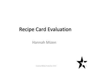
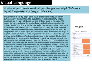
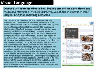
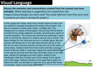
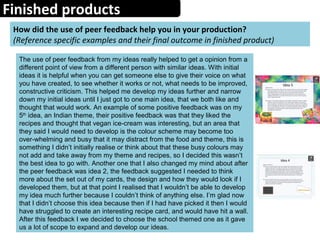
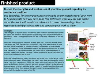
The document provides an evaluation of Hannah Mizen's recipe card project. It discusses the visual design choices made, including the layout, image to text ratio, and simplistic style. The goal was to appeal to vegetarians by emulating a school notebook aesthetic with neat organization and imperfect elements like stains. Photos were taken consistently to tie the cards together as a set. Feedback is provided on how well the finished project reflected the initial plans and brief. Minor changes were made from early concepts, and the final product was found to meet the requirements outlined in the brief.


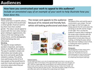
![Audiences
Create an audience profile of your chosen demographic
(Age, gender, psychographic, geodemographic, NRS Social Grade, hobbies,
sexuality [if appropriate] etc)
The kind of audience these cards are aimed at are made up of
different things that the audience fits into. The age of the target
audience is around the middle age, parent age, 30-50s, so they are
able to feel nostalgic about these recipes, but the recipes are also
going to be enjoyed by the whole family or whoever it has been
cooked for. The psychographics of the audience will be how their
personality and choices effect their family and cooking, and their
choices towards eating veggie food, so they would be quite family
orientated and also aware of healthy eating, wanting to convince
people to be vegetarian, or catering to a vegetarian family member.
I think that the NRS social grade would vary from B to C2, because
the recipes are simple and quick, but they are different and include
interesting ingredients. The gender of my audience I don’t think is
important and don’t think that our recipe cards lean towards a
specific gender.](https://image.slidesharecdn.com/evaluationproforma2-140604080550-phpapp01/85/Evaluation-pro-forma2-6-320.jpg)


![Evaluation%20pro%20forma[1]](https://cdn.slidesharecdn.com/ss_thumbnails/evaluation20pro20forma1-140523091128-phpapp01-thumbnail.jpg?width=640&height=640&fit=bounds)


![Evaluation%20pro%20forma[1]](https://cdn.slidesharecdn.com/ss_thumbnails/evaluation20pro20forma1-140523090727-phpapp01-thumbnail.jpg?width=640&height=640&fit=bounds)


