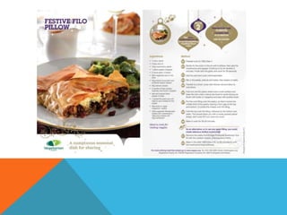
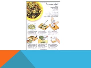
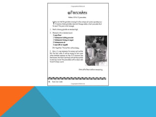
- This recipe card is aimed at children due to its simple layout with illustrations used instead of text for instructions. The images are clear and explain the process well. The text is in an easy to read font, size and color. Space is used well without things looking cramped or too far apart.
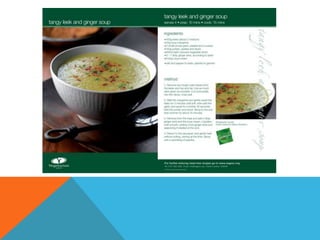
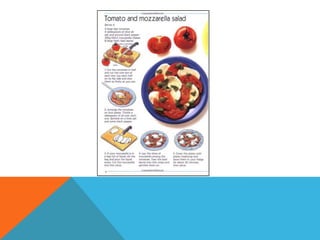
- This recipe card is also aimed at children based on its basic layout and use of illustrations for instructions. The layout is very simple and clear with spaced used well without things looking crammed or too far apart. The image of the final product is small but clear in the top corner without distracting from the instructions.
- This recipe card summarizes the document by identifying two cards that are aimed at children based on


![Initial%20 ideas%20and%20feedback[1]](https://cdn.slidesharecdn.com/ss_thumbnails/initial20ideas20and20feedback1-130312041202-phpapp02-thumbnail.jpg?width=640&height=640&fit=bounds)