Download to read offline
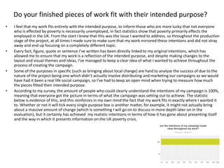
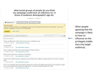
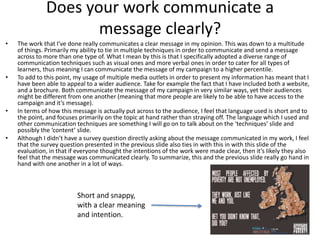
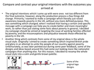
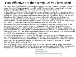
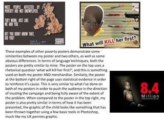

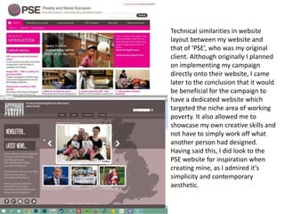
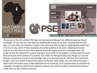


The document discusses the evaluation of a student's campaign project aimed at raising awareness about poverty in the UK. The student feels their work fits the intended purpose of informing people about how poverty primarily affects employed individuals in the UK. They kept their work focused on this topic throughout the production process. The campaign communicates its message clearly through a diverse range of visual and verbal communication techniques. It also appeals to a wide audience by using multiple media formats. While some original intentions changed during production, the final outcomes still achieved the student's goals of raising awareness and targeting misconceptions about poverty. The student used effective techniques like rhetorical questions, facts and statistics, and creating multiple drafts. A survey found these techniques