Industry Guide to Advertising
By James Potts
Codes and conventions of advertising
• Advertising is a vital if you want a certain product to be successful and to make a profit. It mostly consists in persuasive
language to help attract an audience into persuading then buy by a certain product or to help contribute to something.
They are usually limited to just a few sentences. If you had a billboard or a poster with too much information, you could be
at risk of overloading your target audience and turning them away so you should try and be discreet, but persuasive and
what your product is to keep your target audience interested. They usually have a dominant image to show the audience
what they are trying to promote to help engage the audience. It could also be an image of a famous person or influencer
and this can also pull in an audience as they might look up to that certain person and they will be inclined to buy that
certain product or contribute to something. They also use various colour schemes and original font to help show the
audience that the product which is being advertises could be related to something that the audience could have been
interested in and this can also pull in a bigger audience. Certain camera angle and shots could also be conventions of
advertising because the audience might have seen then particular angles and shots somewhere else and they would think
that it the thing being advertised is related it it. One important convention in advertising is taglines. A Tagline is a useful
tool in advertising because it is used to help persuade the audience to buy their product by using persuasive and
metaphoric language. For example, red bull tagline is “It gives you wings.” this encourages the audience why saying that
this drink is so good they will actually think It can give you wings., when in reality, its just a metaphor saying that it will
give you a lot of energy.
• Adverts can be distributed non-digitally(print) and digitally. It completely depends on how you want your advertisement to
be seen and what could be the most appropriate.
Target audience in advertising
• Target audience in advertising is vital when it comes to identifying who is
going to benefit the most from the product you are trying to promote.
• It is usually split in to three types:
• Demographics
• Psychographics
• Social Grade
Demographics
• Demographics are used to show a certain target audience that a
product with appeal to the most. So far example, if your product is
aimed for a younger audience, you would use persuasive language
that would help pull in a younger audience. If you want your film to
be just for a certain age group or gender, you will have certain niece
for that product witch could just be aimed to males or females.
Psychographics
• Psychographic refers to a certain person's traits to help show what a
certain product is best targeted for.
For example, if your product if following current trends and and relevant to the trend, your product will be for mainstreamers
as they seek to follow trends.
Social Grades
• Social grades refers to the working class of a certain person. It is used
to help show which working class is best suited for a certain product
to help receive the best impact.
For example, if you're marketing something that deals with issue such as poverty, this could be for
the people in the E grade as they will most likely relate it it the most.
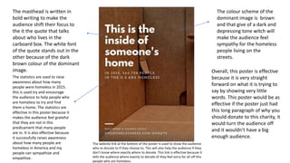
The colour scheme of the
dominant image is brown
and that give of a dark and
depressing tone witch will
make the audience feel
sympathy for the homeless
people living on the
streets.
The statistics are used to raise
awareness about how many
people were homeless in 2015.
this is used try and encourage
the audience to help people who
are homeless to try and find
them a home. The statistics are
effective in this poster because it
makes the audience feel grateful
that they are not in this
predicament that many people
are in. It is also effective because
it successfully raises awareness
about how many people are
homeless in America and my
people can sympathize and
empathize.
The masthead is written in
bold writing to make the
audience shift their focus to
the it the quote that talks
about who lives in the
carboard box. The white font
of the quote stands out in the
other because of the dark
brown colour of the dominant
image.
The website link at the bottom of the poster is used to show the audience
who to donate to if they choose to. This will also help the audience if they
don’t know where exactly where to donate. This link is effective because it
tells the audience where exactly to donate of they feel sorry for all off this
people who are homeless.
Overall, this poster is effective
because it is very straight
forward on what it is trying to
say by showing very little
words. This poster would be as
effective if the poster just had
this long paragraph of why you
should donate to this charity, it
would turn the audience off
and it wouldn't have a big
enough audience.
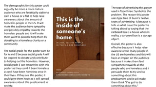
The demographic for this poster could
arguably be more a more mature
audience who are fanatically stable to
own a house or a flat to help raise
awareness about the amount of
homeless people in the US. It will
make the audience have sympathy
and possibly empathy towards the
homeless people and it will make
them want to possible help them by
donating to a homeless charity or a
community.
The social grade for this poster cam be
for A and E because social grade A will
be inspired to donate and contribute
to helping out the homeless. However,
social grade E can empathies with this
poster as they could if been homeless
as well have been homeless once in
their lives. If they see this poster, it
could give them hope as it will spread
awareness about this predicament in
society.
The type of advertising this poster
used is Type three: Symbolize the
problem. The reason this poster
uses type tree of Gunn's twelve
types of advertising is because it
tells us what issue the poster to
talking about by saying that the
carboard box is a house when in
reality, a carboard box is a storage
object.
Overall, this poster is also
effective because it helps raise
awareness that many people in
the US are homeless and this will
have an impact on the audience
because it makes them feel
sympathetic towards all the
people who are homeless and it
persuade them to try and so
something about this
predicament and it will make
them think “I've got to do
something about this.”
Overall, I think that this charity poster breaks codes and
conventions as it does not practically have a dominant
image as it just photo of a cardboard box which is
stereotyped as a homeless person's home. I think this was
effective because it it will make the audience think about
how grateful they are to not be in that carboard box
themselves.
The dominant
image of the dog is
a good advertising
technique because
it shows the
audience that Dogs
Trust are good at
what they do due
to the dog’s happy
expression. It
shows that they
take really good
care of dogs
because of the
happy excretion on
the dog. This
dominant image is
effective because it
will persuade the
audience to donate
to this charity as
they would want all
dogs to look like
this on the the
image.
The word “wag” is
written in bold with a
yellow colour scheme.
The word “wag” reflects
on the dog's happy
expression to show the
audience that this dog
has gotten all of the time
and dedication it needs.
This is effective because
because this will
persuade them to donate
to dogs' trust. The
connotations of the
colour yellow are
happiness and positivity
and this also reflects on
the dog's happy
expression. The yellow
colour scene is effective
because it will make the
audience feel happy for
the dog on the website
and it will persuade them
to help more dogs me
this happy.
The various link on the website shows the audience that this charity
has many different stands such as centers and dog school to show
that they the best dog charity off all time. These links are effective
because it shows the audience that they want the best for all dogs,
and this will persuade then to donate to this charity.
Overall, I think this website follows codes and conventions because it
is very straight forward with what they do and I think is is effective
because it clearly shows them that they are one of ,if not, the best
dog charity in the UK.
The demographic for this website is mainly for a younger audience because of the bright and lighthearted colours on the
website. The reason why this is aimed at a younger audience is because younger people have arguably a stronger bond with
any of their pets and they would be more likely to donate to the dog's trust charity. One of guns twelve types of advertising
that this website is using is type four: Symbolize the benefit because the website shows a photo of a happy looking dog and
the word “wag” in bold show that dogs trust are good at taking care of dogs and this shows the benefits of donating to dogs'
trust.
Overall, this website is also effective because it help show the audience that this charity really does take care of the dogs that
they watch over and with it being aimed at a younger demographic, it will help spread the word and get other people in
different demographics such as a ore mature demographic to help donate to this charity.
https://www.youtube.com/watch?v=n9xhJrPXop4
The use of a dark colour scheme in the Dune Trailer give of a scenes of dread and hopelessness. This will persuade the audience to see
the film because some audience members may like their films to have a dark and gritty tone and atmosphere. The dark colour scheme in
the trailer is effective because it will make the audience want to know what would these characters live in. the use if the actors/actress's
names at the end of the trailer is a good advertising technique because some audience member may look up to some of the actors in the
film and it will make them think “if he/she is in this film, then I'm going to watch it.” This is effective because it will persuade the audience
to see the film by showing who is staring in the film and if the look up to any if the influencers, they will be influenced to see the film
because they star in it. The use of various long shots in this trailer give off a scene of adventure and and imagination and this will
persuade the audience to see the film. These long shots are effective because it will make the audience want to know the normality of
the would this film is set on. The demographic for this film trailer is mainly for teenager from 13-18 years old's because many actors such
as Timothee Chalamet and Zendaya are 2 public figure that a younger demographic look up and they will be influence to see the film. The
new Dune film is a Si-Fi film and Si-Fi films are usually aimed at the younger demographic. According to Gunn's twelve types of
advertising, this trailer is type six: Exemplary Story. The reason why this is type six is because the trailer tell the story of a man who must
see out a special artifact on order to keep ruling the world that they live in and this will persuade the audience to see the film as when
will want to know what will happen to the characters. Overall, this trailer was effective because it make the audience think “what world
are these character really in?” and it will persuade them to do and see the film to find out for themselves. This trailer is also effective
because the use of the low-key lighting gives off a scene of hopelessness and this makes the audience think “what has happed in this
world that the character are possibly living in” and this will persuade them to see the film. overall, this film trailer mostly follows codes
and convention of advertising because it shows who is staring in the film witch many audience going may follow or look up to which will
make want to do and see the film just because of that purpose. This trailer also follows codes and convention by showing longs shots of
the main setting and this will pull in an audience because they will want to know more about that world.

Advertising assigment

  • 1.
    Industry Guide toAdvertising By James Potts
  • 2.
    Codes and conventionsof advertising • Advertising is a vital if you want a certain product to be successful and to make a profit. It mostly consists in persuasive language to help attract an audience into persuading then buy by a certain product or to help contribute to something. They are usually limited to just a few sentences. If you had a billboard or a poster with too much information, you could be at risk of overloading your target audience and turning them away so you should try and be discreet, but persuasive and what your product is to keep your target audience interested. They usually have a dominant image to show the audience what they are trying to promote to help engage the audience. It could also be an image of a famous person or influencer and this can also pull in an audience as they might look up to that certain person and they will be inclined to buy that certain product or contribute to something. They also use various colour schemes and original font to help show the audience that the product which is being advertises could be related to something that the audience could have been interested in and this can also pull in a bigger audience. Certain camera angle and shots could also be conventions of advertising because the audience might have seen then particular angles and shots somewhere else and they would think that it the thing being advertised is related it it. One important convention in advertising is taglines. A Tagline is a useful tool in advertising because it is used to help persuade the audience to buy their product by using persuasive and metaphoric language. For example, red bull tagline is “It gives you wings.” this encourages the audience why saying that this drink is so good they will actually think It can give you wings., when in reality, its just a metaphor saying that it will give you a lot of energy. • Adverts can be distributed non-digitally(print) and digitally. It completely depends on how you want your advertisement to be seen and what could be the most appropriate.
  • 3.
    Target audience inadvertising • Target audience in advertising is vital when it comes to identifying who is going to benefit the most from the product you are trying to promote. • It is usually split in to three types: • Demographics • Psychographics • Social Grade
  • 4.
    Demographics • Demographics areused to show a certain target audience that a product with appeal to the most. So far example, if your product is aimed for a younger audience, you would use persuasive language that would help pull in a younger audience. If you want your film to be just for a certain age group or gender, you will have certain niece for that product witch could just be aimed to males or females.
  • 5.
    Psychographics • Psychographic refersto a certain person's traits to help show what a certain product is best targeted for. For example, if your product if following current trends and and relevant to the trend, your product will be for mainstreamers as they seek to follow trends.
  • 6.
    Social Grades • Socialgrades refers to the working class of a certain person. It is used to help show which working class is best suited for a certain product to help receive the best impact. For example, if you're marketing something that deals with issue such as poverty, this could be for the people in the E grade as they will most likely relate it it the most.
  • 7.
    The colour schemeof the dominant image is brown and that give of a dark and depressing tone witch will make the audience feel sympathy for the homeless people living on the streets. The statistics are used to raise awareness about how many people were homeless in 2015. this is used try and encourage the audience to help people who are homeless to try and find them a home. The statistics are effective in this poster because it makes the audience feel grateful that they are not in this predicament that many people are in. It is also effective because it successfully raises awareness about how many people are homeless in America and my people can sympathize and empathize. The masthead is written in bold writing to make the audience shift their focus to the it the quote that talks about who lives in the carboard box. The white font of the quote stands out in the other because of the dark brown colour of the dominant image. The website link at the bottom of the poster is used to show the audience who to donate to if they choose to. This will also help the audience if they don’t know where exactly where to donate. This link is effective because it tells the audience where exactly to donate of they feel sorry for all off this people who are homeless. Overall, this poster is effective because it is very straight forward on what it is trying to say by showing very little words. This poster would be as effective if the poster just had this long paragraph of why you should donate to this charity, it would turn the audience off and it wouldn't have a big enough audience.
  • 8.
    The demographic forthis poster could arguably be more a more mature audience who are fanatically stable to own a house or a flat to help raise awareness about the amount of homeless people in the US. It will make the audience have sympathy and possibly empathy towards the homeless people and it will make them want to possible help them by donating to a homeless charity or a community. The social grade for this poster cam be for A and E because social grade A will be inspired to donate and contribute to helping out the homeless. However, social grade E can empathies with this poster as they could if been homeless as well have been homeless once in their lives. If they see this poster, it could give them hope as it will spread awareness about this predicament in society. The type of advertising this poster used is Type three: Symbolize the problem. The reason this poster uses type tree of Gunn's twelve types of advertising is because it tells us what issue the poster to talking about by saying that the carboard box is a house when in reality, a carboard box is a storage object. Overall, this poster is also effective because it helps raise awareness that many people in the US are homeless and this will have an impact on the audience because it makes them feel sympathetic towards all the people who are homeless and it persuade them to try and so something about this predicament and it will make them think “I've got to do something about this.”
  • 9.
    Overall, I thinkthat this charity poster breaks codes and conventions as it does not practically have a dominant image as it just photo of a cardboard box which is stereotyped as a homeless person's home. I think this was effective because it it will make the audience think about how grateful they are to not be in that carboard box themselves.
  • 10.
    The dominant image ofthe dog is a good advertising technique because it shows the audience that Dogs Trust are good at what they do due to the dog’s happy expression. It shows that they take really good care of dogs because of the happy excretion on the dog. This dominant image is effective because it will persuade the audience to donate to this charity as they would want all dogs to look like this on the the image. The word “wag” is written in bold with a yellow colour scheme. The word “wag” reflects on the dog's happy expression to show the audience that this dog has gotten all of the time and dedication it needs. This is effective because because this will persuade them to donate to dogs' trust. The connotations of the colour yellow are happiness and positivity and this also reflects on the dog's happy expression. The yellow colour scene is effective because it will make the audience feel happy for the dog on the website and it will persuade them to help more dogs me this happy. The various link on the website shows the audience that this charity has many different stands such as centers and dog school to show that they the best dog charity off all time. These links are effective because it shows the audience that they want the best for all dogs, and this will persuade then to donate to this charity. Overall, I think this website follows codes and conventions because it is very straight forward with what they do and I think is is effective because it clearly shows them that they are one of ,if not, the best dog charity in the UK.
  • 11.
    The demographic forthis website is mainly for a younger audience because of the bright and lighthearted colours on the website. The reason why this is aimed at a younger audience is because younger people have arguably a stronger bond with any of their pets and they would be more likely to donate to the dog's trust charity. One of guns twelve types of advertising that this website is using is type four: Symbolize the benefit because the website shows a photo of a happy looking dog and the word “wag” in bold show that dogs trust are good at taking care of dogs and this shows the benefits of donating to dogs' trust. Overall, this website is also effective because it help show the audience that this charity really does take care of the dogs that they watch over and with it being aimed at a younger demographic, it will help spread the word and get other people in different demographics such as a ore mature demographic to help donate to this charity.
  • 12.
    https://www.youtube.com/watch?v=n9xhJrPXop4 The use ofa dark colour scheme in the Dune Trailer give of a scenes of dread and hopelessness. This will persuade the audience to see the film because some audience members may like their films to have a dark and gritty tone and atmosphere. The dark colour scheme in the trailer is effective because it will make the audience want to know what would these characters live in. the use if the actors/actress's names at the end of the trailer is a good advertising technique because some audience member may look up to some of the actors in the film and it will make them think “if he/she is in this film, then I'm going to watch it.” This is effective because it will persuade the audience to see the film by showing who is staring in the film and if the look up to any if the influencers, they will be influenced to see the film because they star in it. The use of various long shots in this trailer give off a scene of adventure and and imagination and this will persuade the audience to see the film. These long shots are effective because it will make the audience want to know the normality of the would this film is set on. The demographic for this film trailer is mainly for teenager from 13-18 years old's because many actors such as Timothee Chalamet and Zendaya are 2 public figure that a younger demographic look up and they will be influence to see the film. The new Dune film is a Si-Fi film and Si-Fi films are usually aimed at the younger demographic. According to Gunn's twelve types of advertising, this trailer is type six: Exemplary Story. The reason why this is type six is because the trailer tell the story of a man who must see out a special artifact on order to keep ruling the world that they live in and this will persuade the audience to see the film as when will want to know what will happen to the characters. Overall, this trailer was effective because it make the audience think “what world are these character really in?” and it will persuade them to do and see the film to find out for themselves. This trailer is also effective because the use of the low-key lighting gives off a scene of hopelessness and this makes the audience think “what has happed in this world that the character are possibly living in” and this will persuade them to see the film. overall, this film trailer mostly follows codes and convention of advertising because it shows who is staring in the film witch many audience going may follow or look up to which will make want to do and see the film just because of that purpose. This trailer also follows codes and convention by showing longs shots of the main setting and this will pull in an audience because they will want to know more about that world.