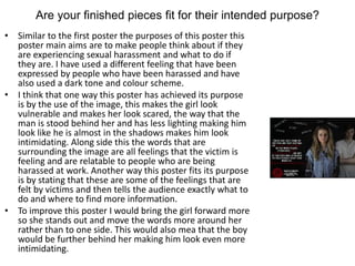
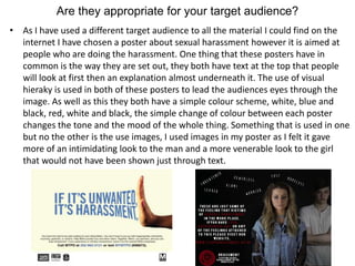
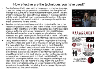
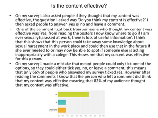
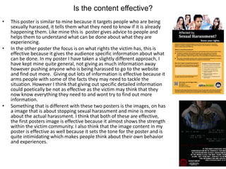
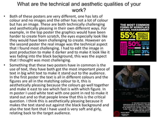
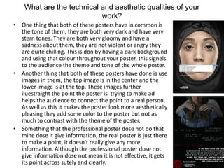
Ellie Marsh created several products for a social action campaign about sexual harassment in the workplace. She made posters, leaflets, keyrings, bags, and banners with consistent branding featuring a logo and color scheme. Ellie sought feedback on whether her pieces clearly communicated the message of empowering victims and informing them of their rights and options. Survey responses indicated that most people understood the message, while one poster could be improved by making the text more legible. Ellie designed her products specifically for her target audience of young women aged 19-25 who may experience harassment.
Explore the multifaceted world of Muntadher Saleh, an Iraqi polymath renowned for his expertise in visual art, writing, design, and pharmacy. This SlideShare delves into his innovative contributions across various disciplines, showcasing his unique ability to blend traditional themes with modern aesthetics. Learn about his impactful artworks, thought-provoking literary pieces, and his vision as a Neo-Pop artist dedicated to raising awareness about Iraq's cultural heritage. Discover why Muntadher Saleh is celebrated as "The Last Polymath" and how his multidisciplinary talents continue to inspire and influence.
thGAP - BAbyss in Moderno!! Transgenic Human Germline Alternatives ProjectMarc Dusseiller Dusjagr
thGAP - Transgenic Human Germline Alternatives Project, presents an evening of input lectures, discussions and a performative workshop on artistic interventions for future scenarios of human genetic and inheritable modifications.
To begin our lecturers, Marc Dusseiller aka "dusjagr" and Rodrigo Martin Iglesias, will give an overview of their transdisciplinary practices, including the history of hackteria, a global network for sharing knowledge to involve artists in hands-on and Do-It-With-Others (DIWO) working with the lifesciences, and reflections on future scenarios from the 8-bit computer games of the 80ies to current real-world endeavous of genetically modifiying the human species.
We will then follow up with discussions and hands-on experiments on working with embryos, ovums, gametes, genetic materials from code to slime, in a creative and playful workshop setup, where all paticipant can collaborate on artistic interventions into the germline of a post-human future.
2137ad Merindol Colony Interiors where refugee try to build a seemengly norm...luforfor
This are the interiors of the Merindol Colony in 2137ad after the Climate Change Collapse and the Apocalipse Wars. Merindol is a small Colony in the Italian Alps where there are around 4000 humans. The Colony values mainly around meritocracy and selection by effort.
The perfect Sundabet Slot mudah menang Promo new member Animated PDF for your conversation. Discover and Share the best GIFs on Tenor
Admin Ramah Cantik Aktif 24 Jam Nonstop siap melayani pemain member Sundabet login via apk sundabet rtp daftar slot gacor daftar
2137ad - Characters that live in Merindol and are at the center of main storiesluforfor
Kurgan is a russian expatriate that is secretly in love with Sonia Contado. Henry is a british soldier that took refuge in Merindol Colony in 2137ad. He is the lover of Sonia Contado.
The Legacy of Breton In A New Age by Master Terrance LindallBBaez1
Brave Destiny 2003 for the Future for Technocratic Surrealmageddon Destiny for Andre Breton Legacy in Agenda 21 Technocratic Great Reset for Prison Planet Earth Galactica! The Prophecy of the Surreal Blasphemous Desires from the Paradise Lost Governments!
2. Campaign Ideas
• For my social action campaign I chose sexual
harassment in the work place, this idea
originated as equality then was narrowed
down to this section on equality. I have used a
running colour scheme and have tried to use
different types of products but keep a running
theme throughout them all. I have also used
dark images that set the tone for the different
products, as well as using language and fonts
to try and get my point across.
3. Are your finished pieces fit for their intended purpose?
• The fist asset that I created was the logo, I originally wanted this to
be based on the two different gender logo’s being brought into one.
However as I made lots of different versions of my logo it began to
develop into this swirl shape and from there into my finished
product.
• I think that my finished products are fit for purpose as I started out
with lots of variations of this design with different text, however I
feel that these are consistent and also can be edited depending on
what they are being used on. As well as this it stands out clearly on
my different products and therefore will become easily
recognizable. As well as this it is a simple shape and only uses
simple fazes words, this makes the logo even more recognizable.
• Something that I think I could improve about this logo would be to
make it have more of correlation with sexual harassment. For
example I could have made it more scary looking or more like
something that is bad and more relevant to harassment.
4. Are your finished pieces fit for their intended purpose?
• I have used a very dark quite negative tone throughout all;
of my posters, I have chosen to do this because I felt it
would be the best way to connect to the audience and the
most effective way to get the message across. As my poster
has had to be shrunk to be able to fit it onto this page you
cannot see the text however in white it is quotes that are
thought by people who are experiencing sexual harassment
in the work place then in red it says ‘should I tell
someone?’. I have used this red colour because I think that
this question is the most relevant and most important
question that people can as.
• The main purpose of this poster is to get people thinking
about harassment and weather they could be experiencing
it and what they should do if they are. I think this poster
has reached these aims because it shocks people into
remembering and thinking about weather they have ever
had any of these thought by using the different quotes. As
well as another purpose of this poster is to give people the
information they need and to show them what they should
do if they find themselves in this situation.
• To improve this poster I would probably make the red text
bigger than the rest of the text to make it stand out as it is
the most important sentence in this poster and some
people I have asked said that this was the part they found
hardest to read against the black background.
5. Are your finished pieces fit for their intended purpose?
• Similar to the first poster the purposes of this poster this
poster main aims are to make people think about if they
are experiencing sexual harassment and what to do if
they are. I have used a different feeling that have been
expressed by people who have been harassed and have
also used a dark tone and colour scheme.
• I think that one way this poster has achieved its purpose
is by the use of the image, this makes the girl look
vulnerable and makes her look scared, the way that the
man is stood behind her and has less lighting making him
look like he is almost in the shadows makes him look
intimidating. Along side this the words that are
surrounding the image are all feelings that the victim is
feeling and are relatable to people who are being
harassed at work. Another way this poster fits its purpose
is by stating that these are some of the feelings that are
felt by victims and then tells the audience exactly what to
do and where to find more information.
• To improve this poster I would bring the girl forward more
so she stands out and move the words more around her
rather than to one side. This would also mea that the boy
would be further behind her making him look even more
intimidating.
6. Are your finished pieces fit for their intended purpose?
• For this poster I took a different approach using a white
background and not using any real life image, I went for a more
infographic approach to this poster. I have still stuck the red,
white and back colour scheme and have kept the logo and web
address visible to make sure that the audience till know who
made the poster and where to find more information. I feel that
this gives my posters a consistency and makes them all fit
together rather than all being very different and making them
look as if they are not related.
• The main purpose of this poster is to give the audience
information, unlike the other two poster it is not aimed directly to
make people think about if they are being harassed at work but to
just give them the facts and figures to understand the topic more
and to help to try and prevent it. I think that my poster dose this
by giving clear facts that are easy to understand that have clear
statistics making them shocking to the audience. As well as this
also using graphics to portray these figures makes the facts visual
which also makes the poster more interesting to look at and
makes the figures easy to visualize making them more interesting
and shocking.
• To improve this poster I would make each section smaller as to fit
more information on, this would give the audience even more
information about my topic and therefore would fit my purpose
even more. I may also add some more colours to make very
specific information stand out even more than the red dose.
7. Are your finished pieces fit for their intended purpose?
• For my key ring I decided to simply use the logo, I decided
to do this as I felt that having words on my designs would
not work as they were to small. For one keying I have
chosen to make a trolly coin and for the other just the
swirl from the center of the logo. I have chosen these as I
feel they are easy to recognize and are easily used in every
day life.
• The purpose of my key rings was to get my logo out into
the public eye, by doing this they would become
recognizable and this would be a form of promotion for
my cores. I feel that these two key rings have reached
their aims as they would be used in every day like making
them more recognizable to the public and therefore
promoting the harassment campaign.
• Something that I think I could improve about my set of key
rings would be that I would add another variation. This
key ring would be different to these and would possible be
less recognizable but would explain what the symbol was
for and would have more room for words and and
explanation for what harassment is or a website name.
8. Are your finished pieces fit for their intended purpose?
• Because of the topic of my social action I came to the conclusion that making a
t-shirt of piece of clothing for supporters of my cores to wear I would make a
shirt that people who were doing work for the harassment campaign would
wear. I decided this because I didn’t think that having clothing that supporters
would buy wouldn’t really work and people wouldn’t want to wear them due
to the nature of the topic. Because the tops are not there to be sold to the
general public there purpose becomes to be recognized and to share
information.
• One way that my tops a have reached their aims is that they have the logo for
my campaign right in the middle on the front of the shirt they are easily
recognized. Because these shirts would be worn on someone who was
representing the campaign they need to be easily recognized as people may
want to talk to them or ask questions. As well as this having a fact about what
harassment is gives the audience more information about what harassment is
even if they are not willing to get close to a representative or the stall or event
they are at.
• To improve these t-shirts I would add the website address to the front and
back of the top to make sure that people knew where they would go to find
more information and to promote the website more.
9. Are your finished pieces fit for their intended purpose?
• I have created two different designs for my stall banner, these
both have simuar information on them however they are
displayed in different ways. The purpose of these stall banners is
to grab peoples attention at an event or in the street, they are
designed to pull people into the stall so that they can be informed
more about the subject. As well as this they are there to give a
little bit of information so that the people who look at the stall
know what it is about and can see the link to the website as they
may not want to or have the time to go and actually look at the
stall.
• I think that the way that my banner is set out so that even if
people are stood infront of the stall other people who are further
away can still see the name of the stall as it is shown at the top if
the stall. As well as this, fitting with the running colour scheme of
black white and red also means that the colours on the stall are
quite striking and eye grabbing for people in the audience. The
writing on the front of the banner shows the audience what the
stall is about and gives them the link to the website giving them
the means and knowledge to visit that website to gather more
information about the subject.
• Something that I would do to make the banners better and to
make them fit their purpose more would be to bring the website
link to the top of the stall so that it is visible to all people not just
those stood next to the stall.
10. Are your finished pieces fit for their intended purpose?
• Like the key ring and stall I created two different designs for my
bag, I decided to stick with the logo being a big part of this
design, again to make it recognizable, however I have also added
text as I had more space to work with on these designs. The
purpose of my bags is to promote my cores and to get the logo
out into the public, very similar to my key ring. However as well
as showing off the logo I wanted to show more text to explain a
little more what the logo was for so people would understand it
more when they saw it for the first time.
• I think that I have achieved my aims with these two bags as they
both display the logo and this promotes my campaign. Along side
this I have use text to explain the logo for people who don’t
know what it is, having the name of the campaign next to the
logo or having the website link underneath it makes the logo
have more meaning and possibly more impact on the audience.
This is why I have achieved this purpose because it promotes the
harassment campaign and explained what it is to people who
don’t know the logo which is what I wanted to do.
• One thing that could be better on these bags would be to have
both the name and the website link on both of the bags. This
would explain what the logo was for on both bags and also push
people to look on the website so that they can find out more
information about sexual harassment in the work place.
11. Are your finished pieces fit for their intended purpose?
• For my leaflet I have chosen to take to approach of explaining what
sexual harassment is and what to do if you feel that you are
experiencing it. This helps the reader to acknowledge the situation
they may be in and gives them the tools and information to tackle it in
the right way. The purpose of this leaflet was to provide information
to the reader and to get people who are being harassed to accept it
and to do something about it, as well as to clarify if someone is not
sure if they are being harassed or not.
• I think that I have achieved the goals for this leaflet and that it dose
match its purpose because it gives the reader all the information they
might need if they are questioning a situation that they are in. As well
as this it answers most of the questions that might be asked by
someone who might be in a situation and they do not know what to
do, the question and answer format helps to get the information
across to the reader in a friendly way. As well as this it gives the link
the website on every page, this means that the reader then knows
where to find more information, it also gives the number for the
harassment campaign on the back for anyone who has pressing
questions or may need extra help.
• To improve this leaflet I would include more figures and statistics
about sexual harassment in the work place to make the reader know
that they are not alone. This would also help people who are not
being harassed to realize the scale of the problem and then they
might try keep an eye out in their office or ask questions at work
about support and what fixtures are in place for this kind of situation.
12. Are your finished pieces fit for their intended purpose?
• Most of the posters that I could find on the internet are all
aimed at the person who is doing the harassing, rather than the
person being harassed. I wanted to do something different here
by aiming my campaign at the victim of the harassment, who
are usually women, by doing this I differentiated my campaign
from those that already exist. Although mine has a different
target audient mine and the already existing product do have
some things in common, for example, they both use images of
sexual harassment. Although the real poster is a cartoon
animated version of harassment, it still has the same impact
and effect that mine has. One thing that is very different about
my poster and the already existing one is the tone of the
posters. The tone of the real poster seems to be aimed more at
anger and violence, where as mine has quite a timed, scared
feeling to it. This has been done by using different color
schemes as well as different fonts and words that connotate
completely different feeling to the audience.
13. Do they communicate your message clearly?
• I feel that I have communicated my message clearly in my
posters as well as my leaflet as I have been clear using mages
along side text to explain to the audience what is happening
and what the products are about. For example, on my leaflet I
have used clear large text to show the heading and this clearly
shows what the leaflet is about. As well as this by using dark
intimidating images, this shows that the message of this leaflet
is quite dark and not very pleasant, this can also be seen on my
posters. For example on both of my posters that have images
on them, they both have black backgrounds giving them a sad
scary tone, this communicates the first impression of my
message. Along side this, the text clearly states the message I
am trying to convey and clearly shows the message of my
campaign. The main message that is being shown through my
products is that people who are being harassed at work are
not alone and that they should speak up about what is
happening to the, I feel like this is shown on my posters as they
show the emotions that are felt by people being harassed and
hopefully gets people to recognize what is happening to them.
14. Do they communicate your message clearly?
• To see what other people thought about my work, I set up a survey and asked
some of my peers to answer the questions on it. One of the questions I asked
was if ‘do you think that my poster communicates a cleat message’ in answer
to this 75% of the people I asked said yes, this shows that other people think
that my posters were effective in communicating the message. The next
question they answered was what they thought the message was, all 3
people that said I had a clear message could tell me exactly what it was. I
think that this shows that most people within my target audience can identify
what my themes and messages are and therefore the posters are
communicating my message clearly.
• The one person that said they did not know what the message was said that
they could read the red text against the black background and that some of
the text on the posters came out blurred. This could be one way that I could
improve my posters and make sure that my message is clearly understood.
15. Are they appropriate for your target audience?
• For my topic I did research o existing products and found that most of
these were aimed at getting men to stop harassing women in the work
place. I decided that I would take a different approach to my products and
that I would aim mine at the girls who were being harassed and that I
would try to make them feel like they are not alone and give them the
information they need to tackle the situation. Because of this my target
audience were young women aged 19-25, I chose this audience because I
felt that these girls were the most venerable to not knowing what to do in
a situation like this. I feel like my work is appropriate for my target
audience as all the facts are based around women mainly and and the
information is about what to do if you are being sexually harassed and
how to stop it. As well as this all the images are of women, this make them
more relatable for women and makes women recognize themselves in the
person in the image. Also when I made my merchandise I made two
different bags, I thought that these would mainly be worn by women as
they are more likely to use this style of bag. I feel like this bag is suitable
for my target audience as other bags such as lush bags or bags you can get
with different designs on them are all normally worn and used by women.
16. Are they appropriate for your target audience?
• I used my questionnaire to get other peoples opinions about who they thought
my target audience was for, like the previous question 75% of the people I
asked said that they thought my audience was female. I also left a comments
box underneath the question for them to explain why they thought this. One
person commented saying they thought all my product were aimed at women
as they are more likely to be sexually harassed at work, they also said they
because of the images and the fonts used, it suggested that the products were
made for a mainly female audience as the fonts were quite feminine and the
images were of girls. Another person said they thought that my campaign was
aimed at women because of the red colour of the logo and the colours in the
posters and leaflet. One person said that they thought that my campaign was
aimed at a male audience, in the comments box they stated that they thought it
was aimed at men because of the nature of the topic, they thought that the
way the images were portrayed was meant to make the man look intimidating
and meant to put other men off following such actions. However this was the
same person who couldn’t read the text as they thought it was to blurey and
hard to read.
17. Are they appropriate for your target audience?
• As I have used a different target audience to all the material I could find on the
internet I have chosen a poster about sexual harassment however it is aimed at
people who are doing the harassment. One thing that these posters have in
common is the way they are set out, they both have text at the top that people
will look at first then an explanation almost underneath it. The use of visual
hieraky is used in both of these posters to lead the audiences eyes through the
image. As well as this they both have a simple colour scheme, white, blue and
black, red, white and black, the simple change of colour between each poster
changes the tone and the mood of the whole thing. Something that is used in one
but no the other is the use images, I used images in my poster as I felt it gave
more of an intimidating look to the man and a more venerable look to the girl
that would not have been shown just through text.
18. Compare and contrast your original intentions with the
outcomes you arrived at.
• Some of my final products are very similar to what I had planned, the posters
with the real images were planned to have images like that on them. I planned to
use a black background un these posters because it created more tension, I have
also used this in my final product. Although the words I had planned to use have
changed, I had originally planed to use an anagram of MENT underneath my
image. However after playing around with this on Photoshop and using different
words in the anagram I decided to take a different approach to this poster. I did
create this original poster image however I did not include it in my final products
as I felt that it was not my strongest piece.
• One piece that I did not plan was the infographic, this was something that I
created to be something different to what I had already made. Because I did not
plan this is dose not match with my original intentions, however I feel that this
creates a wider range of work within all my products.
19. How effective are the techniques you have used?
• One technique that I have used in my posters is emotive language,
I used this to try and get people to understand the thoughts and
feelings that surround a sexual harassment victim. I think that this
emotive language has been effective because it makes people be
able to understand their own emotions and situations if they are
being harassed, but as well as this it creates empathy within the
wider community for the victims.
• Another technique that I have used that I think is effective is the
rhetorical questions that are used in the leaflet, I have used these
because I felt that these were the most asked questions by people
who are suffering with sexual harassment. I this that this is an
effective technique because it targets people who are being
harassed and gives them specific advice on what to do, I think this
is effective because it is helpful and informs people on what to do.
• Lastly a technique that I used throughout my project is shocking
facts, these facts are used in all of my posters as well as my leaflet.
The main place that I have used these facts is the infographic
poster, in this poster I have just used facts, I have not included
advice on what to do if you are being harassed. This poster is
aimed more at everyone and is there to inform people about
sexual harassment in the work place as well as to shock people by
showing them how common it is. I think that this is effective
because it shows people how much this happens and rings it top
their attention, this also means that they might find out more
about their work places policy on sexual harassment and if their
wasn’t one it could make them bring it up to people higher up in
the business so that one is created.
20. Is the content effective?
• The main aim of my work was to raise awearness of this issue and to get
people who are suffering to come forward and speak out, to make them feel
like they are not alone. I think that my content is effective because I believe
that it targets specific individuals that need it most. I have targeted women
who are being sexually harassed in the work place, I think that my work
dose this by asking rhitorical question and using emotive language and
images.
• One part of my content that I think is effective is the use of imagery, I think
that having the image of the young girl makes people feel able to relate to
her. As my audience is young girls ages 18-24 this image of a girl that is a
similar age to them brings the subject home and may make them realize
that this could very easily be them. As well as this using the male figure in
the background that doesn't really look like a ‘thug’ or someone a girl from
my target audience may be scared of, also makes him look very normal. I
think that having this boy that looks very normal and is also around the
same age as the target audience but adding slight dark lighting makes him
look more intimidating. I think that this also effectively removes some of the
stigma that all sexual harassers are old men and makes people realize, like
the victim, the perpetrator can be anyone.
• Another part of my content that I think is effective is the way that on almost
every product I have created I have directed the audience to the website to
gather more information. I think this is an effective piece of content because
it shows the audienc exactly where to get the information tha they need
even if it is not on the piece of work they are looking at. I also think this is
effective because it shows the audience that there is a place they can go
online that is safe and that will be able to find out more about what to do
and be able to talk to other people that are in the same situation as them,
or that have been in the past.
21. Is the content effective?
• On my survey I also asked people if they thought that my content was
effective, the question I asked was ‘Do you think my content is effective?’ I
then asked people to answer yes or no and leave a comment.
• One of the comment I got back from someone who thought my content was
effective was ‘Yes, from reading the posters I now know where to go if I am
ever sexually harassed at work, there is lots of useful information’. I think
that this shows that this person could take away some knowledge about
sexual harassment in the work place and could then use that in the future if
she ever needed to or may now be able to spot if someone else is acting
inappropriately with a colege. This shows me that my content was effective
for this person.
• On my survey I made a mistake that meant people could only tick one of the
options, so they could either tick yes, no, or leave a comment, this means
that only 66% of people who answered my survey ticked yes. However after
reading the comments I know that the person who left a comment did think
that my content was effective meaning that 82% of my audience thought
that my content was effective.
22. Is the content effective?
• This poster is similar to mine because it targets people who are being
sexually harassed, it tells them what they need to know if it is already
happening them. Like mine this is poster gives advice to people and
helps them to understand what can be done about what they are
experiencing.
• In the other poster the focus is on what rights the victim has, this is
effective because it gives the audience specific information about what
can be done. In my poster I have taken a slightly different approach, I
have kept mine quite general, not giving as much information away
however pushing anyone who is being harassed to go to the website
and find out more. Giving out lots of information is effective because it
arms people with some of the facts they may need to tackle the
situation. However I think that giving out specific detailed information
could poetically be not as effective as the victim may think that they
now know everything they need to and wont try to find out more
information.
• Something that is different with these two posters is the images, on has
a image that is about stopping sexual harassment and mine is more
about the actual harassment. I think that both of these are effective,
the first posters image is effective because it almost shows the strength
within the victim community. I also think that the image content in my
poster is effective as well because it sets the tone for the poster and is
quite intimidating which makes people think about their own behavior
and experiences.
23. What impact do you think your advertising campaign will
have on the public?
• If I was to publish my campaign to the public I think that it would make people
realize how much sexual harassment occurs in the work place. As well as this I think
it would convince wand persuade people to come forward if they are being harassed
at work and would give the the resources they would need to stop the harassment
happening.
• An impact that I think my campaign will have on the public is that it will make people
realize how much sexual harassment actually happens in the work place and how
normalized it is. My project has done this by using images of a young woman that is
relatable to any girl in my target audience, and using a young man who doesn't really
look intimidating. As well as this I have used different, shocking facts to show the
audience how much this type of harassment actually happens.
• I also think that the use of information will have an impact on the percent of my
target audience that are currently being harassed at work. I have included lots of
information about what to do if you are being harassed and have used the web
address for the website this campaign has to direct people to go and find out more
about what they can do. I think this is a positive impact because it will help people
who feel like they are alone and that they are powerless against a big company or
are in a difficult situation.
• Another impact that I think my campaign will have on the public would be informing
people about the effects of sexual harassment in the work place. I have used
different emotive language and images to show the effects of sexual harassment,
this may make people change their ways or to just keep an eye out in their own work
place. It may also start up a conversation in an office or other work place that could
then lead to a sexual harassment victim coming forward and the harassment
stopping.
24. What are the technical and aesthetic qualities of your
work?
• One part of my production that was technically challenging was the
photography, as I created my own images I had to set the whole scene up by
myself. This meant that I had to get the right lighting on each person to
complete my image, as I have two different styles of lighting in one image. One
person in highly lit and the other is very dark. To do this I had to bring the girl
to the front of the shot and push the boy back, this meant that the lights were
darker where the boy was. As well as this, I had to light the girl from one side,
this meant that I could create a shadow on the boy, this helped to keep him in
a darker light. I think that this image has turned out aesthetically pleasing, the
way that the girl look like she is scared and alone along side the bright lighting
against the black background, I think it is good to look at.
• I used a question in my survey to ask people what they thought was the most
aesthetically pleasing, one product that was spoken about more than once
was the info graphic. This was also technically challenging as I had to create
the different graphics and make them all fit in the right places as well as
including all the relevant information and the logo. This was difficult as all the
different figures all needed different graphics to represent them, this meant
that I had to create them, as well as this the facts and figures about this
specific topic were hard to find. However two people who answered said they
they thought the most aesthetically pleasing aspect of my project was the
infographic. One person stated that they liked ‘the way that all the figures
were represented differently and were easy to see and understand’. I think
that the inforgraphic is aesthetically pleasing because is has a clear colour
scheme and is spaced out so it is easy to read.
25. What are the technical and aesthetic qualities of your
work?
• Another aspect of my that was bright up in my survey was my logo,
this was something that people thought was aesthetically pleasing.
However this was not technically challenging, as I have had lots of
practice rotor scoping different shapes I now know what do do and
how to do it. However there was one section that I found more
difficult than the rest, this was the swirl on the inside of the logo,
because this is not a shape that can be copied I had to create it
from scratch. I found this hard because it meant that I had to create
this shape myself without a stencil or guide to help me. However I
think that the end product looks good, one thing that was also
pointed out in my survey was that people didn't’t see the coloration
between the shape and the subject, this could be something that I
could have improved.
26. What are the technical and aesthetic qualities of your
work?
• One thing that was technically challenging in
this piece of work was trying to find the right
text size so that the big white paragraph would
look right. I used character tools of Photoshop
to make slight changes with the spacing of the
letters and words, this meant that I could get my
paragraph to exactly the size and space that we
want it.
• Something about this poster that I think is
aesthetically pleasing is the image. I have used
the black paint brush tool to make the image
look like it if fading into the background. I have
also used the brightness tool on this image to
make it look darker, I think that this looks nice
because it sets the theme and tone for the
whole image, it crates tension. I also like the
way that you cannot see the girls eyes in this
image, it makes her look more like a victim, it
also makes her look like she could be anyone
and shows that the victim of sexual harassment
can be anyone.
27. What are the technical and aesthetic qualities of your
work?
• When I created my survey one of the questions I asked was ‘which of
my products do you think is the most aesthetically pleasing?’ to
which several people answered saying they thought the logo was the
best looking asset I had made. One person said that they liked the
colours used and felt that it was a clear simple logo that would be
easily recognizable. I think that this logo dose look good however the
only part of this that was technically challenging, the swirl in the
center of the logo was the hardest part to create as it wasn’t a shape
that I could copy. Because of this my logo became harder to create
and dosnt have smooth edges in the middle however I have decided
to keep it that way as I think it looks more original not polished.
28. What are the technical and aesthetic qualities of your
work?
• As well as the logo, another section that was
brought up in my question about being
aesthetically pleasing was my infographic. One
person said that they liked the consistent colour
scheme and the way that I had spaced out the
information so it was clear and consist. I like the
different graphics that I have created to
represent the different facts. One aspect of this
piece of work that I found challenging was
making all the different little graphics that
represent the different facts. I found this
challenging because it was hard to think of
different things to represent the figures, as well
as this it was difficult to get the percentage of
the different figures coloured in. I had to make
sure that the different parts of the little graphic
were coloured in at the right parts and that I had
the percentages right, this was the thing that I
found the most technically challenging.
29. What are the technical and aesthetic qualities of your
work?
• Both of these posters are very different, one has lots of
colour and no images and the other has not a lot of colour
but has an image. These are both technically challenging
and aesthetically pleasing in their own different ways. For
example, in the top poster the graphics would have been
harder to create from scratch, the eyes especially look like
they would have been challenging to create. However on
the second poster the real image was the technical aspect
that I found most challenging. I had to edit the image in
post production to make it darker and to make it look like it
was fading into the black background, this was the aspect
that I thought was most challenging.
• Something that these two posters have in common is the
use of text, they have both got the most important piece of
text in big whit text to make it stand out to the audience.
In the first poster the text is all in different colours and the
figures are all in the matching colour to it, this is
aesthetically pleasing because the colours go well together
and make it east to see which fast is with which figure. In
m poster I used white text with one point in red to make it
stand out and so that people knew that this is the critical
question. I think this is aesthetically pleasing because it
makes the text stand out against the black background and
also the text font that I have used is very soft and girly,
relating back to the target audience.
30. What are the technical and aesthetic qualities of your
work?
• One thing that both of these posters have in common is
the tone of them, they are both very dark and have very
stern tones. They are both very gloomy and have a
sadness about them, they are not violent or angry they
are quite chilling. This is don by having a dark background
and using that colour throughout your poster, this signels
to the audience the theme and tone of the whole poster.
• Another thing that both of these posters have done is use
images in them, the top image is in the center and the
lower image is at the top. These images further
iluestraight the point the poster is trying to make ad
helps the audience to connect the point to a real person.
As well as this it makes the poster look more aesthetically
pleasing they add some color to the poster but not as
much to contrast with the theme of the poster.
• Something that the professional poster dose not do that
mine dose it give information, the real poster is just there
to make a point, it doesn't really give any more
information. Although the professional poster dose not
give information dose not mean it is not effective, it gets
its point across sutely and clearly.