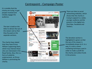
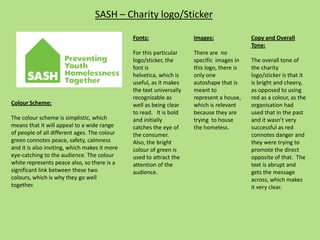
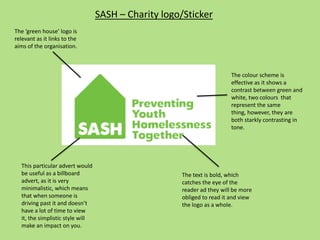
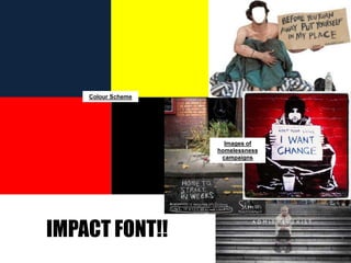
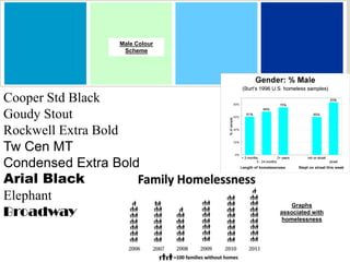
The document provides an analysis of different homeless charity marketing campaigns. It summarizes the fonts, color schemes, images, tones, and techniques used in posters and websites for Shelter, Centrepoint, and SASH homeless charities. Key points made are that the fonts are universally readable, red is used to convey danger in Shelter and Centrepoint materials, and green represents safety in the Centrepoint and SASH campaigns. Statistics and impactful images are analyzed as effective techniques to raise awareness. Similarities and differences between the campaigns are discussed. The results of a homeless survey show negative stereotypes influence perceptions and support is seen as key to addressing homelessness.


![5G Explained! A High Level Overview [Introduction]](https://cdn.slidesharecdn.com/ss_thumbnails/5gexplainedahighleveloverview-260119165306-cc137a3e-thumbnail.jpg?width=640&height=640&fit=bounds)