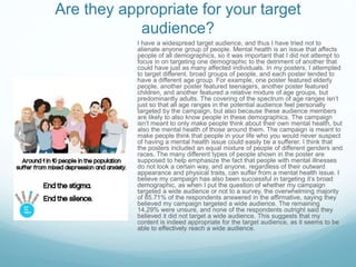
SlideShare a Scribd company logo
1 of 13
Social Action Evaluation
Scott Harrand
Are your finished pieces fit for their
intended purpose?
The main purpose of the campaign was to end stigma
surrounding mental health issues, by raising awareness, giving
people the facts, and tackling inaccurate assumptions. I believe I
reached the goals I set with these intended purposes throughout
my campaign. The main bulk of my campaign was the series of
posters I created for the campaign, and I believe these posters
especially embodied the purposes of the campaign, as they
show that people with mental health issues are just like everyone
else, and mental health issues are a prominent issue that effect
many more people in our lives than we would imagine. The
posters also give clear and concise information regarding mental
health statistics, which helps to give the facts and inform people.
I believe that this information was used effectively, and when put
to a survey, I found out that 71.43% of respondents learned
something new from the campaign, with comments stating that
the majority of respondents were unaware of the statistics and
figures that were featured in the campaign. This means that the
goal to inform about mental health has arguably been achieved.
As well as my posters, I believe that other components of my
campaign have been equally fit for their intended purpose. For
example, my logo, which features regularly throughout the
campaign, is a simple but relatively recognizable icon that I have
been able to insert into my posters as well as into a variety of
merchandise.
Do they communicate your message
clearly?
The slogan “End the stigma. End the silence.” runs consistently throughout the campaign. I think that
this slogan (which is featured prominently and boldly in the posters, logo and merchandise) is quite
clear in the message is it is meaning to convey, and sums up the message I had aimed to get across
during the planning stages of the campaign. However, I think other elements of my products aside from
the slogan help to communicate my message. For example, I think that the colour scheme is a balance
between serious and not-so-serious. The images use positive, bright colours, and the lower captioned
half of the posters use serious and starkly contrasting black and white (with a dash of blue for the
logo). I think this helps to emphasize the fact that the images are meant to depict everyday people
appearing ultimately happy and well adjust, and contrasting them with the true facts of mental health,
and insinuating that someone in the image may be affected by mental health issues. I also wanted to
make clear the fact that someone’s outward appearance of happiness was not necessarily indicative
that they had no issues to struggle with internally, as a big problem with mental health issues is that
there are often no physical traces of the struggle that the sufferers go through.
While my slogan and my poster, I believe, are both effective
methods of communicating the message that I intended to convey
with my campaign, I also believe that the two lines of merchandise
in my campaign (both the regular merchandise and the Blue
Christmas merchandise) are each also able to effectively
communicate my campaign’s intentions. The merchandise itself is a
simple but effective way of raising the campaign’s profile, by putting
it’s logo and/or slogan on to normal, everyday items that people are
likely to be enticed into purchasing at an affordable price on a
whim, or wouldn’t say no to taking if they were offered out as
freebies. By having the logo spread through these items of
merchandise, awareness of the campaign is raised, and therefore,
ideally, awareness of mental health issues is also raised. The
regular merchandise is able to raise awareness for the campaign,
but the Blue Christmas merchandise goes a step further. By
infiltrating the holiday season, a time that has often been
commercialized to help sell consumer goods, the campaign is able
to latch on to pre-existing sentiments of charity and sympathy for
those less fortunate which are especially prevalent during
Christmas time. The campaign also helps to remind people that
mental health issues are just as prevalent an issue even during the
Christmas season, and intends to ensure that the discussion of
mental health isn’t discarded during these times, especially as
many people tend to struggle with feelings of depression and
suicidal ideation even more so during the Christmas time. The
actual merchandise itself, Christmas decorations and similar
Christmas merchandise, will also be likely to sell quickly and in bulk
during this time of year, which will mean it is likely to be able to
raise a great deal of money for the Mental Health charities.
Are they appropriate for your target
audience?
I have a widespread target audience, and thus I have tried not to
alienate anyone group of people. Mental health is an issue that affects
people of all demographics, so it was important that I did not attempt to
focus in on targeting one demographic to the detriment of another that
could have just as many affected individuals. In my posters, I attempted
to target different, broad groups of people, and each poster tended to
have a different age group. For example, one poster featured elderly
people, another poster featured teenagers, another poster featured
children, and another featured a relative mixture of age groups, but
predominantly adults. The covering of the spectrum of age ranges isn’t
just so that all age ranges in the potential audience feel personally
targeted by the campaign, but also because these audience members
are likely to also know people in these demographics. The campaign
isn’t meant to only make people think about their own mental health, but
also the mental health of those around them. The campaign is meant to
make people think that people in your life who you would never suspect
of having a mental health issue could easily be a sufferer. I think that
the posters included an equal mixture of people of different genders and
races. The many different types of people shown in the poster are
supposed to help emphasize the fact that people with mental illnesses
do not look a certain way, and anyone, regardless of their outward
appearance and physical traits, can suffer from a mental health issue. I
believe my campaign has also been successful in targeting it’s broad
demographic, as when I put the question of whether my campaign
targeted a wide audience or not to a survey, the overwhelming majority
of 85.71% of the respondents answered in the affirmative, saying they
believed my campaign targeted a wide audience. The remaining
14.29% were unsure, and none of the respondents outright said they
believed it did not target a wide audience. This suggests that my
content is indeed appropriate for the target audience, as it seems to be
able to effectively reach a wide audience.
Compare and contrast your original intentions
with the outcomes you arrived at.I think that the total outcome of my production was
not too far-off from my originally planned intentions
for my campaign. Many of my original plans and
ideas for my campaign, including messages and
goals involved in it as well as actual format ideas
and design methods, were mostly realized in the
actual creation of the campaign. For example,
during the very first, early on idea generation
stages, I had summed up the concept behind my
campaign poster as “Regular pictures of groups of
four people, with a tagline that reads “one in four
people will have mental health issues.”. While my
campaign would go on to expand and cover a wider
range of mental health issues, they still followed the
same basic format, just with different statistics and
numbers of people. Despite this, there was still a
poster amongst my final pieces of which this
descriptor perfectly accurately describes. Also in my
initial planning generation, I listed a few of my initial
aims with a mental health campaign, they were the
following; “Encourage people to talk about mental
health.” and “Humanize people with mental health
issues.”. I have certainly attempted to achieve these
goals throughout the production of my campaign,
and I believe that I managed to achieve them as
well. The slogan running throughout the campaign,
“End the Stigma. End the Silence.”, I believe,
encompasses the goal of “Encouraging people to
talk about mental health.”, and I also believe that
the usage throughout of groups of everyday, normal
people, with no clear indication of who amongst
them did or did not have a mental health issue,
helped to achieve the other initially created goal and
humanize people with mental health issues.
However, throughout the production process, a few elements of the campaign have
been altered. For example, some design aspects fluctuated during production, such
as in the case poster design, which originally featured bold, heavy border-lines. These
borders were removed later in production as they proved to be ineffectual and
inhibited the poster from flowing in a more aesthetically pleasing fashion. Yet another
element of the campaign that was removed was the addition of a second logo, the
“Spectrum” logo, which initially was planned to stand in as the logo for a fictional
mental health organization, to give the posters a more professional slant. However,
the second logo seemed to make the poster much more cluttered, and took up an
unnecessary amount of room and minimized the sleek, minimalistic effect that the
lower half of the posters was meant to achieve. Because of this, the second logo was
deemed as not necessary and scrapped.
How effective are the techniques you have used?
This is because, if such a logo becomes recognizable enough, it can be attached to almost
anything and everything, and still convey a complex message in a very simple and easily
replicated symbol. This can make it much easier to spread a campaigns message. With
these things in mind, I tried to feature my logo throughout the campaign, on merchandise
as well as on posters. I also used the shade of blue that features on my logo throughout the
campaign, and even made it a central feature in the chain of Christmas merchandise that
made up my fourth campaign idea. Alongside the shade of blue, I have also tried to feature
(at least parts of) the campaign slogan, “End the stigma. End the silence.” within the
campaign regularly.
I think that the methods I used in my campaign were fairly effective. In my posters, which were arguably the main bulk of
my campaign, I have tried to design them in such away that the information given is blunt and clear and memorable. I
juxtaposed the serious, hard facts with the pleasant and happy imagery in order to emphasize their severity, as well as
writing this text in bold black text on a white background, to stand out severely from the colourful rotoscoped images.
These techniques were done in the name of eliciting shock, as shocking campaigns tend to be more memorable, but I
have tried to avoid using pure shock value, as I believe this would have detracted from the message. I believe that my
techniques have been able to clearly and effectively convey facts and information in a way that is memorable. I also
believe that through conveying this facts, the campaign has a good chance of being able to change people’s attitudes
and approach towards the subject of mental health, as well as the sufferers of mental health issues, in a positive way,
which is yet another of the main goals of the campaign. Alongside this technique, that featured solely in the poster, I
have also tried throughout my campaign to establish brand recognition. I believe if a campaign has a recognizable logo,
slogan, or some other kind of way by which they can be easily identified, then they will have more impact.
Another technique I chose to use during the production was rotoscoping, specifically
in the posters. I believed that rotoscoping images instead of just using photos would
make the images more visually interesting and eye-catching, and would allow me to
employ much more colour and give the images a happier feel. I also felt that the use
of rotoscoped images would help the campaign to stand out as more original, as
many other mental health campaigns generally just use photograph images. Also in
this images, I was careful to select groups of people to rotoscope that were quite
varied in their appearance and demographic, in the hopes of targeting as many
specific demographics as possible. This is because I did not want any groups to feel
as if they were not targeted by the campaign, as it was meant to target anyone and
everyone, as anyone could be a sufferer of mental health issues, or at least know
someone who was affected. In my merchandise, I have tried to be careful in
selecting what objects to make a part of my merchandise. Generally, the things I
selected were things that people would often need. For example, pens are
something that people need quite often and will most likely take if offered at a fairly
low price or for free. While people may not necessarily wear these t-shirts on
special occasions, many people like to have a few extra t-shirts for wearing around
the house or as pajamas. I felt as if it would be better to have merchandise that was
generally quite cheap, practical, everyday things, as people would be more likely to
buy them on a whim and be less concerned with having the logo of the campaign on
them.
Is the content effective?
The reaction of the audience is important to consider when deciding whether
a campaign is effective, as they are the ones who the campaign needs to
impact and effect. When the question of how effective the campaign was was
put to the survey, all of the respondents believed the techniques used in my
campaign (both visual and written) were effective. Just over half the
respondents (57.14%) believed that my visual techniques were “Very
Effective”, and a much more substantial amount of respondents (71.43%)
thought that my written techniques were “Very effective”. All other
respondents considered the techniques as “Quite Effective”, with no
respondents considering the techniques less than effective. I also believe the
content of my campaign can be considered effective because it seems to
have reached many of the aims I had been attempting to reach when
creating the campaign, such as to inform people about mental health. For
example, using the survey for the data, my campaign was able to inform
71.43% of those that saw it of information on mental health that they were
not already aware of (with many citing that the statistics were new
information to them). Also according to the survey, 57.14% of the
respondents believed that their opinions on mental health had changed,
which is important as yet another one of my aims was to change attitudes
surrounding mental health. Because of these statistics, I believe that my
content can be considered effective. I also believe that the techniques have
all had purposes that were suited to the aims that I wanted to achieve with
the campaign, such as how I conveyed statistical information in my posters in
order to inform about mental health. Or how I used my “Blue Christmas”
campaign idea in order to raise greater awareness for mental health at a time
when people are generally only thinking about festivities, which would then
raise the profile of the campaign while also raising money for the charities.
What impact do you think your advertising
campaign will have on the public?
If my survey results are anything to judge this by, I believe that my campaign has the potential to have a noteworthy impact on
the public. Part of this, I believe, is because there are comparatively not that many mental health campaigns in the public eye
that often, as it is a subject that is not always spoken about that openly. Many other campaign subjects tend to gain greater
traction, such as campaigns surrounding physical health, but the lesser number of mental health campaigns may be a result of
mental health not being treated as seriously as physical health, as it’s effects are not always as clear and quantifiable, but they
are no less detrimental and potentially damaging, and they require just as much attention. I think something that sets my
campaign aside from most other mental health campaigns is that it does not make use of the imagery and tone that is generally
associated with mental health campaigns, such as being in shadowy, dark colours or black and white, or using images of people
looking sad or isolated. My campaign instead tries to use happy images of everyday people. This is because most people with
mental health issues will not outwardly appear any different to people without mental health issues, and it is detrimental to
assume you can simply “tell” when people have a mental health problem. I think it is important that people realize this, and I
believe this campaign is capable of promoting this idea. I also think that my fourth idea, “A Blue Christmas”, has the potential to
make a significant impact on the public opinions surrounding mental health. This is because the line of merchandise, all
traditional Christmas decorations and icons in the campaign’s trademark shade of blue, is intended to remind people that mental
health issues are something people struggle with on a daily basis, regardless of what time of year it is. This section of the
campaign is aimed at working off of a popular holiday (that is also a well known time of charitable giving) in order to raise
awareness as well as money, as the concept behind the “Blue Christmas” campaign is that the proceeds of it would go towards
mental health organizations. I believe this section of the campaign, especially, has the potential to make a large impact.
What are the technical and aesthetic qualities of
your work?
There are many different qualities and elements involved in my campaign.
For example, throughout my campaign, in the logo, posters, merchandise,
and additional Christmas merchandise, the colour of light blue featured
prominently. Outside of the colours used in the rotoscoped poster images, it
is one of the only uses of colour throughout the campaign. I chose this shade
of light blue because I thought it was a calming colour that was aesthetically
pleasing to look at, and also suited the grey that was also featured in the
logo (which is where I initially decided to use this colour). However, I also felt
that the colour blue was a fitting choice for a campaign surrounding mental
illness, especially as a colloquial term for sadness or depression is “feeling
blue”. While depressive emotions are not the only sort of emotions someone
suffering from the wide and varied spectrum of mental health issues may
experience, it is still related to the campaign. By using the colour throughout,
I hoped to make it synonymous with the campaign, in order to make the
campaign more easily recognizable. I have generally used the colour in
contrast with white, as seen in the merchandise, which primarily features
merchandise in a blank white colour, generally with the campaign logo (which
features the shade of blue) on it. Some other merchandise (such as the
pens) instead feature the slogan, but still have the shade of blue featured
somewhere on them. One of the main technical/aesthetic qualities of my
campaign, which features on my posters, is the juxtaposition and contrast
between my rotoscoped images (that feature bright colours) and the
captioned lower halves of the posters (which are in black and white, as well
as featuring the serious statistics of mental health.). This visual contrast is
meant to emphasize the difference between the outward appearance that
people may convey in daily life (e.g the colorfulness and happiness and
otherwise normalcy) and the stark reality which may be hidden underneath
(e.g the statistical likelihood of one or more of the people in the poster
images having a mental health issue.) The use of colour, or occasionally lack
thereof, in the posters is meant to help emphasize this point.
Improvements
 Talk more about Merchandise and “Blue Christmas”.
ď‚— More comparisons with other campaigns
 Discuss more about “How effective are the techniques
you have used?” (e.g rotoscoping, choosing the groups
of people, etc…)
 Talk more about my own feedback in “Is the content
effective?”

More Related Content

What's hot

Task 4 research
Task 4  researchTask 4  research
Task 4 researchEmily Shaw
 
Task 4 research
Task 4  researchTask 4  research
Task 4 researchEmily Shaw
 
Campaign Evaluation - Psychoactive Stop
Campaign Evaluation - Psychoactive StopCampaign Evaluation - Psychoactive Stop
Campaign Evaluation - Psychoactive StopRuby Hooper
 
The Human Truths Behind Consumer Behaviour
The Human Truths Behind Consumer BehaviourThe Human Truths Behind Consumer Behaviour
The Human Truths Behind Consumer BehaviourXPotential
 
Comparison of Campaigns
Comparison of CampaignsComparison of Campaigns
Comparison of CampaignsNazish
 
Evaluation
EvaluationEvaluation
EvaluationMarieSie
 
Content tips for health and wellness brands
Content tips for health and wellness brandsContent tips for health and wellness brands
Content tips for health and wellness brandsEmily Hubbell
 
Charting New Territories: Old School PR Meets Social Media
Charting New Territories: Old School PR Meets Social MediaCharting New Territories: Old School PR Meets Social Media
Charting New Territories: Old School PR Meets Social MediaAbigail Broussard Falgout
 
Evaluation
EvaluationEvaluation
Evaluationhndoja
 
Social action presentation
Social action presentationSocial action presentation
Social action presentationveggieburgers4lyf
 
Unit 6 – Task 2 – Analysis Of A Magazine Cover – Focus Groups
Unit 6 – Task 2 – Analysis Of A Magazine Cover – Focus GroupsUnit 6 – Task 2 – Analysis Of A Magazine Cover – Focus Groups
Unit 6 – Task 2 – Analysis Of A Magazine Cover – Focus GroupsChelsie Brandrick
 
Impact of Celebrity Endorsement on the image of brand on Customer's mind
Impact of Celebrity Endorsement on the image of brand on Customer's mindImpact of Celebrity Endorsement on the image of brand on Customer's mind
Impact of Celebrity Endorsement on the image of brand on Customer's mindinventionjournals
 
Social Action and Community Media Research Task 1
Social Action and Community Media Research Task 1Social Action and Community Media Research Task 1
Social Action and Community Media Research Task 1katietorpey1
 
Factual page layout task 1
Factual page layout task 1Factual page layout task 1
Factual page layout task 1hndoja
 

What's hot (18)

Task 4 research
Task 4  researchTask 4  research
Task 4 research
 
Task 4 research
Task 4  researchTask 4  research
Task 4 research
 
Canon research
Canon researchCanon research
Canon research
 
Campaign Evaluation - Psychoactive Stop
Campaign Evaluation - Psychoactive StopCampaign Evaluation - Psychoactive Stop
Campaign Evaluation - Psychoactive Stop
 
Smile
Smile Smile
Smile
 
Evaluation
Evaluation Evaluation
Evaluation
 
The Human Truths Behind Consumer Behaviour
The Human Truths Behind Consumer BehaviourThe Human Truths Behind Consumer Behaviour
The Human Truths Behind Consumer Behaviour
 
Comparison of Campaigns
Comparison of CampaignsComparison of Campaigns
Comparison of Campaigns
 
Evaluation
EvaluationEvaluation
Evaluation
 
Evaluation
EvaluationEvaluation
Evaluation
 
Content tips for health and wellness brands
Content tips for health and wellness brandsContent tips for health and wellness brands
Content tips for health and wellness brands
 
Charting New Territories: Old School PR Meets Social Media
Charting New Territories: Old School PR Meets Social MediaCharting New Territories: Old School PR Meets Social Media
Charting New Territories: Old School PR Meets Social Media
 
Evaluation
EvaluationEvaluation
Evaluation
 
Social action presentation
Social action presentationSocial action presentation
Social action presentation
 
Unit 6 – Task 2 – Analysis Of A Magazine Cover – Focus Groups
Unit 6 – Task 2 – Analysis Of A Magazine Cover – Focus GroupsUnit 6 – Task 2 – Analysis Of A Magazine Cover – Focus Groups
Unit 6 – Task 2 – Analysis Of A Magazine Cover – Focus Groups
 
Impact of Celebrity Endorsement on the image of brand on Customer's mind
Impact of Celebrity Endorsement on the image of brand on Customer's mindImpact of Celebrity Endorsement on the image of brand on Customer's mind
Impact of Celebrity Endorsement on the image of brand on Customer's mind
 
Social Action and Community Media Research Task 1
Social Action and Community Media Research Task 1Social Action and Community Media Research Task 1
Social Action and Community Media Research Task 1
 
Factual page layout task 1
Factual page layout task 1Factual page layout task 1
Factual page layout task 1
 

Viewers also liked

Development pro forma
Development pro formaDevelopment pro forma
Development pro formaScott Harrand
 
PROJECT REPORT
PROJECT REPORTPROJECT REPORT
PROJECT REPORTGeorge Victor
 
Audience research
Audience research Audience research
Audience research Scott Harrand
 
History magazine idea generation
History magazine idea generation History magazine idea generation
History magazine idea generation Scott Harrand
 
Development pro forma
Development pro formaDevelopment pro forma
Development pro formaScott Harrand
 
Ch1406 genetic engineering unit-i
Ch1406   genetic engineering unit-iCh1406   genetic engineering unit-i
Ch1406 genetic engineering unit-iPradeep I
 
Development pro forma
Development pro formaDevelopment pro forma
Development pro formaScott Harrand
 
Social action evaluation
Social action evaluationSocial action evaluation
Social action evaluationScott Harrand
 
Updated social action evaluation
Updated social action evaluationUpdated social action evaluation
Updated social action evaluationScott Harrand
 
York press powerpoint
York press powerpointYork press powerpoint
York press powerpointScott Harrand
 
Development pro forma
Development pro formaDevelopment pro forma
Development pro formaScott Harrand
 

Viewers also liked (17)

Development pro forma
Development pro formaDevelopment pro forma
Development pro forma
 
PROJECT REPORT
PROJECT REPORTPROJECT REPORT
PROJECT REPORT
 
Audience research
Audience research Audience research
Audience research
 
CERTIFICATES
CERTIFICATESCERTIFICATES
CERTIFICATES
 
History magazine idea generation
History magazine idea generation History magazine idea generation
History magazine idea generation
 
Schedule
Schedule Schedule
Schedule
 
Development pro forma
Development pro formaDevelopment pro forma
Development pro forma
 
Ch1406 genetic engineering unit-i
Ch1406   genetic engineering unit-iCh1406   genetic engineering unit-i
Ch1406 genetic engineering unit-i
 
Development pro forma
Development pro formaDevelopment pro forma
Development pro forma
 
Social action evaluation
Social action evaluationSocial action evaluation
Social action evaluation
 
Updated social action evaluation
Updated social action evaluationUpdated social action evaluation
Updated social action evaluation
 
York press powerpoint
York press powerpointYork press powerpoint
York press powerpoint
 
GEORGE CV OCT
GEORGE CV OCTGEORGE CV OCT
GEORGE CV OCT
 
Development pro forma
Development pro formaDevelopment pro forma
Development pro forma
 
Task 2
Task 2Task 2
Task 2
 
Grids
Grids Grids
Grids
 
Task 5
Task 5 Task 5
Task 5
 

Similar to Social action evaluation

Existing products research
Existing products researchExisting products research
Existing products researchScott Harrand
 
Social action case studies
Social action case studiesSocial action case studies
Social action case studiesHannahMizen
 
Smile Campaign Rationale
Smile Campaign RationaleSmile Campaign Rationale
Smile Campaign RationaleTillyBrown1
 
Evaluation
EvaluationEvaluation
Evaluationalisrose1
 
Aims and conciderations
Aims and conciderationsAims and conciderations
Aims and conciderationsJordan Bohill
 
Smile campaign rationale updated
Smile campaign rationale updatedSmile campaign rationale updated
Smile campaign rationale updatedTillyBrown1
 
Rationale
RationaleRationale
RationaleEmber Tait
 
Capaign evaluation with resubmission
Capaign evaluation with resubmissionCapaign evaluation with resubmission
Capaign evaluation with resubmissionAlex Walker
 
Smile campaign
Smile campaignSmile campaign
Smile campaignZacBainbridge
 
Aims and conciderations
Aims and conciderationsAims and conciderations
Aims and conciderationsJordan Bohill
 
Aims and Considerations
Aims and Considerations Aims and Considerations
Aims and Considerations Chris Bailey
 
Aims and considerations sheet
Aims and considerations sheetAims and considerations sheet
Aims and considerations sheetveggieburgers4lyf
 
Smile campaign info (1)
Smile campaign info (1)Smile campaign info (1)
Smile campaign info (1)TillyBrown1
 
Initial responses
Initial responsesInitial responses
Initial responsesAmelia Browne
 
Week 2 Discussion 226.docx
Week 2 Discussion 226.docxWeek 2 Discussion 226.docx
Week 2 Discussion 226.docxwrite22
 

Similar to Social action evaluation (20)

Ghghggd
GhghggdGhghggd
Ghghggd
 
Existing products research
Existing products researchExisting products research
Existing products research
 
Social action case studies
Social action case studiesSocial action case studies
Social action case studies
 
Smile
Smile Smile
Smile
 
Smile Campaign Rationale
Smile Campaign RationaleSmile Campaign Rationale
Smile Campaign Rationale
 
Evaluation
EvaluationEvaluation
Evaluation
 
Aims and conciderations
Aims and conciderationsAims and conciderations
Aims and conciderations
 
Smile campaign rationale updated
Smile campaign rationale updatedSmile campaign rationale updated
Smile campaign rationale updated
 
Rationale
RationaleRationale
Rationale
 
Capaign evaluation with resubmission
Capaign evaluation with resubmissionCapaign evaluation with resubmission
Capaign evaluation with resubmission
 
Client research
Client researchClient research
Client research
 
Smile campaign
Smile campaignSmile campaign
Smile campaign
 
Aims and conciderations
Aims and conciderationsAims and conciderations
Aims and conciderations
 
Smile campaign pitch
Smile campaign pitchSmile campaign pitch
Smile campaign pitch
 
Aims and Considerations
Aims and Considerations Aims and Considerations
Aims and Considerations
 
Aims and considerations sheet
Aims and considerations sheetAims and considerations sheet
Aims and considerations sheet
 
Smile campaign info (1)
Smile campaign info (1)Smile campaign info (1)
Smile campaign info (1)
 
Initial responses
Initial responsesInitial responses
Initial responses
 
Week 2 Discussion 226.docx
Week 2 Discussion 226.docxWeek 2 Discussion 226.docx
Week 2 Discussion 226.docx
 
Smile brief
Smile briefSmile brief
Smile brief
 

More from Scott Harrand

Working to a brief pro forma(1)
Working to a brief pro forma(1)Working to a brief pro forma(1)
Working to a brief pro forma(1)Scott Harrand
 
Idea development pro forma
Idea development pro formaIdea development pro forma
Idea development pro formaScott Harrand
 
Idea development pro forma
Idea development pro formaIdea development pro forma
Idea development pro formaScott Harrand
 
Veganuary Article Editing
Veganuary Article EditingVeganuary Article Editing
Veganuary Article EditingScott Harrand
 
Veganuary Research
Veganuary ResearchVeganuary Research
Veganuary ResearchScott Harrand
 
InDesign Presentation
InDesign Presentation InDesign Presentation
InDesign Presentation Scott Harrand
 
Client factfile
Client factfileClient factfile
Client factfileScott Harrand
 
Social action final pieces
Social action final piecesSocial action final pieces
Social action final piecesScott Harrand
 
Social action presentation
Social action presentationSocial action presentation
Social action presentationScott Harrand
 
Development pro forma
Development pro formaDevelopment pro forma
Development pro formaScott Harrand
 

More from Scott Harrand (16)

Evaluation
Evaluation Evaluation
Evaluation
 
Evaluation
Evaluation Evaluation
Evaluation
 
Working to a brief pro forma(1)
Working to a brief pro forma(1)Working to a brief pro forma(1)
Working to a brief pro forma(1)
 
Pitch
Pitch Pitch
Pitch
 
Idea development pro forma
Idea development pro formaIdea development pro forma
Idea development pro forma
 
Idea development pro forma
Idea development pro formaIdea development pro forma
Idea development pro forma
 
Veganuary Article Editing
Veganuary Article EditingVeganuary Article Editing
Veganuary Article Editing
 
Task 1
Task 1Task 1
Task 1
 
Veganuary Research
Veganuary ResearchVeganuary Research
Veganuary Research
 
InDesign Presentation
InDesign Presentation InDesign Presentation
InDesign Presentation
 
Mood boards
Mood boardsMood boards
Mood boards
 
Client factfile
Client factfileClient factfile
Client factfile
 
Social action final pieces
Social action final piecesSocial action final pieces
Social action final pieces
 
Social action presentation
Social action presentationSocial action presentation
Social action presentation
 
Development pro forma
Development pro formaDevelopment pro forma
Development pro forma
 
Cinderella
CinderellaCinderella
Cinderella
 

Recently uploaded

History Class XII Ch. 3 Kinship, Caste and Class (1).pptx
History Class XII Ch. 3 Kinship, Caste and Class (1).pptxHistory Class XII Ch. 3 Kinship, Caste and Class (1).pptx
History Class XII Ch. 3 Kinship, Caste and Class (1).pptxsocialsciencegdgrohi
 
POINT- BIOCHEMISTRY SEM 2 ENZYMES UNIT 5.pptx
POINT- BIOCHEMISTRY SEM 2 ENZYMES UNIT 5.pptxPOINT- BIOCHEMISTRY SEM 2 ENZYMES UNIT 5.pptx
POINT- BIOCHEMISTRY SEM 2 ENZYMES UNIT 5.pptxSayali Powar
 
Blooming Together_ Growing a Community Garden Worksheet.docx
Blooming Together_ Growing a Community Garden Worksheet.docxBlooming Together_ Growing a Community Garden Worksheet.docx
Blooming Together_ Growing a Community Garden Worksheet.docxUnboundStockton
 
Employee wellbeing at the workplace.pptx
Employee wellbeing at the workplace.pptxEmployee wellbeing at the workplace.pptx
Employee wellbeing at the workplace.pptxNirmalaLoungPoorunde1
 
18-04-UA_REPORT_MEDIALITERAСY_INDEX-DM_23-1-final-eng.pdf
18-04-UA_REPORT_MEDIALITERAСY_INDEX-DM_23-1-final-eng.pdf18-04-UA_REPORT_MEDIALITERAСY_INDEX-DM_23-1-final-eng.pdf
18-04-UA_REPORT_MEDIALITERAСY_INDEX-DM_23-1-final-eng.pdfssuser54595a
 
Class 11 Legal Studies Ch-1 Concept of State .pdf
Class 11 Legal Studies Ch-1 Concept of State .pdfClass 11 Legal Studies Ch-1 Concept of State .pdf
Class 11 Legal Studies Ch-1 Concept of State .pdfakmcokerachita
 
How to Make a Pirate ship Primary Education.pptx
How to Make a Pirate ship Primary Education.pptxHow to Make a Pirate ship Primary Education.pptx
How to Make a Pirate ship Primary Education.pptxmanuelaromero2013
 
internship ppt on smartinternz platform as salesforce developer
internship ppt on smartinternz platform as salesforce developerinternship ppt on smartinternz platform as salesforce developer
internship ppt on smartinternz platform as salesforce developerunnathinaik
 
Final demo Grade 9 for demo Plan dessert.pptx
Final demo Grade 9 for demo Plan dessert.pptxFinal demo Grade 9 for demo Plan dessert.pptx
Final demo Grade 9 for demo Plan dessert.pptxAvyJaneVismanos
 
Computed Fields and api Depends in the Odoo 17
Computed Fields and api Depends in the Odoo 17Computed Fields and api Depends in the Odoo 17
Computed Fields and api Depends in the Odoo 17Celine George
 
Hybridoma Technology ( Production , Purification , and Application )
Hybridoma Technology  ( Production , Purification , and Application  ) Hybridoma Technology  ( Production , Purification , and Application  )
Hybridoma Technology ( Production , Purification , and Application ) Sakshi Ghasle
 
Proudly South Africa powerpoint Thorisha.pptx
Proudly South Africa powerpoint Thorisha.pptxProudly South Africa powerpoint Thorisha.pptx
Proudly South Africa powerpoint Thorisha.pptxthorishapillay1
 
Sanyam Choudhary Chemistry practical.pdf
Sanyam Choudhary Chemistry practical.pdfSanyam Choudhary Chemistry practical.pdf
Sanyam Choudhary Chemistry practical.pdfsanyamsingh5019
 
Science lesson Moon for 4th quarter lesson
Science lesson Moon for 4th quarter lessonScience lesson Moon for 4th quarter lesson
Science lesson Moon for 4th quarter lessonJericReyAuditor
 
Paris 2024 Olympic Geographies - an activity
Paris 2024 Olympic Geographies - an activityParis 2024 Olympic Geographies - an activity
Paris 2024 Olympic Geographies - an activityGeoBlogs
 
ECONOMIC CONTEXT - LONG FORM TV DRAMA - PPT
ECONOMIC CONTEXT - LONG FORM TV DRAMA - PPTECONOMIC CONTEXT - LONG FORM TV DRAMA - PPT
ECONOMIC CONTEXT - LONG FORM TV DRAMA - PPTiammrhaywood
 
Incoming and Outgoing Shipments in 1 STEP Using Odoo 17
Incoming and Outgoing Shipments in 1 STEP Using Odoo 17Incoming and Outgoing Shipments in 1 STEP Using Odoo 17
Incoming and Outgoing Shipments in 1 STEP Using Odoo 17Celine George
 
ENGLISH5 QUARTER4 MODULE1 WEEK1-3 How Visual and Multimedia Elements.pptx
ENGLISH5 QUARTER4 MODULE1 WEEK1-3 How Visual and Multimedia Elements.pptxENGLISH5 QUARTER4 MODULE1 WEEK1-3 How Visual and Multimedia Elements.pptx
ENGLISH5 QUARTER4 MODULE1 WEEK1-3 How Visual and Multimedia Elements.pptxAnaBeatriceAblay2
 

Recently uploaded (20)

History Class XII Ch. 3 Kinship, Caste and Class (1).pptx
History Class XII Ch. 3 Kinship, Caste and Class (1).pptxHistory Class XII Ch. 3 Kinship, Caste and Class (1).pptx
History Class XII Ch. 3 Kinship, Caste and Class (1).pptx
 
POINT- BIOCHEMISTRY SEM 2 ENZYMES UNIT 5.pptx
POINT- BIOCHEMISTRY SEM 2 ENZYMES UNIT 5.pptxPOINT- BIOCHEMISTRY SEM 2 ENZYMES UNIT 5.pptx
POINT- BIOCHEMISTRY SEM 2 ENZYMES UNIT 5.pptx
 
Blooming Together_ Growing a Community Garden Worksheet.docx
Blooming Together_ Growing a Community Garden Worksheet.docxBlooming Together_ Growing a Community Garden Worksheet.docx
Blooming Together_ Growing a Community Garden Worksheet.docx
 
Employee wellbeing at the workplace.pptx
Employee wellbeing at the workplace.pptxEmployee wellbeing at the workplace.pptx
Employee wellbeing at the workplace.pptx
 
Model Call Girl in Tilak Nagar Delhi reach out to us at 🔝9953056974🔝
Model Call Girl in Tilak Nagar Delhi reach out to us at 🔝9953056974🔝Model Call Girl in Tilak Nagar Delhi reach out to us at 🔝9953056974🔝
Model Call Girl in Tilak Nagar Delhi reach out to us at 🔝9953056974🔝
 
18-04-UA_REPORT_MEDIALITERAСY_INDEX-DM_23-1-final-eng.pdf
18-04-UA_REPORT_MEDIALITERAСY_INDEX-DM_23-1-final-eng.pdf18-04-UA_REPORT_MEDIALITERAСY_INDEX-DM_23-1-final-eng.pdf
18-04-UA_REPORT_MEDIALITERAСY_INDEX-DM_23-1-final-eng.pdf
 
Class 11 Legal Studies Ch-1 Concept of State .pdf
Class 11 Legal Studies Ch-1 Concept of State .pdfClass 11 Legal Studies Ch-1 Concept of State .pdf
Class 11 Legal Studies Ch-1 Concept of State .pdf
 
How to Make a Pirate ship Primary Education.pptx
How to Make a Pirate ship Primary Education.pptxHow to Make a Pirate ship Primary Education.pptx
How to Make a Pirate ship Primary Education.pptx
 
internship ppt on smartinternz platform as salesforce developer
internship ppt on smartinternz platform as salesforce developerinternship ppt on smartinternz platform as salesforce developer
internship ppt on smartinternz platform as salesforce developer
 
Final demo Grade 9 for demo Plan dessert.pptx
Final demo Grade 9 for demo Plan dessert.pptxFinal demo Grade 9 for demo Plan dessert.pptx
Final demo Grade 9 for demo Plan dessert.pptx
 
Computed Fields and api Depends in the Odoo 17
Computed Fields and api Depends in the Odoo 17Computed Fields and api Depends in the Odoo 17
Computed Fields and api Depends in the Odoo 17
 
Hybridoma Technology ( Production , Purification , and Application )
Hybridoma Technology  ( Production , Purification , and Application  ) Hybridoma Technology  ( Production , Purification , and Application  )
Hybridoma Technology ( Production , Purification , and Application )
 
Proudly South Africa powerpoint Thorisha.pptx
Proudly South Africa powerpoint Thorisha.pptxProudly South Africa powerpoint Thorisha.pptx
Proudly South Africa powerpoint Thorisha.pptx
 
Staff of Color (SOC) Retention Efforts DDSD
Staff of Color (SOC) Retention Efforts DDSDStaff of Color (SOC) Retention Efforts DDSD
Staff of Color (SOC) Retention Efforts DDSD
 
Sanyam Choudhary Chemistry practical.pdf
Sanyam Choudhary Chemistry practical.pdfSanyam Choudhary Chemistry practical.pdf
Sanyam Choudhary Chemistry practical.pdf
 
Science lesson Moon for 4th quarter lesson
Science lesson Moon for 4th quarter lessonScience lesson Moon for 4th quarter lesson
Science lesson Moon for 4th quarter lesson
 
Paris 2024 Olympic Geographies - an activity
Paris 2024 Olympic Geographies - an activityParis 2024 Olympic Geographies - an activity
Paris 2024 Olympic Geographies - an activity
 
ECONOMIC CONTEXT - LONG FORM TV DRAMA - PPT
ECONOMIC CONTEXT - LONG FORM TV DRAMA - PPTECONOMIC CONTEXT - LONG FORM TV DRAMA - PPT
ECONOMIC CONTEXT - LONG FORM TV DRAMA - PPT
 
Incoming and Outgoing Shipments in 1 STEP Using Odoo 17
Incoming and Outgoing Shipments in 1 STEP Using Odoo 17Incoming and Outgoing Shipments in 1 STEP Using Odoo 17
Incoming and Outgoing Shipments in 1 STEP Using Odoo 17
 
ENGLISH5 QUARTER4 MODULE1 WEEK1-3 How Visual and Multimedia Elements.pptx
ENGLISH5 QUARTER4 MODULE1 WEEK1-3 How Visual and Multimedia Elements.pptxENGLISH5 QUARTER4 MODULE1 WEEK1-3 How Visual and Multimedia Elements.pptx
ENGLISH5 QUARTER4 MODULE1 WEEK1-3 How Visual and Multimedia Elements.pptx
 

Social action evaluation

  • 2. Are your finished pieces fit for their intended purpose? The main purpose of the campaign was to end stigma surrounding mental health issues, by raising awareness, giving people the facts, and tackling inaccurate assumptions. I believe I reached the goals I set with these intended purposes throughout my campaign. The main bulk of my campaign was the series of posters I created for the campaign, and I believe these posters especially embodied the purposes of the campaign, as they show that people with mental health issues are just like everyone else, and mental health issues are a prominent issue that effect many more people in our lives than we would imagine. The posters also give clear and concise information regarding mental health statistics, which helps to give the facts and inform people. I believe that this information was used effectively, and when put to a survey, I found out that 71.43% of respondents learned something new from the campaign, with comments stating that the majority of respondents were unaware of the statistics and figures that were featured in the campaign. This means that the goal to inform about mental health has arguably been achieved. As well as my posters, I believe that other components of my campaign have been equally fit for their intended purpose. For example, my logo, which features regularly throughout the campaign, is a simple but relatively recognizable icon that I have been able to insert into my posters as well as into a variety of merchandise.
  • 3. Do they communicate your message clearly? The slogan “End the stigma. End the silence.” runs consistently throughout the campaign. I think that this slogan (which is featured prominently and boldly in the posters, logo and merchandise) is quite clear in the message is it is meaning to convey, and sums up the message I had aimed to get across during the planning stages of the campaign. However, I think other elements of my products aside from the slogan help to communicate my message. For example, I think that the colour scheme is a balance between serious and not-so-serious. The images use positive, bright colours, and the lower captioned half of the posters use serious and starkly contrasting black and white (with a dash of blue for the logo). I think this helps to emphasize the fact that the images are meant to depict everyday people appearing ultimately happy and well adjust, and contrasting them with the true facts of mental health, and insinuating that someone in the image may be affected by mental health issues. I also wanted to make clear the fact that someone’s outward appearance of happiness was not necessarily indicative that they had no issues to struggle with internally, as a big problem with mental health issues is that there are often no physical traces of the struggle that the sufferers go through.
  • 4. While my slogan and my poster, I believe, are both effective methods of communicating the message that I intended to convey with my campaign, I also believe that the two lines of merchandise in my campaign (both the regular merchandise and the Blue Christmas merchandise) are each also able to effectively communicate my campaign’s intentions. The merchandise itself is a simple but effective way of raising the campaign’s profile, by putting it’s logo and/or slogan on to normal, everyday items that people are likely to be enticed into purchasing at an affordable price on a whim, or wouldn’t say no to taking if they were offered out as freebies. By having the logo spread through these items of merchandise, awareness of the campaign is raised, and therefore, ideally, awareness of mental health issues is also raised. The regular merchandise is able to raise awareness for the campaign, but the Blue Christmas merchandise goes a step further. By infiltrating the holiday season, a time that has often been commercialized to help sell consumer goods, the campaign is able to latch on to pre-existing sentiments of charity and sympathy for those less fortunate which are especially prevalent during Christmas time. The campaign also helps to remind people that mental health issues are just as prevalent an issue even during the Christmas season, and intends to ensure that the discussion of mental health isn’t discarded during these times, especially as many people tend to struggle with feelings of depression and suicidal ideation even more so during the Christmas time. The actual merchandise itself, Christmas decorations and similar Christmas merchandise, will also be likely to sell quickly and in bulk during this time of year, which will mean it is likely to be able to raise a great deal of money for the Mental Health charities.
  • 5. Are they appropriate for your target audience? I have a widespread target audience, and thus I have tried not to alienate anyone group of people. Mental health is an issue that affects people of all demographics, so it was important that I did not attempt to focus in on targeting one demographic to the detriment of another that could have just as many affected individuals. In my posters, I attempted to target different, broad groups of people, and each poster tended to have a different age group. For example, one poster featured elderly people, another poster featured teenagers, another poster featured children, and another featured a relative mixture of age groups, but predominantly adults. The covering of the spectrum of age ranges isn’t just so that all age ranges in the potential audience feel personally targeted by the campaign, but also because these audience members are likely to also know people in these demographics. The campaign isn’t meant to only make people think about their own mental health, but also the mental health of those around them. The campaign is meant to make people think that people in your life who you would never suspect of having a mental health issue could easily be a sufferer. I think that the posters included an equal mixture of people of different genders and races. The many different types of people shown in the poster are supposed to help emphasize the fact that people with mental illnesses do not look a certain way, and anyone, regardless of their outward appearance and physical traits, can suffer from a mental health issue. I believe my campaign has also been successful in targeting it’s broad demographic, as when I put the question of whether my campaign targeted a wide audience or not to a survey, the overwhelming majority of 85.71% of the respondents answered in the affirmative, saying they believed my campaign targeted a wide audience. The remaining 14.29% were unsure, and none of the respondents outright said they believed it did not target a wide audience. This suggests that my content is indeed appropriate for the target audience, as it seems to be able to effectively reach a wide audience.
  • 6. Compare and contrast your original intentions with the outcomes you arrived at.I think that the total outcome of my production was not too far-off from my originally planned intentions for my campaign. Many of my original plans and ideas for my campaign, including messages and goals involved in it as well as actual format ideas and design methods, were mostly realized in the actual creation of the campaign. For example, during the very first, early on idea generation stages, I had summed up the concept behind my campaign poster as “Regular pictures of groups of four people, with a tagline that reads “one in four people will have mental health issues.”. While my campaign would go on to expand and cover a wider range of mental health issues, they still followed the same basic format, just with different statistics and numbers of people. Despite this, there was still a poster amongst my final pieces of which this descriptor perfectly accurately describes. Also in my initial planning generation, I listed a few of my initial aims with a mental health campaign, they were the following; “Encourage people to talk about mental health.” and “Humanize people with mental health issues.”. I have certainly attempted to achieve these goals throughout the production of my campaign, and I believe that I managed to achieve them as well. The slogan running throughout the campaign, “End the Stigma. End the Silence.”, I believe, encompasses the goal of “Encouraging people to talk about mental health.”, and I also believe that the usage throughout of groups of everyday, normal people, with no clear indication of who amongst them did or did not have a mental health issue, helped to achieve the other initially created goal and humanize people with mental health issues.
  • 7. However, throughout the production process, a few elements of the campaign have been altered. For example, some design aspects fluctuated during production, such as in the case poster design, which originally featured bold, heavy border-lines. These borders were removed later in production as they proved to be ineffectual and inhibited the poster from flowing in a more aesthetically pleasing fashion. Yet another element of the campaign that was removed was the addition of a second logo, the “Spectrum” logo, which initially was planned to stand in as the logo for a fictional mental health organization, to give the posters a more professional slant. However, the second logo seemed to make the poster much more cluttered, and took up an unnecessary amount of room and minimized the sleek, minimalistic effect that the lower half of the posters was meant to achieve. Because of this, the second logo was deemed as not necessary and scrapped.
  • 8. How effective are the techniques you have used? This is because, if such a logo becomes recognizable enough, it can be attached to almost anything and everything, and still convey a complex message in a very simple and easily replicated symbol. This can make it much easier to spread a campaigns message. With these things in mind, I tried to feature my logo throughout the campaign, on merchandise as well as on posters. I also used the shade of blue that features on my logo throughout the campaign, and even made it a central feature in the chain of Christmas merchandise that made up my fourth campaign idea. Alongside the shade of blue, I have also tried to feature (at least parts of) the campaign slogan, “End the stigma. End the silence.” within the campaign regularly. I think that the methods I used in my campaign were fairly effective. In my posters, which were arguably the main bulk of my campaign, I have tried to design them in such away that the information given is blunt and clear and memorable. I juxtaposed the serious, hard facts with the pleasant and happy imagery in order to emphasize their severity, as well as writing this text in bold black text on a white background, to stand out severely from the colourful rotoscoped images. These techniques were done in the name of eliciting shock, as shocking campaigns tend to be more memorable, but I have tried to avoid using pure shock value, as I believe this would have detracted from the message. I believe that my techniques have been able to clearly and effectively convey facts and information in a way that is memorable. I also believe that through conveying this facts, the campaign has a good chance of being able to change people’s attitudes and approach towards the subject of mental health, as well as the sufferers of mental health issues, in a positive way, which is yet another of the main goals of the campaign. Alongside this technique, that featured solely in the poster, I have also tried throughout my campaign to establish brand recognition. I believe if a campaign has a recognizable logo, slogan, or some other kind of way by which they can be easily identified, then they will have more impact.
  • 9. Another technique I chose to use during the production was rotoscoping, specifically in the posters. I believed that rotoscoping images instead of just using photos would make the images more visually interesting and eye-catching, and would allow me to employ much more colour and give the images a happier feel. I also felt that the use of rotoscoped images would help the campaign to stand out as more original, as many other mental health campaigns generally just use photograph images. Also in this images, I was careful to select groups of people to rotoscope that were quite varied in their appearance and demographic, in the hopes of targeting as many specific demographics as possible. This is because I did not want any groups to feel as if they were not targeted by the campaign, as it was meant to target anyone and everyone, as anyone could be a sufferer of mental health issues, or at least know someone who was affected. In my merchandise, I have tried to be careful in selecting what objects to make a part of my merchandise. Generally, the things I selected were things that people would often need. For example, pens are something that people need quite often and will most likely take if offered at a fairly low price or for free. While people may not necessarily wear these t-shirts on special occasions, many people like to have a few extra t-shirts for wearing around the house or as pajamas. I felt as if it would be better to have merchandise that was generally quite cheap, practical, everyday things, as people would be more likely to buy them on a whim and be less concerned with having the logo of the campaign on them.
  • 10. Is the content effective? The reaction of the audience is important to consider when deciding whether a campaign is effective, as they are the ones who the campaign needs to impact and effect. When the question of how effective the campaign was was put to the survey, all of the respondents believed the techniques used in my campaign (both visual and written) were effective. Just over half the respondents (57.14%) believed that my visual techniques were “Very Effective”, and a much more substantial amount of respondents (71.43%) thought that my written techniques were “Very effective”. All other respondents considered the techniques as “Quite Effective”, with no respondents considering the techniques less than effective. I also believe the content of my campaign can be considered effective because it seems to have reached many of the aims I had been attempting to reach when creating the campaign, such as to inform people about mental health. For example, using the survey for the data, my campaign was able to inform 71.43% of those that saw it of information on mental health that they were not already aware of (with many citing that the statistics were new information to them). Also according to the survey, 57.14% of the respondents believed that their opinions on mental health had changed, which is important as yet another one of my aims was to change attitudes surrounding mental health. Because of these statistics, I believe that my content can be considered effective. I also believe that the techniques have all had purposes that were suited to the aims that I wanted to achieve with the campaign, such as how I conveyed statistical information in my posters in order to inform about mental health. Or how I used my “Blue Christmas” campaign idea in order to raise greater awareness for mental health at a time when people are generally only thinking about festivities, which would then raise the profile of the campaign while also raising money for the charities.
  • 11. What impact do you think your advertising campaign will have on the public? If my survey results are anything to judge this by, I believe that my campaign has the potential to have a noteworthy impact on the public. Part of this, I believe, is because there are comparatively not that many mental health campaigns in the public eye that often, as it is a subject that is not always spoken about that openly. Many other campaign subjects tend to gain greater traction, such as campaigns surrounding physical health, but the lesser number of mental health campaigns may be a result of mental health not being treated as seriously as physical health, as it’s effects are not always as clear and quantifiable, but they are no less detrimental and potentially damaging, and they require just as much attention. I think something that sets my campaign aside from most other mental health campaigns is that it does not make use of the imagery and tone that is generally associated with mental health campaigns, such as being in shadowy, dark colours or black and white, or using images of people looking sad or isolated. My campaign instead tries to use happy images of everyday people. This is because most people with mental health issues will not outwardly appear any different to people without mental health issues, and it is detrimental to assume you can simply “tell” when people have a mental health problem. I think it is important that people realize this, and I believe this campaign is capable of promoting this idea. I also think that my fourth idea, “A Blue Christmas”, has the potential to make a significant impact on the public opinions surrounding mental health. This is because the line of merchandise, all traditional Christmas decorations and icons in the campaign’s trademark shade of blue, is intended to remind people that mental health issues are something people struggle with on a daily basis, regardless of what time of year it is. This section of the campaign is aimed at working off of a popular holiday (that is also a well known time of charitable giving) in order to raise awareness as well as money, as the concept behind the “Blue Christmas” campaign is that the proceeds of it would go towards mental health organizations. I believe this section of the campaign, especially, has the potential to make a large impact.
  • 12. What are the technical and aesthetic qualities of your work? There are many different qualities and elements involved in my campaign. For example, throughout my campaign, in the logo, posters, merchandise, and additional Christmas merchandise, the colour of light blue featured prominently. Outside of the colours used in the rotoscoped poster images, it is one of the only uses of colour throughout the campaign. I chose this shade of light blue because I thought it was a calming colour that was aesthetically pleasing to look at, and also suited the grey that was also featured in the logo (which is where I initially decided to use this colour). However, I also felt that the colour blue was a fitting choice for a campaign surrounding mental illness, especially as a colloquial term for sadness or depression is “feeling blue”. While depressive emotions are not the only sort of emotions someone suffering from the wide and varied spectrum of mental health issues may experience, it is still related to the campaign. By using the colour throughout, I hoped to make it synonymous with the campaign, in order to make the campaign more easily recognizable. I have generally used the colour in contrast with white, as seen in the merchandise, which primarily features merchandise in a blank white colour, generally with the campaign logo (which features the shade of blue) on it. Some other merchandise (such as the pens) instead feature the slogan, but still have the shade of blue featured somewhere on them. One of the main technical/aesthetic qualities of my campaign, which features on my posters, is the juxtaposition and contrast between my rotoscoped images (that feature bright colours) and the captioned lower halves of the posters (which are in black and white, as well as featuring the serious statistics of mental health.). This visual contrast is meant to emphasize the difference between the outward appearance that people may convey in daily life (e.g the colorfulness and happiness and otherwise normalcy) and the stark reality which may be hidden underneath (e.g the statistical likelihood of one or more of the people in the poster images having a mental health issue.) The use of colour, or occasionally lack thereof, in the posters is meant to help emphasize this point.
  • 13. Improvements ď‚— Talk more about Merchandise and “Blue Christmas”. ď‚— More comparisons with other campaigns ď‚— Discuss more about “How effective are the techniques you have used?” (e.g rotoscoping, choosing the groups of people, etc…) ď‚— Talk more about my own feedback in “Is the content effective?”