Evaluation
1) In what ways does your media product
use, develop, or challenge forms and
conventions of real media products?
The cover:
Ive conformed to using a strip at the
bottom of the magazine, as shown by this
NME magazine. I did this as it allows
information to be clearly displayed in a
way which looks nice.
Similarly to the NME
magazines, ive
made a short and
snappy title which
has large bold
writing that stands
out on the cover,
and like almost all
indie magazines, is
in the top left
corner. This makes
it look normal, if I’d
put it in the bottom
it would have
looked strange and
may put customers
off buying it.
I have placed my barcode
in the bottom left corner,
in the same way of this
magazine, as it is a general
convention of magazines,
and looks natural. Unlike if
I was to place it on the top
of the cover.
I’ve kept to the colour
scheme convention typical
in indie music magazines, of
red, black and white. I’ve
chosen to do this as It
means that anyone who
see’s the magazine will
instantly know the genre,
and people looking for an
indie magazine will be
drawn in.
Like in most magazine front
cover shoots, my model is
making eye contact with the
camera. This technique is
useful as it draws customers
in.
Alliteration Is a convention of magazines
based on a younger audience, and adds a
light hearted sense to the magazine.
The Contents page:
Like in the contents pages of many music
magazines, I've chosen to include my
magazine title on the contents page, as it
makes the cover and contents page look
similar, adding a sense of identity to the
magazine.
Iv’e gone for the
conventional left hand
side list found in almost
every music magazine,
which splits the
magazine in to sub
categories. It looks nice
and makes everything
easy to access.
Iv’e used the large image
typical of many magazines, as
it fills a lot of space and
makes the page aesthetically
pleasing.
I stuck to the
red/white/black indie colour
scheme which is
conventionally used in order
for it to match with the
other pieces of the
magazine.
Pull quote has been
used much like other
music magazines
would use to draw
attention to the main
feature/article.
Most
magazines list
the date of
the issue on
the contents
page, however
I didn’t feel
this was
necessary as
the date is
displayed on
the front of
mine.
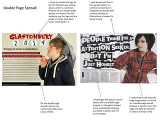
Double Page Spread:
I chose to include the logo of
the the festival I was writing
about, which is a common
thing to do on a double page
spread as it means that the
audience see the logo and are
drawn in if they have been
to/are interested in it.
I used wonky text like on
this spread, which is a
common convention in
magazines asociated with
a messy lifestyle, as
Glastonbury is known for
being ‘messy’.
On the double page
spread I kept to my
conforming indie music
colour sheme.
I challenged the typical column
layout with my double page
spread, as I thought it looked
more aesthetically pleasing
and fitted in better with it’s
surroundings.
I conformed to the typically
large image which is normal
on a double page spread,
because it stands out on the
page and adds an element
of colour and eye candy.
2) How does your media product
represent particular social groups?
This use of language is
stereotypical of a younger
audience, and in this was is
suitable for the target
audience of my magazine.
Fashionable clothing is worn by
the model in this picture,
representing the style of clothing
worn by indie music listeners, as
well as young people.
The word
‘comeback’
suggests a sense of
hostility and fast
pace, which is
associated with the
lifestyle of younger
people.
A male is shown on the cover of the
magazine, representing the fact that
this is a predominately male based
magazine, however at the same time
it caters for the male gaze.
Again, males have
been used on the
page, representing
the musicality of the
magazine audience.
The umbrella is a
form of phallic
symbolism,
further adding
masculinity to
the model and
representing a
masculine figure.
The red, white and black
colour scheme is typical of
indie music magazines, and
helps to represent the indie
style of music, catering for this
market.
Instead of having a formal introduction to
the contents page, I've used the simplistic
phrase ‘this week’, representing the more
simplistic social group of my target
audience, this is aimed at a younger
audience, not people who get up and read
The Guardian with a coffee in the morning.
‘Glasto’ is an
abbreviation which
a younger
audience will
recognise, so In
this way I’m
conforming to the
stereotype that
young people will
use this word.
I've stuck to the stereotypical colours of an indie
music magazine on this double page spread, to go
with the stereotypical indie mag look which this
magazine represents.
‘George Green’ looks away
form the camera,
representing a sense of
disobedience and lack of
authority that matches the
young audience, and
represents them in this
way.
The language ‘Bringing
the Green to
Glastonbury’ was used by
me to connote the drug
use often associated with
this genre of music and
festival, and represents
this social group as being
people related with
drugs.
George is wearing ear
jewellery, which is a bold
fashion statement and
represents youth as being
outgoing in terms of
appearance, suggesting that
young people dress this way,
and influencing the audience
to follow the way he
dresses.
3) What kind of media institutions
might distribute your product? And
why?
A radio channel such a BBC Radio 1 would be perfect for my channel as it is a large radio station
which focuses on popular music, but in particular more rock music than channels suck as Capital,
which are more charts based. It would fit on an indie rock based show on the channel, as it fit’s this
niche in market, there could be some form of cross-media convergence between the two brands in
this way to create benefits for my magazine and the radio station.
Kerrang’s TV based music channel focuses on alternative/indie rock artists such as Kaiser
Chiefs, Foo Fighters and Red Hot Chilly Peppers. These artists would be ones which would
be likely to be feature in my magazine due to the genre of music it represents. So this music
channel might distribute advertisement of some sort for my product, or include some form
of convergence with my product.
Although my product is not a niche, as there are many music magazines of a similar
style and genre, I think that Bauer media would be likely to want to get involved and
publish my magazine to their previous experience and success within the genre,
with magazines such as ‘Q’ and ‘Mojo’.
4) Who would be the
audience for your
media product?
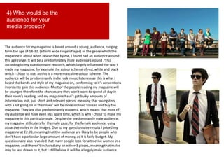
The audience for my magazine is based around a young, audience, ranging
form the age of 14-30, (a fairly wide range of ages) as the genre which the
magazine is about when researched by me, I found had an audience around
this age range. It will be a predominately male audience (around 75%)
according to my questionnaire research, which largely influenced the way I
made my magazine, for example the colour scheme of red, white and black
which I chose to use, as this is a more masculine colour scheme. The
audience will be predominantly indie rock music listeners as this is what I
based the bands and style of my magazine on, conforming to it’s conventions
in order to gain this audience. Most of the people reading my magazine will
be younger, therefore the chances are they won’t want to spend all day in
their room’s reading, and my magazine hasn’t got bulky amounts of
information in it, just short and relevant pieces, meaning that youngsters
with a lot going on in their lives' will be more inclined to read and buy the
magazine. They are also predominantly students, which means that most of
my audience will have even less spare time, which is why I chose to make my
magazine in this particular style. Despite the predominantly male audience,
my magazine still caters for the male gaze, for the female audience, using
attractive males in the images. Due to my questionnaire results I priced my
magazine at £2.99, meaning that the audience are likely to be people who
don’t have a particular large amount of money, as it is fairly budget. My
questionnaire also revealed that many people look for attractive women in a
magazine, and I haven’t included any on either 3 pieces, meaning that males
may be less drawn to it, but I still believe it will be a largely male audience.
5) How did you
attract/address your
audience?
In my product I used several techniques and marketing schemes in order to pull in the
audience which I wanted to be buying and reading my magazine. I also addressed them
by conforming to the typical social norms and stereotypes associated with my audience.
The choice Of language I used meant that I could address my audience in a way which
they could relate to and not feel out in the blue. For example using words such as
‘Glasto’ and ‘Bringing the Green’ which are suitable for a young audience.
By using fashionable styles of clothing, I attracted the younger audience, who are know
for caring about appearance and how they look, and enticed them.
I used the read white and black colour scheme in order to address the indie audience the
magazine was based at. This attracted them as they where familiar with the colours
being associated with the genre, and adding to this was the simplistic and modern layout
often found in indie magazines, as it is a refection of the audience, so in this way I
addressed my audience well.
I think I could've done a better job at including my audience within the magazine, by this
I mean that I didn’t have any sort of quiz or competition for them to take part in, which
would address them in the fact that it would add a sense of interactivity for them.
However, you could argue that indie music magazines aren’t know for those sort of
features, so in a way I was addressing the fact that it isn’t something indie music
magazine readers are the biggest fans of.
I addressed the fact that my audience use social media platforms by including
advertisement for Facebook, twitter and Instagram. This meant that they can quickly
follow/like the pages and keep up to date with any news. Similarly I included the website
and radio station on the contents page.
I Also addressed and attracted the female audience of my magazine by using pictures
which cater for the female gaze, as I thought that the magazine was too manly and
needed some feminine appeal.
6) What have you learnt about
technologies from the process of
constructing this product?
Over the process of creating my final media product I have learnt a number of things about
technologies, not only about software but about the way certain rules and techniques apply
within the media industry. I have learnt from scratch how to use adobe Photoshop after
having almost no experience in it, after using it to create my front cover and contents page I
now am confident using the software and know all of it’s features for example the different
editing effects which can be used like the ‘lasso’ tool in order to cut out images from their
background. I also learnt from scratch the basic tools if ‘In design’ when producing my double
page spread.
I've also learnt how to use Google blogger as I have been using as my blog platform to put all
of my coursework onto. I've learnt that it is a good way of storing data and files online and
how it can be used to create a portfolio of work. This has been helpful as it’s given me insight
on blogging I may do in the future.
I've learnt about how to use an SLR camera correctly as I've been taking pictures for my
media product, and now feel comfortable with the settings and functions of one. Not only
this but I've learnt about the different angles of shots used in photography and the names
they are given, for example high angle/low angle shots, and the different variety of close ups.
I've learnt about what attracts certain groups of people, eg. Particular social groups or
genders, and what goes along with their representations and stereotypes. For example
learning about how to attract a masculine audience using the male gaze.
Another thing I have learnt about technologies is that fact that social media networks help to
connect and integrates a media product, and using the internet to further benefit a media
product. An example of this would be adding Facebook and Twitter logos with advertisement
of their pages on the cover of the magazine in order to gain publicity.
I've also learnt that backing up work on to more than one device is crucial, and if this is not
done it can lead to disaster, as some people in my class found out the hard way!
7) Looking back at the preliminary
task, what do you feel you have
learnt in the progression from it to
the full product?
I feel like I now understand a lot more about the codes and conventions to do with a media product
than I did before I had started my production. The analysis section of the coursework in which I had to
analyse different front covers, contents pages and double page spreads allowed me to understand
conventions such as the male and female gaze, as I said in question 6, and how to approach and attract
certain audiences. For example if I was to make a magazine based on a younger audience, I’d use
suitable vocabulary and phrases which are associated with younger people. This has increased my over
all knowledge on how to make something appealing to someone.
I learnt about photography studios and the fact that you cannot just take a picture and stick it on a
magazine, there is planning needed and most of the time you have to be set up in a studio!
If I look back at my primary front cover which I produced compared to my final coursework front cover,
it is clear to see quite how much I have learnt about the layout of a magazine. I previously didn’t know
what any particular part was, for example I had no Idea what a masthead was, or a selling line, and I
think that if I was to produce my own magazine now I would produce it much more efficiently than I
would have before creating my product, so in this way I've learnt lots about magazine structure in
general. Iv’e also learnt that colour schemes and aesthetically pleasing colour coordination can have a
large impact on whether or not someone will be attracted to a magazine or not, and certain colours
are conventional for certain genres of magazines, so you shouldn’t make a death metal magazine pink
and purple!
Another thing I've learnt it that you should always be prepared to make adjustments. Not everything
will go your way, or work out how you want it to, and I’ve learnt that being able to adapt and change
ideas is crucial in order to making a good product. For example, I was originally planning on having a
quiz built into my double page spread, but I realized that there wasn’t anywhere on the page I couldv’e
fitted it without overcrowding, so I binned the idea.
My overall musical knowledge has also improved over the space of the production, and I've learnt the
ins and outs of how music can be integrated with other platforms (in this case a magazine). I now feel
confident in media production and how to create a successful product.

Evaluation

  • 1.
  • 2.
    1) In whatways does your media product use, develop, or challenge forms and conventions of real media products? The cover: Ive conformed to using a strip at the bottom of the magazine, as shown by this NME magazine. I did this as it allows information to be clearly displayed in a way which looks nice. Similarly to the NME magazines, ive made a short and snappy title which has large bold writing that stands out on the cover, and like almost all indie magazines, is in the top left corner. This makes it look normal, if I’d put it in the bottom it would have looked strange and may put customers off buying it. I have placed my barcode in the bottom left corner, in the same way of this magazine, as it is a general convention of magazines, and looks natural. Unlike if I was to place it on the top of the cover. I’ve kept to the colour scheme convention typical in indie music magazines, of red, black and white. I’ve chosen to do this as It means that anyone who see’s the magazine will instantly know the genre, and people looking for an indie magazine will be drawn in. Like in most magazine front cover shoots, my model is making eye contact with the camera. This technique is useful as it draws customers in. Alliteration Is a convention of magazines based on a younger audience, and adds a light hearted sense to the magazine.
  • 3.
    The Contents page: Likein the contents pages of many music magazines, I've chosen to include my magazine title on the contents page, as it makes the cover and contents page look similar, adding a sense of identity to the magazine. Iv’e gone for the conventional left hand side list found in almost every music magazine, which splits the magazine in to sub categories. It looks nice and makes everything easy to access. Iv’e used the large image typical of many magazines, as it fills a lot of space and makes the page aesthetically pleasing. I stuck to the red/white/black indie colour scheme which is conventionally used in order for it to match with the other pieces of the magazine. Pull quote has been used much like other music magazines would use to draw attention to the main feature/article. Most magazines list the date of the issue on the contents page, however I didn’t feel this was necessary as the date is displayed on the front of mine.
  • 4.
    Double Page Spread: Ichose to include the logo of the the festival I was writing about, which is a common thing to do on a double page spread as it means that the audience see the logo and are drawn in if they have been to/are interested in it. I used wonky text like on this spread, which is a common convention in magazines asociated with a messy lifestyle, as Glastonbury is known for being ‘messy’. On the double page spread I kept to my conforming indie music colour sheme. I challenged the typical column layout with my double page spread, as I thought it looked more aesthetically pleasing and fitted in better with it’s surroundings. I conformed to the typically large image which is normal on a double page spread, because it stands out on the page and adds an element of colour and eye candy.
  • 5.
    2) How doesyour media product represent particular social groups? This use of language is stereotypical of a younger audience, and in this was is suitable for the target audience of my magazine. Fashionable clothing is worn by the model in this picture, representing the style of clothing worn by indie music listeners, as well as young people. The word ‘comeback’ suggests a sense of hostility and fast pace, which is associated with the lifestyle of younger people. A male is shown on the cover of the magazine, representing the fact that this is a predominately male based magazine, however at the same time it caters for the male gaze.
  • 6.
    Again, males have beenused on the page, representing the musicality of the magazine audience. The umbrella is a form of phallic symbolism, further adding masculinity to the model and representing a masculine figure. The red, white and black colour scheme is typical of indie music magazines, and helps to represent the indie style of music, catering for this market. Instead of having a formal introduction to the contents page, I've used the simplistic phrase ‘this week’, representing the more simplistic social group of my target audience, this is aimed at a younger audience, not people who get up and read The Guardian with a coffee in the morning. ‘Glasto’ is an abbreviation which a younger audience will recognise, so In this way I’m conforming to the stereotype that young people will use this word.
  • 7.
    I've stuck tothe stereotypical colours of an indie music magazine on this double page spread, to go with the stereotypical indie mag look which this magazine represents. ‘George Green’ looks away form the camera, representing a sense of disobedience and lack of authority that matches the young audience, and represents them in this way. The language ‘Bringing the Green to Glastonbury’ was used by me to connote the drug use often associated with this genre of music and festival, and represents this social group as being people related with drugs. George is wearing ear jewellery, which is a bold fashion statement and represents youth as being outgoing in terms of appearance, suggesting that young people dress this way, and influencing the audience to follow the way he dresses.
  • 8.
    3) What kindof media institutions might distribute your product? And why? A radio channel such a BBC Radio 1 would be perfect for my channel as it is a large radio station which focuses on popular music, but in particular more rock music than channels suck as Capital, which are more charts based. It would fit on an indie rock based show on the channel, as it fit’s this niche in market, there could be some form of cross-media convergence between the two brands in this way to create benefits for my magazine and the radio station. Kerrang’s TV based music channel focuses on alternative/indie rock artists such as Kaiser Chiefs, Foo Fighters and Red Hot Chilly Peppers. These artists would be ones which would be likely to be feature in my magazine due to the genre of music it represents. So this music channel might distribute advertisement of some sort for my product, or include some form of convergence with my product. Although my product is not a niche, as there are many music magazines of a similar style and genre, I think that Bauer media would be likely to want to get involved and publish my magazine to their previous experience and success within the genre, with magazines such as ‘Q’ and ‘Mojo’.
  • 9.
    4) Who wouldbe the audience for your media product? The audience for my magazine is based around a young, audience, ranging form the age of 14-30, (a fairly wide range of ages) as the genre which the magazine is about when researched by me, I found had an audience around this age range. It will be a predominately male audience (around 75%) according to my questionnaire research, which largely influenced the way I made my magazine, for example the colour scheme of red, white and black which I chose to use, as this is a more masculine colour scheme. The audience will be predominantly indie rock music listeners as this is what I based the bands and style of my magazine on, conforming to it’s conventions in order to gain this audience. Most of the people reading my magazine will be younger, therefore the chances are they won’t want to spend all day in their room’s reading, and my magazine hasn’t got bulky amounts of information in it, just short and relevant pieces, meaning that youngsters with a lot going on in their lives' will be more inclined to read and buy the magazine. They are also predominantly students, which means that most of my audience will have even less spare time, which is why I chose to make my magazine in this particular style. Despite the predominantly male audience, my magazine still caters for the male gaze, for the female audience, using attractive males in the images. Due to my questionnaire results I priced my magazine at £2.99, meaning that the audience are likely to be people who don’t have a particular large amount of money, as it is fairly budget. My questionnaire also revealed that many people look for attractive women in a magazine, and I haven’t included any on either 3 pieces, meaning that males may be less drawn to it, but I still believe it will be a largely male audience.
  • 10.
    5) How didyou attract/address your audience? In my product I used several techniques and marketing schemes in order to pull in the audience which I wanted to be buying and reading my magazine. I also addressed them by conforming to the typical social norms and stereotypes associated with my audience. The choice Of language I used meant that I could address my audience in a way which they could relate to and not feel out in the blue. For example using words such as ‘Glasto’ and ‘Bringing the Green’ which are suitable for a young audience. By using fashionable styles of clothing, I attracted the younger audience, who are know for caring about appearance and how they look, and enticed them. I used the read white and black colour scheme in order to address the indie audience the magazine was based at. This attracted them as they where familiar with the colours being associated with the genre, and adding to this was the simplistic and modern layout often found in indie magazines, as it is a refection of the audience, so in this way I addressed my audience well. I think I could've done a better job at including my audience within the magazine, by this I mean that I didn’t have any sort of quiz or competition for them to take part in, which would address them in the fact that it would add a sense of interactivity for them. However, you could argue that indie music magazines aren’t know for those sort of features, so in a way I was addressing the fact that it isn’t something indie music magazine readers are the biggest fans of. I addressed the fact that my audience use social media platforms by including advertisement for Facebook, twitter and Instagram. This meant that they can quickly follow/like the pages and keep up to date with any news. Similarly I included the website and radio station on the contents page. I Also addressed and attracted the female audience of my magazine by using pictures which cater for the female gaze, as I thought that the magazine was too manly and needed some feminine appeal.
  • 11.
    6) What haveyou learnt about technologies from the process of constructing this product? Over the process of creating my final media product I have learnt a number of things about technologies, not only about software but about the way certain rules and techniques apply within the media industry. I have learnt from scratch how to use adobe Photoshop after having almost no experience in it, after using it to create my front cover and contents page I now am confident using the software and know all of it’s features for example the different editing effects which can be used like the ‘lasso’ tool in order to cut out images from their background. I also learnt from scratch the basic tools if ‘In design’ when producing my double page spread. I've also learnt how to use Google blogger as I have been using as my blog platform to put all of my coursework onto. I've learnt that it is a good way of storing data and files online and how it can be used to create a portfolio of work. This has been helpful as it’s given me insight on blogging I may do in the future. I've learnt about how to use an SLR camera correctly as I've been taking pictures for my media product, and now feel comfortable with the settings and functions of one. Not only this but I've learnt about the different angles of shots used in photography and the names they are given, for example high angle/low angle shots, and the different variety of close ups. I've learnt about what attracts certain groups of people, eg. Particular social groups or genders, and what goes along with their representations and stereotypes. For example learning about how to attract a masculine audience using the male gaze. Another thing I have learnt about technologies is that fact that social media networks help to connect and integrates a media product, and using the internet to further benefit a media product. An example of this would be adding Facebook and Twitter logos with advertisement of their pages on the cover of the magazine in order to gain publicity. I've also learnt that backing up work on to more than one device is crucial, and if this is not done it can lead to disaster, as some people in my class found out the hard way!
  • 12.
    7) Looking backat the preliminary task, what do you feel you have learnt in the progression from it to the full product? I feel like I now understand a lot more about the codes and conventions to do with a media product than I did before I had started my production. The analysis section of the coursework in which I had to analyse different front covers, contents pages and double page spreads allowed me to understand conventions such as the male and female gaze, as I said in question 6, and how to approach and attract certain audiences. For example if I was to make a magazine based on a younger audience, I’d use suitable vocabulary and phrases which are associated with younger people. This has increased my over all knowledge on how to make something appealing to someone. I learnt about photography studios and the fact that you cannot just take a picture and stick it on a magazine, there is planning needed and most of the time you have to be set up in a studio! If I look back at my primary front cover which I produced compared to my final coursework front cover, it is clear to see quite how much I have learnt about the layout of a magazine. I previously didn’t know what any particular part was, for example I had no Idea what a masthead was, or a selling line, and I think that if I was to produce my own magazine now I would produce it much more efficiently than I would have before creating my product, so in this way I've learnt lots about magazine structure in general. Iv’e also learnt that colour schemes and aesthetically pleasing colour coordination can have a large impact on whether or not someone will be attracted to a magazine or not, and certain colours are conventional for certain genres of magazines, so you shouldn’t make a death metal magazine pink and purple! Another thing I've learnt it that you should always be prepared to make adjustments. Not everything will go your way, or work out how you want it to, and I’ve learnt that being able to adapt and change ideas is crucial in order to making a good product. For example, I was originally planning on having a quiz built into my double page spread, but I realized that there wasn’t anywhere on the page I couldv’e fitted it without overcrowding, so I binned the idea. My overall musical knowledge has also improved over the space of the production, and I've learnt the ins and outs of how music can be integrated with other platforms (in this case a magazine). I now feel confident in media production and how to create a successful product.