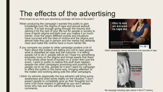
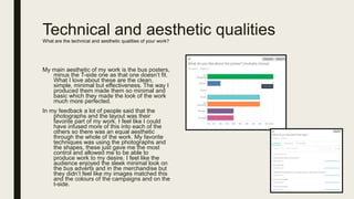
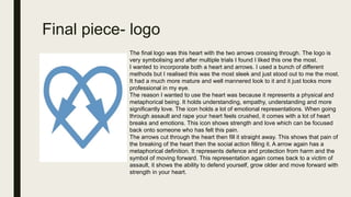
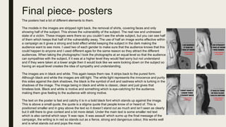
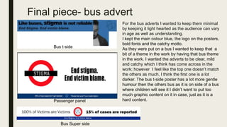
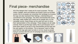
EVALUATION
Research
I started out the project with some research. In this research I wanted to
find out what audiences find appealing and what existing organizations
do to make their organisation stand out and be successful. I also wanted
to gain ideas and inspiration through other peoples work.
By looking at a range of work it gave me the ability to access the
strengths' and weakness’ of organizations work by gaining ideas and
concepts that I could apply in my own work. I think my research into the
existing work was strong. I looked into all aspects of work and a variety of
media and levels of organisation's. To improve this I could have looked at
more work and also looked more into the success of the organisation's
and just dug further into the research which I was doing.
I also did research into the audience. Audience research allowed me to
understand where my audiences level of understanding was and how I
could use their responses to tackle the issue of rape culture and the
stigma surrounding it. The results did this justice, they allowed me to
make products that would challenge the stigma and create awareness of
the cause.
I feel like I asked some really good questions in my survey and
conducted audience research with a lot of strength attached to get the
responses I needed. However if I was to do this again I would want to
find out even more. I intended on doing an interview with a sexual assault
survivor to find out the stigma but due to the time scale I didn’t have
enough time to conduct this. I would also look at different questions to
ask as some of them could have had more potential.
Overall I think my audience research was strong, it did have some light
drawbacks however allowed me to get to know my audience and have a
good starting point of what I had to produce.
The way I analyzed other work was looking at the campaign
outcomes and then look at all of the different elements that
make it strong. I did some background information on the
organisation and then tried to look into all of the work they have
done. This method did work, however could have been more
thorough.
The way I researched the audience was by using a survey and
sending out to multiple platforms to get results. I then analyzed
the results to compare and look at all of the answers that were
given. This worked well and allowed me to be able to see all of
the points which I wanted to focus my campaigns around.
Planning
When it came to planning I initially made a plan of times, weeks and
tasks. This allowed me to plan the tasks accordingly to the time scale
which was given. This started off as a strong method as it let me see all
of the tasks I had to do, however the first few tasks got done to a much
faster pace then I anticipated which meant I began to slack and things
didn’t get done. However everything did finally get complete to the correct
standard and deadline but it would have been a lot better for me to stick
to the plan. On the next task I think I will try stick to the plan more and
take more into consideration when making the plan.
I also planned all of the final pieces before making them. This was a good
method to do as it gave me the ability to produce the products I wanted a
lot easier as I had more indication and knowledge of what I wanted to do
before producing it. Things like mind maps of ideas, images, text and
colour to mock up plan designs. This all gave me chance to get my ideas
down and then gave me the chance to do mock ups then the real piece.
This definitely made the whole process a lot easier and manageable and
made sure the final pieces were what I wanted to make. I will definitely
keep this as a planning process the next time I create work.
Initial time plan
Mock up plan
Mind map
Fitting for purpose
The purpose:
The purpose of this campaign was to challenge the stigma around rape
culture. This was to make people realize the amount of stigma that circles the
issue and the way they should consider the thoughts around the matter. I
wanted the campaign to be motive and have the ability to really drive the
campaign to give off a feeling of emotion making the audience consider the
issue. The campaign was to gain awareness and also recognition of rape
culture especially stigma. I feel like the outcomes that I have produced are
highly fitting for the purpose, they highlight the stigma and they show that the
main reasoning behind this social campaign is to end stigma and the whole
idea around sexual assault and rape culture.
If you compare my work to the make your move campaign you can see that it
has a similar purpose, they both are targetting sexual assault and the way the
people act towards the matter. The mission from make a move is “Make Your
Move! is an innovative campaign designed to engage men and women as
allies to prevent sexual violence in the greater Missoula area. This multi-
faceted, inter-agency approach creates long-term, positive change by
changing the beliefs and behaviors that support sexual violence, thus creating
a safer and healthier community.”
which is changing the social norms and challenging behavior. Comparing this
back to my plan of the campaign and the purpose you can see how my work is
fitting for the purpose of ending stigma and challenging the view of the subject.
My work successfully fits the purpose intended and is designed to fit this
purpose.
My campaign
Make your move
campaign
Appropriate for target audience
When doing research into my audience I didn’t really want to delve too far into personal
information I more wanted to focus on the subject and find out more insights into the thoughts
around the subject matter.
The only question I wanted to ask was the age of the people taking the survey, this is because
I wanted to know the ages so I could keep an idea in mind of the audience. I didn’t want to
restrict my campaign to one age group; however I did want an idea on the people that were
accessing my work.
My target audience was prominently 16+ as I feel children younger then this need something
more simple to understand. I wanted the work to be appropriate for a younger audience but the
main understanding of the audience was to be 16+. There wasn’t a set social class, gender,
demographics etc.. as I feel with a campaign like this it is hard to really target it to one specific
audience. I did want a mature, sleek and professional look to keep it serious.
If you look at a campaign like this one that the Manchester police
issued was very student based, aimed at male prominently, it is a
very specific audience. The images of people drinking gives that
student look (which the campaign is targeted at) then the ‘she’
repetition makes it aimed towards a male audience. This might
work for this campaign as it is for a different aim; however, for
mine this wouldn’t work as it is to raise awareness not stop the
matter and when it comes to stigma it can effect literally anyone
of any background, so something of this level of specific wouldn’t
work on a campaign like mine.
Appropriate for target audience
I feel like my work is appropriate for my audience. I have made the campaign
with the audience in mind. It has a professional sleek look to it which makes it
appealing for the audience. The colour is minimal and doesn’t overpower any
specific gender or age. The images are appropriate for the audience as they are
not too revealing and don’t have mature content like some campaigns could
have, the images are in black so keeps a classy and mature look to them. The
photographs are half hidden which has that mystery and pained look to them
which keeps within the context but still has a mature look but keeping it PG.
They also have male and female subjects to keep an equal balance between the
gender board.
The text is minimal, the language is very up front and is not too in your face and
there isn’t too much text to process which makes it appealing for a younger
audience to understand; but at the same time I feel like this is good for an older
audience as it isn’t too overpowering.
I think that my work does have a mature and is fitting for the audience, but there
are some parts like the bus posters that could be improved and be made to be
more fitting. The reason these are like this is because I wanted to make sure that
they were suiting for younger ages as buses are public and accessible for a
younger audience. I feel like I could improve them to be a lot more suiting and
still appeal to an older audience.
A lot of my feedback regarding my work was positive about it being professional.
This shows that my work is a professional level which I would then show that it
meets the criteria for my target audience as they are older I didn’t want this to be
patronizing and almost childish, instead I wanted to keep It professional and
formal which from audience response you can tell that I have managed to do. If
Communication of message
When planning this work I wanted to make sure I was getting the
message of stigma across. As much as I wanted to challenge people
about stigma I wanted to show the reality of stigma by giving
examples. My message is not very discreet, this you can see by
looking at the bus adverts, it is simple and clear, gets the message
across.
Like a smoking advert I wanted my work to be very to the point, giving
this message a very short message but something that will stick.
Cigarette ads are known for their graphic image then short text, it
almost implies that idea of not giving too much time to it because it
shouldn’t be a something anyway.
I feel like even though my poster is a little bit more complex then the
bus advert it is still very direct. The text is centered and sharp, making
it an eye grabbing feature then the bold black goes into the much
sharper red saying the slogan. Everything on the poster is simple so
that the audience can understand the message clearly. Image, stigma
sentence, what it was, what it was, what it was, what it is. This is such
a simple layout and all of the elements are easy to grasp. Again like
the smoking campaign being straight to the point and not over doing it
makes the message convey and register a lot easier then what it
would have been with a busy look.
The bus adverts and the campaign posters all do hold a lot elements
but the way they are laid out and presented makes the digestion of
the campaign a lot easier and gets that message across a lot easier
without having to have a lot on there. If there was more text then there
would be an issue of keeping the reader involved so this minimal style
does help the communication of the message.
My bus campaign
Smoking campaign
My poster campaign
Planning to outcomes
Logo:
The logo was the first of the outcomes I made.
I started with an idea in my head and then took to the internet to do some
broader research into ideas. I looked into other organizations logos to get an
idea into the different ones I could make. I then looked into fonts, font sizes and
the different effects of fonts then finally I looked at colours, the aura and the
representations of colours and how they could effect the audience.
After research I had a much better idea about the different logos I could make
that would represent my organisation. I wanted to use heart and arrows to I
mocked up some ideas, trialed colours within them ideas to see what I could
produce and what would look best. After all the trialing I used different
techniques and adapted different ideas to the techniques to see what I could
produce and what worked best. The technique I used was a lot of warping and
cutting of different icons and then merging them and changing the colour
overlay.
After the mock up designs I found the style I liked the most and suited the
project most. I wanted something that would keep that professional look whilst
being very clean. I can use this logo on a lot of scales. It can be stretched
really large and not loose its format which works well for a campaign, and can
also be shrunk really small and still keep its look. The feedback that I got for
my logo was positive. I got the ‘simple’ ‘clean’ feedback which is what I
intended for the logo.
I feel like I got the look I wanted, it wasn’t what I originally had in mind and I
feel like there could be improvements, I could tidy the edges up, make the
arrows more equal and maybe trial something other than shapes, I feel like it
Planning to outcomes
Posters:
The next outcome I produced was the posters.
I started with some research. I had already looked into other organisation's and
how they produce campaigns so I had a brief understanding and what I wanted
to produce. I made a mood board with more ideas, looking at campaigns,
colours, fonts and the sizing. After this research I understood even more what I
wanted to produce, so I went on and I made mock up designs with shapes and
minimal text to give me an idea on the different layouts I could use and gave me
chance to trial the posters. This was a good technique as it allowed me to be
able to try making the posters first and also gave me the ability to know exactly
where everything was going.
After research and mock ups I went on and did some plans of production for the
photographs then went and shot all of my different subjects. This was the easiest
task as I knew what I wanted to take I just had to put planning into play to be
able to make the images. I could have done the production of these photographs
a lot sooner, which would have benefited the whole project, this was definitely a
costing error.
After the photograph production I had to make the posters, this was possibly the
hardest part as it was putting everything together, I ended up having to shift a
few things around in production. There was a lot of trialing, I feel like if I did this
again I would do a few mock ups and try and follow them a bit better as using
just the one wasn’t manageable in the actual production. I edited the images first
then put them onto the document then the text, then I did all of the details at the
bottom. I think my technique was fine, it was just the ability to put it together,
there was a lot of shifting that totaled up a lot of time, so next time I will look at
Mood board Mock up
Plan for photographs
Final outcomeThe different outcomes
Planning to outcomes
Bus advert:
The logo next outcome was the bus advert.
As I had not come across any campaigns I was researching that advertised on
buses and I had no history with this sort of work the first thing I did was research
the different bus adverts. I knew I wanted to use my colours and have the logo
involved, however I didn’t really know how I wanted to use this all. So I gathered
all of these ideas first.
After research I still wasn’t too sure how I was going to go about this. I feel like this
is a major flaw in my research and I should have done further research or made
mock ups prior to starting production. This would have also made all of the
outcomes match a bit more. As I didn’t know what I was really doing I decided to
start production and just use trial and error, this was a weak method and I should
have planned more. In this stage I developed ideas, used text, images and colour
to create different looks and try produce something of high quality. Trialing the
different techniques was a good way to be able to get to where I did, however It
was not the best method as it took too long to get to the final outcome points.
It did take me a while to produce the outcomes which was not a good thing and I
should have really planned and researched a little more. However two of the
banners ended up working really well together but the t-side did end up looking a
lot different , as the t-side was the first one produced it doesn’t hold the same as
the others which is something I would change.
In my feedback people also brought this up, the outcomes were good and minimal
which I agree with; however could be improved with colour, text and layout. I
would agree with the feedback and could really improve these outcomes more
than any of the others.
Research
Production
Final outcomes
Feedback
Planning to outcomes
Merch:
The final outcome was merchandise and branded products.
I had a few ideas about what I wanted to make, stickers and badges to give out
at events was my first idea. I wanted to make more products to give out at
events and also for people who run the events to wear and have there. To find
these products I did some research into existing campaigns to see what they
were giving out at events, I then looked at text and colours to see what I could
involved in my products.
I started production with making the badges and stickers as this is what I
already had the ideas for. I then went on to produce key chains and pens,
these are something that I want to give out at the events. I used the research to
produce these other outcomes.
I then went onto making products for other people at the event to wear, I made
t-shirts and tote bags but from research I also produced water bottles and
socks. I used the colour and the logo with the backing knowledge of the
research to produce these products.
These outcomes were easy to produce. I took the blank product images
(sourced from Google) and then added my logo, text and designs on
Photoshop. It was an easy yet effective method, as I knew what I wanted to
produce I just had to produce them. I feel like my merch could have been a lot
more detailed and I could have produced stronger outcomes which were a lot
less plain. I wanted them to be simple but I feel like they are too simple.
On the feedback I got from other people they gave suggestions on other merch
I could use which I could add more too.
Mood board research
Final outcomes
feedback
How effective are the techniques you have used?
At the start of the planning I knew I wanted to have a very minimal and
sleek look on my campaign. As you can see from my initial plans there
has never been something really extreme and next level. Everything
has always been sleek, clear and minimal.
The techniques I used helped me to keep the minimal look. The shapes,
warping and the methods I used were all very simple and nothing too
complicated to avoid the details and minor add ons that could be
gained from other techniques. For parts that I wanted to make more
prominent I used shadows and outer glows, this gave me the chance
to be able to make something simple but still be able to add that
format and bold elements that it needs to be formed.
If you compare my work to other minimal posters like this one which is
raising awareness for homelessness this is a really minimal poster.
Like mine it has a simple image; however there is less text. I feel like
to make my posters more simple then I should use text like the bus
adverts where there is less but less creates more. The other campaign
has used a similar technique with the taking the images but the layout
and the minimal text almost makes it more effective. I could play
around with my text more to make mine a similar outcome.
In my feedback people were saying my work was minimal and effective
which shows the methods were successful to an audience, I do feel
like my work could be more tidy and minimal to keep this look more
effective and I could work on this.
Techniques
Logo:
For the production of the logo the techniques I used was simple I used the quick selection tool to cut around the image and then used
the colour overlay tool to colour the icon the colour I want. I then used warping, cmd+t and then level and made them together. The
main technique in this logo was just cutting, coloring and layering (not hair dressing terms)
I experimented with gapping, guttering, shadowing and outlines. These are all different techniques that I used with the logos.
This technique worked well with this logo as it gave me full control over the image and process, using warping allowed me to be able to
really get the logo almost perfectly.
I could have used other methods for this technique which might have made the work a bit better and more straight especially around
the edges.
Poster:
The poster had an easy technique, a lot of what was needed was done in the photography shooting so that I wouldn’t have to do too
much in the post production. When it came to this I wanted to make the image black and white so I used the black and white icon, then I
used the different bars to edit the levels so there was control over the shadows and the brightness of the images and I could shape the
images more.
I then added text to the campaign. I wanted the text to stand out, as on other campaigns which I researched the text had a really
distinctive look which I wanted to recreate. I used the text control bar to edit the physical sizing of the text. I then used layer style and
drop shadows to add depth the text.
The overall poster technique was successful, I made a successful outcome and managed to produce something of good quality, however
I could have used other techniques which might have made my project posters a lot stronger, I should have trialed other techniques; but
these did work for the minimal look I desired.
Techniques
Bus advert:
For the bus advert I used images I had already images and a lot of text work, more than anything else. Something else in my bus
adverts was the use of shapes to recreate the London underground sign. This was the best technique for this creation as I did originally
start this with trying to Rota-scope but I just didn’t have the ability to recreate the look I wanted. Instead I used shapes to recreate the
signs. This worked best by tracing the shapes over the existing outcome and then using a gentle Rota-scope to make the images a bit
more together. I started this by just using all the same colour shapes until I eventually get it right. I then use colour overlay to make the
colours the ones that I want. The final aspect for this recreation is adding text. Like the poster I used the text control tab to format the
text better to make it fit.
This was the best technique for this as I got so much control and creative freedom, making the final outcome strong and professional.
Merch:
For the merch there wasn’t much of a technique needed. I just imported blank images from the internet and then used my logo and
added it onto the merchandise.
As I was adding the logo via a JPEG file I had to use the quick selection tool to get around the logo image so it could be blank and
flawless when on the merch. The only other technique I used was again with text, after the text control bar I had to arch the text and
make it fit around the circle design for the sticker. This technique makes it effective. A lot of organizations use arched text on stickers as
it gives you space for logos and other extras.
Content
Is the content effective?
The content of my campaign has effective elements, there is some strong points that are effective and also some points that
could have been improved or added to make it more effective on the audience.
Starting with the effective strong points of the content.
My poster defines the purpose, the content is relating to the social action campaign, each element of the poster is
reflecting the matter and is linked to the matter, this makes it successful and makes the content effective to the audience.
As the poster is black and white and has that pop of red it grabs the audiences attention instantly, this has an effective
feeling to it because having the black and white image is motive and the red is a contrast sharp. The colour contrast and the
subject of the image work together to make the content effective on the audience. As the subject is half covered and in black
and white it holds a level of suspense making it attention grabbing.
One important factor of making the content effective is the format and layout. The content is important but the way it is
displayed is just as important. I used the space to make sure I could make the image fit the mysterious layout which I
wanted and then put the text central right to that and allowed some negative space around the text, making the text stand
out and be clear. Having this simple layout makes the campaign visually capturing and makes the content have more effect
as the audience can read it and understand it better.
I have used both text and illustrations and used colours and tones to make different elements stand out, by making
different parts of the poster stand out against each other (the subject and red text) makes the poster pop and become really
effective to the audiences eye. These combined allowed me to express the campaign through multiple platforms and medias
to make the content have a more effective stance on the audience so they could understand better. Using both allows a
contrast and holds two types of content which makes it stand out and being effective.
I have used a simple font to make sure the text is visible and easy to read without being too overwhelming on the
audience. This is effective as the text is strong and has a drive and the font even though simple is bold and sharp to convey
this message across. The font also has highlighted words which shows the importance and makes this stand out more than
the other words, this is an effective idea as it stands out the most and draws attention to the audience which will convey the
message making the campaign get the overall message across, even if the audience only look at this they will see the
content of the whole poster in these words.
Content
Is the content effective?
This content is also not as effective as it could have been. There are points and techniques
I could have used to make the content be more effective for the audience. These are all
things I could change and also parts I would do again next time.
Column format- I could have used a column format. This would have allowed me to place
things more strategically and produce more equal work. I found it hard to make things line
up and fit together a bit more, after doing the equaluation I had a brain wave of using a
collum format which would have allowed my work to be a lot more neat and would have
made it easier to make all of the campaigns the same.
Self explaitory- if you look at this poster which is campaignig for the same act which I am
it is very self explanitory, you can look at it and understand which is going on straight
away. If I was to do this again I would make it a lot more simple and self explanitory.
Making the image a bit more basic and not have such a complex arty feeling behind it.
Title- I feel like I should have used a title or something a bit more bold as a title like format.
Looking at the other poster the ‘yeah, right.’ stands as a title and this just formats the
whole text, having that something else breaks up the rest of the text and gives a hierachy
format. I feel like I could have used a title to make my work more structured.
Negative space- a lot of the focus to my work is the centre, I have not used the space well
enough due to the images so there is not as much negatiave space then I maybe need.
This is a fallback on my half and the campaign almost becomes crowded. I much prefer
the bus adverts where there is more negative space, this should have been carried
through into my posters instead of having over crowdedness.
The effects of the advertisingWhat impact do you think your advertising campaign will have on the public?
When producing the campaign I wanted the public to gain
knowledge over the stigma of rape and sexual assault
victims. It is bad enough going through the trauma and
reliving it for the rest of your life but for people in society to
have a harsh stigma and light over you makes it so much
harder. Over the years different events and situations
have occurred and the idea of victims and the stigma and
almost hate they get in person and the media has defiantly
risen and make the victims have a much harder life.
If you compare my poster to other campaign posters a lot of
them about this subject are telling you not to rape people,
what is classified as rape and the outcome, it is telling
people not to do it, people still do so I hope my advertising
educates more on the stigma and brings aware that there
is this whole other level of burden on a victim then just the
event. I want to public to realize this stuff does happen,
despite the other campaigns promoting and pushing for
people not to do this, people do it and I want my campaign
to effect the public in the same way, bringing attention to
the matter and working along side the other campaigns.
I think my adverts (especially the bus adverts) will bring some
awareness and shed some reality on the situation. I don’t
expect people to completely give up their thoughts but to
have a bit more respect in general as you don’t always
know who has and who will be effected by such
comments.
Other campaigns raising awareness over excuses of rape
My campaign showing rape culture in the 21st century
Technical and aesthetic qualitiesWhat are the technical and aesthetic qualities of your work?
My main aesthetic of my work is the bus posters,
minus the T-side one as that one doesn’t fit.
What I love about these are the clean,
simple, minimal but effectiveness. The way I
produced them made them so minimal and
basic which they made the look of the work
much more perfected.
In my feedback a lot of people said that the
photographs and the layout was their
favorite part of my work. I feel like I could
have infused more of this into each of the
others so there was an equal aesthetic
through the whole of the work. My favorite
techniques was using the photographs and
the shapes, these just gave me the most
control and allowed me to be able to
produce work to my desire. I feel like the
audience enjoyed the sleek minimal look on
the bus adverts and in the merchandise but
they didn’t feel like my images matched this
and the colours of the campaigns and on the
t-side.
Final piece- logo
The final logo was this heart with the two arrows crossing through. The logo is
very symbolising and after multiple trials I found I liked this one the most.
I wanted to incorporate both a heart and arrows. I used a bunch of different
methods but I realised this was the most sleek and just stood out to me the most.
It had a much more mature and well mannered look to it and it just looks more
professional in my eye.
The reason I wanted to use the heart was because it represents a physical and
metaphorical being. It holds understanding, empathy, understanding and more
significantly love. The icon holds a lot of emotional representations. When going
through assault and rape your heart feels crushed, it comes with a lot of heart
breaks and emotions. This icon shows strength and love which can be focused
back onto someone who has felt this pain.
The arrows cut through the heart then fill it straight away. This shows that pain of
the breaking of the heart then the social action filling it. A arrow again has a
metaphorical definition. It represents defence and protection from harm and the
symbol of moving forward. This representation again comes back to a victim of
assault, it shows the ability to defend yourself, grow older and move forward with
strength in your heart.
Final piece- posters
The posters had a lot of different elements to them.
The models in the images are stripped right back, the removal of shirts, covering faces and only
showing half of the subject. This shows the vulnerability of the subject. The real raw and undressed
state of a victim. These images were there so you couldn’t see the whole subject, but you can see half
of them which keeps that half of the vulnerability away. The use of half an image works effective within
a campaign as it gives a strong and bold effect whilst keeping the subject in the dark making the
audience want to see more. I used two of each gender to make sure that the audience knows that this
could happen to anyone and I used different ages for the same reason so they attract the different
audiences. When taking the photographs I took the photographs at an equal level so that the audience
can sympathise with the subject, if it was at a higher level they would feel sorry but not understand
and if they were taken at a lower angle then it would look like we were looking down on the subject so
having an equal level creates the idea of sympathy and understanding.
The images are in black and white. This again keeps them raw. It strips back to the purest form.
Although black and white the images are still light. The white light represents the innocence and purity
this sides against the dark shadows, the black is the symbol of evil and sadness which is lurking in the
shadows of the image. The image being in black and white is classic, clean and just gives that
timeless look. Black and white is motive and something which is eye-catching for the audience,
making them give feeling to the audience with strong motive.
The text on the poster is fast and catchy it is in a bold black font which stands up against the image.
This is above a small quote, the quote is a stigma quote that people know of or heard of. This is
positioned smaller and in grey above the text so it doesn’t stand out as much and isn’t seen as clearly
but it still there to give context and a bit more detail. Under the main text is some smaller red text
which is also central which says ‘It was rape. It was assault’ which sums up the final message of the
campaign, the writing is in red so stands out as a fierce, strong and dangerous colour, this works well
and is what stands out and pops the most.
Final piece- bus advert
Bus t-side
Passenger panel
Bus Super side
For the bus adverts I wanted to keep them minimal
by keeping it light hearted as the audience can vary
in age as well as understanding.
I kept the main colour blue, the logo on the posters,
bold fonts and the catchy motto.
As they were put on a bus I wanted to keep that a
bit of a theme in the work by having that bus theme
in the work. I wanted the adverts to be clear, mild
and catchy which I think has come across in the
work; however I feel like the top one doesn’t match
the others as much, I think the first one is a lot
darker. The bus t-side poster has a lot more gentle
humour then the others bus as it is on side of a bus
where children will see it I didn’t want to put too
much graphic content on it in case, just as it is a
hard content.
Final piece- merchandise
All of the designs that I made are for event purposes. The key
chains, badges, pens and stickers are things to give out at these
events, this is so people can remember the campaign by knowing
the logo and also represent their feelings, understanding and
commitment to the campaign. The other merchandise like socks,
tote bags, water bottles and t-shirts are for people who run the
campaign events, these things can be used and worn to show
their representation of the campaign. These designs are all really
minimal, there is just the logo mainly, this is just because I don’t
think there needs to be lots on the merchandise just the logo and
the odd caption on the stickers. This is because I want to make
sure that the logo gets seen but also is not too visual so people
trying to connect with this sort of campaign should be a little less
visual and standing out.

Evaluation

  • 1.
  • 2.
    Research I started outthe project with some research. In this research I wanted to find out what audiences find appealing and what existing organizations do to make their organisation stand out and be successful. I also wanted to gain ideas and inspiration through other peoples work. By looking at a range of work it gave me the ability to access the strengths' and weakness’ of organizations work by gaining ideas and concepts that I could apply in my own work. I think my research into the existing work was strong. I looked into all aspects of work and a variety of media and levels of organisation's. To improve this I could have looked at more work and also looked more into the success of the organisation's and just dug further into the research which I was doing. I also did research into the audience. Audience research allowed me to understand where my audiences level of understanding was and how I could use their responses to tackle the issue of rape culture and the stigma surrounding it. The results did this justice, they allowed me to make products that would challenge the stigma and create awareness of the cause. I feel like I asked some really good questions in my survey and conducted audience research with a lot of strength attached to get the responses I needed. However if I was to do this again I would want to find out even more. I intended on doing an interview with a sexual assault survivor to find out the stigma but due to the time scale I didn’t have enough time to conduct this. I would also look at different questions to ask as some of them could have had more potential. Overall I think my audience research was strong, it did have some light drawbacks however allowed me to get to know my audience and have a good starting point of what I had to produce. The way I analyzed other work was looking at the campaign outcomes and then look at all of the different elements that make it strong. I did some background information on the organisation and then tried to look into all of the work they have done. This method did work, however could have been more thorough. The way I researched the audience was by using a survey and sending out to multiple platforms to get results. I then analyzed the results to compare and look at all of the answers that were given. This worked well and allowed me to be able to see all of the points which I wanted to focus my campaigns around.
  • 3.
    Planning When it cameto planning I initially made a plan of times, weeks and tasks. This allowed me to plan the tasks accordingly to the time scale which was given. This started off as a strong method as it let me see all of the tasks I had to do, however the first few tasks got done to a much faster pace then I anticipated which meant I began to slack and things didn’t get done. However everything did finally get complete to the correct standard and deadline but it would have been a lot better for me to stick to the plan. On the next task I think I will try stick to the plan more and take more into consideration when making the plan. I also planned all of the final pieces before making them. This was a good method to do as it gave me the ability to produce the products I wanted a lot easier as I had more indication and knowledge of what I wanted to do before producing it. Things like mind maps of ideas, images, text and colour to mock up plan designs. This all gave me chance to get my ideas down and then gave me the chance to do mock ups then the real piece. This definitely made the whole process a lot easier and manageable and made sure the final pieces were what I wanted to make. I will definitely keep this as a planning process the next time I create work. Initial time plan Mock up plan Mind map
  • 4.
    Fitting for purpose Thepurpose: The purpose of this campaign was to challenge the stigma around rape culture. This was to make people realize the amount of stigma that circles the issue and the way they should consider the thoughts around the matter. I wanted the campaign to be motive and have the ability to really drive the campaign to give off a feeling of emotion making the audience consider the issue. The campaign was to gain awareness and also recognition of rape culture especially stigma. I feel like the outcomes that I have produced are highly fitting for the purpose, they highlight the stigma and they show that the main reasoning behind this social campaign is to end stigma and the whole idea around sexual assault and rape culture. If you compare my work to the make your move campaign you can see that it has a similar purpose, they both are targetting sexual assault and the way the people act towards the matter. The mission from make a move is “Make Your Move! is an innovative campaign designed to engage men and women as allies to prevent sexual violence in the greater Missoula area. This multi- faceted, inter-agency approach creates long-term, positive change by changing the beliefs and behaviors that support sexual violence, thus creating a safer and healthier community.” which is changing the social norms and challenging behavior. Comparing this back to my plan of the campaign and the purpose you can see how my work is fitting for the purpose of ending stigma and challenging the view of the subject. My work successfully fits the purpose intended and is designed to fit this purpose. My campaign Make your move campaign
  • 5.
    Appropriate for targetaudience When doing research into my audience I didn’t really want to delve too far into personal information I more wanted to focus on the subject and find out more insights into the thoughts around the subject matter. The only question I wanted to ask was the age of the people taking the survey, this is because I wanted to know the ages so I could keep an idea in mind of the audience. I didn’t want to restrict my campaign to one age group; however I did want an idea on the people that were accessing my work. My target audience was prominently 16+ as I feel children younger then this need something more simple to understand. I wanted the work to be appropriate for a younger audience but the main understanding of the audience was to be 16+. There wasn’t a set social class, gender, demographics etc.. as I feel with a campaign like this it is hard to really target it to one specific audience. I did want a mature, sleek and professional look to keep it serious. If you look at a campaign like this one that the Manchester police issued was very student based, aimed at male prominently, it is a very specific audience. The images of people drinking gives that student look (which the campaign is targeted at) then the ‘she’ repetition makes it aimed towards a male audience. This might work for this campaign as it is for a different aim; however, for mine this wouldn’t work as it is to raise awareness not stop the matter and when it comes to stigma it can effect literally anyone of any background, so something of this level of specific wouldn’t work on a campaign like mine.
  • 6.
    Appropriate for targetaudience I feel like my work is appropriate for my audience. I have made the campaign with the audience in mind. It has a professional sleek look to it which makes it appealing for the audience. The colour is minimal and doesn’t overpower any specific gender or age. The images are appropriate for the audience as they are not too revealing and don’t have mature content like some campaigns could have, the images are in black so keeps a classy and mature look to them. The photographs are half hidden which has that mystery and pained look to them which keeps within the context but still has a mature look but keeping it PG. They also have male and female subjects to keep an equal balance between the gender board. The text is minimal, the language is very up front and is not too in your face and there isn’t too much text to process which makes it appealing for a younger audience to understand; but at the same time I feel like this is good for an older audience as it isn’t too overpowering. I think that my work does have a mature and is fitting for the audience, but there are some parts like the bus posters that could be improved and be made to be more fitting. The reason these are like this is because I wanted to make sure that they were suiting for younger ages as buses are public and accessible for a younger audience. I feel like I could improve them to be a lot more suiting and still appeal to an older audience. A lot of my feedback regarding my work was positive about it being professional. This shows that my work is a professional level which I would then show that it meets the criteria for my target audience as they are older I didn’t want this to be patronizing and almost childish, instead I wanted to keep It professional and formal which from audience response you can tell that I have managed to do. If
  • 7.
    Communication of message Whenplanning this work I wanted to make sure I was getting the message of stigma across. As much as I wanted to challenge people about stigma I wanted to show the reality of stigma by giving examples. My message is not very discreet, this you can see by looking at the bus adverts, it is simple and clear, gets the message across. Like a smoking advert I wanted my work to be very to the point, giving this message a very short message but something that will stick. Cigarette ads are known for their graphic image then short text, it almost implies that idea of not giving too much time to it because it shouldn’t be a something anyway. I feel like even though my poster is a little bit more complex then the bus advert it is still very direct. The text is centered and sharp, making it an eye grabbing feature then the bold black goes into the much sharper red saying the slogan. Everything on the poster is simple so that the audience can understand the message clearly. Image, stigma sentence, what it was, what it was, what it was, what it is. This is such a simple layout and all of the elements are easy to grasp. Again like the smoking campaign being straight to the point and not over doing it makes the message convey and register a lot easier then what it would have been with a busy look. The bus adverts and the campaign posters all do hold a lot elements but the way they are laid out and presented makes the digestion of the campaign a lot easier and gets that message across a lot easier without having to have a lot on there. If there was more text then there would be an issue of keeping the reader involved so this minimal style does help the communication of the message. My bus campaign Smoking campaign My poster campaign
  • 8.
    Planning to outcomes Logo: Thelogo was the first of the outcomes I made. I started with an idea in my head and then took to the internet to do some broader research into ideas. I looked into other organizations logos to get an idea into the different ones I could make. I then looked into fonts, font sizes and the different effects of fonts then finally I looked at colours, the aura and the representations of colours and how they could effect the audience. After research I had a much better idea about the different logos I could make that would represent my organisation. I wanted to use heart and arrows to I mocked up some ideas, trialed colours within them ideas to see what I could produce and what would look best. After all the trialing I used different techniques and adapted different ideas to the techniques to see what I could produce and what worked best. The technique I used was a lot of warping and cutting of different icons and then merging them and changing the colour overlay. After the mock up designs I found the style I liked the most and suited the project most. I wanted something that would keep that professional look whilst being very clean. I can use this logo on a lot of scales. It can be stretched really large and not loose its format which works well for a campaign, and can also be shrunk really small and still keep its look. The feedback that I got for my logo was positive. I got the ‘simple’ ‘clean’ feedback which is what I intended for the logo. I feel like I got the look I wanted, it wasn’t what I originally had in mind and I feel like there could be improvements, I could tidy the edges up, make the arrows more equal and maybe trial something other than shapes, I feel like it
  • 9.
    Planning to outcomes Posters: Thenext outcome I produced was the posters. I started with some research. I had already looked into other organisation's and how they produce campaigns so I had a brief understanding and what I wanted to produce. I made a mood board with more ideas, looking at campaigns, colours, fonts and the sizing. After this research I understood even more what I wanted to produce, so I went on and I made mock up designs with shapes and minimal text to give me an idea on the different layouts I could use and gave me chance to trial the posters. This was a good technique as it allowed me to be able to try making the posters first and also gave me the ability to know exactly where everything was going. After research and mock ups I went on and did some plans of production for the photographs then went and shot all of my different subjects. This was the easiest task as I knew what I wanted to take I just had to put planning into play to be able to make the images. I could have done the production of these photographs a lot sooner, which would have benefited the whole project, this was definitely a costing error. After the photograph production I had to make the posters, this was possibly the hardest part as it was putting everything together, I ended up having to shift a few things around in production. There was a lot of trialing, I feel like if I did this again I would do a few mock ups and try and follow them a bit better as using just the one wasn’t manageable in the actual production. I edited the images first then put them onto the document then the text, then I did all of the details at the bottom. I think my technique was fine, it was just the ability to put it together, there was a lot of shifting that totaled up a lot of time, so next time I will look at Mood board Mock up Plan for photographs Final outcomeThe different outcomes
  • 10.
    Planning to outcomes Busadvert: The logo next outcome was the bus advert. As I had not come across any campaigns I was researching that advertised on buses and I had no history with this sort of work the first thing I did was research the different bus adverts. I knew I wanted to use my colours and have the logo involved, however I didn’t really know how I wanted to use this all. So I gathered all of these ideas first. After research I still wasn’t too sure how I was going to go about this. I feel like this is a major flaw in my research and I should have done further research or made mock ups prior to starting production. This would have also made all of the outcomes match a bit more. As I didn’t know what I was really doing I decided to start production and just use trial and error, this was a weak method and I should have planned more. In this stage I developed ideas, used text, images and colour to create different looks and try produce something of high quality. Trialing the different techniques was a good way to be able to get to where I did, however It was not the best method as it took too long to get to the final outcome points. It did take me a while to produce the outcomes which was not a good thing and I should have really planned and researched a little more. However two of the banners ended up working really well together but the t-side did end up looking a lot different , as the t-side was the first one produced it doesn’t hold the same as the others which is something I would change. In my feedback people also brought this up, the outcomes were good and minimal which I agree with; however could be improved with colour, text and layout. I would agree with the feedback and could really improve these outcomes more than any of the others. Research Production Final outcomes Feedback
  • 11.
    Planning to outcomes Merch: Thefinal outcome was merchandise and branded products. I had a few ideas about what I wanted to make, stickers and badges to give out at events was my first idea. I wanted to make more products to give out at events and also for people who run the events to wear and have there. To find these products I did some research into existing campaigns to see what they were giving out at events, I then looked at text and colours to see what I could involved in my products. I started production with making the badges and stickers as this is what I already had the ideas for. I then went on to produce key chains and pens, these are something that I want to give out at the events. I used the research to produce these other outcomes. I then went onto making products for other people at the event to wear, I made t-shirts and tote bags but from research I also produced water bottles and socks. I used the colour and the logo with the backing knowledge of the research to produce these products. These outcomes were easy to produce. I took the blank product images (sourced from Google) and then added my logo, text and designs on Photoshop. It was an easy yet effective method, as I knew what I wanted to produce I just had to produce them. I feel like my merch could have been a lot more detailed and I could have produced stronger outcomes which were a lot less plain. I wanted them to be simple but I feel like they are too simple. On the feedback I got from other people they gave suggestions on other merch I could use which I could add more too. Mood board research Final outcomes feedback
  • 12.
    How effective arethe techniques you have used? At the start of the planning I knew I wanted to have a very minimal and sleek look on my campaign. As you can see from my initial plans there has never been something really extreme and next level. Everything has always been sleek, clear and minimal. The techniques I used helped me to keep the minimal look. The shapes, warping and the methods I used were all very simple and nothing too complicated to avoid the details and minor add ons that could be gained from other techniques. For parts that I wanted to make more prominent I used shadows and outer glows, this gave me the chance to be able to make something simple but still be able to add that format and bold elements that it needs to be formed. If you compare my work to other minimal posters like this one which is raising awareness for homelessness this is a really minimal poster. Like mine it has a simple image; however there is less text. I feel like to make my posters more simple then I should use text like the bus adverts where there is less but less creates more. The other campaign has used a similar technique with the taking the images but the layout and the minimal text almost makes it more effective. I could play around with my text more to make mine a similar outcome. In my feedback people were saying my work was minimal and effective which shows the methods were successful to an audience, I do feel like my work could be more tidy and minimal to keep this look more effective and I could work on this.
  • 13.
    Techniques Logo: For the productionof the logo the techniques I used was simple I used the quick selection tool to cut around the image and then used the colour overlay tool to colour the icon the colour I want. I then used warping, cmd+t and then level and made them together. The main technique in this logo was just cutting, coloring and layering (not hair dressing terms) I experimented with gapping, guttering, shadowing and outlines. These are all different techniques that I used with the logos. This technique worked well with this logo as it gave me full control over the image and process, using warping allowed me to be able to really get the logo almost perfectly. I could have used other methods for this technique which might have made the work a bit better and more straight especially around the edges. Poster: The poster had an easy technique, a lot of what was needed was done in the photography shooting so that I wouldn’t have to do too much in the post production. When it came to this I wanted to make the image black and white so I used the black and white icon, then I used the different bars to edit the levels so there was control over the shadows and the brightness of the images and I could shape the images more. I then added text to the campaign. I wanted the text to stand out, as on other campaigns which I researched the text had a really distinctive look which I wanted to recreate. I used the text control bar to edit the physical sizing of the text. I then used layer style and drop shadows to add depth the text. The overall poster technique was successful, I made a successful outcome and managed to produce something of good quality, however I could have used other techniques which might have made my project posters a lot stronger, I should have trialed other techniques; but these did work for the minimal look I desired.
  • 14.
    Techniques Bus advert: For thebus advert I used images I had already images and a lot of text work, more than anything else. Something else in my bus adverts was the use of shapes to recreate the London underground sign. This was the best technique for this creation as I did originally start this with trying to Rota-scope but I just didn’t have the ability to recreate the look I wanted. Instead I used shapes to recreate the signs. This worked best by tracing the shapes over the existing outcome and then using a gentle Rota-scope to make the images a bit more together. I started this by just using all the same colour shapes until I eventually get it right. I then use colour overlay to make the colours the ones that I want. The final aspect for this recreation is adding text. Like the poster I used the text control tab to format the text better to make it fit. This was the best technique for this as I got so much control and creative freedom, making the final outcome strong and professional. Merch: For the merch there wasn’t much of a technique needed. I just imported blank images from the internet and then used my logo and added it onto the merchandise. As I was adding the logo via a JPEG file I had to use the quick selection tool to get around the logo image so it could be blank and flawless when on the merch. The only other technique I used was again with text, after the text control bar I had to arch the text and make it fit around the circle design for the sticker. This technique makes it effective. A lot of organizations use arched text on stickers as it gives you space for logos and other extras.
  • 15.
    Content Is the contenteffective? The content of my campaign has effective elements, there is some strong points that are effective and also some points that could have been improved or added to make it more effective on the audience. Starting with the effective strong points of the content. My poster defines the purpose, the content is relating to the social action campaign, each element of the poster is reflecting the matter and is linked to the matter, this makes it successful and makes the content effective to the audience. As the poster is black and white and has that pop of red it grabs the audiences attention instantly, this has an effective feeling to it because having the black and white image is motive and the red is a contrast sharp. The colour contrast and the subject of the image work together to make the content effective on the audience. As the subject is half covered and in black and white it holds a level of suspense making it attention grabbing. One important factor of making the content effective is the format and layout. The content is important but the way it is displayed is just as important. I used the space to make sure I could make the image fit the mysterious layout which I wanted and then put the text central right to that and allowed some negative space around the text, making the text stand out and be clear. Having this simple layout makes the campaign visually capturing and makes the content have more effect as the audience can read it and understand it better. I have used both text and illustrations and used colours and tones to make different elements stand out, by making different parts of the poster stand out against each other (the subject and red text) makes the poster pop and become really effective to the audiences eye. These combined allowed me to express the campaign through multiple platforms and medias to make the content have a more effective stance on the audience so they could understand better. Using both allows a contrast and holds two types of content which makes it stand out and being effective. I have used a simple font to make sure the text is visible and easy to read without being too overwhelming on the audience. This is effective as the text is strong and has a drive and the font even though simple is bold and sharp to convey this message across. The font also has highlighted words which shows the importance and makes this stand out more than the other words, this is an effective idea as it stands out the most and draws attention to the audience which will convey the message making the campaign get the overall message across, even if the audience only look at this they will see the content of the whole poster in these words.
  • 16.
    Content Is the contenteffective? This content is also not as effective as it could have been. There are points and techniques I could have used to make the content be more effective for the audience. These are all things I could change and also parts I would do again next time. Column format- I could have used a column format. This would have allowed me to place things more strategically and produce more equal work. I found it hard to make things line up and fit together a bit more, after doing the equaluation I had a brain wave of using a collum format which would have allowed my work to be a lot more neat and would have made it easier to make all of the campaigns the same. Self explaitory- if you look at this poster which is campaignig for the same act which I am it is very self explanitory, you can look at it and understand which is going on straight away. If I was to do this again I would make it a lot more simple and self explanitory. Making the image a bit more basic and not have such a complex arty feeling behind it. Title- I feel like I should have used a title or something a bit more bold as a title like format. Looking at the other poster the ‘yeah, right.’ stands as a title and this just formats the whole text, having that something else breaks up the rest of the text and gives a hierachy format. I feel like I could have used a title to make my work more structured. Negative space- a lot of the focus to my work is the centre, I have not used the space well enough due to the images so there is not as much negatiave space then I maybe need. This is a fallback on my half and the campaign almost becomes crowded. I much prefer the bus adverts where there is more negative space, this should have been carried through into my posters instead of having over crowdedness.
  • 17.
    The effects ofthe advertisingWhat impact do you think your advertising campaign will have on the public? When producing the campaign I wanted the public to gain knowledge over the stigma of rape and sexual assault victims. It is bad enough going through the trauma and reliving it for the rest of your life but for people in society to have a harsh stigma and light over you makes it so much harder. Over the years different events and situations have occurred and the idea of victims and the stigma and almost hate they get in person and the media has defiantly risen and make the victims have a much harder life. If you compare my poster to other campaign posters a lot of them about this subject are telling you not to rape people, what is classified as rape and the outcome, it is telling people not to do it, people still do so I hope my advertising educates more on the stigma and brings aware that there is this whole other level of burden on a victim then just the event. I want to public to realize this stuff does happen, despite the other campaigns promoting and pushing for people not to do this, people do it and I want my campaign to effect the public in the same way, bringing attention to the matter and working along side the other campaigns. I think my adverts (especially the bus adverts) will bring some awareness and shed some reality on the situation. I don’t expect people to completely give up their thoughts but to have a bit more respect in general as you don’t always know who has and who will be effected by such comments. Other campaigns raising awareness over excuses of rape My campaign showing rape culture in the 21st century
  • 18.
    Technical and aestheticqualitiesWhat are the technical and aesthetic qualities of your work? My main aesthetic of my work is the bus posters, minus the T-side one as that one doesn’t fit. What I love about these are the clean, simple, minimal but effectiveness. The way I produced them made them so minimal and basic which they made the look of the work much more perfected. In my feedback a lot of people said that the photographs and the layout was their favorite part of my work. I feel like I could have infused more of this into each of the others so there was an equal aesthetic through the whole of the work. My favorite techniques was using the photographs and the shapes, these just gave me the most control and allowed me to be able to produce work to my desire. I feel like the audience enjoyed the sleek minimal look on the bus adverts and in the merchandise but they didn’t feel like my images matched this and the colours of the campaigns and on the t-side.
  • 19.
    Final piece- logo Thefinal logo was this heart with the two arrows crossing through. The logo is very symbolising and after multiple trials I found I liked this one the most. I wanted to incorporate both a heart and arrows. I used a bunch of different methods but I realised this was the most sleek and just stood out to me the most. It had a much more mature and well mannered look to it and it just looks more professional in my eye. The reason I wanted to use the heart was because it represents a physical and metaphorical being. It holds understanding, empathy, understanding and more significantly love. The icon holds a lot of emotional representations. When going through assault and rape your heart feels crushed, it comes with a lot of heart breaks and emotions. This icon shows strength and love which can be focused back onto someone who has felt this pain. The arrows cut through the heart then fill it straight away. This shows that pain of the breaking of the heart then the social action filling it. A arrow again has a metaphorical definition. It represents defence and protection from harm and the symbol of moving forward. This representation again comes back to a victim of assault, it shows the ability to defend yourself, grow older and move forward with strength in your heart.
  • 20.
    Final piece- posters Theposters had a lot of different elements to them. The models in the images are stripped right back, the removal of shirts, covering faces and only showing half of the subject. This shows the vulnerability of the subject. The real raw and undressed state of a victim. These images were there so you couldn’t see the whole subject, but you can see half of them which keeps that half of the vulnerability away. The use of half an image works effective within a campaign as it gives a strong and bold effect whilst keeping the subject in the dark making the audience want to see more. I used two of each gender to make sure that the audience knows that this could happen to anyone and I used different ages for the same reason so they attract the different audiences. When taking the photographs I took the photographs at an equal level so that the audience can sympathise with the subject, if it was at a higher level they would feel sorry but not understand and if they were taken at a lower angle then it would look like we were looking down on the subject so having an equal level creates the idea of sympathy and understanding. The images are in black and white. This again keeps them raw. It strips back to the purest form. Although black and white the images are still light. The white light represents the innocence and purity this sides against the dark shadows, the black is the symbol of evil and sadness which is lurking in the shadows of the image. The image being in black and white is classic, clean and just gives that timeless look. Black and white is motive and something which is eye-catching for the audience, making them give feeling to the audience with strong motive. The text on the poster is fast and catchy it is in a bold black font which stands up against the image. This is above a small quote, the quote is a stigma quote that people know of or heard of. This is positioned smaller and in grey above the text so it doesn’t stand out as much and isn’t seen as clearly but it still there to give context and a bit more detail. Under the main text is some smaller red text which is also central which says ‘It was rape. It was assault’ which sums up the final message of the campaign, the writing is in red so stands out as a fierce, strong and dangerous colour, this works well and is what stands out and pops the most.
  • 21.
    Final piece- busadvert Bus t-side Passenger panel Bus Super side For the bus adverts I wanted to keep them minimal by keeping it light hearted as the audience can vary in age as well as understanding. I kept the main colour blue, the logo on the posters, bold fonts and the catchy motto. As they were put on a bus I wanted to keep that a bit of a theme in the work by having that bus theme in the work. I wanted the adverts to be clear, mild and catchy which I think has come across in the work; however I feel like the top one doesn’t match the others as much, I think the first one is a lot darker. The bus t-side poster has a lot more gentle humour then the others bus as it is on side of a bus where children will see it I didn’t want to put too much graphic content on it in case, just as it is a hard content.
  • 22.
    Final piece- merchandise Allof the designs that I made are for event purposes. The key chains, badges, pens and stickers are things to give out at these events, this is so people can remember the campaign by knowing the logo and also represent their feelings, understanding and commitment to the campaign. The other merchandise like socks, tote bags, water bottles and t-shirts are for people who run the campaign events, these things can be used and worn to show their representation of the campaign. These designs are all really minimal, there is just the logo mainly, this is just because I don’t think there needs to be lots on the merchandise just the logo and the odd caption on the stickers. This is because I want to make sure that the logo gets seen but also is not too visual so people trying to connect with this sort of campaign should be a little less visual and standing out.

Editor's Notes