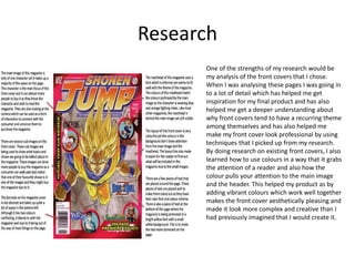
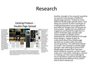
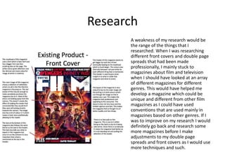
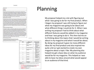
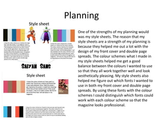
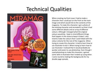
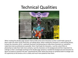
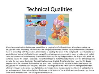
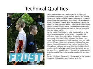
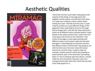
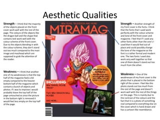
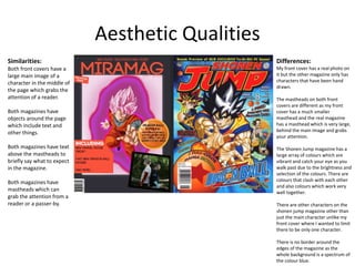
SlideShare a Scribd company logo
1 of 33
Evaluation
Ayrton Starkey
Production Process Evaluation
Research
One of the strengths of my research would be
my analysis of the front covers that I chose.
When I was analysing these pages I was going in
to a lot of detail which has helped me get
inspiration for my final product and has also
helped me get a deeper understanding about
why front covers tend to have a recurring theme
among themselves and has also helped me
make my front cover look professional by using
techniques that I picked up from my research.
By doing research on existing front covers, I also
learned how to use colours in a way that it grabs
the attention of a reader and also how the
colour pulls your attention to the main image
and the header. This helped my product as by
adding vibrant colours which work well together
makes the front cover aesthetically pleasing and
made it look more complex and creative than I
had previously imagined that I would create it.
Research
Another strength of my research would be
my research and analysis of different
double page spreads. I looked at many
different double page spreads when I was
doing my research so that I could get an
understanding about recurring patterns
and different designs that influenced my
final product. I gathered many different
magazines and looked through them in
search of double page spreads with
unique designs or designs which
interested me. Whilst looking for through
these designs, I began to gain an
understand about how double page
spreads are usually made and some
recurring themes. This definitely helped
me when I was making my double page
spreads I was referring to some of the
double page spreads that I had seen
whilst doing my research so that I could
make sure I was either sticking to a theme
or making sure that I was breaking the
recurring theme so that my double page
spread would be different from others
and so that it stands out.
Research
A weakness of my research would be
the range of the things that I
researched. When I was researching
different front covers and double page
spreads that had been made
professionally, I mainly stuck to
magazines about film and television
when I should have looked at an array
of different magazines for different
genres. This would have helped me
develop a magazine which could be
unique and different from other film
magazines as I could have used
conventions that are used mainly in
magazines based on other genres. If I
was to improve on my research I would
definitely go back and research some
more magazines before I make
adjustments to my double page
spreads and front covers as I would use
more techniques and such.
Planning
My proposal helped me a lot with figuring out
what I was going to do for my final product. When
I began my proposal I was still trying to figure out
what my magazine was going to be about and
what different things I could do for it. When I was
writing my proposal I had to think about what
different features would be added in my magazine
and how I was going to do it. This then led me on
to thinking about the topics that I would be writing
about in my magazine and what it would be about.
By doing my proposal it gave me many different
ideas for my final product and also inspired me
quite a bit as I got excited to create my own
magazine about a topic I like. My planning also
helped me get a base idea on what my audience
would be for my magazine. This helped as I was
able to base my ideas around what would appeal
to an audience of that kind.
Planning
One of the strengths of my planning would
was my style sheets. The reason that my
style sheets are a strength of my planning is
because they helped me out a lot with the
design of my front cover and double page
spreads. The colour schemes what I made in
my style sheets helped me get a good
balance between the colours I wanted to use
so that they all work together well and look
aesthetically pleasing. My style sheets also
helped me figure out which fonts I wanted to
use in both my front cover and double page
spreads. By using these fonts with the colour
schemes I could distinguish which fonts could
work with each colour scheme so that the
magazine looks professional.
Time Management
My time management was not very good as it took me quite a long time to end up finishing my project. I spent
a lot of time on making characters and my articles when I could have tried to find ways to do them faster. When
I was making my characters I took my time whilst making them as I wanted them to look professional and for
them to resemble what I was basing them off of. If I searched for a faster way to do the colouring of the
characters, it would have saved me a lot of time as it took a long time to keep adding different layers of shading
over each character so that they look good. My time management for my articles were also not very good as I
spent a lot of time thinking about what I was going to write in them and how I was going to write it. If I could
improve on this I would have made a plan about what I was going to write about in my articles and what my
double page spreads would be about. Doing this would have helped a lot as I would have spent less time on my
articles and more time on my production, adding more detail to my front covers and double page spreads.
When it came round to my production reflection, I think I managed my time well. There was always a dedicated
20 minutes at the end of each day where I would write about what I had been doing that day in my production
reflection. This helped a lot as if there was not this time, my production reflection would probably be less
detailed and contain less content as I would end up doing it a while later and I may have forgotten some of the
things that I had been doing that day. If I had more time to complete my work I would definitely go over my
front cover and both of my double page spreads and add more detail among other things.
Technical Qualities
When creating my front cover I had to make a
character that I could put on the front as the main
image and which would link to the contents of the
magazine. To make this character I got a photo of
the existing character and recreated it so that it had
some different details and an array of different
colours. Although I changed what the original
colours would be, I kept in mind different things
that happen in the show to keep it linked. I also
tried to make the colours that I used linked with the
colour scheme for the rest of the magazine. When
trying to create this character I tried to learn how to
use illustrator to do it. When trying to learn how to
use illustrator I realised that it would probably be
quicker and easier to use photoshop. Even though I
used photoshop to make this character, I gained
some skills in illustrator that I ended up using when
I came round to making the backgrounds for my
double page spreads.
Technical Qualities
When creating this double page spread I had to make some more characters so that I could make a group of
them under the villain of the show that I am talking about. When making the characters is used existing photos
to base the characters off of. I used both illustrator and photoshop to make these characters as I wanted to
make them look as professional as possible. Once I had made the characters, I use the cutout filter on
photoshop to make them look more cartoony. I put the characters on the background and then imported it to
indesign so that I could begin working on the double page spread as I needed the background and characters to
figure out where to position the text. I positioned the villain above the heroes to symbolise both his danger and
his superiority to the heroes as he is a deity and much more powerful than them.
Technical Qualities
When I was creating this double page spread I had to create a lot of different things. When I was making my
background I used photoshop and illustrator. The background I created contains a bunch of different islands that I
made in photoshop with the pen tool. When I came to creating the tower in the background, I used illustrator as I
wanted to add quite a lot of detail. I used many different features when making this tower to make sure it looked
clean and professional. Another thing that I made in illustrator for my background was the dragon balls which are
scattered around the screen. I also used a few different tools to make these objects and used the different colours
to make the have some shading on them so they look more detailed. The character that I used for this double
page spread is the same one that I used on my front cover. I mainly did this because he looks good against the
background but also because it was just a bit easier. The image above the article contains a range of characters
which are relevant to the show. I used photoshop to recreate these characters and lined them all up together to
get an image which shows all the fighters. The image at the bottom of the article is a screenshot that I got from a
show which relates to what I am talking about in the article.
Technical Qualities
When making this poster I used quite a lot of effects and
techniques to make the characters look like they do. To make
the arms of the hero look like they are made out of ice, I used
photoshop and a few different filters. Firstly, I desaturated his
arms, I then added a plastic wrap filter and then inverted the
colours of the arms. I then added a glass filter so that it looked
like his arms were frozen. Lastly, I added a hue and saturation
filter to the arms and colourised them so that the arms were
blue and looked like ice.
For the villain, I first started by using the clouds filter so that
there were clouds taking up the screen. I then added the
difference clouds filter, which added distinct lines between
each cloud. I then inverted the colours of the clouds. This
made the lines between the clouds stand out more and made
them a different colour. Next I changed the levels of the layer
so that the clouds disappeared but the lines remained. This
then allowed me to cut out some of the lines left behind and
use them on the villains arm so it looked like there is lava on
his arms. Once I added the lines, I changed the hue/saturation
and also added a filter to the actual arm so that his arm looks
dark.
For the title, I used the same ice effect as used for the hero on
the poster. I followed the same method to do this.
Aesthetic Qualities
I think that my front cover looks really good as the
majority of the things on the page work well
together and the colours mix well with each other
as I made sure to follow a colour scheme when
making the cover. I feel like my front cover is quite
creative as there are many different things on the
page and I have made objects to put on the page
like the dragon ball. I also like the colours because I
tried a lot of different colour schemes before I could
decide on the colour scheme that I used in the end.
I also spent a lot of time on the character in the
centre of the page as I was experimenting with
different colours and trying to make the character
look good. I tried adapting my character around a
few different colour schemes that I was going to use
with my front cover but once I chose the colour
scheme for my front cover, I tried to make my
character revolve around it whilst also keeping to
what has been seen in the show that I was talking
about. If I was to improve upon the colours, I would
make the aura around the character a bit more
transparent but other than that I think that my front
cover looks good as it is.
Aesthetic Qualities
Strength - I think that the majority
of the objects placed on the front
cover work well with the rest of the
page. The colours of the objects like
the dragon ball and the shape that
contains text work well with the
colour scheme of the front cover.
Due to the objects blending in with
the colour scheme, they don’t stand
out too much compared to the main
image and masthead which are
supposed to grab the attention of
the reader.
Strength – Another strength of
my front cover is the fonts. I think
that the fonts that I used work
perfectly with the colour scheme
and tone of the front cover and
magazine. I feel that if I used any
other fonts other than the one’s I
used then it would feel out of
place and could possibly change
the tone of the magazine as the
font is a rather formal and modern
one. The two fonts I used also
work very well together so that
one of them doesn’t stand out too
much from the other.
Weakness – One of the
weaknesses of my front cover is the
photo that is placed in the bottom
right of the screen. I feel like this
photo stands out too much from
the rest of the page and doesn’t
work well with the rest of the things
on the page. This is mainly due to
the contrast of the colours and the
fact that it is a photo of something
real compared to everything else on
the cover which is hand drawn and
has a cartoon-like resemblance.
Weakness – I think that another
one of my weaknesses is that the top
half of the magazine feels a bit
empty compared to the heavier
bottom half of the magazine which
contains a bunch of objects and
photos. If I was to improve I would
probably leave the top half of the
page untouched as once the picture
in the bottom right is removed it
would feel less empty on the top half
of the page.
Aesthetic Qualities
Similarities:
Both front covers have a
large main image of a
character in the middle of
the page which grabs the
attention of a reader.
Both magazines have
objects around the page
which include text and
other things.
Both magazines have text
above the mastheads to
briefly say what to expect
in the magazine.
Both magazines have
mastheads which can
grab the attention from a
reader or a passer-by.
Differences:
My front cover has a real photo on
it but the other magazine only has
characters that have been hand
drawn.
The mastheads on both front
covers are different as my front
cover has a much smaller
masthead and the real magazine
has a masthead which is very large,
behind the main image and grabs
your attention.
The Shonen Jump magazine has a
large array of colours which are
vibrant and catch your eye as you
walk past due to the brightness and
selection of the colours. There are
colours that clash with each other
and also colours which work very
well together.
There are other characters on the
shonen jump magazine other than
just the main character unlike my
front cover where I wanted to limit
there to be only one character.
There is no border around the
edges of the magazine as the
whole background is a spectrum of
the colour blue.
Aesthetic Qualities
I think that my design of this double page spread looks really good due to the characters in the middle and how the text is easily read with the
transparent background. I also like how neither side feels too heavy in terms of content due to the characters being such a large presence on the
page and also due to the small font size of the article. The article that I wrote for the for this double page spread is a good size as it takes up the right
amount of space on the spread whilst also being such a small font. What I think is quite creative about this double page spread is the way that the
characters mix in well with the background as if they are meant to be there and I also think that their design is creative as the as the heroes all have a
lot of blue and other bright colours on them whilst the villain above them is made from darker colours which contrasts with the heroes. By having
this colour difference it can help the reader differentiate who is who in the photos if they have not read the article. If I was to improve on this double
page spread I would probably either a new character or something else which can help take up some of the empty space in the top right hand side of
the page as it feels as though something could be missing from there. Another thing that I would improve on is the transparency of the background
of the text for the article. To improve the background I would make it a little bit more solid so that the texts stands out more and is easier to read as
it may be quite difficult at some parts currently due to the background of the double page spread being quite dark in some places like buildings etc.
Aesthetic QualitiesStrength – The
characters in the middle of
the page don’t draw too
much attention from the
article to the left of them.
The characters also look
very good and work well
with the background that I
have chosen for this double
page spread. The way that
the characters are placed
imply a hierarchy where the
character above is superior.
This is true in the show and
gives a good link between
the double page spread and
the film that I am talking
about in the article.
Strength – I think that
the article is a good strength
of my double page spread.
The article stands out from
the page whilst also having a
small font size. The amount of
text in the article is a good
amount as it resembles the
amount of text that you could
see in a real and professional
magazine. The background of
the text also helps the article
stand out from the
background and also makes it
a lot easier to read due to the
dark background of the page.
Weakness – One of the
weaknesses of this double
page spread is that the top
right of the spread feels
quite empty as there is
nothing but the background
image there. If I was to
improve on this weakness I
would probably extend the
yellow bar in the bottom
right so that it covers the
majority of the right hand
side of the page or I would
add another character which
is positioned there.
Weakness – Another
weakness of my double
page spread would be the
transparency of the
articles background. At
some points the text is
quite hard to read due to
the darkness of the
spreads background. To
improve on this I would
probably decrease the
transparency of the white
box so that it makes the
text easier to read over
the darkest parts of the
background.
Strength – I think that another one of my double page spreads strengths is
the yellow bar on the right of the page. This bar stands out enough to catch
the eye of the reader yet also blends in enough to not completely distract
them from the article and the characters placed in the middle of the page. I
wanted this bar to stand out quite a bit so that the advertisements on it would
be noticed my a reader. I have seen things like this done in professional
magazines so I wanted to try and emulate this in my own double page spread
so that it looked as realistic as possible.
Aesthetic Qualities
Similarities:
Both of these double page
spreads contain characters
which look like they are
ready to fight take up quite
a lot of the page.
Both magazines also have
characters which take up
the majority of the page and
pull the attention of the
reader as the colours that
they used for them are
vibrant and work well
together.
Both magazines have text
which takes priority over
the background of the page
so that it stands out just
enough to make it easy to
read and also so that it
stands out.
Both magazines have
sections where something is
being advertised in large
text and has a colourful
background to grab your
attention.
Differences:
There are many differences
between my double page spread
and this other one. The first one
being the amount of text that is
scattered around the screen. On
this other double page spread most
of the text on the page is
fragmented around the page so
that it keeps the reader interested
as they are not just looking at the
same part for quite a while.
Another difference is the amount
of colour being used on the page.
In my page I have used a
desaturated background with
bright characters whilst this other
page uses bright colours to
symbolise the heroes on one side
and dark colours on the other side
where there are villains.
On this other double page spread it
is split in to two halves so that the
villains can be on one side and the
heroes on the other. On my DPS I
chose to have the villain hovering
above the heroes so that it
symbolises that the villain is
superior to them and that he is a
diety.
Aesthetic Qualities
I am very happy with this double page spread as I think it came out looking really good in many different ways. I think that the background
works really well with the rest of the page and the character that is taking up the right hand side of the page. I intentionally made this
character very large as I wanted him to take up the entire right hand side of the page. I had seen this done in many magazines that I had
looked through before I made this double page spread and was very inspired by it which lead me to make my own version of it for my final
product. I also think that the left side of the page looks great. This is because of the layout of the text, images and titles all working together
very well to make an aesthetically pleasing segment. The images that are placed with the article work well with the background due to the
colour schemes of them and they don’t pull the attention from the masthead and the article. I think that this double page spread looks very
professional and looks like something that you would see in a real magazine if bought one. I don’t particularly feel like I want to make any
improvements to my double page spread as I think that there is none to be done and my spread looks great as it is. The colours work well
together as I used a colour scheme to make sure that no colours were clashing.
Aesthetic Qualities
Strength – One strength of
this double page spread is
the box in which the article,
images and masthead is kept.
I made sure that this box was
solid enough to ensure that
the text is readable while
also making it transparent
enough so that you can see
the background behind it. I
think this gives the page a
great look as the section
would look bland and
uninteresting if the
background for the text was
just one plain colour.
Strength – Another
strength of my double page
spread would be the colours.
The colours are very vibrant
and keep the reader
interested. There are no
bland colours as I followed a
colour scheme so that I was
sure that I only used vibrant
colours. I made sure that the
colours did not clash with
each other as that would
make the page look
unappealing and possibly
drive away a reader.
Weakness – A weakness
of this double page spread is
the detail of the background.
I wished to have had more
islands and detail on the
background but I decided
that having too much detail
would pull attention for the
wrong reasons. I quite like
having minimal detail as it is
not distracting but I would
not mind having a little bit
more detail so that it stays
interesting. If I could improve
I would add some trees and
foliage to the islands.
Strength – A strength of this
page would be the placement of
the character and how the
background blends with the rest
of the page. Although the
character is very large and takes
up a majority of the page, it does
not pull too much attention and
keeps the reader from being too
distracted from the article yet also
keeps them interested at the
same time. As for the background,
it works very well with the
character and he seems like he
belongs there. The background
also works well with the section of
text and images which makes the
page look more professional and
aesthetically pleasing.
Aesthetic Qualities
Similarities:
Both of these double page
spreads have large
characters taking up the
majority of the spread.
Both magazines have
sections of text where the
masthead, article and
images are so that the
image does not take priority
over them.
Both magazines utilise
colours in a way that they
keep the reader interested
and don’t bore the reader
due to mundane and
desaturated colours. They
instead use bright and
vibrant colours.
Both magazines use images
which work with the colour
scheme of the double page
spread so that they don’t
stand out too much
compared to the rest of the
page.
Differences:
One of the differences between
these two double page spreads is the
background. In my double page
spread the background takes up the
entire page whilst in this other
spread there is an image that takes
up the majority of the page.
Another difference is the way the
background is used. In my double
page spread I use the background
aesthetically and make it look
interesting and colourful whilst on
this other spread they use the
background as something that’s sole
purpose is to overwrite.
The other double page spread has a
section of text separated from the
main image just like mine but my
section of text has a transparent
background so that you can see the
image behind it, which makes it look
better in my opinion.
My double page spread is also much
more colourful than this other
spread as I used a wide range of
colours whilst sticking to a colour
scheme yet this other double page
spread only used a few different
colours, mainly in the main image.
Aesthetic Qualities
Strength – One strength of my
poster is the title. I think that the
title looks really good and works with
the poster along with the theme of
the film. The font of the title is really
good as it works very well with the
effects that I have been using to
make things look like ice. If I was
using any other font I don’t believe
that the title would look as good,
resulting in my poster looking worse
as a whole. If I did not have a header,
I also believe that the poster would
look much worse due to it. I am very
happy with how this poster turned
out and how the header makes the
poster look so good.
Strength – Another strength
of my poster would be the way
that the images are split and
fragmented on the poster.
These images compensate for
the title covering the arms of
the hero, which is covering his
power. By adding these
fragmented sections, you are
able to see what the hero looks
like properly, without
obstruction.
Weakness – A weakness of my
poster would be how the title is
obstructing the arms of the hero
in the main part of the image. This
makes it so at first glance, you do
not notice the heroes powers, but
the villains instead. To make up for
this I added a couple images at the
top of the poster so that you can
see the heroes arms and see his
powers.
Weakness – Another weakness of
my poster would be the arm of the
villain. I have tried to make the
villain (left) have arms that look like
they could be made from magma.
Although it does not look a lot like
magma, I still think you can tell that
he must have some sort of power
that revolves around fire and heat. If
I could improve this I would make
sure that the villains powers look
more distinct and realistic so that
you can tell what his powers are
precisely just by looking at his arms
and the name of the film.
Aesthetic Qualities
Similarities:
Both of these posters have
characters standing back to
back. This could symbolise
that the characters are
enemies or friends.
Both posters have a large
title which takes up a good
proportion of the page. This
helps grab the attention of
somebody who glances at
the poster.
Both posters have the
actors names next to the
title. This is a common
theme with posters, so I
tried to replicate this when
making mine.
Differences:
One of the differences between my
poster and this blade runner poster is the
amount of colour. On my poster there
are only a few colours that stand out
whilst the rest are less saturated to make
the characters stand out. In the blade
runner poster there are very vibrant
colours which make the characters stand
out whilst making the poster look very
good.
Another difference would be the amount
of characters. The amount of different
characters being shown on the poster is
different on the blade runner poster than
on mine. This is mainly due to there
being more main characters in the blade
runner film than there is in my fictional
one. This difference does not make my
poster a worse though as having two
characters on a page can have the same
impact as having 6 or so.
Another difference would be the text on
the poster. On my poster the only text is
the title and the actors names. On the
blade runner poster there are is quite a
lot of text containing information about
the film like when it is being released,
what studio it is from, etc. This is what is
usually found when looking at the
bottom of posters yet I did not add it. If I
could improve I would probably end up
adding text like this just to make my
poster seem more authentic.
Audience AppealTo appeal to my audience I
made my front cover less
formal than I originally wanted
to. I added more vibrant
colours and more straight
forward information to keep
their interest.
Since my audience consists of a
lot of people who do not
usually read magazines, I made
my front cover consist of bright
and vibrant colours so that it
catches their attention and
hopefully interests them
enough that they end up
reading it.
The majority of my audience
wanted to see a film and
television magazine which is
what I made. I was originally
going to make a magazine with
this concept so I did not have
to change anything to appeal
to my audience in this degree.
My audience wanted to see
news and information about
new films and shows which
were being released. To appeal
to my audience, I added short
lines of text which gave brief
news and information about
some films and shows on my
front cover.
All of my audience said that
they would read a magazine
which covers the topics that I
wanted to use in my magazine.
I appealed to my audience by
making the magazine on those
topics.
I added a price tag in the range
of £2-3 which is the range that
the majority of my audience
would pay for a magazine if
they were to buy one.
Audience Appeal
To appeal to my audience on this double page spread I made sure that I designed it to be a bit informal so that the
age group that my magazine caters for will stay interested. The main bit of the page which is informal is the
advertising on the right hand side of the page. I also catered to my audience by revolving this double page spread
around a concept that my audience said that they would read about. I had this in mind when I was creating this
page as I wanted to make something that my audience would read if it was a real magazine. When I was writing my
article for this double page spread, I kept in mind what my audience wanted to read in a magazine like the one I
was making. I made sure that I included news and information about the shows that I was talking about in my
articles so that I could appeal to my audience.
Audience Appeal
This double page spread that I made is also quite informal to suit my audience. The main informality comes from
the background of the spread as it is quite cartoony and filled with bright and vibrant colours. The title of the
article is also quite informal due to the different colours that are included in it. I also tried to appeal to my
audience by writing about news and information about a show, which is what most of them said that they wanted
to see in a magazine like the one I created. Since my audience said that they would buy a magazine which covers
the topics I was going to write about, I did not change my original plan for this double page spread as I knew that
my audience would be happy to buy the magazine if I stuck to that plan.
Audience Appeal
When I was making my poster
I had to keep in mind how I
could design it so that it
appeals to my audience.
One of the ways that I
appealed to my target
audience is by making the
title of the film catch your
eye. This is so that it can grab
the attention of a passer-by
and possible convince them
to want to go and see the
film.
Another way that I appealed
to my audience was by trying
to make my poster look
appealing. I think that my
poster looks quite good and
hopefully my audience also
will do. I tried to make the
poster look quite colourful so
it looks aesthetically pleasing
and appeals to a person
looking at it.
When I conducted my survey my
audience said that they read a
magazine about film and
television mainly. To appeal to
my audience with my poster I
decided to make one for a film so
that it aligns with the topics of
my magazine and what my
audience wanted from my final
project.
Since my audience said that they
would buy a magazine covering
topics such as film and
television, I think that this poser
would appeal to my audience as
it is a film poster.
Peer
Feedback
Feedback 1
• What did you like about the product?
– The art is very high-quality and looks extremely professional. Within the front
cover everything is nicely composed within the frame as well as there being a
frame around the central image which nicely guides your eye to the cover
image as well as making the mast head and all the blobs and stars stand out
extremely well. All the colours used overall compliment each other but where
necessary (the mast head and pieces of information) they work quite well to
contrast. This makes an overall very visually pleasing front cover.
– The first DPS background looks really nice as the colours all match nicely in
saturation and temperature as well as there being a nice balance within the
frame between content and dead space.
• What improvements could have been made to the product?
– The only improvement I can think of is darkening down the characters in the
second DPS background as they don’t really fit into the scene yet. The
background is relatively desaturated and green however the characters are
very vibrant and bright. So maybe I’d just darken them down and desaturate
them a little bit so they blend/fit within the scene more.
Feedback 2
• What did you like about the product?
– From what there is, I feel like it is impressive in how the characters
have been created by you, from looking at the originals.
– I also love how you have kept to conventions of a magazine and have
got clear header and articles where you would expect them.
• What improvements could have been made to the product?
– Personally, I feel like there should be slightly more in terms of articles
to intrigue the reader as it seems like one that would mainly appeal to
their existing readership, and be hard to get more possible readers
through pure finding them in a shop.
Feedback 3
• What did you like about the product?
– First of all I especially like the design of the poster as
all the information is easy to navigate and the image
in the middle is easy to see for it grab the audiences
attention.
– The black and orange also fits with the characters
clothing which comforts my eyes.
• What improvements could have been made to
the product?
– the dragon ball information is slightly difficult to read
as its over an image with different colours such as the
stars disturbing the mind.
Peer Feedback Summary
• What do you agree with from your peer
feedback?
I agree with the feedback about the text being quite difficult to read over the
stars on the dragon ball. To make the text more readable I would at a stroke
around the text so that it stands out more against the colours in the background
and makes it easier to read.
• What do you disagree with from your peer
feedback?
– I disagree with the feedback about changing the saturation of the
characters on my second double page spread. This is because I wanted my
characters to stand out from the background that they are placed on top
of. I also think that the saturation of the characters compared to the
background is fine as they do not stand out too much compared to the
rest of the page.
Peer Feedback Summary

More Related Content

What's hot

Digital graphics
Digital graphicsDigital graphics
Digital graphicsemilyap1
 
Development pro forma
Development pro formaDevelopment pro forma
Development pro formaemilyap1
 
Factual Development and Planning Pro Forma
Factual Development and Planning Pro FormaFactual Development and Planning Pro Forma
Factual Development and Planning Pro FormaShaniceYates
 
Digital graphics evaluation pro forma
Digital graphics evaluation pro formaDigital graphics evaluation pro forma
Digital graphics evaluation pro formatwilliams1992
 
Digital Grahics
Digital GrahicsDigital Grahics
Digital Grahicsemilyap1
 
6. fmp production reflection improved
6. fmp production reflection improved6. fmp production reflection improved
6. fmp production reflection improvedBenjaminLawrenson
 
Print pro forma
Print pro formaPrint pro forma
Print pro formaAllanGodin
 
The Grid Reflections
The Grid ReflectionsThe Grid Reflections
The Grid ReflectionsShaniceYates
 
Print pro forma
Print pro formaPrint pro forma
Print pro formaAllanGodin
 
Production reflection
Production reflectionProduction reflection
Production reflectionLuke Ross
 
Development graphics scott wilson
Development graphics scott wilsonDevelopment graphics scott wilson
Development graphics scott wilsonScottWilson977
 
Development graphics scott wilson 1
Development graphics scott wilson 1Development graphics scott wilson 1
Development graphics scott wilson 1ScottWilson977
 
6. production reflection f
6. production reflection f 6. production reflection f
6. production reflection f AlicjaMorawska
 

What's hot (20)

7. evaluation
7. evaluation7. evaluation
7. evaluation
 
Digital graphics
Digital graphicsDigital graphics
Digital graphics
 
Development pro forma
Development pro formaDevelopment pro forma
Development pro forma
 
Factual Development and Planning Pro Forma
Factual Development and Planning Pro FormaFactual Development and Planning Pro Forma
Factual Development and Planning Pro Forma
 
Digital graphics evaluation pro forma
Digital graphics evaluation pro formaDigital graphics evaluation pro forma
Digital graphics evaluation pro forma
 
7. evaluation
7. evaluation7. evaluation
7. evaluation
 
Evaluation
EvaluationEvaluation
Evaluation
 
Digital Grahics
Digital GrahicsDigital Grahics
Digital Grahics
 
Pre Production
Pre ProductionPre Production
Pre Production
 
6. fmp production reflection improved
6. fmp production reflection improved6. fmp production reflection improved
6. fmp production reflection improved
 
Overallevaluation
OverallevaluationOverallevaluation
Overallevaluation
 
Print pro forma
Print pro formaPrint pro forma
Print pro forma
 
My contents page analyss
My contents page analyssMy contents page analyss
My contents page analyss
 
The Grid Reflections
The Grid ReflectionsThe Grid Reflections
The Grid Reflections
 
Print pro forma
Print pro formaPrint pro forma
Print pro forma
 
Production reflection
Production reflectionProduction reflection
Production reflection
 
Development graphics scott wilson
Development graphics scott wilsonDevelopment graphics scott wilson
Development graphics scott wilson
 
Development graphics scott wilson 1
Development graphics scott wilson 1Development graphics scott wilson 1
Development graphics scott wilson 1
 
5. Evaluation
5. Evaluation5. Evaluation
5. Evaluation
 
6. production reflection f
6. production reflection f 6. production reflection f
6. production reflection f
 

Similar to Evaluation

Digital graphics evaluation pro forma
Digital graphics evaluation pro formaDigital graphics evaluation pro forma
Digital graphics evaluation pro formaAaron Aacster
 
Digital graphics evaluation pro forma
Digital graphics evaluation pro formaDigital graphics evaluation pro forma
Digital graphics evaluation pro formaENCRES DUBUIT
 
Digital graphics evaluation pro forma
Digital graphics evaluation pro formaDigital graphics evaluation pro forma
Digital graphics evaluation pro formaaa12134455
 
7. Evaluation FMP (Liberty Whitehorn)
7. Evaluation FMP (Liberty Whitehorn)7. Evaluation FMP (Liberty Whitehorn)
7. Evaluation FMP (Liberty Whitehorn)Libby Whitehorn
 
Question 7 powerpoint presentation
Question 7 powerpoint presentationQuestion 7 powerpoint presentation
Question 7 powerpoint presentationboomgag
 
(6) production reflection
(6) production reflection(6) production reflection
(6) production reflectionerinstephensxn
 
Factual layout evaluation
Factual layout evaluationFactual layout evaluation
Factual layout evaluationashboyne
 
Digital graphics evaluation pro forma
Digital graphics evaluation pro formaDigital graphics evaluation pro forma
Digital graphics evaluation pro formaFinlay Jackson
 
Construction
ConstructionConstruction
Constructionsalaffina
 

Similar to Evaluation (20)

Evaluation
EvaluationEvaluation
Evaluation
 
Digital graphics evaluation pro forma
Digital graphics evaluation pro formaDigital graphics evaluation pro forma
Digital graphics evaluation pro forma
 
Digital graphics evaluation pro forma
Digital graphics evaluation pro formaDigital graphics evaluation pro forma
Digital graphics evaluation pro forma
 
7. evaluation(1)
7. evaluation(1)7. evaluation(1)
7. evaluation(1)
 
Task 7
Task 7Task 7
Task 7
 
7. evaluation Print
7. evaluation Print7. evaluation Print
7. evaluation Print
 
7. evaluation done
7. evaluation done7. evaluation done
7. evaluation done
 
Digital graphics evaluation pro forma
Digital graphics evaluation pro formaDigital graphics evaluation pro forma
Digital graphics evaluation pro forma
 
7. evaluation(3)
7. evaluation(3)7. evaluation(3)
7. evaluation(3)
 
7. Evaluation FMP (Liberty Whitehorn)
7. Evaluation FMP (Liberty Whitehorn)7. Evaluation FMP (Liberty Whitehorn)
7. Evaluation FMP (Liberty Whitehorn)
 
7. evaluation
7. evaluation7. evaluation
7. evaluation
 
Fmp Reflections
Fmp ReflectionsFmp Reflections
Fmp Reflections
 
Evaluation
Evaluation Evaluation
Evaluation
 
Evaluation
EvaluationEvaluation
Evaluation
 
Question 7 powerpoint presentation
Question 7 powerpoint presentationQuestion 7 powerpoint presentation
Question 7 powerpoint presentation
 
(6) production reflection
(6) production reflection(6) production reflection
(6) production reflection
 
Factual layout evaluation
Factual layout evaluationFactual layout evaluation
Factual layout evaluation
 
Digital graphics evaluation pro forma
Digital graphics evaluation pro formaDigital graphics evaluation pro forma
Digital graphics evaluation pro forma
 
Construction
ConstructionConstruction
Construction
 
7. evaluation
7. evaluation7. evaluation
7. evaluation
 

More from Ayrton Starkey (20)

Research
ResearchResearch
Research
 
Reflections
ReflectionsReflections
Reflections
 
Evaluation
EvaluationEvaluation
Evaluation
 
Production Reflection
Production ReflectionProduction Reflection
Production Reflection
 
Pre-Production
Pre-ProductionPre-Production
Pre-Production
 
Production Experiments
Production ExperimentsProduction Experiments
Production Experiments
 
Research
ResearchResearch
Research
 
Proposal
ProposalProposal
Proposal
 
Initial Plans
Initial PlansInitial Plans
Initial Plans
 
Pre-Production
Pre-ProductionPre-Production
Pre-Production
 
Production Experiments
Production ExperimentsProduction Experiments
Production Experiments
 
Research
ResearchResearch
Research
 
Production Reflection
Production ReflectionProduction Reflection
Production Reflection
 
Production Reflection
Production ReflectionProduction Reflection
Production Reflection
 
Proposal
ProposalProposal
Proposal
 
Research
ResearchResearch
Research
 
Reflections
ReflectionsReflections
Reflections
 
1. Initial Plans
1. Initial Plans1. Initial Plans
1. Initial Plans
 
3. Research
3. Research3. Research
3. Research
 
6. evaluation sf 2017
6. evaluation sf 20176. evaluation sf 2017
6. evaluation sf 2017
 

Recently uploaded

BASLIQ CURRENT LOOKBOOK LOOKBOOK(1) (1).pdf
BASLIQ CURRENT LOOKBOOK  LOOKBOOK(1) (1).pdfBASLIQ CURRENT LOOKBOOK  LOOKBOOK(1) (1).pdf
BASLIQ CURRENT LOOKBOOK LOOKBOOK(1) (1).pdfSoniaTolstoy
 
9548086042 for call girls in Indira Nagar with room service
9548086042  for call girls in Indira Nagar  with room service9548086042  for call girls in Indira Nagar  with room service
9548086042 for call girls in Indira Nagar with room servicediscovermytutordmt
 
POINT- BIOCHEMISTRY SEM 2 ENZYMES UNIT 5.pptx
POINT- BIOCHEMISTRY SEM 2 ENZYMES UNIT 5.pptxPOINT- BIOCHEMISTRY SEM 2 ENZYMES UNIT 5.pptx
POINT- BIOCHEMISTRY SEM 2 ENZYMES UNIT 5.pptxSayali Powar
 
Grant Readiness 101 TechSoup and Remy Consulting
Grant Readiness 101 TechSoup and Remy ConsultingGrant Readiness 101 TechSoup and Remy Consulting
Grant Readiness 101 TechSoup and Remy ConsultingTechSoup
 
Disha NEET Physics Guide for classes 11 and 12.pdf
Disha NEET Physics Guide for classes 11 and 12.pdfDisha NEET Physics Guide for classes 11 and 12.pdf
Disha NEET Physics Guide for classes 11 and 12.pdfchloefrazer622
 
Advanced Views - Calendar View in Odoo 17
Advanced Views - Calendar View in Odoo 17Advanced Views - Calendar View in Odoo 17
Advanced Views - Calendar View in Odoo 17Celine George
 
Call Girls in Dwarka Mor Delhi Contact Us 9654467111
Call Girls in Dwarka Mor Delhi Contact Us 9654467111Call Girls in Dwarka Mor Delhi Contact Us 9654467111
Call Girls in Dwarka Mor Delhi Contact Us 9654467111Sapana Sha
 
JAPAN: ORGANISATION OF PMDA, PHARMACEUTICAL LAWS & REGULATIONS, TYPES OF REGI...
JAPAN: ORGANISATION OF PMDA, PHARMACEUTICAL LAWS & REGULATIONS, TYPES OF REGI...JAPAN: ORGANISATION OF PMDA, PHARMACEUTICAL LAWS & REGULATIONS, TYPES OF REGI...
JAPAN: ORGANISATION OF PMDA, PHARMACEUTICAL LAWS & REGULATIONS, TYPES OF REGI...anjaliyadav012327
 
Presentation by Andreas Schleicher Tackling the School Absenteeism Crisis 30 ...
Presentation by Andreas Schleicher Tackling the School Absenteeism Crisis 30 ...Presentation by Andreas Schleicher Tackling the School Absenteeism Crisis 30 ...
Presentation by Andreas Schleicher Tackling the School Absenteeism Crisis 30 ...EduSkills OECD
 
Web & Social Media Analytics Previous Year Question Paper.pdf
Web & Social Media Analytics Previous Year Question Paper.pdfWeb & Social Media Analytics Previous Year Question Paper.pdf
Web & Social Media Analytics Previous Year Question Paper.pdfJayanti Pande
 
1029 - Danh muc Sach Giao Khoa 10 . pdf
1029 -  Danh muc Sach Giao Khoa 10 . pdf1029 -  Danh muc Sach Giao Khoa 10 . pdf
1029 - Danh muc Sach Giao Khoa 10 . pdfQucHHunhnh
 
Nutritional Needs Presentation - HLTH 104
Nutritional Needs Presentation - HLTH 104Nutritional Needs Presentation - HLTH 104
Nutritional Needs Presentation - HLTH 104misteraugie
 
Interactive Powerpoint_How to Master effective communication
Interactive Powerpoint_How to Master effective communicationInteractive Powerpoint_How to Master effective communication
Interactive Powerpoint_How to Master effective communicationnomboosow
 
Kisan Call Centre - To harness potential of ICT in Agriculture by answer farm...
Kisan Call Centre - To harness potential of ICT in Agriculture by answer farm...Kisan Call Centre - To harness potential of ICT in Agriculture by answer farm...
Kisan Call Centre - To harness potential of ICT in Agriculture by answer farm...Krashi Coaching
 
Arihant handbook biology for class 11 .pdf
Arihant handbook biology for class 11 .pdfArihant handbook biology for class 11 .pdf
Arihant handbook biology for class 11 .pdfchloefrazer622
 
social pharmacy d-pharm 1st year by Pragati K. Mahajan
social pharmacy d-pharm 1st year by Pragati K. Mahajansocial pharmacy d-pharm 1st year by Pragati K. Mahajan
social pharmacy d-pharm 1st year by Pragati K. Mahajanpragatimahajan3
 
CARE OF CHILD IN INCUBATOR..........pptx
CARE OF CHILD IN INCUBATOR..........pptxCARE OF CHILD IN INCUBATOR..........pptx
CARE OF CHILD IN INCUBATOR..........pptxGaneshChakor2
 

Recently uploaded (20)

Mattingly "AI & Prompt Design: Structured Data, Assistants, & RAG"
Mattingly "AI & Prompt Design: Structured Data, Assistants, & RAG"Mattingly "AI & Prompt Design: Structured Data, Assistants, & RAG"
Mattingly "AI & Prompt Design: Structured Data, Assistants, & RAG"
 
BASLIQ CURRENT LOOKBOOK LOOKBOOK(1) (1).pdf
BASLIQ CURRENT LOOKBOOK  LOOKBOOK(1) (1).pdfBASLIQ CURRENT LOOKBOOK  LOOKBOOK(1) (1).pdf
BASLIQ CURRENT LOOKBOOK LOOKBOOK(1) (1).pdf
 
9548086042 for call girls in Indira Nagar with room service
9548086042  for call girls in Indira Nagar  with room service9548086042  for call girls in Indira Nagar  with room service
9548086042 for call girls in Indira Nagar with room service
 
Código Creativo y Arte de Software | Unidad 1
Código Creativo y Arte de Software | Unidad 1Código Creativo y Arte de Software | Unidad 1
Código Creativo y Arte de Software | Unidad 1
 
POINT- BIOCHEMISTRY SEM 2 ENZYMES UNIT 5.pptx
POINT- BIOCHEMISTRY SEM 2 ENZYMES UNIT 5.pptxPOINT- BIOCHEMISTRY SEM 2 ENZYMES UNIT 5.pptx
POINT- BIOCHEMISTRY SEM 2 ENZYMES UNIT 5.pptx
 
Grant Readiness 101 TechSoup and Remy Consulting
Grant Readiness 101 TechSoup and Remy ConsultingGrant Readiness 101 TechSoup and Remy Consulting
Grant Readiness 101 TechSoup and Remy Consulting
 
Disha NEET Physics Guide for classes 11 and 12.pdf
Disha NEET Physics Guide for classes 11 and 12.pdfDisha NEET Physics Guide for classes 11 and 12.pdf
Disha NEET Physics Guide for classes 11 and 12.pdf
 
Advance Mobile Application Development class 07
Advance Mobile Application Development class 07Advance Mobile Application Development class 07
Advance Mobile Application Development class 07
 
Advanced Views - Calendar View in Odoo 17
Advanced Views - Calendar View in Odoo 17Advanced Views - Calendar View in Odoo 17
Advanced Views - Calendar View in Odoo 17
 
Call Girls in Dwarka Mor Delhi Contact Us 9654467111
Call Girls in Dwarka Mor Delhi Contact Us 9654467111Call Girls in Dwarka Mor Delhi Contact Us 9654467111
Call Girls in Dwarka Mor Delhi Contact Us 9654467111
 
JAPAN: ORGANISATION OF PMDA, PHARMACEUTICAL LAWS & REGULATIONS, TYPES OF REGI...
JAPAN: ORGANISATION OF PMDA, PHARMACEUTICAL LAWS & REGULATIONS, TYPES OF REGI...JAPAN: ORGANISATION OF PMDA, PHARMACEUTICAL LAWS & REGULATIONS, TYPES OF REGI...
JAPAN: ORGANISATION OF PMDA, PHARMACEUTICAL LAWS & REGULATIONS, TYPES OF REGI...
 
Presentation by Andreas Schleicher Tackling the School Absenteeism Crisis 30 ...
Presentation by Andreas Schleicher Tackling the School Absenteeism Crisis 30 ...Presentation by Andreas Schleicher Tackling the School Absenteeism Crisis 30 ...
Presentation by Andreas Schleicher Tackling the School Absenteeism Crisis 30 ...
 
Web & Social Media Analytics Previous Year Question Paper.pdf
Web & Social Media Analytics Previous Year Question Paper.pdfWeb & Social Media Analytics Previous Year Question Paper.pdf
Web & Social Media Analytics Previous Year Question Paper.pdf
 
1029 - Danh muc Sach Giao Khoa 10 . pdf
1029 -  Danh muc Sach Giao Khoa 10 . pdf1029 -  Danh muc Sach Giao Khoa 10 . pdf
1029 - Danh muc Sach Giao Khoa 10 . pdf
 
Nutritional Needs Presentation - HLTH 104
Nutritional Needs Presentation - HLTH 104Nutritional Needs Presentation - HLTH 104
Nutritional Needs Presentation - HLTH 104
 
Interactive Powerpoint_How to Master effective communication
Interactive Powerpoint_How to Master effective communicationInteractive Powerpoint_How to Master effective communication
Interactive Powerpoint_How to Master effective communication
 
Kisan Call Centre - To harness potential of ICT in Agriculture by answer farm...
Kisan Call Centre - To harness potential of ICT in Agriculture by answer farm...Kisan Call Centre - To harness potential of ICT in Agriculture by answer farm...
Kisan Call Centre - To harness potential of ICT in Agriculture by answer farm...
 
Arihant handbook biology for class 11 .pdf
Arihant handbook biology for class 11 .pdfArihant handbook biology for class 11 .pdf
Arihant handbook biology for class 11 .pdf
 
social pharmacy d-pharm 1st year by Pragati K. Mahajan
social pharmacy d-pharm 1st year by Pragati K. Mahajansocial pharmacy d-pharm 1st year by Pragati K. Mahajan
social pharmacy d-pharm 1st year by Pragati K. Mahajan
 
CARE OF CHILD IN INCUBATOR..........pptx
CARE OF CHILD IN INCUBATOR..........pptxCARE OF CHILD IN INCUBATOR..........pptx
CARE OF CHILD IN INCUBATOR..........pptx
 

Evaluation

  • 3. Research One of the strengths of my research would be my analysis of the front covers that I chose. When I was analysing these pages I was going in to a lot of detail which has helped me get inspiration for my final product and has also helped me get a deeper understanding about why front covers tend to have a recurring theme among themselves and has also helped me make my front cover look professional by using techniques that I picked up from my research. By doing research on existing front covers, I also learned how to use colours in a way that it grabs the attention of a reader and also how the colour pulls your attention to the main image and the header. This helped my product as by adding vibrant colours which work well together makes the front cover aesthetically pleasing and made it look more complex and creative than I had previously imagined that I would create it.
  • 4. Research Another strength of my research would be my research and analysis of different double page spreads. I looked at many different double page spreads when I was doing my research so that I could get an understanding about recurring patterns and different designs that influenced my final product. I gathered many different magazines and looked through them in search of double page spreads with unique designs or designs which interested me. Whilst looking for through these designs, I began to gain an understand about how double page spreads are usually made and some recurring themes. This definitely helped me when I was making my double page spreads I was referring to some of the double page spreads that I had seen whilst doing my research so that I could make sure I was either sticking to a theme or making sure that I was breaking the recurring theme so that my double page spread would be different from others and so that it stands out.
  • 5. Research A weakness of my research would be the range of the things that I researched. When I was researching different front covers and double page spreads that had been made professionally, I mainly stuck to magazines about film and television when I should have looked at an array of different magazines for different genres. This would have helped me develop a magazine which could be unique and different from other film magazines as I could have used conventions that are used mainly in magazines based on other genres. If I was to improve on my research I would definitely go back and research some more magazines before I make adjustments to my double page spreads and front covers as I would use more techniques and such.
  • 6. Planning My proposal helped me a lot with figuring out what I was going to do for my final product. When I began my proposal I was still trying to figure out what my magazine was going to be about and what different things I could do for it. When I was writing my proposal I had to think about what different features would be added in my magazine and how I was going to do it. This then led me on to thinking about the topics that I would be writing about in my magazine and what it would be about. By doing my proposal it gave me many different ideas for my final product and also inspired me quite a bit as I got excited to create my own magazine about a topic I like. My planning also helped me get a base idea on what my audience would be for my magazine. This helped as I was able to base my ideas around what would appeal to an audience of that kind.
  • 7. Planning One of the strengths of my planning would was my style sheets. The reason that my style sheets are a strength of my planning is because they helped me out a lot with the design of my front cover and double page spreads. The colour schemes what I made in my style sheets helped me get a good balance between the colours I wanted to use so that they all work together well and look aesthetically pleasing. My style sheets also helped me figure out which fonts I wanted to use in both my front cover and double page spreads. By using these fonts with the colour schemes I could distinguish which fonts could work with each colour scheme so that the magazine looks professional.
  • 8. Time Management My time management was not very good as it took me quite a long time to end up finishing my project. I spent a lot of time on making characters and my articles when I could have tried to find ways to do them faster. When I was making my characters I took my time whilst making them as I wanted them to look professional and for them to resemble what I was basing them off of. If I searched for a faster way to do the colouring of the characters, it would have saved me a lot of time as it took a long time to keep adding different layers of shading over each character so that they look good. My time management for my articles were also not very good as I spent a lot of time thinking about what I was going to write in them and how I was going to write it. If I could improve on this I would have made a plan about what I was going to write about in my articles and what my double page spreads would be about. Doing this would have helped a lot as I would have spent less time on my articles and more time on my production, adding more detail to my front covers and double page spreads. When it came round to my production reflection, I think I managed my time well. There was always a dedicated 20 minutes at the end of each day where I would write about what I had been doing that day in my production reflection. This helped a lot as if there was not this time, my production reflection would probably be less detailed and contain less content as I would end up doing it a while later and I may have forgotten some of the things that I had been doing that day. If I had more time to complete my work I would definitely go over my front cover and both of my double page spreads and add more detail among other things.
  • 9. Technical Qualities When creating my front cover I had to make a character that I could put on the front as the main image and which would link to the contents of the magazine. To make this character I got a photo of the existing character and recreated it so that it had some different details and an array of different colours. Although I changed what the original colours would be, I kept in mind different things that happen in the show to keep it linked. I also tried to make the colours that I used linked with the colour scheme for the rest of the magazine. When trying to create this character I tried to learn how to use illustrator to do it. When trying to learn how to use illustrator I realised that it would probably be quicker and easier to use photoshop. Even though I used photoshop to make this character, I gained some skills in illustrator that I ended up using when I came round to making the backgrounds for my double page spreads.
  • 10. Technical Qualities When creating this double page spread I had to make some more characters so that I could make a group of them under the villain of the show that I am talking about. When making the characters is used existing photos to base the characters off of. I used both illustrator and photoshop to make these characters as I wanted to make them look as professional as possible. Once I had made the characters, I use the cutout filter on photoshop to make them look more cartoony. I put the characters on the background and then imported it to indesign so that I could begin working on the double page spread as I needed the background and characters to figure out where to position the text. I positioned the villain above the heroes to symbolise both his danger and his superiority to the heroes as he is a deity and much more powerful than them.
  • 11. Technical Qualities When I was creating this double page spread I had to create a lot of different things. When I was making my background I used photoshop and illustrator. The background I created contains a bunch of different islands that I made in photoshop with the pen tool. When I came to creating the tower in the background, I used illustrator as I wanted to add quite a lot of detail. I used many different features when making this tower to make sure it looked clean and professional. Another thing that I made in illustrator for my background was the dragon balls which are scattered around the screen. I also used a few different tools to make these objects and used the different colours to make the have some shading on them so they look more detailed. The character that I used for this double page spread is the same one that I used on my front cover. I mainly did this because he looks good against the background but also because it was just a bit easier. The image above the article contains a range of characters which are relevant to the show. I used photoshop to recreate these characters and lined them all up together to get an image which shows all the fighters. The image at the bottom of the article is a screenshot that I got from a show which relates to what I am talking about in the article.
  • 12. Technical Qualities When making this poster I used quite a lot of effects and techniques to make the characters look like they do. To make the arms of the hero look like they are made out of ice, I used photoshop and a few different filters. Firstly, I desaturated his arms, I then added a plastic wrap filter and then inverted the colours of the arms. I then added a glass filter so that it looked like his arms were frozen. Lastly, I added a hue and saturation filter to the arms and colourised them so that the arms were blue and looked like ice. For the villain, I first started by using the clouds filter so that there were clouds taking up the screen. I then added the difference clouds filter, which added distinct lines between each cloud. I then inverted the colours of the clouds. This made the lines between the clouds stand out more and made them a different colour. Next I changed the levels of the layer so that the clouds disappeared but the lines remained. This then allowed me to cut out some of the lines left behind and use them on the villains arm so it looked like there is lava on his arms. Once I added the lines, I changed the hue/saturation and also added a filter to the actual arm so that his arm looks dark. For the title, I used the same ice effect as used for the hero on the poster. I followed the same method to do this.
  • 13. Aesthetic Qualities I think that my front cover looks really good as the majority of the things on the page work well together and the colours mix well with each other as I made sure to follow a colour scheme when making the cover. I feel like my front cover is quite creative as there are many different things on the page and I have made objects to put on the page like the dragon ball. I also like the colours because I tried a lot of different colour schemes before I could decide on the colour scheme that I used in the end. I also spent a lot of time on the character in the centre of the page as I was experimenting with different colours and trying to make the character look good. I tried adapting my character around a few different colour schemes that I was going to use with my front cover but once I chose the colour scheme for my front cover, I tried to make my character revolve around it whilst also keeping to what has been seen in the show that I was talking about. If I was to improve upon the colours, I would make the aura around the character a bit more transparent but other than that I think that my front cover looks good as it is.
  • 14. Aesthetic Qualities Strength - I think that the majority of the objects placed on the front cover work well with the rest of the page. The colours of the objects like the dragon ball and the shape that contains text work well with the colour scheme of the front cover. Due to the objects blending in with the colour scheme, they don’t stand out too much compared to the main image and masthead which are supposed to grab the attention of the reader. Strength – Another strength of my front cover is the fonts. I think that the fonts that I used work perfectly with the colour scheme and tone of the front cover and magazine. I feel that if I used any other fonts other than the one’s I used then it would feel out of place and could possibly change the tone of the magazine as the font is a rather formal and modern one. The two fonts I used also work very well together so that one of them doesn’t stand out too much from the other. Weakness – One of the weaknesses of my front cover is the photo that is placed in the bottom right of the screen. I feel like this photo stands out too much from the rest of the page and doesn’t work well with the rest of the things on the page. This is mainly due to the contrast of the colours and the fact that it is a photo of something real compared to everything else on the cover which is hand drawn and has a cartoon-like resemblance. Weakness – I think that another one of my weaknesses is that the top half of the magazine feels a bit empty compared to the heavier bottom half of the magazine which contains a bunch of objects and photos. If I was to improve I would probably leave the top half of the page untouched as once the picture in the bottom right is removed it would feel less empty on the top half of the page.
  • 15. Aesthetic Qualities Similarities: Both front covers have a large main image of a character in the middle of the page which grabs the attention of a reader. Both magazines have objects around the page which include text and other things. Both magazines have text above the mastheads to briefly say what to expect in the magazine. Both magazines have mastheads which can grab the attention from a reader or a passer-by. Differences: My front cover has a real photo on it but the other magazine only has characters that have been hand drawn. The mastheads on both front covers are different as my front cover has a much smaller masthead and the real magazine has a masthead which is very large, behind the main image and grabs your attention. The Shonen Jump magazine has a large array of colours which are vibrant and catch your eye as you walk past due to the brightness and selection of the colours. There are colours that clash with each other and also colours which work very well together. There are other characters on the shonen jump magazine other than just the main character unlike my front cover where I wanted to limit there to be only one character. There is no border around the edges of the magazine as the whole background is a spectrum of the colour blue.
  • 16. Aesthetic Qualities I think that my design of this double page spread looks really good due to the characters in the middle and how the text is easily read with the transparent background. I also like how neither side feels too heavy in terms of content due to the characters being such a large presence on the page and also due to the small font size of the article. The article that I wrote for the for this double page spread is a good size as it takes up the right amount of space on the spread whilst also being such a small font. What I think is quite creative about this double page spread is the way that the characters mix in well with the background as if they are meant to be there and I also think that their design is creative as the as the heroes all have a lot of blue and other bright colours on them whilst the villain above them is made from darker colours which contrasts with the heroes. By having this colour difference it can help the reader differentiate who is who in the photos if they have not read the article. If I was to improve on this double page spread I would probably either a new character or something else which can help take up some of the empty space in the top right hand side of the page as it feels as though something could be missing from there. Another thing that I would improve on is the transparency of the background of the text for the article. To improve the background I would make it a little bit more solid so that the texts stands out more and is easier to read as it may be quite difficult at some parts currently due to the background of the double page spread being quite dark in some places like buildings etc.
  • 17. Aesthetic QualitiesStrength – The characters in the middle of the page don’t draw too much attention from the article to the left of them. The characters also look very good and work well with the background that I have chosen for this double page spread. The way that the characters are placed imply a hierarchy where the character above is superior. This is true in the show and gives a good link between the double page spread and the film that I am talking about in the article. Strength – I think that the article is a good strength of my double page spread. The article stands out from the page whilst also having a small font size. The amount of text in the article is a good amount as it resembles the amount of text that you could see in a real and professional magazine. The background of the text also helps the article stand out from the background and also makes it a lot easier to read due to the dark background of the page. Weakness – One of the weaknesses of this double page spread is that the top right of the spread feels quite empty as there is nothing but the background image there. If I was to improve on this weakness I would probably extend the yellow bar in the bottom right so that it covers the majority of the right hand side of the page or I would add another character which is positioned there. Weakness – Another weakness of my double page spread would be the transparency of the articles background. At some points the text is quite hard to read due to the darkness of the spreads background. To improve on this I would probably decrease the transparency of the white box so that it makes the text easier to read over the darkest parts of the background. Strength – I think that another one of my double page spreads strengths is the yellow bar on the right of the page. This bar stands out enough to catch the eye of the reader yet also blends in enough to not completely distract them from the article and the characters placed in the middle of the page. I wanted this bar to stand out quite a bit so that the advertisements on it would be noticed my a reader. I have seen things like this done in professional magazines so I wanted to try and emulate this in my own double page spread so that it looked as realistic as possible.
  • 18. Aesthetic Qualities Similarities: Both of these double page spreads contain characters which look like they are ready to fight take up quite a lot of the page. Both magazines also have characters which take up the majority of the page and pull the attention of the reader as the colours that they used for them are vibrant and work well together. Both magazines have text which takes priority over the background of the page so that it stands out just enough to make it easy to read and also so that it stands out. Both magazines have sections where something is being advertised in large text and has a colourful background to grab your attention. Differences: There are many differences between my double page spread and this other one. The first one being the amount of text that is scattered around the screen. On this other double page spread most of the text on the page is fragmented around the page so that it keeps the reader interested as they are not just looking at the same part for quite a while. Another difference is the amount of colour being used on the page. In my page I have used a desaturated background with bright characters whilst this other page uses bright colours to symbolise the heroes on one side and dark colours on the other side where there are villains. On this other double page spread it is split in to two halves so that the villains can be on one side and the heroes on the other. On my DPS I chose to have the villain hovering above the heroes so that it symbolises that the villain is superior to them and that he is a diety.
  • 19. Aesthetic Qualities I am very happy with this double page spread as I think it came out looking really good in many different ways. I think that the background works really well with the rest of the page and the character that is taking up the right hand side of the page. I intentionally made this character very large as I wanted him to take up the entire right hand side of the page. I had seen this done in many magazines that I had looked through before I made this double page spread and was very inspired by it which lead me to make my own version of it for my final product. I also think that the left side of the page looks great. This is because of the layout of the text, images and titles all working together very well to make an aesthetically pleasing segment. The images that are placed with the article work well with the background due to the colour schemes of them and they don’t pull the attention from the masthead and the article. I think that this double page spread looks very professional and looks like something that you would see in a real magazine if bought one. I don’t particularly feel like I want to make any improvements to my double page spread as I think that there is none to be done and my spread looks great as it is. The colours work well together as I used a colour scheme to make sure that no colours were clashing.
  • 20. Aesthetic Qualities Strength – One strength of this double page spread is the box in which the article, images and masthead is kept. I made sure that this box was solid enough to ensure that the text is readable while also making it transparent enough so that you can see the background behind it. I think this gives the page a great look as the section would look bland and uninteresting if the background for the text was just one plain colour. Strength – Another strength of my double page spread would be the colours. The colours are very vibrant and keep the reader interested. There are no bland colours as I followed a colour scheme so that I was sure that I only used vibrant colours. I made sure that the colours did not clash with each other as that would make the page look unappealing and possibly drive away a reader. Weakness – A weakness of this double page spread is the detail of the background. I wished to have had more islands and detail on the background but I decided that having too much detail would pull attention for the wrong reasons. I quite like having minimal detail as it is not distracting but I would not mind having a little bit more detail so that it stays interesting. If I could improve I would add some trees and foliage to the islands. Strength – A strength of this page would be the placement of the character and how the background blends with the rest of the page. Although the character is very large and takes up a majority of the page, it does not pull too much attention and keeps the reader from being too distracted from the article yet also keeps them interested at the same time. As for the background, it works very well with the character and he seems like he belongs there. The background also works well with the section of text and images which makes the page look more professional and aesthetically pleasing.
  • 21. Aesthetic Qualities Similarities: Both of these double page spreads have large characters taking up the majority of the spread. Both magazines have sections of text where the masthead, article and images are so that the image does not take priority over them. Both magazines utilise colours in a way that they keep the reader interested and don’t bore the reader due to mundane and desaturated colours. They instead use bright and vibrant colours. Both magazines use images which work with the colour scheme of the double page spread so that they don’t stand out too much compared to the rest of the page. Differences: One of the differences between these two double page spreads is the background. In my double page spread the background takes up the entire page whilst in this other spread there is an image that takes up the majority of the page. Another difference is the way the background is used. In my double page spread I use the background aesthetically and make it look interesting and colourful whilst on this other spread they use the background as something that’s sole purpose is to overwrite. The other double page spread has a section of text separated from the main image just like mine but my section of text has a transparent background so that you can see the image behind it, which makes it look better in my opinion. My double page spread is also much more colourful than this other spread as I used a wide range of colours whilst sticking to a colour scheme yet this other double page spread only used a few different colours, mainly in the main image.
  • 22. Aesthetic Qualities Strength – One strength of my poster is the title. I think that the title looks really good and works with the poster along with the theme of the film. The font of the title is really good as it works very well with the effects that I have been using to make things look like ice. If I was using any other font I don’t believe that the title would look as good, resulting in my poster looking worse as a whole. If I did not have a header, I also believe that the poster would look much worse due to it. I am very happy with how this poster turned out and how the header makes the poster look so good. Strength – Another strength of my poster would be the way that the images are split and fragmented on the poster. These images compensate for the title covering the arms of the hero, which is covering his power. By adding these fragmented sections, you are able to see what the hero looks like properly, without obstruction. Weakness – A weakness of my poster would be how the title is obstructing the arms of the hero in the main part of the image. This makes it so at first glance, you do not notice the heroes powers, but the villains instead. To make up for this I added a couple images at the top of the poster so that you can see the heroes arms and see his powers. Weakness – Another weakness of my poster would be the arm of the villain. I have tried to make the villain (left) have arms that look like they could be made from magma. Although it does not look a lot like magma, I still think you can tell that he must have some sort of power that revolves around fire and heat. If I could improve this I would make sure that the villains powers look more distinct and realistic so that you can tell what his powers are precisely just by looking at his arms and the name of the film.
  • 23. Aesthetic Qualities Similarities: Both of these posters have characters standing back to back. This could symbolise that the characters are enemies or friends. Both posters have a large title which takes up a good proportion of the page. This helps grab the attention of somebody who glances at the poster. Both posters have the actors names next to the title. This is a common theme with posters, so I tried to replicate this when making mine. Differences: One of the differences between my poster and this blade runner poster is the amount of colour. On my poster there are only a few colours that stand out whilst the rest are less saturated to make the characters stand out. In the blade runner poster there are very vibrant colours which make the characters stand out whilst making the poster look very good. Another difference would be the amount of characters. The amount of different characters being shown on the poster is different on the blade runner poster than on mine. This is mainly due to there being more main characters in the blade runner film than there is in my fictional one. This difference does not make my poster a worse though as having two characters on a page can have the same impact as having 6 or so. Another difference would be the text on the poster. On my poster the only text is the title and the actors names. On the blade runner poster there are is quite a lot of text containing information about the film like when it is being released, what studio it is from, etc. This is what is usually found when looking at the bottom of posters yet I did not add it. If I could improve I would probably end up adding text like this just to make my poster seem more authentic.
  • 24. Audience AppealTo appeal to my audience I made my front cover less formal than I originally wanted to. I added more vibrant colours and more straight forward information to keep their interest. Since my audience consists of a lot of people who do not usually read magazines, I made my front cover consist of bright and vibrant colours so that it catches their attention and hopefully interests them enough that they end up reading it. The majority of my audience wanted to see a film and television magazine which is what I made. I was originally going to make a magazine with this concept so I did not have to change anything to appeal to my audience in this degree. My audience wanted to see news and information about new films and shows which were being released. To appeal to my audience, I added short lines of text which gave brief news and information about some films and shows on my front cover. All of my audience said that they would read a magazine which covers the topics that I wanted to use in my magazine. I appealed to my audience by making the magazine on those topics. I added a price tag in the range of £2-3 which is the range that the majority of my audience would pay for a magazine if they were to buy one.
  • 25. Audience Appeal To appeal to my audience on this double page spread I made sure that I designed it to be a bit informal so that the age group that my magazine caters for will stay interested. The main bit of the page which is informal is the advertising on the right hand side of the page. I also catered to my audience by revolving this double page spread around a concept that my audience said that they would read about. I had this in mind when I was creating this page as I wanted to make something that my audience would read if it was a real magazine. When I was writing my article for this double page spread, I kept in mind what my audience wanted to read in a magazine like the one I was making. I made sure that I included news and information about the shows that I was talking about in my articles so that I could appeal to my audience.
  • 26. Audience Appeal This double page spread that I made is also quite informal to suit my audience. The main informality comes from the background of the spread as it is quite cartoony and filled with bright and vibrant colours. The title of the article is also quite informal due to the different colours that are included in it. I also tried to appeal to my audience by writing about news and information about a show, which is what most of them said that they wanted to see in a magazine like the one I created. Since my audience said that they would buy a magazine which covers the topics I was going to write about, I did not change my original plan for this double page spread as I knew that my audience would be happy to buy the magazine if I stuck to that plan.
  • 27. Audience Appeal When I was making my poster I had to keep in mind how I could design it so that it appeals to my audience. One of the ways that I appealed to my target audience is by making the title of the film catch your eye. This is so that it can grab the attention of a passer-by and possible convince them to want to go and see the film. Another way that I appealed to my audience was by trying to make my poster look appealing. I think that my poster looks quite good and hopefully my audience also will do. I tried to make the poster look quite colourful so it looks aesthetically pleasing and appeals to a person looking at it. When I conducted my survey my audience said that they read a magazine about film and television mainly. To appeal to my audience with my poster I decided to make one for a film so that it aligns with the topics of my magazine and what my audience wanted from my final project. Since my audience said that they would buy a magazine covering topics such as film and television, I think that this poser would appeal to my audience as it is a film poster.
  • 29. Feedback 1 • What did you like about the product? – The art is very high-quality and looks extremely professional. Within the front cover everything is nicely composed within the frame as well as there being a frame around the central image which nicely guides your eye to the cover image as well as making the mast head and all the blobs and stars stand out extremely well. All the colours used overall compliment each other but where necessary (the mast head and pieces of information) they work quite well to contrast. This makes an overall very visually pleasing front cover. – The first DPS background looks really nice as the colours all match nicely in saturation and temperature as well as there being a nice balance within the frame between content and dead space. • What improvements could have been made to the product? – The only improvement I can think of is darkening down the characters in the second DPS background as they don’t really fit into the scene yet. The background is relatively desaturated and green however the characters are very vibrant and bright. So maybe I’d just darken them down and desaturate them a little bit so they blend/fit within the scene more.
  • 30. Feedback 2 • What did you like about the product? – From what there is, I feel like it is impressive in how the characters have been created by you, from looking at the originals. – I also love how you have kept to conventions of a magazine and have got clear header and articles where you would expect them. • What improvements could have been made to the product? – Personally, I feel like there should be slightly more in terms of articles to intrigue the reader as it seems like one that would mainly appeal to their existing readership, and be hard to get more possible readers through pure finding them in a shop.
  • 31. Feedback 3 • What did you like about the product? – First of all I especially like the design of the poster as all the information is easy to navigate and the image in the middle is easy to see for it grab the audiences attention. – The black and orange also fits with the characters clothing which comforts my eyes. • What improvements could have been made to the product? – the dragon ball information is slightly difficult to read as its over an image with different colours such as the stars disturbing the mind.
  • 32. Peer Feedback Summary • What do you agree with from your peer feedback? I agree with the feedback about the text being quite difficult to read over the stars on the dragon ball. To make the text more readable I would at a stroke around the text so that it stands out more against the colours in the background and makes it easier to read. • What do you disagree with from your peer feedback? – I disagree with the feedback about changing the saturation of the characters on my second double page spread. This is because I wanted my characters to stand out from the background that they are placed on top of. I also think that the saturation of the characters compared to the background is fine as they do not stand out too much compared to the rest of the page.

Editor's Notes

  1. What were the strengths of your research? How did your research help your product? What were the weaknesses of your research? What could you have done better/improve? What effect would this have had on your product?
  2. What were the strengths of your research? How did your research help your product? What were the weaknesses of your research? What could you have done better/improve? What effect would this have had on your product?
  3. What were the strengths of your research? How did your research help your product? What were the weaknesses of your research? What could you have done better/improve? What effect would this have had on your product?
  4. What were the strengths of your planning? How did your planning help your product? What were the weaknesses of your planning? What could you have done better/improve? What effect would this have had on your product?
  5. What were the strengths of your planning? How did your planning help your product? What were the weaknesses of your planning? What could you have done better/improve? What effect would this have had on your product?
  6. Did you manage your time well? Did you complete your project on time or would your products have improved with additional time? What would you have done if you had more time to produce your work?
  7. Compare your work to similar existing products and discuss the similarities and differences Put your final piece(s) in the centre of a page alongside an existing product Use text boxes and arrows
  8. Compare your work to similar existing products and discuss the similarities and differences Put your final piece(s) in the centre of a page alongside an existing product Use text boxes and arrows
  9. Compare your work to similar existing products and discuss the similarities and differences Put your final piece(s) in the centre of a page alongside an existing product Use text boxes and arrows
  10. Compare your work to similar existing products and discuss the similarities and differences Put your final piece(s) in the centre of a page alongside an existing product Use text boxes and arrows
  11. Does your work look good? Was it creative? What aspects of your game’s visuals do you like? What would you improve? How would you improve it? Discuss the strengths and weaknesses Put your final piece(s) in the centre of a page and analyse them Use text boxes and arrows
  12. Does your work look good? Was it creative? What aspects of your game’s visuals do you like? What would you improve? How would you improve it? Discuss the strengths and weaknesses Put your final piece(s) in the centre of a page and analyse them Use text boxes and arrows
  13. Does your work look good? Was it creative? What aspects of your game’s visuals do you like? What would you improve? How would you improve it? Discuss the strengths and weaknesses Put your final piece(s) in the centre of a page and analyse them Use text boxes and arrows
  14. Does your work look good? Was it creative? What aspects of your game’s visuals do you like? What would you improve? How would you improve it? Discuss the strengths and weaknesses Put your final piece(s) in the centre of a page and analyse them Use text boxes and arrows
  15. Does your work look good? Was it creative? What aspects of your game’s visuals do you like? What would you improve? How would you improve it? Discuss the strengths and weaknesses Put your final piece(s) in the centre of a page and analyse them Use text boxes and arrows
  16. Does your work look good? Was it creative? What aspects of your game’s visuals do you like? What would you improve? How would you improve it? Discuss the strengths and weaknesses Put your final piece(s) in the centre of a page and analyse them Use text boxes and arrows
  17. Does your work look good? Was it creative? What aspects of your game’s visuals do you like? What would you improve? How would you improve it? Discuss the strengths and weaknesses Put your final piece(s) in the centre of a page and analyse them Use text boxes and arrows
  18. Does your work look good? Was it creative? What aspects of your game’s visuals do you like? What would you improve? How would you improve it? Discuss the strengths and weaknesses Put your final piece(s) in the centre of a page and analyse them Use text boxes and arrows
  19. Does your work look good? Was it creative? What aspects of your game’s visuals do you like? What would you improve? How would you improve it? Discuss the strengths and weaknesses Put your final piece(s) in the centre of a page and analyse them Use text boxes and arrows
  20. Does your work look good? Was it creative? What aspects of your game’s visuals do you like? What would you improve? How would you improve it? Discuss the strengths and weaknesses Put your final piece(s) in the centre of a page and analyse them Use text boxes and arrows
  21. How have you appealed to your target audience? What specific bits of content would appeal to your target audience. Refer to your findings from your questionnaire. Put your final piece(s) in the centre of a page and analyse them Use text boxes and arrows
  22. How have you appealed to your target audience? What specific bits of content would appeal to your target audience. Refer to your findings from your questionnaire. Put your final piece(s) in the centre of a page and analyse them Use text boxes and arrows
  23. How have you appealed to your target audience? What specific bits of content would appeal to your target audience. Refer to your findings from your questionnaire. Put your final piece(s) in the centre of a page and analyse them Use text boxes and arrows
  24. How have you appealed to your target audience? What specific bits of content would appeal to your target audience. Refer to your findings from your questionnaire. Put your final piece(s) in the centre of a page and analyse them Use text boxes and arrows
  25. What changes would you make to your product based upon your peer feedback and why?