OCR – Level 3 Cambridge Introductory Diploma in Media
Unit 14: Producing a Print Based Media Product
LO1: Be able to produce pre-production materials for a planned original print based media product.
Emily Thompson 6107
OCR – Level 3 Cambridge Introductory Diploma in Media
Unit 13: Planning and Pitching a Print based Media Product.
LO3: Be able to develop ideas by creating proposals and sample materials for two original print-based products.
Emily Thompson 6107
OCR – Level 3 Cambridge Introductory Diploma in Media
Unit 13: Planning and Pitching a Print based Media Product.
LO3: Be able to develop ideas by creating proposals and sample materials for two original print-based products.
Emily Thompson 6107
OCR – Level 3 Cambridge Introductory Diploma in Media
Unit 14: Producing a Print Based Media Product
LO4: Be able to edit materials to produce a final print media product.
Emily Thompson 6107
OCR – Level 3 Cambridge Introductory Diploma in Media
Unit 14: Producing a Print Based Media Product
LO3: Be able to produce materials for use in an original print media product.
Emily Thompson 6107
OCR – Level 3 Cambridge Introductory Diploma in Media
Unit 14: Producing a Print Based Media Product
LO2: Be able to assess locations, risks, and legal/ethical issues relevant to their print media product, finding solutions to any risks or issues identified.
Emily Thompson 6107
OCR – Level 3 Cambridge Introductory Diploma in Media
Unit 13: Planning and Pitching a Print based Media Product.
LO2: Be able to generate ideas for an original print-based media product.
Emily Thompson 6107
OCR – Level 3 Cambridge Introductory Diploma in Media
Unit 30: UK Media Publishing
LO1 - Understand UK based media publishing and associated products.
Emily Thompson 6107
OCR – Level 3 Cambridge Introductory Diploma in Media
Unit 13: Planning and Pitching a Print based Media Product.
LO5: Be able to use feedback gained to inform the development and planning of an original print-based media product.
Emily Thompson 6107
OCR – Level 3 Cambridge Introductory Diploma in Media
Unit 13: Planning and Pitching a Print based Media Product.
LO4: Be able to pitch ideas on proposed print-based products to an editor, client or focus group for feedback.
Emily Thompson 6107
OCR – Level 3 Cambridge Introductory Diploma in Media
Unit 13: Planning and Pitching a Print based Media Product.
LO1: Understand existing print-based media products and how they are created.
Emily Thompson 6107
OCR – Level 3 Cambridge Introductory Diploma in Media
Unit 30: UK Media Publishing
LO3 - Be able to produce materials for an original UK based print media product.
Emily Thompson 6107
OCR – Level 3 Cambridge Introductory Diploma in Media
Unit 30: UK Media Publishing
LO2 - Be able to plan an original UK based media product.
Emily Thompson 6107
OCR – Level 3 Cambridge Introductory Diploma in Media
Unit 30: UK Media Publishing
LO1 - Understand UK based media publishing and associated products.
Emily Thompson 6107
Operation “Blue Star” is the only event in the history of Independent India where the state went into war with its own people. Even after about 40 years it is not clear if it was culmination of states anger over people of the region, a political game of power or start of dictatorial chapter in the democratic setup.
The people of Punjab felt alienated from main stream due to denial of their just demands during a long democratic struggle since independence. As it happen all over the word, it led to militant struggle with great loss of lives of military, police and civilian personnel. Killing of Indira Gandhi and massacre of innocent Sikhs in Delhi and other India cities was also associated with this movement.
June 3, 2024 Anti-Semitism Letter Sent to MIT President Kornbluth and MIT Cor...Levi Shapiro
Letter from the Congress of the United States regarding Anti-Semitism sent June 3rd to MIT President Sally Kornbluth, MIT Corp Chair, Mark Gorenberg
Dear Dr. Kornbluth and Mr. Gorenberg,
The US House of Representatives is deeply concerned by ongoing and pervasive acts of antisemitic
harassment and intimidation at the Massachusetts Institute of Technology (MIT). Failing to act decisively to ensure a safe learning environment for all students would be a grave dereliction of your responsibilities as President of MIT and Chair of the MIT Corporation.
This Congress will not stand idly by and allow an environment hostile to Jewish students to persist. The House believes that your institution is in violation of Title VI of the Civil Rights Act, and the inability or
unwillingness to rectify this violation through action requires accountability.
Postsecondary education is a unique opportunity for students to learn and have their ideas and beliefs challenged. However, universities receiving hundreds of millions of federal funds annually have denied
students that opportunity and have been hijacked to become venues for the promotion of terrorism, antisemitic harassment and intimidation, unlawful encampments, and in some cases, assaults and riots.
The House of Representatives will not countenance the use of federal funds to indoctrinate students into hateful, antisemitic, anti-American supporters of terrorism. Investigations into campus antisemitism by the Committee on Education and the Workforce and the Committee on Ways and Means have been expanded into a Congress-wide probe across all relevant jurisdictions to address this national crisis. The undersigned Committees will conduct oversight into the use of federal funds at MIT and its learning environment under authorities granted to each Committee.
• The Committee on Education and the Workforce has been investigating your institution since December 7, 2023. The Committee has broad jurisdiction over postsecondary education, including its compliance with Title VI of the Civil Rights Act, campus safety concerns over disruptions to the learning environment, and the awarding of federal student aid under the Higher Education Act.
• The Committee on Oversight and Accountability is investigating the sources of funding and other support flowing to groups espousing pro-Hamas propaganda and engaged in antisemitic harassment and intimidation of students. The Committee on Oversight and Accountability is the principal oversight committee of the US House of Representatives and has broad authority to investigate “any matter” at “any time” under House Rule X.
• The Committee on Ways and Means has been investigating several universities since November 15, 2023, when the Committee held a hearing entitled From Ivory Towers to Dark Corners: Investigating the Nexus Between Antisemitism, Tax-Exempt Universities, and Terror Financing. The Committee followed the hearing with letters to those institutions on January 10, 202
Synthetic Fiber Construction in lab .pptxPavel ( NSTU)
Synthetic fiber production is a fascinating and complex field that blends chemistry, engineering, and environmental science. By understanding these aspects, students can gain a comprehensive view of synthetic fiber production, its impact on society and the environment, and the potential for future innovations. Synthetic fibers play a crucial role in modern society, impacting various aspects of daily life, industry, and the environment. ynthetic fibers are integral to modern life, offering a range of benefits from cost-effectiveness and versatility to innovative applications and performance characteristics. While they pose environmental challenges, ongoing research and development aim to create more sustainable and eco-friendly alternatives. Understanding the importance of synthetic fibers helps in appreciating their role in the economy, industry, and daily life, while also emphasizing the need for sustainable practices and innovation.
Instructions for Submissions thorugh G- Classroom.pptxJheel Barad
This presentation provides a briefing on how to upload submissions and documents in Google Classroom. It was prepared as part of an orientation for new Sainik School in-service teacher trainees. As a training officer, my goal is to ensure that you are comfortable and proficient with this essential tool for managing assignments and fostering student engagement.
How to Make a Field invisible in Odoo 17Celine George
It is possible to hide or invisible some fields in odoo. Commonly using “invisible” attribute in the field definition to invisible the fields. This slide will show how to make a field invisible in odoo 17.
Palestine last event orientationfvgnh .pptxRaedMohamed3
An EFL lesson about the current events in Palestine. It is intended to be for intermediate students who wish to increase their listening skills through a short lesson in power point.
2024.06.01 Introducing a competency framework for languag learning materials ...Sandy Millin
http://sandymillin.wordpress.com/iateflwebinar2024
Published classroom materials form the basis of syllabuses, drive teacher professional development, and have a potentially huge influence on learners, teachers and education systems. All teachers also create their own materials, whether a few sentences on a blackboard, a highly-structured fully-realised online course, or anything in between. Despite this, the knowledge and skills needed to create effective language learning materials are rarely part of teacher training, and are mostly learnt by trial and error.
Knowledge and skills frameworks, generally called competency frameworks, for ELT teachers, trainers and managers have existed for a few years now. However, until I created one for my MA dissertation, there wasn’t one drawing together what we need to know and do to be able to effectively produce language learning materials.
This webinar will introduce you to my framework, highlighting the key competencies I identified from my research. It will also show how anybody involved in language teaching (any language, not just English!), teacher training, managing schools or developing language learning materials can benefit from using the framework.
The Roman Empire A Historical Colossus.pdfkaushalkr1407
The Roman Empire, a vast and enduring power, stands as one of history's most remarkable civilizations, leaving an indelible imprint on the world. It emerged from the Roman Republic, transitioning into an imperial powerhouse under the leadership of Augustus Caesar in 27 BCE. This transformation marked the beginning of an era defined by unprecedented territorial expansion, architectural marvels, and profound cultural influence.
The empire's roots lie in the city of Rome, founded, according to legend, by Romulus in 753 BCE. Over centuries, Rome evolved from a small settlement to a formidable republic, characterized by a complex political system with elected officials and checks on power. However, internal strife, class conflicts, and military ambitions paved the way for the end of the Republic. Julius Caesar’s dictatorship and subsequent assassination in 44 BCE created a power vacuum, leading to a civil war. Octavian, later Augustus, emerged victorious, heralding the Roman Empire’s birth.
Under Augustus, the empire experienced the Pax Romana, a 200-year period of relative peace and stability. Augustus reformed the military, established efficient administrative systems, and initiated grand construction projects. The empire's borders expanded, encompassing territories from Britain to Egypt and from Spain to the Euphrates. Roman legions, renowned for their discipline and engineering prowess, secured and maintained these vast territories, building roads, fortifications, and cities that facilitated control and integration.
The Roman Empire’s society was hierarchical, with a rigid class system. At the top were the patricians, wealthy elites who held significant political power. Below them were the plebeians, free citizens with limited political influence, and the vast numbers of slaves who formed the backbone of the economy. The family unit was central, governed by the paterfamilias, the male head who held absolute authority.
Culturally, the Romans were eclectic, absorbing and adapting elements from the civilizations they encountered, particularly the Greeks. Roman art, literature, and philosophy reflected this synthesis, creating a rich cultural tapestry. Latin, the Roman language, became the lingua franca of the Western world, influencing numerous modern languages.
Roman architecture and engineering achievements were monumental. They perfected the arch, vault, and dome, constructing enduring structures like the Colosseum, Pantheon, and aqueducts. These engineering marvels not only showcased Roman ingenuity but also served practical purposes, from public entertainment to water supply.
Home assignment II on Spectroscopy 2024 Answers.pdf
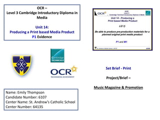
EThompson - Unit 14: LO1 Powerpoint
1. OCR –
Level 3 Cambridge Introductory Diploma in
Media
Unit 14:
Producing a Print based Media Product
P1 Evidence
Name: Emily Thompson
Candidate Number: 6107
Center Name: St. Andrew’s Catholic School
Center Number: 64135
Set Brief - Print
Project/Brief –
Music Magazine & Promotion
2. Contents:
Title Slide
Front Cover Drafts 3 - 4
Double Page Spread Drafts 5 - 6
Final Image Plans 7
Graphic Layout 8
Mood Board 9
Magazine Masthead/Logo 10
Font and Colours 11
Interview Draft Planning 12
Draft Article – Interview 13
Image Plans 14 - 15
Prop List 16
Prop Sourcing 17
Location Images 18
Risk Assessment 19
Production Plan 20
Conclusion 21
3. Unit 14 – Producing a Print Based Media Product – “Planned Format and Style - Front Cover”
Puff Promotion:
By placing the puff promotion at the top
of the page, when the magazine is picked
up this will be one of the first things the
reader will see, as well as the logo. I
believe that having this here entices the
reader to buy the magazine more as they
also have the change to win something
or gain something for free. Another
reason why it has been placed in the top
right hand corner of the page is because
typically people turn the page here,
when they turn the page their eye will
catch the bright red promotional colours
and shapes.
Article Feature:
On this hand drawn draft of the front cover I wanted to include more information
about the content that can be found inside the magazine. Therefore I plan to
include a small textbox with the name of one artist or title. This will be placed over
the front cover subjects lower chest, as this is not considered as an important area
that creates ‘star appeal’.
Main Story:
I have decided to place the main story to
the right of the main image, this is
because the ‘star appeal’ that is created
when viewing the image will draw the
eye to the bulk of text next to them. To
make the main story title more
interesting I could include a direct quote
from the interview. Additionally I thought
that by placing the main story
underneath the magazine logo, when
they view the logo they will see the story
as the most important thing within the
magazine. Looking at my research of Q
Magazine many of their front covers
have used this layout for the main story
text.
Magazine Logo:
I have decided to place the logo of the
magazine in the top right hand corner of
the magazine, this is due to the fact that
when people pick up the magazine it will
be one of the first things they see. This is
very effective when they are placed on a
magazine shelf within a shop. I have been
inspired for the placement of the logo by
Q Magazine, this is due to the fact that
they include bright colours that should be
one of the main aspects the reader sees
when they first pick up the magazine. To
ensure that it is eye-catching they have
placed it in the top left hand corner of
the page.
Magazine Layout:
When producing the drafts of my
magazine I wanted to make sure that it
looks professionally structured and well
presented. I have followed a similar
layout from Q Magazine, which includes
placing smaller items over the body of
the front cover artist. Also another
feature is the text of the main story and
cover lines wrapping around the
silhouette of the artist.
4. Unit 14 – Producing a Print Based Media Product – “Planned Format and Style – Front Cover”
Technical Convergence:
I plan to include technical convergence
on the front cover of my magazine, these
will be in the form of a official magazine
web address and social media logos. The
placement of this convergence will be at
the bottom of the page. This is due to
the fact that it is not of high importance
and there will be technical convergence
found at the bottom of every page.
Cover Lines:
As the main story is at the top of the
page I decided to place the cover lines
of the magazine under the magazine
logo. When creating the magazine I
have to make sure that the cover lines
do not overlay on the main image, this
could reduce the ‘star appeal’ of the
person on the front if they become less
recognisable.
Bar Code:
On the bar code I will have the issue
month and the price of the magazine .
This will always be at the bottom of the
page as it is less important. Additionally
it will be positioned based on the
image that is going to be on the front,
to make sure that it does not cover the
artists features.
Strap Line:
For my strapline I have decided to place
it near the main magazine logo. This is
similar to that of my magazine of
inspiration (Q magazine). The purpose
of this is so that when they read the
logo they then see the strapline and
associate it with the brand. This
repetition can give the magazine a
more well known identity.
House Style:
Features that I plan to repeat throughout my magazine are the type and size of the font. The
font I have chosen for the main story headline is ‘Minion Pro’, I will use this several times
throughout the magazine such as the drop capital for the main articles. Other fonts that I will
include are ‘Poor Richard, Century Schoolbook and Eras Demi ITC’, all of these fonts are
similar to that of Q Magazine with an interesting formal style.
5. Unit 14 – Producing a Print Based Media Product – “Planned Format and Style – Double Page Spread”
Main Image:
The inspiration from this double page spread layout came from Q magazine. By having the whole image on only one side of the page I can
make sure all of the subject is seen. Also because of its size when the reader is looking through the page will catch their eye because of
what is in the image. The position of the subject in the image is centred and has been taken in a wide shot, this enables the reader to see
who the article is about what their personality is like from gestures such as their posture.
Article Images:
By including smaller images
that relate to the article and
the interview this makes the
page more interesting for the
reader. By including images the
page becomes more visually
appealing. I also have the
opportunity of adding captions
for each image so the reader
will be tempted to find out how
the image relates to the article.
Info About Artist:
Including information
about the artist before
the main interview
provides minor
background details
about who they are. I
have decided to lay this
out on the page just
underneath the main
story title and the stand
first on the left hand
column of the page, this
is due to the fact that it
will be read from left to
right.
Interview:
The reason for the positioning of the interview being after the main information is so that the reader has the opportunity to
find out interesting personal information about them, such as their music style and other quirky features. The interview text
will be formatted in a differentiated questions and answer style, this is responses will be clear and easy to read. My idea for
using a differentiated question style is from Q Magazine, in all of their interviews so the reader can establish who is talking
they make part of the text stand out more than others. Additionally they also shorten or use the initials of the name of the
person being interviewed. This saves space in the magazine and is easier to read through.
6. Unit 14 – Producing a Print Based Media Product – “Planned Format and Style – Double Page Spread”
Quote From Interview:
To make the page more
interesting and to fill
some of the blank and
uninteresting space I
decided to include a
quote from the
interview. By doing this
when the image is
viewed the reader will
see the quote and then
proceed to read the
article out of interest. In
Q Magazine they make
sure to include a quote
from the interview, this
is to spark interest for
the reader when they
see it with the image;
this then entices them
to continue reading
more of the article.
Main Image:
The layout of this image is different to my other designs of the double page spread.
Instead of limiting the main image to only one side of the spread I wanted to overlap the
image so it serves as a more interesting background for the text. This means that on the
outside borders of the text you will be able to see features of the image. Although this
may cause some problems when reading the text so I will have to consider either making
the background have little detail or surround the text with text boxes.
Main Story Title:
Compared to the previous ideas for the main title, on this plan I wanted to
place it further down the page. This was to spread things out differently
compared to a normal layout which will attract the attention of the reader.
Stand First:
I feel that the stand
first is very important
as this introduces the
reader into the topic
of the article. Also
because the font size
is also bigger it serves
as an eye catching
feature of the page.
7. Unit 14 – Producing a Print Based Media Product - “Final Image Plans”
Final Double Page Spread Draft:
This is the final hand drawn draft for the magazines double page spread.
The main interview and information about the artist is on the left hand
side of the page and the image is on the right. This was chosen because
when the page is turned the image will be the first thing that is seen on
the page, this can spark interest for the reader and they will want to look
through the article to find the purpose of the image. A quote from the
interview has also been overlaid this is because within the quote will be
something interesting or funny that is taken from the interview. This will
connote to the reader that the article is easy to read and includes
interesting features that will be enjoyable.
Another feature in the final image plan is an image of an artist within the
columns of text. This was inserted so it separates the text and makes the
page look more aesthetically pleasing. It can also connote to the reader
the personal nature of the article as it is a close up of the artist with
informal body language.
Final Front Cover Draft:
This is the final hand drawn draft for the magazine front cover. The magazines logo and
strapline feature in the top left hand corner, this will be a repeat feature for each issue of the
magazine. Additionally this is similar to the barcode, the information within the barcode will be
the same, however this may move positions dependant on each edition of the magazine and
the image of the front cover artist.
One feature that had to be chosen accordingly was the main headline and the cover lines, it
was essential that they could be easily seen from a distance but did not cover the image of the
front cover artist. The main headline was placed on the right hand side of the page, just under
the artists head, this was so it did not take away any ‘star appeal’ – (Richard Dyer). The quote
from the interview, as part of the main headline was placed above as this was in a smaller font
so could fit in the smaller place next to the artist.
Additionally on the right hand side of the artist are the cover lines. These were placed on the
right so the front cover does not look too text heavy and overpower the reader. They will be in
a thinner column and a smaller font than the main headline.
Finally the puff promotion is at the top of the page opposite the main masthead/logo. The
purpose of placing this here is to attract the eye because when readers turn the page they
typically turn with this corner. The circle shape has also been chosen to stand out the rest of
the text which is placed in a square/rectangular format.
8. Unit 14 – Producing a Print based Media Product - “Graphic Layout”
Before creating the pages on Photoshop I created a graphic layout of
both the front cover and double page spread. These have enabled me
to gain a more accurate representation for the sizes of different
elements of the pages. I feel that this is more helpful than the hand
drawn drafts as I am able to control the overlay of certain columns
and boxes over the main image.
For the front cover I felt that a positive of creating this page was
being able to organise the final layout for text elements such as the
main headline and the cover line. This is because it was important
that they do not cover too much of the main image that will take
away ‘star appeal’ (Richard Dyer).
For the double page spread I felt that by recreating this
page the most helpful aspect of Photoshop was
organising the sizing and spacing of the main text
interview columns. I found this difficult as they all have
to be the same size and have even spacing in-between
so that the magazine does not look irregular. The
Photoshop tool, ‘ruler’ enabled me to correct this
problem and increase my accuracy.
9. Unit 14 – Producing a Print Based Media Product – “Mood Board”
Q – “Discover Great
Music”
Using the word ‘discover’ can
signify (De Saussure) to the
reader that they will find
something interesting and new.
From this in relation to Katz’s
theory, the purpose of the
magazine is to ‘inform and
educate’. The strapline of my
magazine will include features
like this to appeal to a large
target audience.
10. Unit 14 – Producing a Print Based Media Product – “Magazine Masthead/Logo”
When creating my magazine masthead/logo I wanted to make sure that it was easy to read and eye-catching. Therefore when it is on
magazine shelves it will be the first thing that is seen.
I had to ensure that the logo was similar to that of my magazine of inspiration Q magazine, hence I made sure it was one bold block
colour, in the end I chose a royal blue so it connotes to the readers that this is a professional, reliable and high quality magazine.
For my logo I will just include the first letter of the magazine name (Volume), I wanted to choose a font that was similar to q magazine. I
tried and tested different font styles on Photoshop and dafont.com to overview how I wanted to final product to look. In the end I found
a font called ‘RomanT’ , this is a very traditional font that is easy to read and I feel will work well on the front cover of the magazine.
Font
Name:
Test:
SuperFrench
Swis721
BdOul BT
Centaur
Felix Titling
After editing the font on Photoshop I created the main logo.
When creating the logo I used several different effects including
stroke, bevel and emboss. I believe that all of these features
made the logo appear professional. The background colour for
the logo is a solid navy blue, I plan to continue using this colour
throughout the magazine.
House Style Consistency:
By exploring the fonts and colour choices for the
magazine I have been able to develop and plan where I
will include consistency throughout the magazine
features.
An example of this is using the main magazine ‘V’ logo
on every page of the magazine. By including it next to
the page number at the bottom of the page, this can
connote to the reader the professionalism and reliability
of the magazine.
11. Unit 14 – Producing a Print Based Media Product – “Magazine Fonts and Colours”
Font Name: Font Preview: Font Usage:
Minion Pro
- Cover Lines
- Price and Date on
Barcode
- Web Address
- Drop Capital
- Stand First
Just Another
Stamp Font
- Headline
- Main Article Title
Poor Richard
- Strapline
- Article Titles
Century
Schoolbook
- Puff Promotion
Eras Demi ITC
- Puff Promotion
Eras Light ITC
- Main article font
I had to make sure when deciding the magazine fonts and
colours that they looked professional and clean cut. This is
because my magazine is aimed at the higher end of the market
to a variety of people.
I have chosen several fonts that will be used in my magazine,
there is a large range because some are easier to read than
others when sized differently. For the main headline and cover
lines the font will be the same, this is so there is a consistency
throughout the magazine and prevents it from looking
overcrowded on the front cover. Other fonts such as ‘Eras Light
ICT’ are being used as they are easier to read when they are a
smaller font size, therefore I will use this as the main article
font.
The primary colour that I will use is a dark royal blue, this will be
on Volume magazines logo of ‘V’ and used in other places
throughout including technical convergence, promotions and
headers. I was inspired when creating the initial mood boards
for the magazine and found the dark blue the most eye-
catching. The reason for this colour choice is because its similar
to Q magazine where it has one solid bright colour. That is
repeated throughout the magazine, which I plan to do.
I have chosen to include two fonts for the puff promotion, this is due to the
fact that I want one to be the most striking with text such as ‘Exclusive!’
then there will be information below in a clearer text where the reader can
find out what the promotion is telling them.
12. Unit 14 – Producing a Print Based Media Product – “Interview Draft Planning”
For my double page spread within the magazine I plan to conduct an interview with the well known artist, George
Ezra. As well as featuring on his own double page spread he will be the main headline for the magazine and will
create ‘star appeal’ (Richard Dyer).
I have chosen to interview George Ezra as he is a well known, up-and-coming indie genre artist who has only been in
the music industry since featuring on an introducing stage at Glastonbury Festival 2013. Since his success at
Glastonbury he has had three singles in the top charts and is famously known for his quirky stylised song ‘Budapest’.
Additionally this year he has released his first album, by featuring him in the album we are essentially promoting
the new album as well as drawing readers in because of his previous hit songs.
Some of the questions that I will ask in the interview will be based around his new career in the music industry. I
also want the interview to have an informal feel so other questions including ‘What his musical inspiration was as a
child’, this will spur on possibly humorous answers.
The presentation of the interview on the
double page spread will be laid in a
differentiated question and answer style. This
is typical in many of Q magazine interviews,
and makes it easier for the reader to
understand the information that is being
published.
This is my page of inspiration that is from the
October issue of Q magazine. They have used
differentiated question and highlighted this by
the boldness of the writing and the different
colours of red and black.
13. Interviewer: Hello George! It’s good to finally have a chat with you – how has your past week been?
GEORGE: Hi! Yeah it’s been great thanks, very busy but exciting.
Interviewer: I bet! Has your life changed much since climbing to the top of the music chart with ‘Budapest’?
GEORGE: It’s non-stop, since signing the record deal then travelling around Europe people have been recognising me more and I’ve had
hundreds of amazing opportunities thrown at me!
Interviewer: Wow! Did you gain your inspiration for the song Budapest when you went travelling?
GEORGE: (Laughs) Yeah you could say that. I got a bit drunk when the Eurovision contest was on, and I missed the train to Budapest. This
made me think that there are many songs about losing something for somebody else. So I thought why not write a song about giving up
things I don’t have?
Interviewer: So how does the George Ezra song writing process work?
GEORGE: When I have a spark of inspiration I write my ideas down everywhere, sometimes even on the walls. Although people see it as
crazy it’s just how my mind works, I don’t want to lose that inspiration. Most of the lyrics have some reference to the placeI am inspired.
Interviewer: So your new album is being released soon, what can we expect from it and when can we have a listen?
GEORGE: Well the two EP’s that have been released so far (Budapest and Cassy O) were meant to introduce people to listening to me
with a band, this is because I do gigs on my own usually. The new album will be me with the band and when I gig I will be joined by the
guys. We’re hoping for it to be released around the start of June/July, the music included has a summer vibe so would be perfect for the
festival atmosphere.
Interviewer: Have you learnt any important or tough lessons from your early experiences of the music industry?
GEORGE: I’d say the first thing I learnt when joining the music industry was to listen to those around you, this is because you’re all in it
together trying to make it and its best to have friends rather than enemies. However it’s also important to be yourself and have your
own opinions as the music industry is looking for people who can be themselves through both music and ideas.
Interviewer: I saw that you have sold out your tour! How does that feel having such a high demand of people wanting to listen to
you?
GEORGE: It’s crazy!! I never thought that I would come this far in music as it started out as a hobby when I was younger. Although picking
up the guitar then and now the feeling hasn’t changed at all, it is still my passion and I will always love playing even if no one wants to
listen.
Interviewer: What was the first song that you ever wrote? And how old were you?
GEORGE: (Laughs) I wrote my first song around thirteen years old, I remember it being called ‘Wishing Well’. I have no clue what it was
about but I’m so glad there is no recordings of it as that would be embarrassing!
Interviewer: When you were younger and started playing the guitar who was your musical inspiration?
GEORGE: I grew up listening to Bob Dylan and Woody Guthrie, people find it strange that my inspirations are revolved around older
blues and folk sound but within the music I create its more 21st century.
Interviewer: Finally, thank you George for your time it’s been great talking with you. Do you have any words of inspiration for your
fans who are looking to pursue a music career?
GEORGE: Thank you. Never stop playing music even if they tell you too, be unique and always look for opportunities to better yourself.
I created a magazine interview
draft, this featured the
popular indie music artist
George Ezra. When creating
the questions I took
inspiration from Q magazines
interview style, this was
relevant and informative
questions that create an
interesting response.
I also had to take into
consideration the answers of
the questions from the artist,
as I could not interview them
in real life. To make sure the
answers were accurate I
conducted some small scale
research into other interviews
they had.
Unit 14 – Producing a Print Based Media Product – “Draft Article - Interview”
14. After the location recce was conducted a detailed image plan was created based on the potential hazards found.
Unit 14 – Producing a Print Based Media Product – “Location Recce Image Plan”
15. Location: Photography Studio Fields near Kingswood
Time - 12:35pm 12:00pm
Date - 21st October 2014 26th October 2014
Why? - Professional clean look similar to that of my magazine of
inspiration (Q Magazine). The use of spotlights create a
dramatic shadow on the face.
The rural scenery matches the typical image of the
artist, who is laid back and has a casual style. The
green background brings the artist into the
foreground.
Picture Needed/Required: Face looking straight into the lens of the camera. Zoomed out image of artist leaning on a tree log
holding his guitar.
Shot Type - Close Up Wide Shot
Props Equipment - Camera, Tripod, Tungsten Light Camera, Guitar, Tripod, Light Reflector
Lighting - Middle Key Lighting Natural Light + Reflector
Costume - Patterned shirt with collar Coloured chinos, patterned jumper, brown boots and
blue coat
Person/People - Joseph Robinson Joseph Robinson
Why? - This photograph needs to have a dramatic feel, that will
attract the reader to look into the article. This will be
placed on the front cover.
For this photograph I need to have a more informal
style as it will be on the double page spread. Next to it
will be the interview with the artist.
Permission Needed: I need to make contact with the model, to make sure we
are in agreement with the projected plans. Permission is
also needed to be given to take images of them.
I need to make contact with the model, to make sure
we are in agreement with the projected plans.
Permission is also needed to be given to take images
of them.
Potential Hazards/Risks: The studio may in be use at the time we want to take the
photographs, this means we may have to re-organise
when we take the photos.
The weather may be rainy, this means I will have to
cover the camera and lens with a waterproof case.
Unit 14 – Producing a Print based Media Product - “Image Plan”
16. Unit 14 – Producing a Print based Media Product - “Prop List”
Before taking the images for the front cover and double page spread I
made several lists of the equipment that will be needed. One of these
includes the prop list. On this features different sections that include
costume, technical equipment and additional props.
By making this list it was easier to plan ahead before travelling to the
location for the shoot, additionally I was able to notify the artist in
advance to let them know what costume was appropriate.
I made sure to include all smaller details such as the lens cap and
camera bag as the equipment will have to be carried around and by
including these features the equipment will stay safe and last longer.
Prop List
Costume:
Patterned shirt with collar
Coloured Chinos
Patterned Jumper
Brown boots
Blue coat
Technical Equipment:
Canon DSLR camera
Lens Cap
Camera Bag
Battery
SD Card
Tripod
Tripod Plate
Tungsten Light
Circular Light Reflector
Additional Props:
Guitar
Chair
The DSLR camera and
tungsten light that will be
used for the photo-shoot.
17. Unit 14 – Producing a Print based Media Product - “Prop Sourcing”
Before taking the images for the front cover and the double page spread I needed to make sure that I had the
equipment available. Some of the equipment I already owned such as a DSLR camera, battery, SD card and tripod.
However we did not have any access to lighting. This meant that we had to source this somewhere else. I researched
several sites where the equipment could be sourced from I found that the cheapest and most reliable site was
‘wexphotographic.com’.
Other props that are needed include the costumes for the artist
and a guitar. I was able to source a guitar from a friend, this
means that I will not have to buy one for the shoot. However the
clothing I have decided will be bought online, this is so it is the
most up to date and fashionable items that will grab the readers
attention. I will source the clothing from ‘urbanoutfitters.com’.
The clothing budget for two whole outfits will be £250, including
all shoes and accessories.
This is a screen shot from the official
‘wexphotographic.com’ site, I found two
tungsten lights for £289, this was a good
deal as the reflectors were also included.
This is a screen shot of the link to the official Urban
Outfitters website. This will be used to buy the clothing
for the artist. Buying these items online will also save
time in the production process as we not have to travel
to the shops and tediously look through all the clothing.
18. Unit 14 – Producing a Print Based Media Product – “Planned Format and Style – Location Images”
Before taking the images for the
front cover and double page spread
I have to make sure that I did some
location scouting. This was so I
could further assess what will be
needed when taking the photos
and the potential risks and hazards.
Additionally I have taken some
photos of the equipment that I will
be using, this includes a Canon
camera and a several lights.
Lighting will only be used in the studio
environment, when taking the images
for the double page spread in the field
I will have to use a circular light
reflector to highlight the subjects
distinctive features. By scouting out
the location before the image have
been taken this can guarantee high
quality images.
19. Unit 14 – Producing a Print Based Media Product – “Risk Assessment”
When taking and editing the images for the front cover and double page spread I had to take into consideration risk assessment. This meant
that I had to look at all individual ‘safe working practices’ and how they could affect the final images.
Image Risk Assessment
- Permissions:
Before taking the images I needed to make sure that the artist gave their full
permission to being photographed and the image being published both online
and in print media. I found that the best way to gain permission was to send an
email to the artist describing what they have to wear, the location and time of
the shoot. I also attached a permission form which they had to sign and date and
send back. By gaining permission through this method the magazine has
declared proof of a signed document, this means that if there are any future
legal difficulties it would not be the magazine at fault.
- Area Assessment:
When scouting the location for the images several area checks had to take
place. This risk assessment had to be conducted to guarantee both the artist and
the people who are taking the images are safe. Areas that should be looked at
are possible hazards such as uneven ground levels, running water, heights and
weather conditions.
Evidence of a permission letter that
was sent and signed to the artist.
When conducting the photo-shoot for the magazine I will be using images of the
person, I have had to contact them in advance and ask for their permission. I
decided the best way to make contact with them was via email, this way it is
quick and any documents that need to be signed can be sent back easier. I also
had to let the subject know what role they will be portraying in the photograph
‘George Ezra’, with this I included what clothes they had to wear and the poses
they will conduct.
20. Unit 14 – Producing a Print Based Media Product – “Production Plan”
This is a detailed production plan for the development and creation of V Magazine. Included is the sections of pre-production, production and post production. In
each of these sections it has been calculated the estimated costs of the process and the staff and equipment that will be needed. The production time is over a two
week period, I feel that this is appropriate as there will be over thirty members of staff working on the magazine pages with the highest quality software and
equipment. Two weeks was chosen as this is the typical length of time that the original magazine of inspiration ‘Q Magazine’ has for creation.
21. Unit 14 –Producing a Print Based Media Product – “Conclusion”
In this learning outcome I focused on creating the pre-production materials for the planned print
based media product. I included the first idea front cover and double page spread drafts which
highlighted the different features that will be included on the pages such as puff promotions and
technical convergence. By looking at these features it enables me to research what were important
aspects of the magazine cover. To support this I also created some graphic layouts, these were
based off of the drawings and were made in Adobe Photoshop CS5.
I then looked more in depth at the smaller yet important features of the magazine, such as the font
styles, images and interviews. By doing this I was able to plan and prepare for the production stage
which would in turn save me time in the future. To support with this I also included the production
plan for the whole magazine, this gave me an overview on how long should be spent on pre-
production.