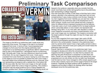
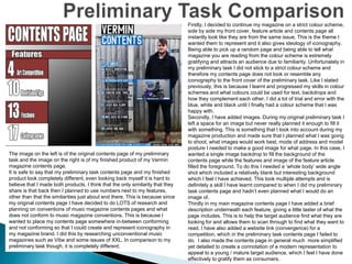
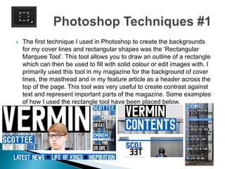
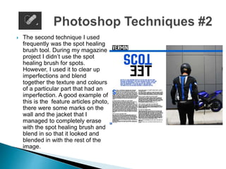
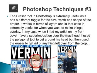
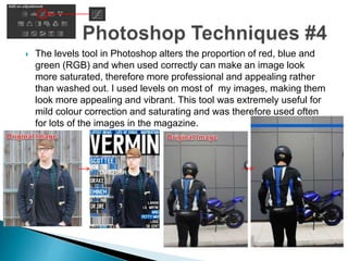
2. The image on the left is my preliminary task I made at the very
beginning of the course. The image on the right is my finished
magazine front cover. In terms of how I have progressed and
changed my front cover from the original preliminary task I
comparison to my finished product is significant. Before I placed these
side by side in this PowerPoint, I still believed that for a preliminary
task I did pretty well. Firstly, the main difference is layout and quality
of the finish. On my main magazine front cover, I have used a
consistent front cover theme to my layout, having my cover lines stick
to the edges as much as possible to present the main cover image. I
have also added more professional features such as a barcode, price
and representing convergence with a website link in the bottom left
with the issue date. My main front cover image on the right actually
has a person rather than a blurry image of a painting. This creates a
connection with the target audience due to it being relatable and
therefore gratifies them. Where as beforehand the painting would not
Appeal to the audience, especially when you consider that they
would most likely have similar demographics due to the preliminary
task representing a college magazine.
One main thing that is similar in both tasks is that they had a colour
scheme, although in the preliminary task it was basic and not very
complementing, it was a colour scheme none the less. However, in
my main magazine front cover I feel like you can see how I really
progressed from the preliminary task in the development of my
colour scheme. It looks much more refined and has a change of
colour for different fonts to represent buzzwords and the features.
I have also used a much more suitable font for my target audience
which I personally believe is more modern and represents that
ideology along with it. In my main task I also decided to conform to
music magazine conventions and have a superimposition of the
main cover image over my masthead. This creates a connection with
the target audience through the angle and way the image ‘pops’ out
of the page.
For my main magazine front cover image I also used a DLSR,
professional photography equipment that allowed me to capture a
still shot in the correct position. However in the preliminary task I
used my camera which doesn’t have a high quality camera to take a
‘camera shaken’ shot which looks poor quality and overall makes the
preliminary task look bad.
Overall I feel that in comparison to my preliminary task I have
managed to develop and refine the conventions which make a music
magazine look like a magazine. It is clear that my research and
planning has paid off because in comparison it is like black and
white. Overall I am very happy looking back and seeing how I have
progressed and not only shows me how my skills have developed
over the task but how I have managed to refine simple aspects such
as the colour scheme, layout and correct usage of fonts for the target
audience. Hopefully the target audience will be gratified by my
magazine and be able to relate to its ideology which has been
developed since the first preliminary task.
3. The image on the left is of the original contents page of my preliminary
task and the image on the right is of my finished product of my Vermin
magazine contents page.
It is safe to say that my preliminary task contents page and my finished
product look completely different, even looking back myself it is hard to
believe that I made both products. I think that the only similarity that they
share is that back then I planned to use numbers next to my features,
other than that the similarities just about end there. This is because since
my original contents page I have decided to do LOTS of research and
planning on conventions of music magazine contents pages and what
does not conform to music magazine conventions. This is because I
wanted to place my contents page somewhere in-between conforming
and not conforming so that I could create and represent iconography in
my magazine brand. I did this by researching unconventional music
magazines such as Vibe and some issues of XXL. In comparison to my
preliminary task though, it is completely different.
Firstly, I decided to continue my magazine on a strict colour scheme,
side by side my front cover, feature article and contents page all
instantly look like they are from the same issue. This is the theme I
wanted them to represent and it also gives ideology of iconography.
Being able to pick up a random page and being able to tell what
magazine you are reading from the colour scheme is extremely
gratifying and attracts an audience due to familiarity. Unfortunately in
my preliminary task I did not stick to a strict colour scheme and
therefore my contents page does not look or resemble any
iconography to the front cover of the preliminary task. Like I stated
previously, this is because I learnt and progressed my skills in colour
schemes and what colours could be used for text, backdrops and
how they complement each other. I did a lot of trial and error with the
blue, white and black until I finally had a colour scheme that I was
happy with.
Secondly, I have added images. During my original preliminary task I
left a space for an image but never really planned it enough to fill it
with something. This is something that I took into account during my
magazine production and made sure that I planned what I was going
to shoot, what images would work best, mode of address and model
posture I needed to make a good image for what page. In this case, I
wanted a single image backdrop to fill the background of the
contents page while the features and image of the feature article
filled the foreground. To do this I needed a ‘whole body’ wide angle
shot which included a relatively blank but interesting background
which I feel I have achieved. This took multiple attempts and is
definitely a skill I have learnt compared to when I did my preliminary
task contents page and hadn’t even planned what I would do an
image of.
Thirdly in my main magazine contents page I have added a brief
description underneath each feature, giving a little taster of what the
page includes. This is to help the target audience find what they are
looking for and allows them to scan through to find what they want to
read. I have also added a website link (convergence) for a
competition, which in the preliminary task contents page I failed to
do. I also made the contents page in general much more simplified
yet detailed to create a connotation of a modern representation to
appeal to a young / mature target audience, which I feel I have done
effectively to gratify them as consumers.
4. The first technique I used in Photoshop to create the backgrounds
for my cover lines and rectangular shapes was the ‘Rectangular
Marquee Tool’. This tool allows you to draw an outline of a rectangle
which can then be used to fill with solid colour or edit images with. I
primarily used this tool in my magazine for the background of cover
lines, the masthead and in my feature article as a header across the
top of the page. This tool was very useful to create contrast against
text and represent important parts of the magazine. Some examples
of how I used the rectangle tool have been placed below.
5. The second technique I used
frequently was the spot healing
brush tool. During my magazine
project I didn’t use the spot
healing brush for spots.
However, I used it to clear up
imperfections and blend
together the texture and colours
of a particular part that had an
imperfection. A good example of
this is the feature articles photo,
there were some marks on the
wall and the jacket that I
managed to completely erase
with the spot healing brush and
blend in so that it looked and
blended in with the rest of the
image.
6. The Eraser tool in Photoshop is extremely useful as it
has a different toggle for the size, width and shape of the
eraser. It works in terms of layers and in that case is
extremely useful for when you want to make things
overlay. In my case when I had my artist on my front
cover have a superimposition over the masthead, I used
the polygonal tool to cut around his head but then used
the eraser to get rid of anything left over from the crop.
7. The levels tool in Photoshop alters the proportion of red, blue and
green (RGB) and when used correctly can make an image look
more saturated, therefore more professional and appealing rather
than washed out. I used levels on most of my images, making them
look more appealing and vibrant. This tool was extremely useful for
mild colour correction and saturating and was therefore used often
for lots of the images in the magazine.
8. Although I have already explained it, I believe that I have created an audience appeal
through the ideology that my magazine represents as well as its iconography. My
magazine is a modern, fashionable twist on a conventional rap magazine. This in
itself makes it unconventional and stand out from competitors in the same genre
straight away.
Secondly, the magazine has been represented in a modern way. This has been done
with the style of writing, recurring colour theme that makes it iconic and recognisable
no matter what page you are on. This creates familiarity with the target audience and
over time will gratify them as consumers. The same way that white text with a red
background in advertising will automatically be associated with coca cola and due to
this recurring theme and iconic use of red and white creates a brand trust between
consumer and brand. I am hoping that the colour scheme and modern twist on my
rap magazine creates a similar effect on my target audience.
Lastly, due to the modern representations of my magazine I am trying to represent
that ‘Vermin’ has an ideology of a wealthy intangible value. These values are the
driving force that will make the target audience more willing to buy the magazine over
other rap magazines as it feels exclusive and expensive and will gratify the target
audience (a younger, predominantly teenage audience) the same way that having an
expensive watch over a cheaper version will have and make the consumer feel more
valuable and unique through purchasing it. These are the values that will appeal to
the target audience and provoke consumerism within them to hopefully make my
magazine successful.
9. During my magazine production I had to use a variety of skills. A
very important aspect was probably my research skills. Although I
don’t have much to show for it, I looked at other rap magazines for
hours on end and looked at how they used conventions to conform
to the genre. Other methods I used included the survey monkey
survey I made at the very beginning of the production to get a good
idea of what my target audience would actually want from my
magazine. The research, although not the most Important part, felt
like it because I had to know what I was going to make before I
made it, otherwise I would end up with products that looked similar
to my preliminary task, as I had no idea what or how to make a
magazine back then.
Overall I feel that my research has paid off, this can be seen from
the progression from my initial preliminary tasks to my finished
music magazine, showing that I have paid enough attention in my
research to be able to develop upon initial ideas and then be able to
make a magazine that conforms to the conventions of the genre.
10. During my magazine production I only made one questionnaire and
have only got 1 person’s feedback on record. Unfortunately towards
the end of my production I ran low on time and resources and could
not get feedback from about 5 different people. However, I still
managed to get feedback from one person who could be a potential
target audience member which provided useful feedback. During my
production I only did the 1 initial questionnaire. Although this was
useful and provided insight into what standards and features would
be required of me to put into the magazine, I could have done a few
more with different styled questions to further explore what would
gratify the target audience. Overall I am happy with how my music
magazine has turned out. However I believe the feedback
department really is a part of my production that I spent less time
and resources on and if I could go back I would ensure that I spent
more time on this part of the production as it is the actual interaction
between your product and the target audience you made it for,
which is in the end all that matters.
11. During the writing part of my magazine production I had to make
sure that I used good literacy. Although not a huge point, it was still
important to make my magazine look as professional and ‘proof
read’ as possible. This was mostly used in my feature article as I
had to write large amounts of text in response to the questions and
therefore was most important.
As you can see from the image of my feature article text there was a
large amount of text that had to be proof read. Because I typed in
Photoshop it was hard to proof read due to it not being like Microsoft
word where it highlights misspelled words in red. However, I made
sure I proof read it a couple time over to ensure literacy was good.