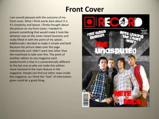
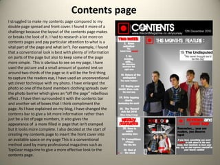
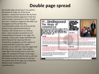
The document provides an evaluation of the student's media products which included a front cover, contents page, and double page spread for a magazine focused on an indie pop/rock genre. For each product, the student discusses what worked well and challenges faced in the design. They aimed to make the products look professional while also adding some unconventional elements to make the magazine unique. Key conventions included logo placement, color schemes, and layouts inspired by magazines like NME and Q. The student also discusses targeting their products towards their intended audience of 14-25 year old indie music fans and representing the genre's themes.