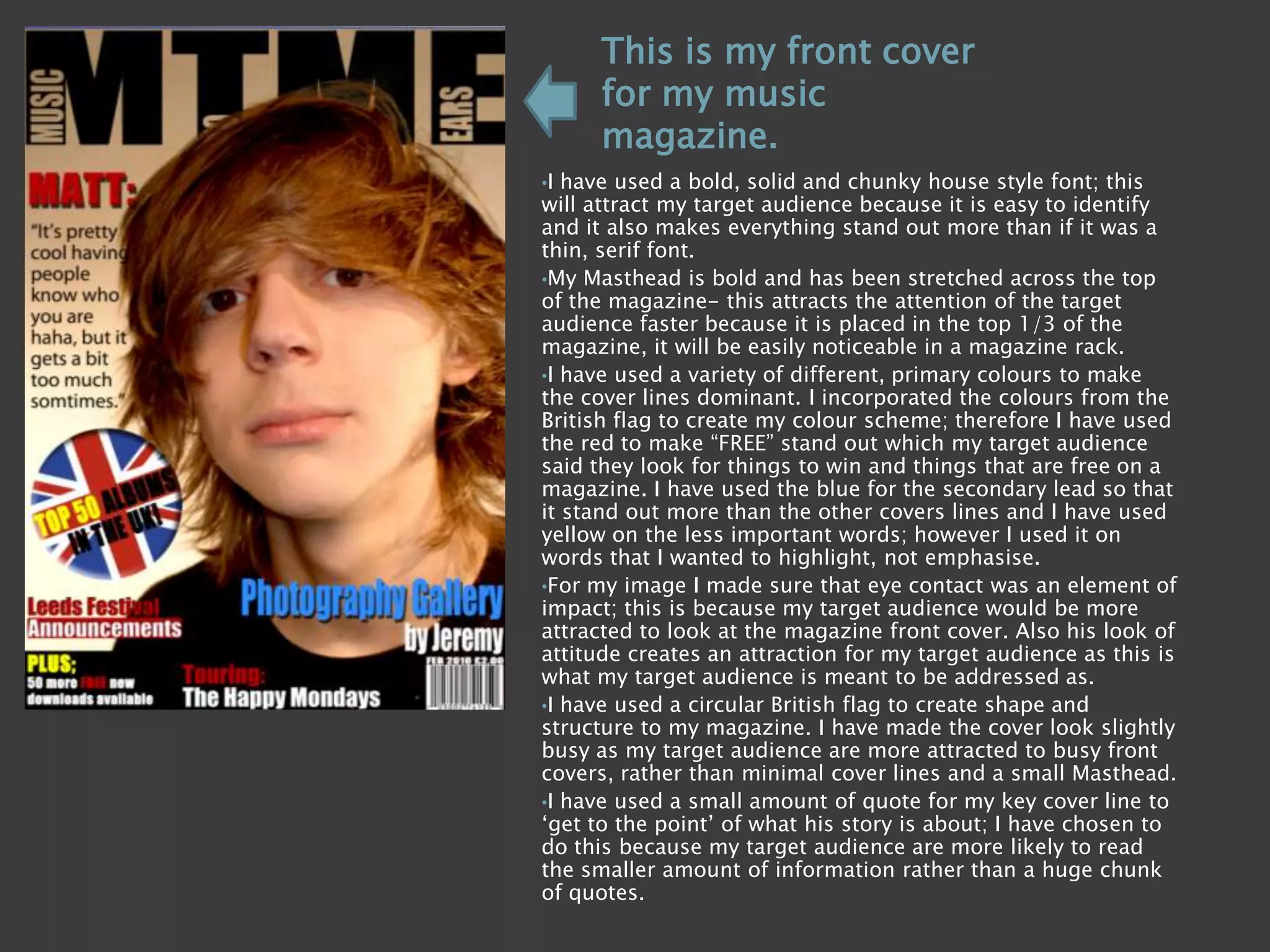
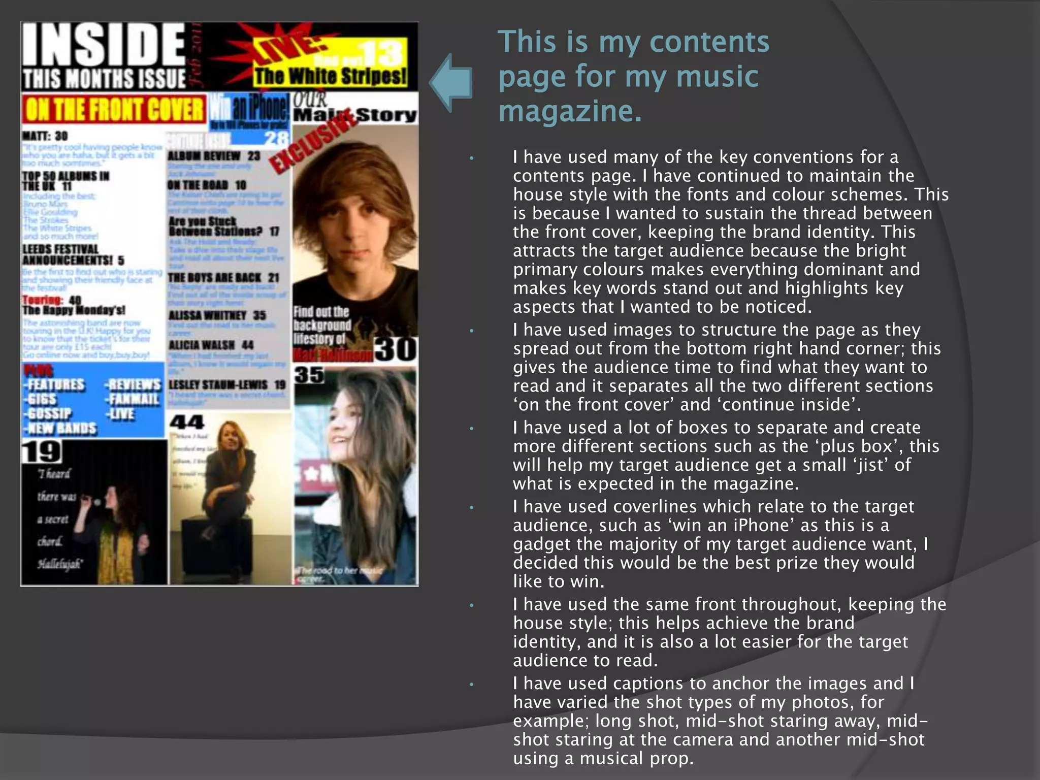
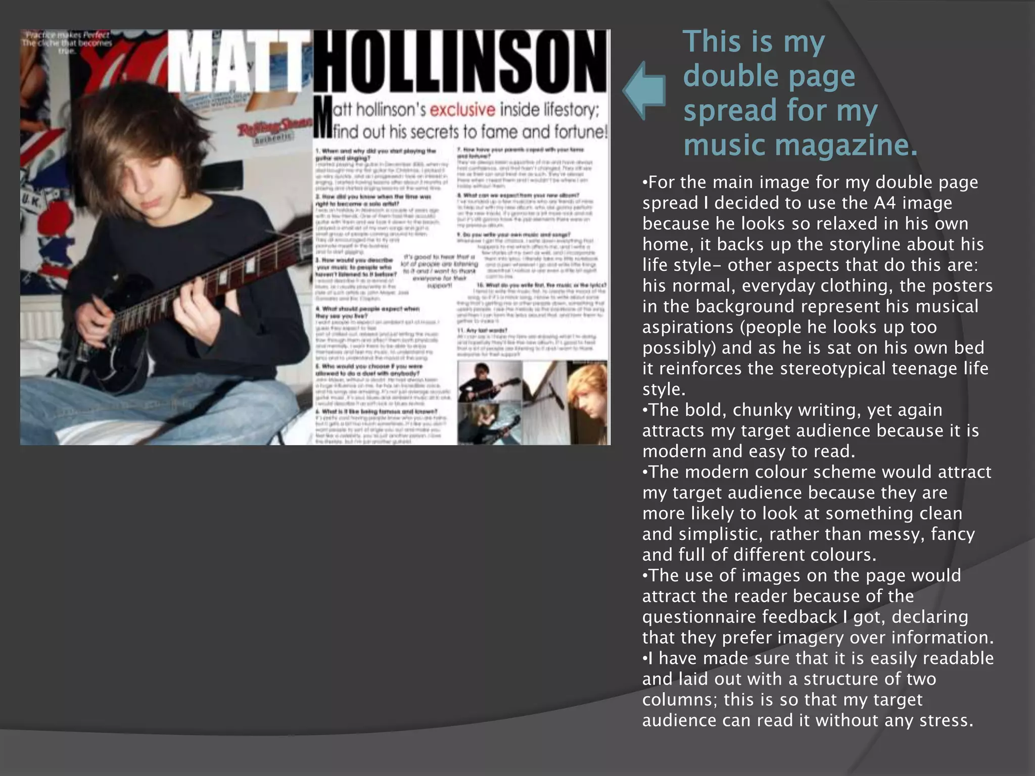
The document summarizes the design choices made for various elements of a music magazine to attract the target audience. For the front cover, a bold font, stretched masthead, use of primary colors from the British flag, and image with eye contact were used. The contents page maintains the house style and uses images, boxes, and coverlines related to things the target audience wants. The double-page spread features a relaxed full-page image, bold chunky writing, a modern color scheme, and a readable two-column structure.