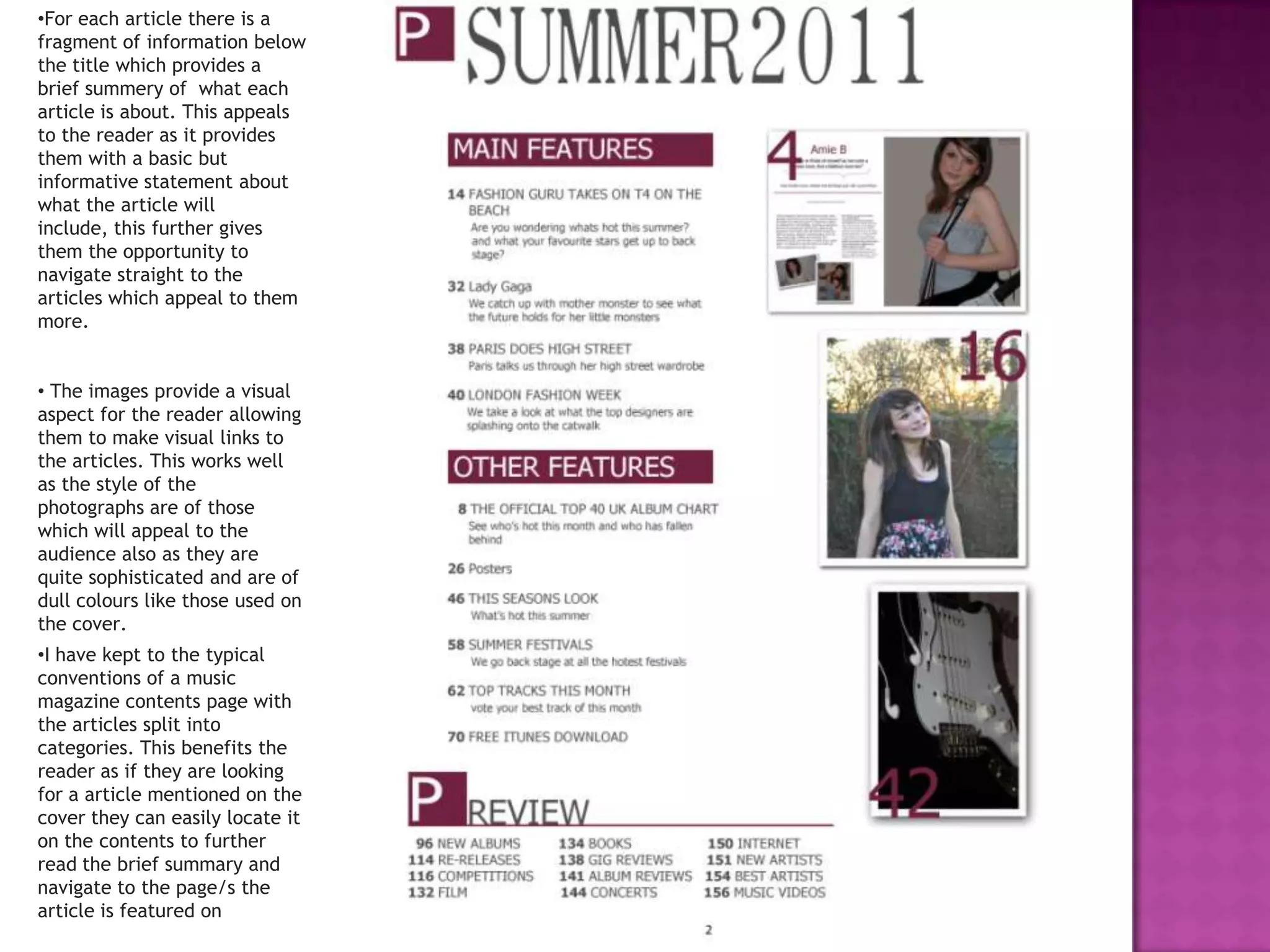
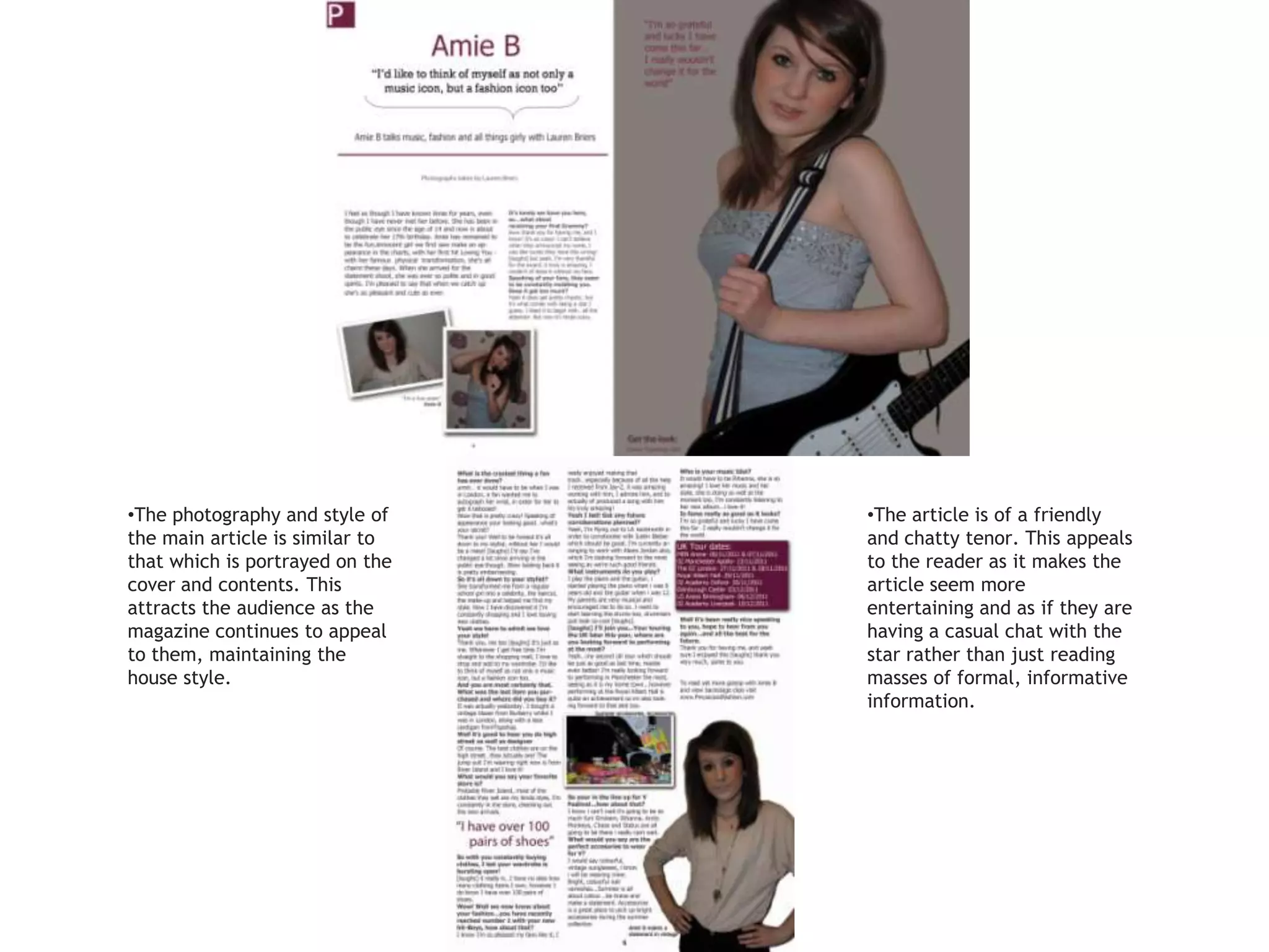
The document discusses strategies for designing the cover and contents page of a magazine to attract and engage the target audience. These include using a menu strip to provide quick facts, highlighting the issue number to show history and quality, and including a USP to give readers an extra reason to buy. Photos are chosen to be sophisticated yet youthful and appeal to the target demographic. Article summaries and consistent photography and style throughout help readers easily navigate and find content they will find appealing.


![[BROCHURE] Italy Tour Project | @SlideON](https://cdn.slidesharecdn.com/ss_thumbnails/brochure8-251215152319-2805af68-thumbnail.jpg?width=640&height=640&fit=bounds)
