SlideShare a Scribd company logo
Media Evaluation Georgia Ioannou
My Final Magazine Front Cover, Contents & Double Page Spread
In what ways does your media product use, develop or challenge forms and conventions of real media products? I think my media product has used a lot of  stereotypical conventions, as well challenging some of the typical conventions. First, I used the common conventions of the masthead at the very top of the front cover that is centred. I chose to call my magazine ‘UPFRONT’ as it relates to the audience being upfront at a gig/concert. The barcode, date, and price are placed in the bottom left hand corner, which makes it clearly visible for the intended audience to see. I have placed the main cover line centre of the model to draw  the readers attention  and to show that it is the main focus of the magazine. I chose to add a button which advertises a free posters and a banner advertising a free give away.  Both of these features both link with what my intended audience wanted from a music magazine. I have also chosen to have one full length image of the artist being shown on the front cover, which acted as the main focal point of the magazine.  However I challenged some of the typical conventions by not including things such as a strapline or added any other pictures of other artists/bands featured in the magazine. Which music magazines commonly do.  Most of my inspiration was drawn from a number of NME covers, the simplicity is something I have taken and incorporated into my text.  The indie scene is notable for its unusual and different dress sense, and this can be reflected with the presentation of the magazine and the artists included inside, predominantly the one featuring Paul Weller on the cover.  Although I have not chosen to use the same style of model for my magazine as NME. I have still tried to stick with the layout and limited use of colours, making it simplistic .
Most of my inspiration for my contents page came from the older styles of NME. I have chosen to follow their conventions of using one main image of an article featured in the magazine. This attracts readers who prefer things to be more visual with less text. The main picture I have used is very simple yet affective, it doesn’t give too much away about the article, making readers want to carry on reading.  I chose not to write a short summary of the article underneath the main image, as I thought by doing this it may put readers off buying the magazine, as it could give away too much about what is included on the double page spread. I instead chose to write a short summary for one of the other images, therefore challenging forms and conventions  of a real media product. I have made the page numbers bold making them stand out, so it easy for readers to navigate around the page, and kept  within the colour scheme used on the front cover and double page spread.  Although I chose to follow conventions of a real media product, I have also challenged it by not choosing to have a band index as shown on the NME contents page. I have incorporated the same colours from my front cover onto my contents page, and will continue to do so on my double page spread. This creates  a sense of shared identity and it links all the pages together. I have listed the contents of what is inside the magazine down the right hand side of the picture, underneath sub headings placed on a block of colour. This makes it clearer to read and understand, and I found this was common in most if not all the NME magazines I looked at. I have put a subscription feature at the bottom of the page with an image of the front cover, that shows that relationship between the two. This is commonly used and can be seen on music magazine contents pages.
I decided on using a main image instead of a few smaller ones which is also common in music magazines, because I wanted the readers to be fully focussed on the artist and her interview, and being able to connect with her without being distracted by a busy background or an instrument, instead of being confused by lots of little pictures scattered around the page. This could give the impression that the artist is more focused about having that connection with her fans, than she is about her music.  I have stereotypically written my interview in columns and have started the text of with a drop cap. Again, along with my front cover and contents page I took most of my influence from NME magazine, as I found from looking at various other music magazines NME had more simplistic double page spreads, in appearance. Throughout my magazine I have used images where my model has got direct eye contact with the camera, this ensures that the reader always has a connection with the magazine and feels that they can relate to the articles in it. For my article I have stereotypically followed the conventions of a double page spread that you would find in a music magazine. I chose to do an interview with the cover artist, and I have stuck to the convention of placing one main image on a the page, covering a large proportion of it. And then put the interview on the opposite page, and used alternating colours for the questions and answers, which you would commonly find in such magazines. I have chosen to use a simple heading of just ‘Melissa East’ for my article, which I decided on placing in the top left hand corner.  Like the subheadings on the contents page I have used a coloured block to put the heading on. This connotes the simplicity of the magazine . I have added a quote, that is the same colour as the article questions and the block of colour that the heading is on. This is so everything ties in together, and links with the colour scheme throughout the magazine. I have used the same colours and fonts, throughout my magazine showing I am keeping the same house style. This helps keep it looking professional and sleek throughout.
How does your media product represent particular social groups? ,[object Object],[object Object],[object Object]
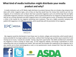
What kind of media institution might distribute your media product and why? ,[object Object],[object Object]
Who would be the audience for your media product? ,[object Object],[object Object],[object Object],[object Object]
How did you attract/address your audience? ,[object Object],[object Object],[object Object]
What have you learnt about technologies from the process of constructing this product? ,[object Object],[object Object]
Looking back at your preliminary task, what do you feel you have learnt in the progression from it to the full product? ,[object Object]

More Related Content

What's hot

Evaluation Of Music Magazine
Evaluation Of Music MagazineEvaluation Of Music Magazine
Evaluation Of Music Magazinekelsea66
 
AS Media Studies Coursework Evaluation
AS Media Studies Coursework EvaluationAS Media Studies Coursework Evaluation
AS Media Studies Coursework Evaluationamy2343
 
As media studies coursework evaluation
As media studies coursework evaluationAs media studies coursework evaluation
As media studies coursework evaluationamy2343
 
Evaluation
EvaluationEvaluation
Evaluation
Jess Radford
 
Evaluation
EvaluationEvaluation
Evaluationramarnax
 
Magazine evaluation
Magazine evaluationMagazine evaluation
Magazine evaluation
Cameron Loftus
 
Magazine evaluation
Magazine evaluationMagazine evaluation
Magazine evaluation
Cameron Loftus
 
Evaluation
EvaluationEvaluation
Evaluation
Jack Barlow
 
Evaluation
EvaluationEvaluation
Evaluationramarnax
 
Question 2
Question 2Question 2
Question 2
TonishaMedia
 

What's hot (12)

Evaluation Of Music Magazine
Evaluation Of Music MagazineEvaluation Of Music Magazine
Evaluation Of Music Magazine
 
AS Media Studies Coursework Evaluation
AS Media Studies Coursework EvaluationAS Media Studies Coursework Evaluation
AS Media Studies Coursework Evaluation
 
As media studies coursework evaluation
As media studies coursework evaluationAs media studies coursework evaluation
As media studies coursework evaluation
 
Evaluation
EvaluationEvaluation
Evaluation
 
Evaluation
EvaluationEvaluation
Evaluation
 
Magazine evaluation
Magazine evaluationMagazine evaluation
Magazine evaluation
 
Magazine evaluation
Magazine evaluationMagazine evaluation
Magazine evaluation
 
Evaluation
EvaluationEvaluation
Evaluation
 
Evaluation
EvaluationEvaluation
Evaluation
 
Question 2
Question 2Question 2
Question 2
 
My evaluation
My evaluationMy evaluation
My evaluation
 
Tyler powerpoint
Tyler powerpointTyler powerpoint
Tyler powerpoint
 

Similar to Media Evaluation

Media evaluation
Media evaluationMedia evaluation
Media evaluationgeorgiai
 
AS Media Final Evaluation
AS Media  Final EvaluationAS Media  Final Evaluation
AS Media Final Evaluation
Nav Man
 
Evaluation Commentary
Evaluation CommentaryEvaluation Commentary
Evaluation CommentaryBarney1995
 
Evaluation write up
Evaluation write upEvaluation write up
Evaluation write up
popk44
 
Media evaluation
Media evaluationMedia evaluation
Media evaluation
james_631
 
Evaluation
EvaluationEvaluation
Evaluation
samanthakryder
 
Media Evaluation
Media EvaluationMedia Evaluation
Media EvaluationJennieTott
 
Music Magazine Evaluaion
Music Magazine EvaluaionMusic Magazine Evaluaion
Music Magazine Evaluaion
charleyboxmedia
 
Media evaluation
Media evaluationMedia evaluation
Media evaluationLeanne94
 
Evaluation
EvaluationEvaluation
EvaluationLeanne94
 
Music magazine – the evaluation final
Music magazine – the evaluation finalMusic magazine – the evaluation final
Music magazine – the evaluation finalRach7
 
Evaluation
EvaluationEvaluation
EvaluationHeidi94
 

Similar to Media Evaluation (20)

Media evaluation
Media evaluationMedia evaluation
Media evaluation
 
Final analysis
Final analysisFinal analysis
Final analysis
 
AS Media Final Evaluation
AS Media  Final EvaluationAS Media  Final Evaluation
AS Media Final Evaluation
 
Evaluation Commentary
Evaluation CommentaryEvaluation Commentary
Evaluation Commentary
 
Evaluation
EvaluationEvaluation
Evaluation
 
Evaluation
EvaluationEvaluation
Evaluation
 
AS Media - Evaluation (Magazine)
AS Media - Evaluation (Magazine)AS Media - Evaluation (Magazine)
AS Media - Evaluation (Magazine)
 
AS Media Evaluation
AS Media EvaluationAS Media Evaluation
AS Media Evaluation
 
Evaluation write up
Evaluation write upEvaluation write up
Evaluation write up
 
Media evaluation
Media evaluationMedia evaluation
Media evaluation
 
Evaluation
EvaluationEvaluation
Evaluation
 
Evaluation
EvaluationEvaluation
Evaluation
 
Evaluation
EvaluationEvaluation
Evaluation
 
Evaluation
EvaluationEvaluation
Evaluation
 
Media Evaluation
Media EvaluationMedia Evaluation
Media Evaluation
 
Music Magazine Evaluaion
Music Magazine EvaluaionMusic Magazine Evaluaion
Music Magazine Evaluaion
 
Media evaluation
Media evaluationMedia evaluation
Media evaluation
 
Evaluation
EvaluationEvaluation
Evaluation
 
Music magazine – the evaluation final
Music magazine – the evaluation finalMusic magazine – the evaluation final
Music magazine – the evaluation final
 
Evaluation
EvaluationEvaluation
Evaluation
 

More from georgiai

Evaluation question 4
Evaluation question 4Evaluation question 4
Evaluation question 4georgiai
 
Evaluation question 4
Evaluation question 4Evaluation question 4
Evaluation question 4georgiai
 
Research into similar magazines and posters
Research into similar magazines and postersResearch into similar magazines and posters
Research into similar magazines and postersgeorgiai
 
Horror questionnaire results
Horror questionnaire resultsHorror questionnaire results
Horror questionnaire resultsgeorgiai
 
Presentation1
Presentation1Presentation1
Presentation1georgiai
 
Media presentation
Media presentation Media presentation
Media presentation georgiai
 

More from georgiai (6)

Evaluation question 4
Evaluation question 4Evaluation question 4
Evaluation question 4
 
Evaluation question 4
Evaluation question 4Evaluation question 4
Evaluation question 4
 
Research into similar magazines and posters
Research into similar magazines and postersResearch into similar magazines and posters
Research into similar magazines and posters
 
Horror questionnaire results
Horror questionnaire resultsHorror questionnaire results
Horror questionnaire results
 
Presentation1
Presentation1Presentation1
Presentation1
 
Media presentation
Media presentation Media presentation
Media presentation
 

Recently uploaded

Resolutions-Key-Interventions-28-May-2024.pdf
Resolutions-Key-Interventions-28-May-2024.pdfResolutions-Key-Interventions-28-May-2024.pdf
Resolutions-Key-Interventions-28-May-2024.pdf
bhavenpr
 
Do Linguistics Still Matter in the Age of Large Language Models.pptx
Do Linguistics Still Matter in the Age of Large Language Models.pptxDo Linguistics Still Matter in the Age of Large Language Models.pptx
Do Linguistics Still Matter in the Age of Large Language Models.pptx
Slator- Language Industry Intelligence
 
Preview of Court Document for Iseyin community
Preview of Court Document for Iseyin communityPreview of Court Document for Iseyin community
Preview of Court Document for Iseyin community
contact193699
 
Hogan Comes Home: an MIA WWII crewman is returned
Hogan Comes Home: an MIA WWII crewman is returnedHogan Comes Home: an MIA WWII crewman is returned
Hogan Comes Home: an MIA WWII crewman is returned
rbakerj2
 
Codes n Conventionss copy (1).paaaaaaptx
Codes n Conventionss copy (1).paaaaaaptxCodes n Conventionss copy (1).paaaaaaptx
Codes n Conventionss copy (1).paaaaaaptx
ZackSpencer3
 
03062024_First India Newspaper Jaipur.pdf
03062024_First India Newspaper Jaipur.pdf03062024_First India Newspaper Jaipur.pdf
03062024_First India Newspaper Jaipur.pdf
FIRST INDIA
 
31052024_First India Newspaper Jaipur.pdf
31052024_First India Newspaper Jaipur.pdf31052024_First India Newspaper Jaipur.pdf
31052024_First India Newspaper Jaipur.pdf
FIRST INDIA
 
Draft-1-Resolutions-Key-Interventions-.pdf
Draft-1-Resolutions-Key-Interventions-.pdfDraft-1-Resolutions-Key-Interventions-.pdf
Draft-1-Resolutions-Key-Interventions-.pdf
bhavenpr
 
2024 is the point of certainty. Forecast of UIF experts
2024 is the point of certainty. Forecast of UIF experts2024 is the point of certainty. Forecast of UIF experts
2024 is the point of certainty. Forecast of UIF experts
olaola5673
 
role of women and girls in various terror groups
role of women and girls in various terror groupsrole of women and girls in various terror groups
role of women and girls in various terror groups
sadiakorobi2
 
AI and Covert Influence Operations: Latest Trends
AI and Covert Influence Operations: Latest TrendsAI and Covert Influence Operations: Latest Trends
AI and Covert Influence Operations: Latest Trends
CI kumparan
 
Sharjeel-Imam-Judgement-CRLA-215-2024_29-05-2024.pdf
Sharjeel-Imam-Judgement-CRLA-215-2024_29-05-2024.pdfSharjeel-Imam-Judgement-CRLA-215-2024_29-05-2024.pdf
Sharjeel-Imam-Judgement-CRLA-215-2024_29-05-2024.pdf
bhavenpr
 
01062024_First India Newspaper Jaipur.pdf
01062024_First India Newspaper Jaipur.pdf01062024_First India Newspaper Jaipur.pdf
01062024_First India Newspaper Jaipur.pdf
FIRST INDIA
 

Recently uploaded (13)

Resolutions-Key-Interventions-28-May-2024.pdf
Resolutions-Key-Interventions-28-May-2024.pdfResolutions-Key-Interventions-28-May-2024.pdf
Resolutions-Key-Interventions-28-May-2024.pdf
 
Do Linguistics Still Matter in the Age of Large Language Models.pptx
Do Linguistics Still Matter in the Age of Large Language Models.pptxDo Linguistics Still Matter in the Age of Large Language Models.pptx
Do Linguistics Still Matter in the Age of Large Language Models.pptx
 
Preview of Court Document for Iseyin community
Preview of Court Document for Iseyin communityPreview of Court Document for Iseyin community
Preview of Court Document for Iseyin community
 
Hogan Comes Home: an MIA WWII crewman is returned
Hogan Comes Home: an MIA WWII crewman is returnedHogan Comes Home: an MIA WWII crewman is returned
Hogan Comes Home: an MIA WWII crewman is returned
 
Codes n Conventionss copy (1).paaaaaaptx
Codes n Conventionss copy (1).paaaaaaptxCodes n Conventionss copy (1).paaaaaaptx
Codes n Conventionss copy (1).paaaaaaptx
 
03062024_First India Newspaper Jaipur.pdf
03062024_First India Newspaper Jaipur.pdf03062024_First India Newspaper Jaipur.pdf
03062024_First India Newspaper Jaipur.pdf
 
31052024_First India Newspaper Jaipur.pdf
31052024_First India Newspaper Jaipur.pdf31052024_First India Newspaper Jaipur.pdf
31052024_First India Newspaper Jaipur.pdf
 
Draft-1-Resolutions-Key-Interventions-.pdf
Draft-1-Resolutions-Key-Interventions-.pdfDraft-1-Resolutions-Key-Interventions-.pdf
Draft-1-Resolutions-Key-Interventions-.pdf
 
2024 is the point of certainty. Forecast of UIF experts
2024 is the point of certainty. Forecast of UIF experts2024 is the point of certainty. Forecast of UIF experts
2024 is the point of certainty. Forecast of UIF experts
 
role of women and girls in various terror groups
role of women and girls in various terror groupsrole of women and girls in various terror groups
role of women and girls in various terror groups
 
AI and Covert Influence Operations: Latest Trends
AI and Covert Influence Operations: Latest TrendsAI and Covert Influence Operations: Latest Trends
AI and Covert Influence Operations: Latest Trends
 
Sharjeel-Imam-Judgement-CRLA-215-2024_29-05-2024.pdf
Sharjeel-Imam-Judgement-CRLA-215-2024_29-05-2024.pdfSharjeel-Imam-Judgement-CRLA-215-2024_29-05-2024.pdf
Sharjeel-Imam-Judgement-CRLA-215-2024_29-05-2024.pdf
 
01062024_First India Newspaper Jaipur.pdf
01062024_First India Newspaper Jaipur.pdf01062024_First India Newspaper Jaipur.pdf
01062024_First India Newspaper Jaipur.pdf
 

Media Evaluation

  • 2. My Final Magazine Front Cover, Contents & Double Page Spread
  • 3. In what ways does your media product use, develop or challenge forms and conventions of real media products? I think my media product has used a lot of stereotypical conventions, as well challenging some of the typical conventions. First, I used the common conventions of the masthead at the very top of the front cover that is centred. I chose to call my magazine ‘UPFRONT’ as it relates to the audience being upfront at a gig/concert. The barcode, date, and price are placed in the bottom left hand corner, which makes it clearly visible for the intended audience to see. I have placed the main cover line centre of the model to draw the readers attention and to show that it is the main focus of the magazine. I chose to add a button which advertises a free posters and a banner advertising a free give away. Both of these features both link with what my intended audience wanted from a music magazine. I have also chosen to have one full length image of the artist being shown on the front cover, which acted as the main focal point of the magazine. However I challenged some of the typical conventions by not including things such as a strapline or added any other pictures of other artists/bands featured in the magazine. Which music magazines commonly do. Most of my inspiration was drawn from a number of NME covers, the simplicity is something I have taken and incorporated into my text. The indie scene is notable for its unusual and different dress sense, and this can be reflected with the presentation of the magazine and the artists included inside, predominantly the one featuring Paul Weller on the cover. Although I have not chosen to use the same style of model for my magazine as NME. I have still tried to stick with the layout and limited use of colours, making it simplistic .
  • 4. Most of my inspiration for my contents page came from the older styles of NME. I have chosen to follow their conventions of using one main image of an article featured in the magazine. This attracts readers who prefer things to be more visual with less text. The main picture I have used is very simple yet affective, it doesn’t give too much away about the article, making readers want to carry on reading. I chose not to write a short summary of the article underneath the main image, as I thought by doing this it may put readers off buying the magazine, as it could give away too much about what is included on the double page spread. I instead chose to write a short summary for one of the other images, therefore challenging forms and conventions of a real media product. I have made the page numbers bold making them stand out, so it easy for readers to navigate around the page, and kept within the colour scheme used on the front cover and double page spread. Although I chose to follow conventions of a real media product, I have also challenged it by not choosing to have a band index as shown on the NME contents page. I have incorporated the same colours from my front cover onto my contents page, and will continue to do so on my double page spread. This creates a sense of shared identity and it links all the pages together. I have listed the contents of what is inside the magazine down the right hand side of the picture, underneath sub headings placed on a block of colour. This makes it clearer to read and understand, and I found this was common in most if not all the NME magazines I looked at. I have put a subscription feature at the bottom of the page with an image of the front cover, that shows that relationship between the two. This is commonly used and can be seen on music magazine contents pages.
  • 5. I decided on using a main image instead of a few smaller ones which is also common in music magazines, because I wanted the readers to be fully focussed on the artist and her interview, and being able to connect with her without being distracted by a busy background or an instrument, instead of being confused by lots of little pictures scattered around the page. This could give the impression that the artist is more focused about having that connection with her fans, than she is about her music. I have stereotypically written my interview in columns and have started the text of with a drop cap. Again, along with my front cover and contents page I took most of my influence from NME magazine, as I found from looking at various other music magazines NME had more simplistic double page spreads, in appearance. Throughout my magazine I have used images where my model has got direct eye contact with the camera, this ensures that the reader always has a connection with the magazine and feels that they can relate to the articles in it. For my article I have stereotypically followed the conventions of a double page spread that you would find in a music magazine. I chose to do an interview with the cover artist, and I have stuck to the convention of placing one main image on a the page, covering a large proportion of it. And then put the interview on the opposite page, and used alternating colours for the questions and answers, which you would commonly find in such magazines. I have chosen to use a simple heading of just ‘Melissa East’ for my article, which I decided on placing in the top left hand corner. Like the subheadings on the contents page I have used a coloured block to put the heading on. This connotes the simplicity of the magazine . I have added a quote, that is the same colour as the article questions and the block of colour that the heading is on. This is so everything ties in together, and links with the colour scheme throughout the magazine. I have used the same colours and fonts, throughout my magazine showing I am keeping the same house style. This helps keep it looking professional and sleek throughout.
  • 6.
  • 7.
  • 8.
  • 9.
  • 10.
  • 11.