The document describes editing an image for an advertising campaign. The key steps taken include:
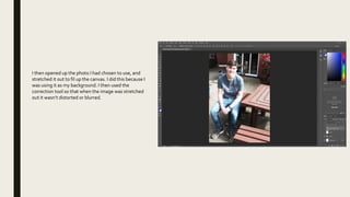
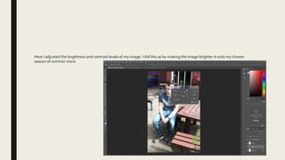
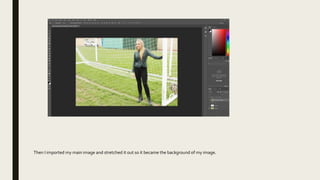
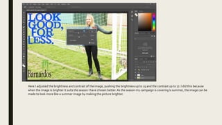
1. Stretching an imported background image to fill the canvas and adjusting brightness/contrast to suit the summer season.
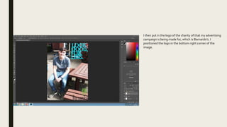
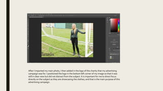
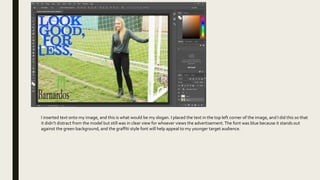
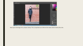
2. Adding the logo of the charity Barnardo's to the bottom right corner.
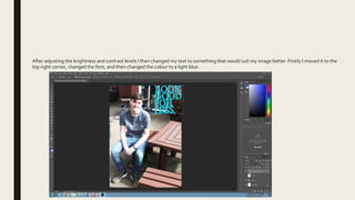
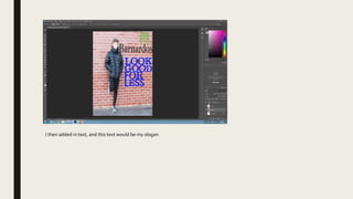
3. Changing the text color, font, and position to the top right corner to suit the background image better.
4. Increasing brightness to 15 and contrast to 17 to make the image appear brighter like a summer photo.