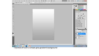
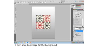
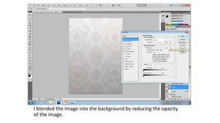
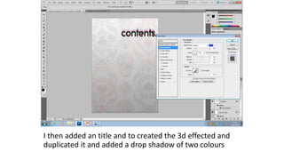
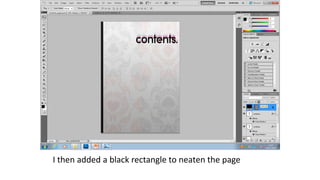
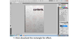
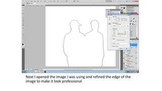
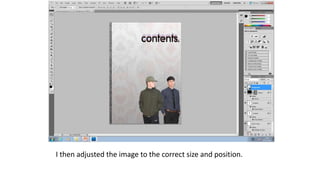
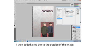
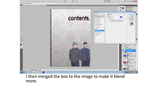
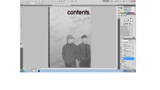
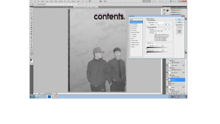
CONTENTS PAGE WEEK 1
I started off with a simple grey gradient background
I then added an image for the background.
I blended the image into the background by reducing the opacity
of the image.
I then added an title and to created the 3d effected and
duplicated it and added a drop shadow of two colours
I then added a black rectangle to neaten the page
• I then dissolved the rectangle for effect.
Next I opened the image I was using and refined the edge of the
image to make it look professional
I then adjusted the image to the correct size and position.
I then added a red box to the outside of the image.
I then merged the box to the image to make it blend
more.
After I added a slight gradient to create a light effect between
the separate subjects in the image.
I then added a black and white effect over the image as I thought
would be most appropriate in order to make the image less dominant
in comparison to text but it left a coloured border around the edge of
the image which is similar to the title “contents”
Contents page week 1

Contents page week 1

  • 1.
  • 2.
    I started offwith a simple grey gradient background
  • 3.
    I then addedan image for the background.
  • 4.
    I blended theimage into the background by reducing the opacity of the image.
  • 5.
    I then addedan title and to created the 3d effected and duplicated it and added a drop shadow of two colours
  • 6.
    I then addeda black rectangle to neaten the page
  • 7.
    • I thendissolved the rectangle for effect.
  • 8.
    Next I openedthe image I was using and refined the edge of the image to make it look professional
  • 9.
    I then adjustedthe image to the correct size and position.
  • 10.
    I then addeda red box to the outside of the image.
  • 11.
    I then mergedthe box to the image to make it blend more.
  • 12.
    After I addeda slight gradient to create a light effect between the separate subjects in the image.
  • 13.
    I then addeda black and white effect over the image as I thought would be most appropriate in order to make the image less dominant in comparison to text but it left a coloured border around the edge of the image which is similar to the title “contents”