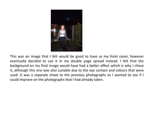
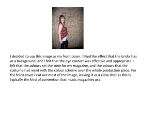
2. In this PowerPoint I will include the photographs that I took for the front cover and double page spread of my magazine. They featured the ‘artist’ that I used for my double page spread, though I also took photographs of other people to include as smaller images in order to break up space on my contents page and front page. I also wanted to make the magazine look more professional and realistic. The reason that I haven’t included these photographs in this presentation is because the focus was aimed to be on ‘Kerry Glaysher’, and the pictures that I took of her were the most important with regard to audience focus.
3. For my magazine I took many photographs of the ‘artist’ that I chose to include. When deciding which to use for my front cover, I narrowed the selection down to four images that I would choose between. In the next few slides I am going to evaluate which one I decided to choose and why.
4. This is a medium shot. I decided not to use this image on my front cover because it lacks the eye contact that is necessary on music magazines in order to make the audience feel as though they are connected with the artist.
5. I decided not to use this image as part of my front cover because it wasn’t an appropriate shape, and again the eye contact that I thought would be needed wasn’t shown as much as I would have liked. However I did like this and wanted to use it, so I included it as the main image on my double page spread.
6. This was an image that I felt would be good to have as my front cover, however eventually decided to use it in my double page spread instead. I felt that the background on my final image would have had a better effect which is why I chose it, although this one was also suitable due to the eye contact and colours that were used. It was a separate shoot to the previous photographs as I wanted to see if I could improve on the photographs that I had already taken.
7. I decided to use this image as my front cover. I liked the effect that the bricks has as a background, and I felt that the eye contact was effective and appropriate. I felt that the colours set the tone for my magazine, and the colours that the costume had went with the colour scheme over the whole production piece. For the front cover I cut out most of the image, leaving it as a close shot as this is typically the kind of convention that music magazines use.