
Recommended
More Related Content
What's hot
What's hot (20)
Viewers also liked
Viewers also liked (14)
Similar to Use of photoshop for images
Similar to Use of photoshop for images (20)
Recently uploaded
Recently uploaded (20)
Use of photoshop for images
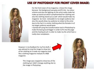
- 1. For the front cover of my magazine, I chose this image because the background was grey and fit into my colour scheme and also the lighting on the artist really made her make up stand out which complimented her clothing and also the clothing stood out as well which would make my magazine be more noticeable to my target audience but also this would allow my audience to relate to the artist due to the fact it is similar clothing what the females in of my target audience would wear. I started off using the transformation tool in Photoshop to make the back ground bigger in order to fit into the page and the healing brush in order to make my the artist have a really clear complexion. However in my feedback for my first draft, I was advised to crop the image to show less of her clothing as it made my magazine look like a clothing magazine instead of a R&B magazine. This image was cropped to show less of the clothing but I didn’t change anything else to the image in Photoshop.
- 2. I used this image because it was a mid shot of the main artist and showed a lot of her clothing that would relate to the text on the double page spread this clothing would cause my target audience to relate to the artists and therefore be more interested in what else was in the magazine the grey background also complimented her dark clothing helping her to stand out even more to the audience. I used Photoshop to use the transformation tool to make the back ground of these images bigger so it would fit to the page in InDesign. I also used the healing brush to give the artist a clearer complexion.
- 3. I chose this image because it is a close up of the main artist which meant it was clear the text was focused on her to the audience. I used Photoshop to make this image black and white as I wanted it to be a faded picture of the artist with the text and other features over it. It also went well with my colour scheme. I also used the healing brush to give the artist a nice clear complexion. To make the back ground larger, I used the transformation tool, I did this in order for the whole image to fill both sides of the double page spread in order to make the actual image of the artist bigger. I chose this image because it represented both genders which meant it appealed to everyone in my target audience. Both people are wearing clothes that relate to the text and are similar clothing to what those of my target group would wear, meaning they can relate to the artists and therefore be intrigued by my magazine. I used Photoshop to also make this image back and white because I also wanted this image to be faded in the back ground with the text over lapping it. I also used Photoshop to crop out unwanted objects in the image and the transformation tool to make the back ground bigger in order to fit perfectly to the page in InDesign and also the healing tool to give the artists clearer complexions.