
Recommended
More Related Content
What's hot
What's hot (20)
Similar to 3 advertisments edit powerpoint
Similar to 3 advertisments edit powerpoint (20)
More from RhysMcLoughlin
Recently uploaded
Recently uploaded (20)
3 advertisments edit powerpoint
- 2. In this image this is where I selected the document type and made sure the size of paper was A4
- 3. In this image I inserted the paper size and rotation.
- 4. In this image I selected the image I wanted to insert into the page for my first advert
- 5. In this image I sized up the image to more appropriately fit in the image .
- 6. In this image I changed the ‘lightness’ and ‘saturation’ settings in order to set the backgrounds different shades.
- 7. Next I inserted the campaign logo to my image by File’ open’ and selecting the image.
- 8. In this image you can now see that I have uploaded the logo to my image I resized the logo and chose and appropriate location for it, I did not show this in the next two adverts as you can see here how to do it.
- 9. In this image I inserted the advertising slogan for my campaign in which I needed to also change the font of the slogan to achieve a close look to my campaign proposal.
- 10. In this image you can how I have changed the font logo and image to achieve my advert
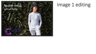
- 11. Image 2 editing
- 12. In this image this is where I selected the document type and made sure the size of paper was A4.
- 13. In this image I inserted the image of Lennie stood at the basketball posts shown in the location recce.
- 14. Next I changed the vibrance and saturation of my image as the theme is summer however the day was not the sunniest, this made the image look brighter and more colourful in vibrancy.
- 15. In this final image I inserted my campaign logo and slogan.
- 16. Image 3 editing
- 17. In this image this is where I selected the document type and made sure the size of paper was A4.
- 18. In this image I inserted a image of Chelsea appropriate as it compares very similar to my location recce and ideas.
- 19. In this image I changed the brightness and contrast to be more of summer theme as the day in which I took this particular image was a rainy dull day.
- 20. In this image again I changed the vibrance and saturation of the image as the theme is summer, his made the image look brighter and more colourful in vibrancy.
- 21. In this image I resized the image to be portrait as I took the image in a land scape mode as in my campaign of ideas I stated that I would be taking two portrait images and one landscape image.
- 22. In this image I inserted the logo and slogan for my campaign which was easier due to using the setting and layout from image 1 .