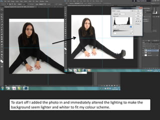
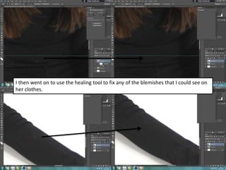
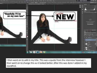
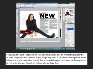
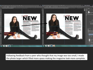
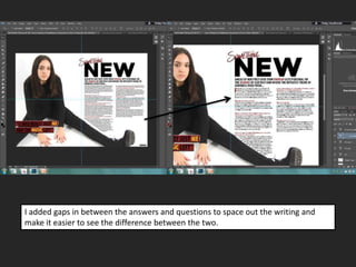
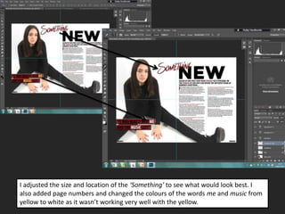
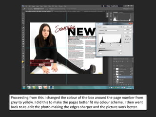
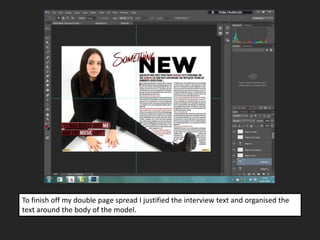
Double page spread:
Layout decisions
To start off I added the photo in and immediately altered the lighting to make the
background seem lighter and whiter to fit my colour scheme.
I then went on to use the healing tool to fix any of the blemishes that I could see on
her clothes.
I then went on to add in my title. This was a quote from the interview however I
then went on to change this as it looked better. After this was done I added in my
standfirst.
Following this step I added in my text and also picked out an interesting quote that
fit with the photo that I chose. In the image my artist is sat alone looking small which
is how the quote makes her sound. For my text I changed the colour of the questions
to red in an attempt to pull my colour scheme together.
Following feedback from a peer who thought that my image was too small, I made
the photo larger which filled more space making the magazine look more complete.
I added gaps in between the answers and questions to space out the writing and
make it easier to see the difference between the two.
I adjusted the size and location of the ‘Something’ to see what would look best. I
also added page numbers and changed the colours of the words me and music from
yellow to white as it wasn’t working very well with the yellow.
Proceeding from this I changed the colour of the box around the page number from
grey to yellow. I did this to make the pages better fit my colour scheme. I then went
back to re-edit the photo making the edges sharper and the picture work better.
To finish off my double page spread I justified the interview text and organised the
text around the body of the model.

DPS layout decisions

  • 1.
  • 2.
    To start offI added the photo in and immediately altered the lighting to make the background seem lighter and whiter to fit my colour scheme.
  • 3.
    I then wenton to use the healing tool to fix any of the blemishes that I could see on her clothes.
  • 4.
    I then wenton to add in my title. This was a quote from the interview however I then went on to change this as it looked better. After this was done I added in my standfirst.
  • 5.
    Following this stepI added in my text and also picked out an interesting quote that fit with the photo that I chose. In the image my artist is sat alone looking small which is how the quote makes her sound. For my text I changed the colour of the questions to red in an attempt to pull my colour scheme together.
  • 6.
    Following feedback froma peer who thought that my image was too small, I made the photo larger which filled more space making the magazine look more complete.
  • 7.
    I added gapsin between the answers and questions to space out the writing and make it easier to see the difference between the two.
  • 8.
    I adjusted thesize and location of the ‘Something’ to see what would look best. I also added page numbers and changed the colours of the words me and music from yellow to white as it wasn’t working very well with the yellow.
  • 9.
    Proceeding from thisI changed the colour of the box around the page number from grey to yellow. I did this to make the pages better fit my colour scheme. I then went back to re-edit the photo making the edges sharper and the picture work better.
  • 10.
    To finish offmy double page spread I justified the interview text and organised the text around the body of the model.