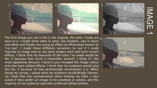
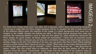
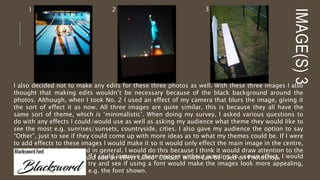
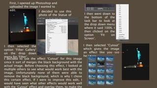
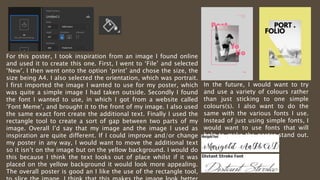
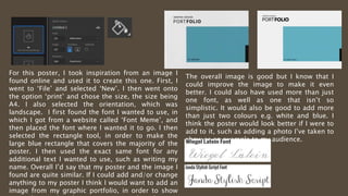
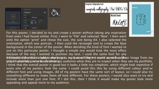
GRAPHICS PORTFOLIO Harriet Smith
IMAGE1
The first image you see is the is the original, the edits I made are
next to it. I made three edits in total, one brighter, one in black
and white and finally one using an effect on Photoshop known as
“cut-out”. I made these different variations to see if I could
improve to image and/or see what images work well with certain
effects. I think that my favourite of the edits I’ve made would be
No. 4 because how much it resembles artwork. I think it’s the
most appealing because I haven’t just changed the image colour
wise but have added effects. I think that my audience would also
like No. 4 because of how aesthetically minimalistic it is. When
doing my survey, I asked what my audience would Bright/vibrant,
so I took that into consideration when making my edits. I also
asked if they prefer an image to be unedited or edited, and the
majority of my audience said they preferred edited photos.
1 2 3
4
IMAGE(S)2
1 2 3
For these three images there aren’t any edits, this is because I didn’t think any would be necessary.
I chose not to make edits for these images because I felt as if I wouldn’t be able to make much use
of the different effects when the majority of the image is a black background with some sort of
imagery in the middle. Despite not making any edits, I like these photos because they make you
question the reasoning behind it, such as; why was this taken? Or, what should this represent? All
three images are quite similar, all being simple yet minimalistic. I think that my favourite would
have to be No. 2, this is because you can also see a correlation between the main image and part of
another image on the left. From looking at the two, you can guess that they’re both linked together
around a certain theme. When doing my survey, I asked; “What topic do you enjoy taking photos of?”
to which I also gave options such as “Animals”, “Cities”, “Sunsets/Sunrises” etc… I also gave them to
option “Other” but also asked them to elaborate on what they do take photos of. 60% of my
audience chose the option “Countryside”, which shows that the majority of my audience enjoy to
take photos more nature based. I also asked; “What do you take your photos on?” and gave then the
IMAGE(S)3
1 2 3
I also decided not to make any edits for these three photos as well. With these three images I also
thought that making edits wouldn’t be necessary because of the black background around the
photos. Although, when I took No. 2 I used an effect of my camera that blurs the image, giving it
the sort of effect it as now. All three images are quite similar, this is because they all have the
same sort of theme, which is ‘minimalistic’. When doing my survey, I asked various questions to
do with any effects I could/would use as well as asking my audience what theme they would like to
see the most e.g. sunrises/sunsets, countryside, cities. I also gave my audience the option to say
“Other”, just to see if they could come up with more ideas as to what my themes could be. If I were
to add effects to these images I would make it so it would only effect the main image in the centre,
not the whole background in general. I would do this because I think it would draw attention to the
centre of the image. I would add an effect called “Cutout” which can be used on Photoshop.If I could improve these images without wanting to use an effect, I would
try and see if using a font would make the images look more appealing,
e.g. the font shown.
First, I opened up Photoshop and
uploaded the image I wanted to
edit. I decided to use this
photo of the Statue of
Liberty.
I then selected the
option ‘Filter Gallery’
on the drop down
menu for ‘Filter’.
I then went down to
the bottom of the
task bar to look at
the drop down menu
where it said 100%. I
then clicked on the
option ‘Fit on
Screen’.
I then selected “Cutout”
which gives the image
an effect like you see
here
I decided to use the effect ‘Cutout’ for this image
since it sort of merges the black background with the
actual image. Before choosing this effect, I looked at
multiple others to see what would work best with the
image. Unfortunately none of them were able to
remove the black background, which is why I chose
this certain effect. If I were to improve this edit, I
would have seen what other effects would work well
with the ‘Cutout’ effect and overlay them, to make the
When using various effects on Photoshop you are able to change the
density of the effect i.e. how much of the original image you want and to
what degree you want the effect to appear. You can do this by looking at
the task bar aside image with the option ‘Number of Levels’. There is
also an option called ‘Edge Simplicity’, which makes the edges of an
image look smoother. When I used this effect to edit my image I set the
number of levels to 6. I did this because if gives me image a darker tone
of colour but you can also see the whole image. This is different when
you set the number of levels 3, as some of the image is cut off. You can
see this in the two images below that show the different contrasts of the
effect. I also set the edge simplicity to 10, since this gives the image a
smoother look. Overall I like using the ‘cutout’ effect because it gives
the image a nice warm undertone rather than it just having the sort of
vibrant colours in the original image.
N0. of
levels: 6
N0. of
levels: 3
N0. of
levels: 0
For this image I used two effects; ‘Cutout’ and
‘Plastic Wrap’. I first used the ‘plastic wrap’ effect
on the windows, which you can see on the left, to
make it stand out more. I then over layered the
effect with the ‘cutout’ effect. When using the
effect ‘cutout’ there is another called number of
levels. This means how much of the original image
you want and to what degree you want the effect
to appear. I decided to set the number of levels to
6, so you are still able to see parts of the original
image and you are also able to see the other
effect. I took this image whilst at an art gallery
along with a few photos similar to it. I chose this
particular photo because I knew I could use these
two effects to make the image look artistic, which
is what I wanted. The good thing about using the
‘cutout’ effect is that it helps to rid of any part of
the image you don’t like/don’t want. I used this to
remove parts of the image I didn’t like, but also
because it makes the image look minimalistic
which is what I was trying to accomplish.
If I could improve this image in any way, I would want to use the ‘plastic wrap’ tool on more than just part of the
image. If I did this, I think that it would improve the overall image greatly. I also think that the image isn’t very
colourful so I would add some form of colour to make it look more appealing. My only problem with the cutout
effect is that most of colour from the original image is replaced by the colour grey. I can change this to an extent
by altering the number of levels of the effect. Another problem with this effect is that it doesn’t look as good
when you merge it with other effects. In the future, I would want to experiment with other effects and try merging
them together, rather than just using one effect constantly. I think this makes the images look boring after a
while. I could have tried using text in some sort of way to make the image look more interesting. I would use the
text for some kind of phrase or word and then decrease it’s opacity, so you would still be able to see the text
For this poster, I took inspiration from an image I found
online and used it to create this one. First, I went to ‘File’ and
selected ‘New’. I then went onto the option ‘print’ and chose
the size, the size being A4. I also selected the orientation,
which was portrait. I then selected the shape tool and aligned
it where I wanted it to go. I found this font on a website called
‘Font Meme’. Whilst looking at this website I found a good
range of fonts that I could use to create my posters. I decided
to use a font called ‘League Spartan’. The overall font is quite
simple but matches well with the plain background. I also like
how the font is two different colours, which makes it stand
out a lot more than just having one colour. I took the
additional text from the image I found online and used it as
well. This making the poster look more professional. The
overall poster is good and I like the overlaps of the yellow and
black colours. If I could improve and/or change my poster in
any way, I would want to include a variety of colours, rather
I would also include more than just
one font. The font I used for this
poster is quite simple as you can
see. If I were to choose another
font, I would want one that is more
cursive, which will draw more
attention to it. I like the overall
layout of the poster, including the
switch between the black and
yellow font. For that reason, I don’t
For this poster, I took inspiration from an image I found online
and used it to create this one. First, I went to ‘File’ and selected
‘New’. I then went onto the option ‘print’ and chose the size, the
size being A4. I also selected the orientation, which was portrait.
I first imported the image I wanted to use for my poster, which
was quite a simple image I had taken outside. Secondly I found
the font I wanted to use, in which I got from a website called
‘Font Meme’, and brought it to the front of my image. I also used
the same exact font create the additional text. Finally I used the
rectangle tool to create a sort of gap between two parts of my
image. Overall I’d say that my image and the image I used as
inspiration are quite different. If I could improve and/or change
my poster in any way, I would want to move the additional text
so it isn’t on the image but on the yellow background. I would do
this because I think the text looks out of place whilst if it was
placed on the yellow background it would look more appealing.
The overall poster is good an I like the use of the rectangle tool,
In the future, I would want to try
and use a variety of colours rather
than just sticking to one simple
colours(s). I also want to do the
same with the various fonts I use.
Instead of just using simple fonts, I
would want to use fonts that will
help to make the poster stand out.
E.g. fonts that are cursive.
For this poster, I took inspiration from an image I
found online and used it to create this one. First, I
went to ‘File’ and selected ‘New’. I then went onto
the option ‘print’ and chose the size, the size being
A4. I also selected the orientation, which was
landscape. I first found the font I wanted to use, in
which I got from a website called ‘Font Meme’, and
then placed the font where I wanted it to go. I then
selected the rectangle tool, in order to make the
large blue rectangle that covers the majority of the
poster. I then used the exact same font for any
additional text I wanted to use, such as writing my
name. Overall I’d say that my poster and the image I
found are quite similar. If I could add and/or change
anything to my poster I think I would want to add an
image from my graphic portfolio, in order to show
The overall image is good but I know that I
could improve the image to make it even
better. I could also have used more than just
one font, as well as one that isn’t so
simplistic. It would also be good to add more
than just two colours e.g. white and blue. I
think the poster would look better if I were to
add to it, such as adding a photo I’ve taken to
show as an example to my audience.
For this poster, I decided to try and create a poster without taking any inspiration
from ones I had found online. First, I went to ‘File’ and selected ‘New’. I then went
onto the option ‘print’ and chose the size, the size being A4. I also selected the
orientation, which was portrait. I then used the rectangle tool to create the blue
background in the center of the poster. When deciding the kind of font I wanted to
use on this particular poster, I thought a simple one would look the most effect
because of the way I wanted to position my text. I used the same font for any
additional I decided to add to the poster, such as adding my name as well as the
title of what my poster is advertising.
If I could add and/or change anything to my poster I think I would want to add an image from my
graphic portfolio, in order to show my audience what they are to expect when they see my portfolio.
I think that the overall poster is good but it looks a little too simplistic, which might look repetitive if
every one of my posters look the same. I could avoid this this by using different colour and/or
different font and using images. All of my posters have the same sort of layout, so I could also try
something different to make them all look different. For these posters, I would also want to try and
include more than just one font. If I did this, then I think it would make my poster look more
appealing and appeal more to my audience.

Image portfolio

  • 1.
  • 2.
    IMAGE1 The first imageyou see is the is the original, the edits I made are next to it. I made three edits in total, one brighter, one in black and white and finally one using an effect on Photoshop known as “cut-out”. I made these different variations to see if I could improve to image and/or see what images work well with certain effects. I think that my favourite of the edits I’ve made would be No. 4 because how much it resembles artwork. I think it’s the most appealing because I haven’t just changed the image colour wise but have added effects. I think that my audience would also like No. 4 because of how aesthetically minimalistic it is. When doing my survey, I asked what my audience would Bright/vibrant, so I took that into consideration when making my edits. I also asked if they prefer an image to be unedited or edited, and the majority of my audience said they preferred edited photos. 1 2 3 4
  • 3.
    IMAGE(S)2 1 2 3 Forthese three images there aren’t any edits, this is because I didn’t think any would be necessary. I chose not to make edits for these images because I felt as if I wouldn’t be able to make much use of the different effects when the majority of the image is a black background with some sort of imagery in the middle. Despite not making any edits, I like these photos because they make you question the reasoning behind it, such as; why was this taken? Or, what should this represent? All three images are quite similar, all being simple yet minimalistic. I think that my favourite would have to be No. 2, this is because you can also see a correlation between the main image and part of another image on the left. From looking at the two, you can guess that they’re both linked together around a certain theme. When doing my survey, I asked; “What topic do you enjoy taking photos of?” to which I also gave options such as “Animals”, “Cities”, “Sunsets/Sunrises” etc… I also gave them to option “Other” but also asked them to elaborate on what they do take photos of. 60% of my audience chose the option “Countryside”, which shows that the majority of my audience enjoy to take photos more nature based. I also asked; “What do you take your photos on?” and gave then the
  • 4.
    IMAGE(S)3 1 2 3 Ialso decided not to make any edits for these three photos as well. With these three images I also thought that making edits wouldn’t be necessary because of the black background around the photos. Although, when I took No. 2 I used an effect of my camera that blurs the image, giving it the sort of effect it as now. All three images are quite similar, this is because they all have the same sort of theme, which is ‘minimalistic’. When doing my survey, I asked various questions to do with any effects I could/would use as well as asking my audience what theme they would like to see the most e.g. sunrises/sunsets, countryside, cities. I also gave my audience the option to say “Other”, just to see if they could come up with more ideas as to what my themes could be. If I were to add effects to these images I would make it so it would only effect the main image in the centre, not the whole background in general. I would do this because I think it would draw attention to the centre of the image. I would add an effect called “Cutout” which can be used on Photoshop.If I could improve these images without wanting to use an effect, I would try and see if using a font would make the images look more appealing, e.g. the font shown.
  • 5.
    First, I openedup Photoshop and uploaded the image I wanted to edit. I decided to use this photo of the Statue of Liberty. I then selected the option ‘Filter Gallery’ on the drop down menu for ‘Filter’. I then went down to the bottom of the task bar to look at the drop down menu where it said 100%. I then clicked on the option ‘Fit on Screen’. I then selected “Cutout” which gives the image an effect like you see here I decided to use the effect ‘Cutout’ for this image since it sort of merges the black background with the actual image. Before choosing this effect, I looked at multiple others to see what would work best with the image. Unfortunately none of them were able to remove the black background, which is why I chose this certain effect. If I were to improve this edit, I would have seen what other effects would work well with the ‘Cutout’ effect and overlay them, to make the
  • 6.
    When using variouseffects on Photoshop you are able to change the density of the effect i.e. how much of the original image you want and to what degree you want the effect to appear. You can do this by looking at the task bar aside image with the option ‘Number of Levels’. There is also an option called ‘Edge Simplicity’, which makes the edges of an image look smoother. When I used this effect to edit my image I set the number of levels to 6. I did this because if gives me image a darker tone of colour but you can also see the whole image. This is different when you set the number of levels 3, as some of the image is cut off. You can see this in the two images below that show the different contrasts of the effect. I also set the edge simplicity to 10, since this gives the image a smoother look. Overall I like using the ‘cutout’ effect because it gives the image a nice warm undertone rather than it just having the sort of vibrant colours in the original image. N0. of levels: 6 N0. of levels: 3 N0. of levels: 0
  • 7.
    For this imageI used two effects; ‘Cutout’ and ‘Plastic Wrap’. I first used the ‘plastic wrap’ effect on the windows, which you can see on the left, to make it stand out more. I then over layered the effect with the ‘cutout’ effect. When using the effect ‘cutout’ there is another called number of levels. This means how much of the original image you want and to what degree you want the effect to appear. I decided to set the number of levels to 6, so you are still able to see parts of the original image and you are also able to see the other effect. I took this image whilst at an art gallery along with a few photos similar to it. I chose this particular photo because I knew I could use these two effects to make the image look artistic, which is what I wanted. The good thing about using the ‘cutout’ effect is that it helps to rid of any part of the image you don’t like/don’t want. I used this to remove parts of the image I didn’t like, but also because it makes the image look minimalistic which is what I was trying to accomplish. If I could improve this image in any way, I would want to use the ‘plastic wrap’ tool on more than just part of the image. If I did this, I think that it would improve the overall image greatly. I also think that the image isn’t very colourful so I would add some form of colour to make it look more appealing. My only problem with the cutout effect is that most of colour from the original image is replaced by the colour grey. I can change this to an extent by altering the number of levels of the effect. Another problem with this effect is that it doesn’t look as good when you merge it with other effects. In the future, I would want to experiment with other effects and try merging them together, rather than just using one effect constantly. I think this makes the images look boring after a while. I could have tried using text in some sort of way to make the image look more interesting. I would use the text for some kind of phrase or word and then decrease it’s opacity, so you would still be able to see the text
  • 8.
    For this poster,I took inspiration from an image I found online and used it to create this one. First, I went to ‘File’ and selected ‘New’. I then went onto the option ‘print’ and chose the size, the size being A4. I also selected the orientation, which was portrait. I then selected the shape tool and aligned it where I wanted it to go. I found this font on a website called ‘Font Meme’. Whilst looking at this website I found a good range of fonts that I could use to create my posters. I decided to use a font called ‘League Spartan’. The overall font is quite simple but matches well with the plain background. I also like how the font is two different colours, which makes it stand out a lot more than just having one colour. I took the additional text from the image I found online and used it as well. This making the poster look more professional. The overall poster is good and I like the overlaps of the yellow and black colours. If I could improve and/or change my poster in any way, I would want to include a variety of colours, rather I would also include more than just one font. The font I used for this poster is quite simple as you can see. If I were to choose another font, I would want one that is more cursive, which will draw more attention to it. I like the overall layout of the poster, including the switch between the black and yellow font. For that reason, I don’t
  • 9.
    For this poster,I took inspiration from an image I found online and used it to create this one. First, I went to ‘File’ and selected ‘New’. I then went onto the option ‘print’ and chose the size, the size being A4. I also selected the orientation, which was portrait. I first imported the image I wanted to use for my poster, which was quite a simple image I had taken outside. Secondly I found the font I wanted to use, in which I got from a website called ‘Font Meme’, and brought it to the front of my image. I also used the same exact font create the additional text. Finally I used the rectangle tool to create a sort of gap between two parts of my image. Overall I’d say that my image and the image I used as inspiration are quite different. If I could improve and/or change my poster in any way, I would want to move the additional text so it isn’t on the image but on the yellow background. I would do this because I think the text looks out of place whilst if it was placed on the yellow background it would look more appealing. The overall poster is good an I like the use of the rectangle tool, In the future, I would want to try and use a variety of colours rather than just sticking to one simple colours(s). I also want to do the same with the various fonts I use. Instead of just using simple fonts, I would want to use fonts that will help to make the poster stand out. E.g. fonts that are cursive.
  • 10.
    For this poster,I took inspiration from an image I found online and used it to create this one. First, I went to ‘File’ and selected ‘New’. I then went onto the option ‘print’ and chose the size, the size being A4. I also selected the orientation, which was landscape. I first found the font I wanted to use, in which I got from a website called ‘Font Meme’, and then placed the font where I wanted it to go. I then selected the rectangle tool, in order to make the large blue rectangle that covers the majority of the poster. I then used the exact same font for any additional text I wanted to use, such as writing my name. Overall I’d say that my poster and the image I found are quite similar. If I could add and/or change anything to my poster I think I would want to add an image from my graphic portfolio, in order to show The overall image is good but I know that I could improve the image to make it even better. I could also have used more than just one font, as well as one that isn’t so simplistic. It would also be good to add more than just two colours e.g. white and blue. I think the poster would look better if I were to add to it, such as adding a photo I’ve taken to show as an example to my audience.
  • 11.
    For this poster,I decided to try and create a poster without taking any inspiration from ones I had found online. First, I went to ‘File’ and selected ‘New’. I then went onto the option ‘print’ and chose the size, the size being A4. I also selected the orientation, which was portrait. I then used the rectangle tool to create the blue background in the center of the poster. When deciding the kind of font I wanted to use on this particular poster, I thought a simple one would look the most effect because of the way I wanted to position my text. I used the same font for any additional I decided to add to the poster, such as adding my name as well as the title of what my poster is advertising. If I could add and/or change anything to my poster I think I would want to add an image from my graphic portfolio, in order to show my audience what they are to expect when they see my portfolio. I think that the overall poster is good but it looks a little too simplistic, which might look repetitive if every one of my posters look the same. I could avoid this this by using different colour and/or different font and using images. All of my posters have the same sort of layout, so I could also try something different to make them all look different. For these posters, I would also want to try and include more than just one font. If I did this, then I think it would make my poster look more appealing and appeal more to my audience.