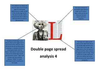
Lady Gaga greyscale photo dominates Q magazine spread
1. The audience can clearly see
that the large picture of Lady
Gaga has some great
significance as it takes up half
of the double page spread.
The photo has been edited
into greyscale which makes it
look quite old and classy at
the same time.
The colour scheme for
this double page spread is
made up of 3 colours,
black, white and red, as
these are the main
colours used in Q
magazine.
The large red L, takes up the
whole of the right hand side of
the double page spread as this
letter links to the singer Lady
Gaga (which is the first word on
the text) and the colour anchors
Q magazines style and logo. Drop
capitals are usually used at the
start of an article, but on this,
they are two at the start of new
paragraphs
The photo of Lady Gaga is very
sexual, which could suggest that it
was aimed at the male eye. From
the picture we can see that all she
is wearing is a necklace and she is
covering her boobs with her
hands. There doesn’t seem to be a
title on this double page spread,
just the artist’s names. “lady” is all
in lower case fancy writing,
whereas “GAGA” is in bold
lettering to make it stand out to
the reader.
Double page spread
analysis 4