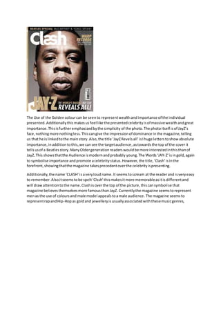
1. The Use of the Golden colour can be seen to represent wealth and importance of the individual
presented. Additionally this makes us feel like the presented celebrity is of massive wealth and great
importance. This is further emphasized by the simplicity of the photo. The photo itself is of JayZ’s
face, nothing more nothing less. This can give the impression of dominance in the magazine, telling
us that he is linked to the main story. Also, the title ‘JayZ Revels all’ is I huge letters to show absolute
importance, in addition to this, we can see the target audience, as towards the top of the cover it
tells us of a Beatles story. Many Older generation readers would be more interested in this than of
JayZ. This shows that the Audience is modern and probably young. The Words ‘JAY-Z’ is in gold, again
to symbolise importance and promote a celebrity status. However, the title, ‘Clash’ is in the
forefront, showing that the magazine takes precedent over the celebrity is presenting.
Additionally, the name ‘CLASH’ is a very loud name. It seems to scream at the reader and is very easy
to remember. Also it seems to be spelt ‘Clssh’ this makes it more memorable as it is different and
will draw attention to the name. Clash is over the top of the picture, this can symboli se that
magazine believes themselves more famous than JayZ. Currently the magazine seems to represent
men as the use of colours and male model appeals to a male audience. The magazine seems to
represent rap and Hip-Hop as gold and jewellery is usually associated with these music genres,
2. This photo can be seen to be more complex than the previous examples. There is more going on in
this photo with a mid-shot and prop (Coke) in in the image. This could have been done as generally
this artist’s music has deep and meaningful lyrics, in simple acoustic songs. Just like the photo, on
the surface Jake Bugg is simple (black and white colour) but underneath it is more complex (prop
use). Additionally, Jake Bugg is a very young artist, still under 20 years old, so the use of a coke cola
instead of an alcoholic drink can symbolise his young state. The front cover uses many bright colours
to attract the attention of the reader. The most important part of this issue is Jake Bugg, this is
shown by the words ‘Jake Bugg’ in bold red letters to draw attention to him. However, above the
masthead is a bright yellow banner. This draws attention to this section that has key information of
the band, Nirvana. This also gives a few photos to entice the reader to view these photos. The key
information is highlighted with bold colours and large letters. The photo and text are in contrast to
each other and in this sense they seem to complement each other. This seems to represent
alternative and rock music as Jake Bugg is an alternative rock artist. The text is simple but uses
contrasting colours (yellow/red) and this can be seen to be different or alternative to the generic
magazines. The target audience can be seen to be younger males and females. This is shown by the
use of bright colours usually associated with the younger generation, additionally, the target is men
and women as the model is a ‘heartthrob’ but the text and magazine style can be seen as quite
masculine. The magazine almost sends out the idea of don’t drink alcohol as Jake Bugg can be seen
drinking as Coke.
3. This magazine cover by NME presents the Gorillaz band. The use of big bold red text to highlight key
information ties in with the picture, this can be seen as the cartoon characters seem to be sinister as
one look evil and is holding what seems to be poison. This idea of evil ties in with the red text which
could link in with blood. The font itself is very large and centred in the middle of the page. This is to
draw all attention to this specific text as it is the most important on the page. Even the title is behind
the characters, this could be to draw attention away from the title and push more attention to the
centre text. The most important text in this cover seems to be ‘Damon, Gorillaz and NME (Although
NME is in the background.), these bits of text are the most obviously important sections. The photo
itself is a very interesting one. Gorillaz was created first in secret, with the band members having
fake cartoon identities, within this picture the cartoon identities are toying with a human, possibly
the lead singer. This shows that the Gorillaz are no long seen with the actual human band members
(which released their identities) and are now only recognisable as the Gorillaz cartoon characters,
they can almost be seen as a bane of their own creation as without these cartoon character they are
nothing. This can be seen with the cartoon characters being the dominant figure in the picture with
the one on the left having apparently poisoned the human in the picture. The cartoon characters are
in control. The target audience in this can be seen as teens and young adults. This is presented
through the use of cartoon characters with a rebellious/violent tendency as one is hold poison. Also
the younger generation seem to enjoy cartons with adult themes mixed in. The photo represents
men as they seem to be the predominant characters within it, however, the figure on the right is a
girl but one would have to know the band to know this. The picture itself and colours seem to appeal
to men more than women.