The document discusses potential magazine masthead designs. It evaluates 6 different font and style options. The first design is described as bold with lines running through the words, but possibly inappropriate. The second is simple and easy to read but possibly too basic. The third has a stylized urban vibe but lacks professionalism. The fourth uses only bold capital letters and could work for an urban magazine but possibly seen as dull. The fifth is creative with a bold and urban feel through missing letter pieces but some may think it's ruined.
1. Mastheads
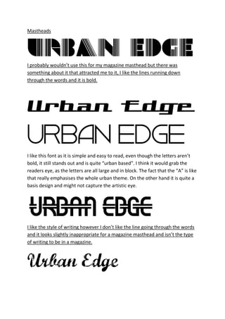
I probably wouldn’t use this for my magazine masthead but there was
something about it that attracted me to it, I like the lines running down
through the words and it is bold.
I like this font as it is simple and easy to read, even though the letters aren’t
bold, it still stands out and is quite “urban based”. I think it would grab the
readers eye, as the letters are all large and in block. The fact that the “A” is like
that really emphasises the whole urban theme. On the other hand it is quite a
basis design and might not capture the artistic eye.
I like the style of writing however I don’t like the line going through the words
and it looks slightly inappropriate for a magazine masthead and isn’t the type
of writing to be in a magazine.
2. In a way I like this design as it is the sort of styled writing that people wear on
their clothes and it stands out, it has a real urban vibe to it, I also like the fact
that the letters fade. However I don’t think it looks professional enough for the
magazine.
I like this design as it is purely bold capitals and makes it really stand out, it is
quite traditional and therefore could be used in an urban based magazine,
however some people would disagree as it could be interpreted as dull and
uncreative.
I chose this design as it is quite creative, I like the fact that it is bold and the
way bits of the letters are missing gives it a urban vibe that RnB music is slowly
becoming less popular and that there isn’t any RnB magazines out there, on
the negative side of things some people might think the missing bits ruin the
masthead itself.