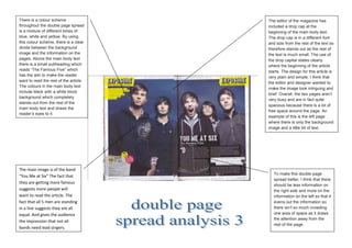
1. There is a colour scheme The editor of the magazine has
throughout the double page spread included a drop cap at the
is a mixture of different tones of beginning of the main body text.
blue, white and yellow. By using The drop cap is in a different font
this colour scheme, there is a clear and size from the rest of the text so
divide between the background therefore stands out as the rest of
image and the information on the the text is much small. The use of
pages. Above the main body text the drop capital states clearly
there is a small subheading which where the beginning of the article
reads “The Famous Five” which starts. The design for this article is
has the aim to make the reader very plain and simple. I think that
want to read the rest of the article.
the editor and designer wanted to
The colours in the main body text
make the image look intriguing and
include black with a white block
brief. Overall, the two pages aren’t
background which completely
very busy and are in fact quite
stands out from the rest of the
spacious because there is a lot of
main body text and draws the
free space around the page. An
reader’s eyes to it.
example of this is the left page
where there is only the background
image and a little bit of text.
The main image is of the band
To make this double page
“You Me at Six” The fact that
spread better, I think that there
they are getting more famous
should be less information on
suggests more people will the right side and more on the
want to read the article. The information on the left so that it
fact that all 5 men are standing evens out the information so
in a line suggests they are all there isn’t so much crowding
equal. And gives the audience one area of space as it draws
the attention away from the
the impression that not all
rest of the page.
bands need lead singers.