
Recommended
More Related Content
What's hot
What's hot (20)
Similar to Task 2.2: Research into existing artifacts
Similar to Task 2.2: Research into existing artifacts (20)
Recently uploaded
Recently uploaded (20)
Task 2.2: Research into existing artifacts
- 1. Task 2.2: Research into existing artefacts
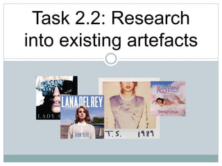
- 2. Lady Gaga – The Fame (2008) The title of the album is shown on the obscure sunglasses sported by Gaga herself in white font. The album appears to be classy and resembles futuristic fashion. The crystals are a sign of wealth and fame. This illustrates the title of the album well, as well as the song which feature on the album. The capitalisation of the album title stands out well against the album cover. The light grey is in good contrast with the black background, making the cover appear classy and wealthy. Minimalistic makeup has been used such as foundation and lip gloss to give a sophisticated angle to Gaga. Airbrush is apparent on this cover as she looks shiny and flawless in complexion.
- 3. Lana Del Rey – Born to Die Bold white font, capitalisation makes the artists name stand out. The blue sky behind suggests an album with upbeat songs more so than melancholic. Del Rey’s signature red lips and red wavy long hair. This is so her fans can see instantly this is her album. Rural background displaying roofs of houses, the top of a forest which goes out of view. Displays the controversial topics that might be expressed in the songs included on the album due to lower class living conditions. The blue capitalised font stands out against her white shirt however not as much as the artists name. This is due to the artist being branded more so the title of an album which makes for bigger sales. Her white shirt shows innocence and purity of the artist. The shirt is buttoned right to the collar which shows modesty which is controversial in a sexual appeal created industry. However, the red lingerie she wears underneath can be seen and hasn’t been edited out for a reason. The colour red has connotations of danger and sultry. This could imply behind every innocence, there is someone completely different.
- 4. Taylor Swift - 1989 The album takes form as if and old Polaroid picture. These were common in the 80’s hence the album cover title. The artists face is only partially on the album. This could be because the artist has been famous for quite some time and doesn’t need to show her face for her fans to identify it is her. Also, the red lipstick is mainly stylistic to Taylor Swift, which her fans identify her by. The jumper she wears was a style fashionable in the 80’s due to the colourful tie-dye wash which was popular in this time. The font of the artist and album title is to be portrayed as wrote on the Polaroid picture with a marker pen. This matches the theme the artist is trying to convey. Another issue is that the artist has only included her initials “TS”. This again referring to no face branding, is because her fans would know who she is by her initials and her stylistic elements such as blonde hair and red lipstick.
- 5. Katy Perry – Teenage Dream The candy style font promotes the style of the artist, in this album, as a sweet young woman singing about relationships. This theme also refers to the song ‘California Girls’ music video. The cotton candy clouds again feature in the ‘California Girls’ music video. The blue in the background suggests these are clouds. Katy Perry, the artist is seen in the middle of the album cover. She is covered only by the candy clouds prop, and showing the majority of her body to reach a wider audience with sex appeal. This also shocks audiences so that the media becomes circulated with this album and the controversy it may cause. She wears medium to heavy make up with bright colours to suit the theme and to look more aesthetic. The photo looks airbrushed due to the shine and flawlessness. Again, candy font is used in the form of candy canes as she stays with the same theme throughout. This is slightly smaller than the artists name, again like the rest of the covers, to brand herself more as an artist rather than the album itself.