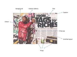
2. For the title, a slightly informal look is given off. This is because the letters in each
words seem to be different sizes and they don’t align – this shows how it is almost like
it has been ‘tagged’ on the page because the title says ‘’FROM TAGS TO RICHES’’. The
font is not very informal but because of the way it is aligned on the page, some parts of
it overlapping, it gives off the informal look. It is very blocky, and as the colour of it is
black, it stands out a lot against the much lighter background.
The actual article is written in a very small type size – this makes the title stand out
even more. It is in 4 columns on the right page of the double page spread. Again, it is in
black and this makes it easily readable against the much brighter background. To start
the article off a drop cap is used to draw the attention of the reader to the beginning
of the article.
The artist’s name has been typed in bold letters – this shows how he is the star on this
page and emphasises his importance in the article.
3. The entire left page has no text on it – it just shows us an image of Dizzee Rascal and a
graffiti background. Even on the right page, the theme of the graffiti wall has been
continued – this denotes vandalism and perhaps people who like breaking rules – a
typical stereotype of rap artists.
The background used for the double page spread is a graffiti wall – there are many
colours used here, but the main ones that stand out are the black ones. This black graffiti
creates a colour scheme with the text on the page and the stereo on the bottom right. In
addition, costume, for example the red coat, stands out a lot against the graffiti
background and also continues the theme of the NME front page – this is creating
branding. There is some green graffiti in the background and there are green bottles of
alcohol on the opposite page – colour theme is continued.
Again images are used to create a representation of the rapper. At first sight, the graffiti
and alcohol bottles may denote a negative image. However, the label on the stereo
saying ‘Have a nice day’ suggests the opposite, and together with the other images and
background connote an image of a slightly rebellious character whom people would want
to read about.
4. In the image we see a graffiti background and Dizzee Rascal ‘tagging’ the wall with a can of
spray paint. This is integrated with the title “FROM TAGS TO RICHES”. It suggests to us that
this is how the rap artist started off. The rapper is wearing a shiny, expensive looking coat
and has some jewellery on and this relates to the part of the title ‘riches’.
The main image is of Dizzee Rascal. He is spray painting the already graffitied wall and is
looking behind him as though to make sure no one is looking. This creates the typical
stereotype of rap fans breaking rules and vandalising things – it is a negative stereotype.
The image is a medium shot – this allows us to see the top half of his costume, but also
allows us to focus on his facial expression. There is no direct address in this photo – he is
looking away- and this creates a sense that he doesn’t want to be seen. It also makes the
entire page look very informal and this will make readers feel that they are reading
something that is quite joyous and not ‘bad’.
5. The language used in the article is quite informal and speaks directly to the
audience. This makes the audience feel more at home and speaking to them
directly makes it seem as though the writer is speaking directly to the audience.
In addition, slang and typical street language is used throughout. This is because
the target audience are probably fans of the type of music produced by Dizzee
Rascal, and stereotypically, people who listen to this type of music use a lot of
slang.