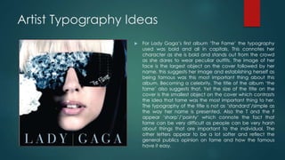
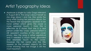
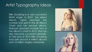
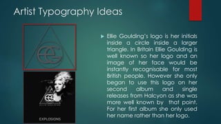
2. Artist Typography Ideas
I have began thinking about how I would like to
represent the artists I have created in different ways.
Thinking about how to put across their personalities in
every possible way. I have been researching the way
similar artists to Keira Black and Marc Atlanta use
typography effectively. Firstly, I have been looking at the
way female solo artists use typography to represent
themselves.
3. Artist Typography Ideas
Lady Gaga is one of the best
selling artists of all time. She has
had numerous number one
singles and albums across the
world. As of June 2014, Lady
Gaga has sold 27 million albums
globally and 125 million singles.
Lady Gaga is also know for being
‘out-there’ and is well known for
wearing flamboyant outfits,
creating extremely odd music
videos and live performances.
Here is a link to her music video
for Born This Way
https://www.youtube.com/watch
?v=wV1FrqwZyKw
4. Artist Typography Ideas
Despite being very adventurous when
it comes to her clothing, music videos
and performances, Lady Gaga’s
typography she uses is quite simplistic
and often looks more hand written to
add a more personal touch. Her songs
often have a deep emotional
message about her life and the
typography she uses reflects that.
However she does not use a consistent
font for each single it changes it fit
with individual songs.
5. Artist Typography Ideas
For Lady Gaga’s first album ‘The Fame’ the typography
used was bold and all in capitals. This connotes her
character as she is bold and stands out from the crowd
as she dares to wear peculiar outfits. The image of her
face is the largest object on the cover followed by her
name, this suggests her image and establishing herself as
being famous was this most important thing about this
album. Becoming a celebrity. The title of the album ‘the
fame’ also suggests that. Yet the size of the title on the
cover is the smallest object on the cover which contrasts
the idea that fame was the most important thing to her.
The typography of the title is not as ‘standard’/simple as
the way her name is presented. Also the T and the F
appear ‘sharp’/’pointy’ which connote the fact that
fame can be very difficult as people can be very harsh
about things that are important to the individual. The
other letters appear to be a lot softer and reflect the
general publics opinion on fame and how the famous
have it easy.
6. Artist Typography Ideas
Applause a single by Lady Gaga released
in August 2013. The song is about herself as
she sings about I and me. She wrote the
song whilst touring her previous album. For
this reason the typography appears to be
hand written which gives the cover a
more personal touch. I think this is
effective as it shows that she is a real
person under the ‘crazy’ persona which is
still apparent courtesy of the odd cover
photo. Also the song is rather egotistical
and it needed a much more grounded
and relatable touch to the cover.
However the her name and the title
appear as the smallest objects on the
cover showing that her image is still the
most important.
7. Artist Typography Ideas
The cover for Born This Way shows Lady
Gaga nude which shows her
vulnerability, as you can see her body
and her tattoos it connotes how open,
raw and personal this album is. As the
typography is larger than it has
previously has been it suggests that with
this album the music is important to her.
Which is again why more informal
typography is used. It looks like it could
be handwritten which adds a further
personal touch to the cover and this
would be pleasing to her fans as it is
almost like a personal gift to them that
they can more easily relate to.
8. Artist Typography Ideas
Ellie Goulding is a very successful
British singer. In 2010 her debut
album, Lights reached the
number one spot in the UK Album
Chart and her second album,
Halcyon reached number two in
the album's chart in 2012. She has
also become successful globally.
At the end of 2013 Ellie Goulding
had sold around 4 million albums
and 15 million singles worldwide.
9. Artist Typography Ideas
Ellie Goulding’s logo is her initials
inside a circle inside a larger
triangle. In Britain Ellie Goulding is
well known so her logo and an
image of her face would be
instantly recognisable for most
British people. However she only
began to use this logo on her
second album and single
releases from Halcyon as she was
more well known by that point.
For her first album she only used
her name rather than her logo.
10. Artist Typography Ideas
The typography used for Ellie Goulding’s first
album Lights is white which connotes purity
and innocence which is backed up by the
sound of Ellie’s unique voice. Her voice
sounds young and angel like. The style of
the text is curvy and soft which suggests
that her music is easy and pleasant to listen
to. Again like with Lady Gaga her name as
this was her first album her name is
significantly larger than the title of the
album as the main aim of the album is to
launch the artist into a ‘star’.
11. Artist Typography Ideas
Foxes is a British singer who rose to fame in
2013. She is best know for featuring on the
song Clarity by Zedd in 2013. She released
three singles from her debut album
Glorious ‘Youth’, ‘Holding onto Heaven’
and ‘Let Go for Tonight’ which all made it
into the top 20 singles chart. Her songs are
upbeat pop songs with electronic, dance
undertones.
12. Artist Typography Ideas
Foxes typography is plain and simple.
The text is bold and all in capitals. This
makes the text stand out to the
audience and as Foxes is a relatively
new artist it is obvious to people who
may have heard her song and name
on the radio and liked it, having a large,
bold text it makes it easier for people to
spot the cd. The text colour changes
depending on the colour of the
background which changes with every
single released. This would appeal to a
younger audience as it looks fun and
interesting.
13. Artist Typography Ideas
As my song features a DJ/Producer I am
looking into the typography of artists
such as Calvin Harris, Avicii and David
Guetta to see how DJ’s present
themselves to audiences through the
use of typography.
From these logos I can see that DJ’s
usually stick to the black and white
colour scheme. What is interesting is that
each of these artists use triangles to fit
with their name within their typography.