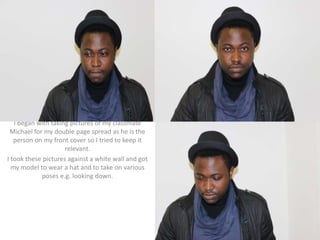
I began with taking pictures of my classmate
Michael for my double page spread as he is the
person on my front cover so I tried to keep it
relevant.
I took these pictures against a white wall and got
my model to wear a hat and to take on various
poses e.g. looking down.
• I picked this picture because I had an idea of
how I wanted to double page spread to look. I
noticed it was a convention in magazines to
include a big picture of the artist that is being
written about.
• I started by putting the
whole picture as my
background covering both
pages, so that the picture of
Michael would slightly cross
over to the second page.
After this I added the title in
big and bold so people
know who it is about (Silom
150 and bold) then I placed
a heading after in smaller
writing (Helvetica 24 and
bold) and this is for the
reader to get a quick idea of
what the double page
spread is going to be about.
I placed both bits of writing
on the right as the picture is
leaning to the right and I
thought it looked good and
worked well.
Using Quark
• After this I added
the interview that I
had written and
placed it under the
rest of the writing
so it looked clean
and neat(Helvetica,
size 12) as its a lot of
writing I decided to
put the questions in
bold to make an
obvious division of
the questions and
answers.
Originally I had black text
but decided this was boring
and due to the black jacket
in the picture, parts of the
writing were not as obvious
as I wanted, therefore I
decided to add colour by
making the colour of the
answers the colour of the
interview answers the
same colour as the title so
it all ties together nicely
and the questions to match
with the mans jumper in
the picture so there was
not to many colours all over
the place
• After this I wanted to
finish off by putting
some elements to
make it more
professional and
realistic so I put the
page numbers in
both of the bottom
corners an also in
the top left I put a
design element of
the ‘ETV explicit’
icon to keep it
consistent
throughout the
magazine
• To finish it off I
decided to edit
the title as I
thought it was
missing
something, I
changed the
colour of the
‘M’ just as a
design element
as I thought it
would look
more modern
and
professional
Mode of address
• The mode of address is indirect as he is not
looking directly at the camera, his clothes are
casual and his expression is thoughtful. This
links to the front cover where the mode of
address is also indirect. I’ve included elements
of red in my double page article because it
features on the front cover. My contents page
uses direct mode of address as she is looking
directly at the camera.
Consistency
There are elements on all 3 of
my pages that show that they
all come from the same
magazine for example the
‘ETVexplicit’ logo, its in both of
the left hand corners for the
pages expect in my contents
page where it is the
background. Also my colours
are consistent which are red
and black, on my front cover I
also added yellow but that was
to make it visually more vibrant
Changes
• On my double page spread, I kept consistent with
the colour red, however I changed the shade
from a dull red to a more bright and eye-catching
colour, that I have used on my other pages. I did
this with the writing and the title. To the writing I
also added drop shadows for more of a blend
with the background and writing and for an
overall more professional finish. I changed the
picture in the bottom left corner because it
seemed appropriate to have the artist recording.
Double Page Spread

Double Page Spread

  • 1.
    I began withtaking pictures of my classmate Michael for my double page spread as he is the person on my front cover so I tried to keep it relevant. I took these pictures against a white wall and got my model to wear a hat and to take on various poses e.g. looking down.
  • 2.
    • I pickedthis picture because I had an idea of how I wanted to double page spread to look. I noticed it was a convention in magazines to include a big picture of the artist that is being written about.
  • 3.
    • I startedby putting the whole picture as my background covering both pages, so that the picture of Michael would slightly cross over to the second page. After this I added the title in big and bold so people know who it is about (Silom 150 and bold) then I placed a heading after in smaller writing (Helvetica 24 and bold) and this is for the reader to get a quick idea of what the double page spread is going to be about. I placed both bits of writing on the right as the picture is leaning to the right and I thought it looked good and worked well. Using Quark
  • 4.
    • After thisI added the interview that I had written and placed it under the rest of the writing so it looked clean and neat(Helvetica, size 12) as its a lot of writing I decided to put the questions in bold to make an obvious division of the questions and answers.
  • 5.
    Originally I hadblack text but decided this was boring and due to the black jacket in the picture, parts of the writing were not as obvious as I wanted, therefore I decided to add colour by making the colour of the answers the colour of the interview answers the same colour as the title so it all ties together nicely and the questions to match with the mans jumper in the picture so there was not to many colours all over the place
  • 6.
    • After thisI wanted to finish off by putting some elements to make it more professional and realistic so I put the page numbers in both of the bottom corners an also in the top left I put a design element of the ‘ETV explicit’ icon to keep it consistent throughout the magazine
  • 7.
    • To finishit off I decided to edit the title as I thought it was missing something, I changed the colour of the ‘M’ just as a design element as I thought it would look more modern and professional
  • 8.
    Mode of address •The mode of address is indirect as he is not looking directly at the camera, his clothes are casual and his expression is thoughtful. This links to the front cover where the mode of address is also indirect. I’ve included elements of red in my double page article because it features on the front cover. My contents page uses direct mode of address as she is looking directly at the camera.
  • 9.
    Consistency There are elementson all 3 of my pages that show that they all come from the same magazine for example the ‘ETVexplicit’ logo, its in both of the left hand corners for the pages expect in my contents page where it is the background. Also my colours are consistent which are red and black, on my front cover I also added yellow but that was to make it visually more vibrant
  • 10.
    Changes • On mydouble page spread, I kept consistent with the colour red, however I changed the shade from a dull red to a more bright and eye-catching colour, that I have used on my other pages. I did this with the writing and the title. To the writing I also added drop shadows for more of a blend with the background and writing and for an overall more professional finish. I changed the picture in the bottom left corner because it seemed appropriate to have the artist recording.