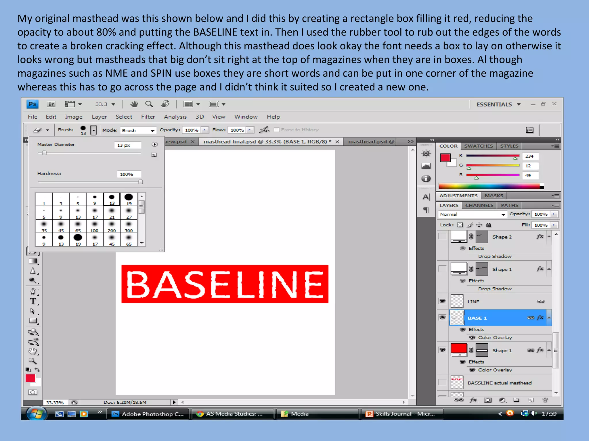
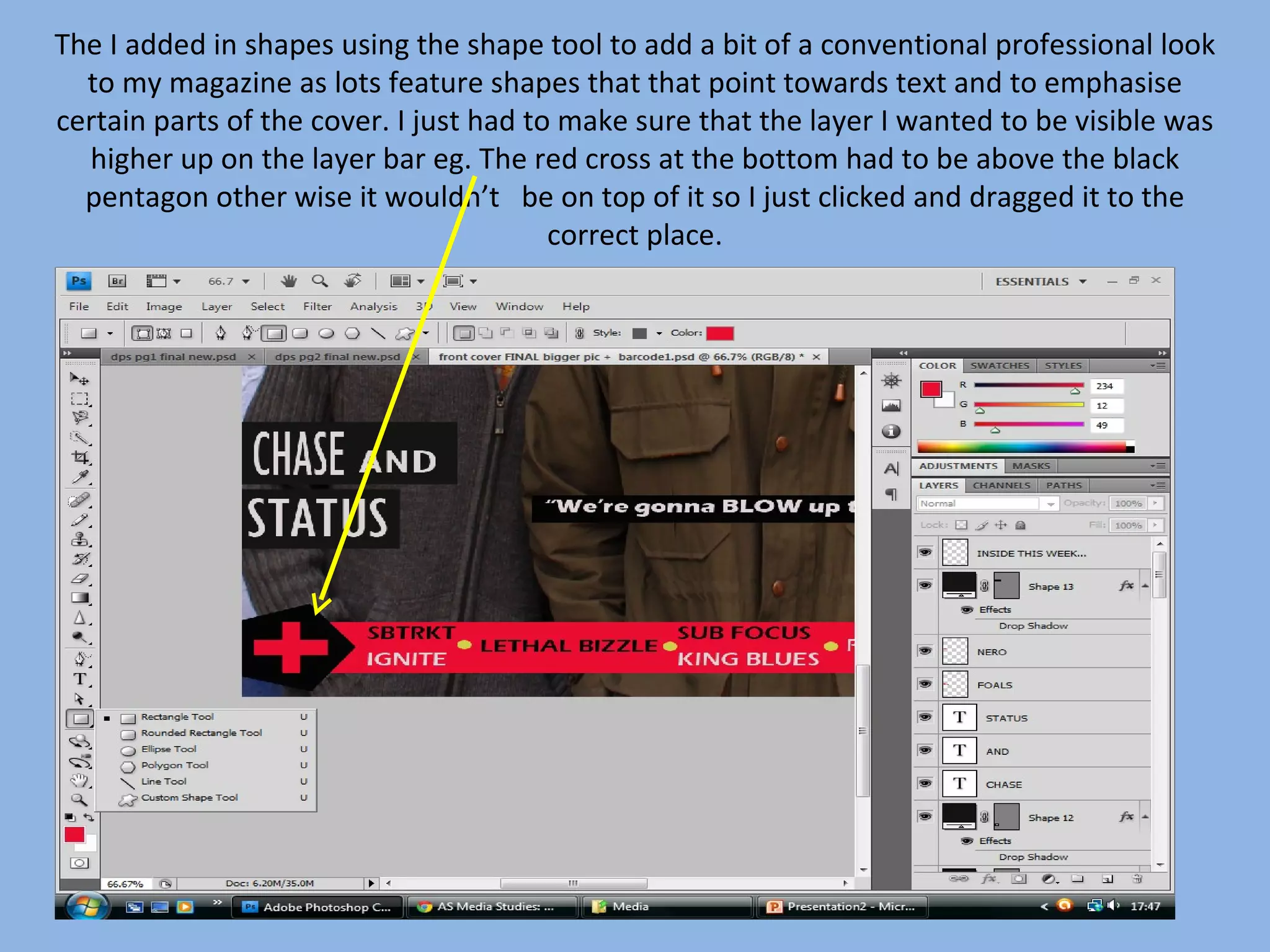
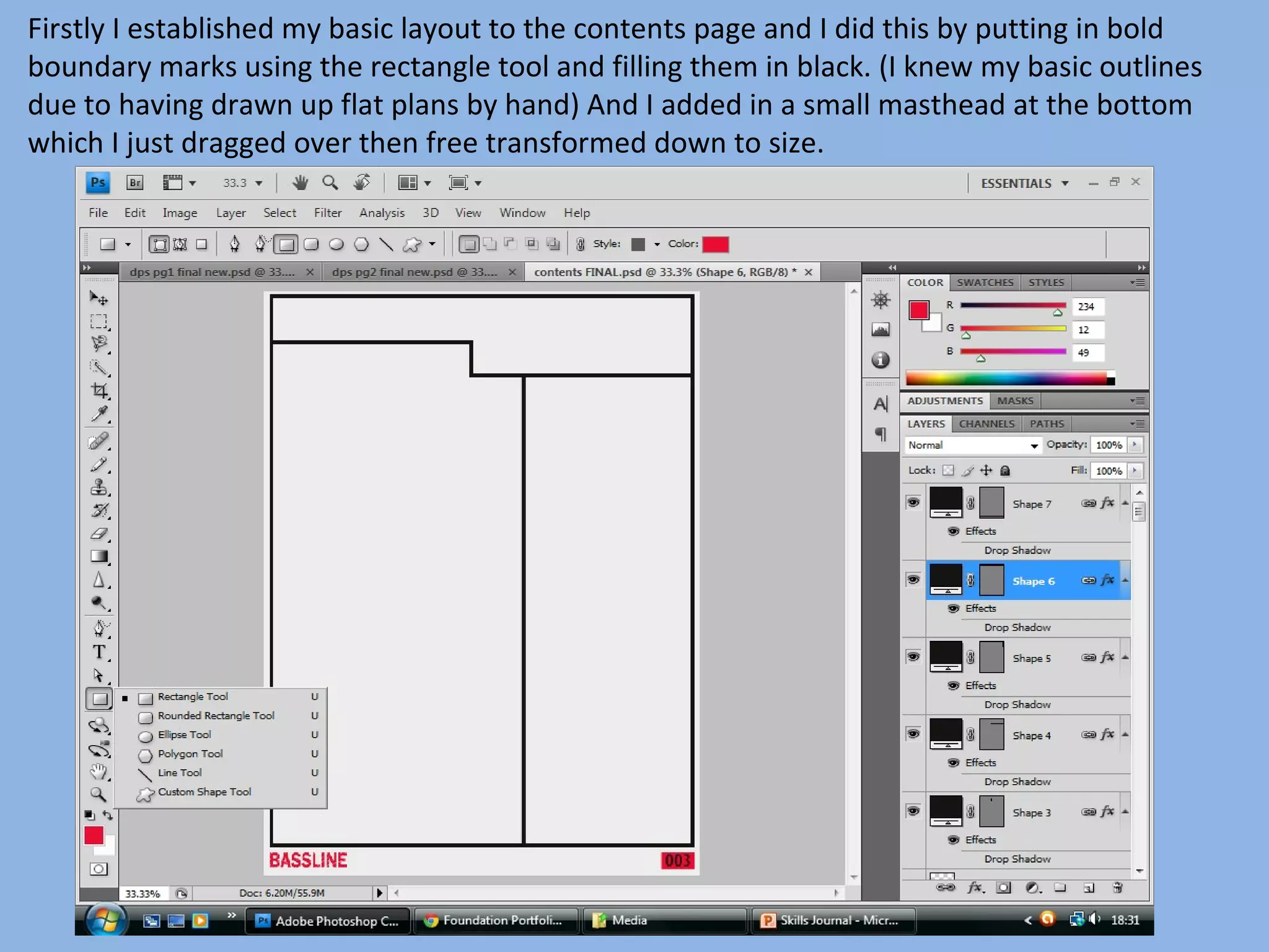
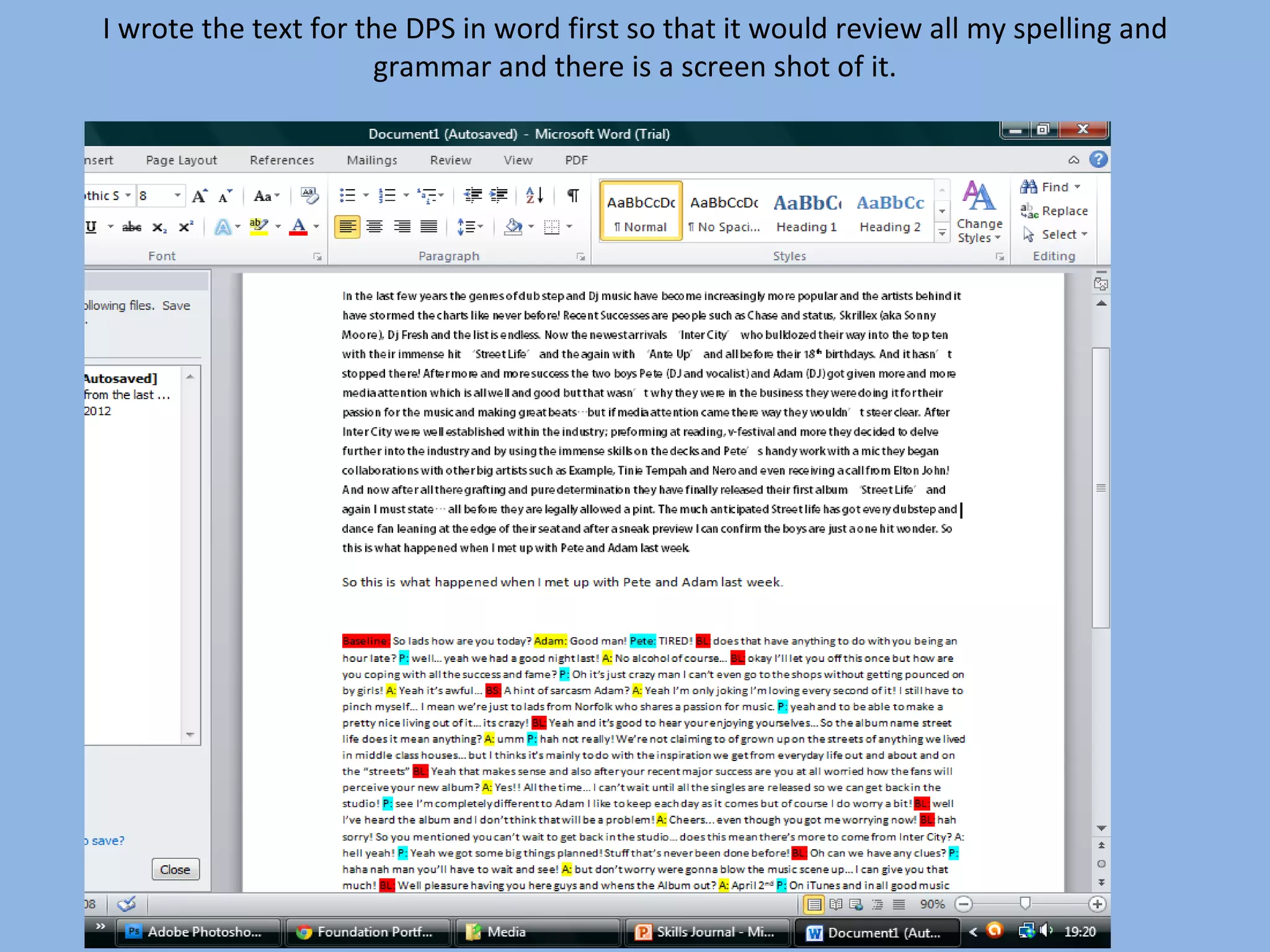
This document summarizes Kieran Hyde's process for designing the cover and contents pages of their skills journal magazine. They began by creating a red masthead with cracked text. For the cover, Kieran used a photo with models and covered green areas with the clone stamp. Text was added using a scratched effect. Shapes and a band name with drop shadow were also included. For the contents, boundaries were marked and a masthead added. Text also had a scratched effect and boxes alternated colors. Images and a link to the cover were included. The DPS included pull quotes, columns of text, and images on black backgrounds.
Ethnobotany and Ethnopharmacology:
Ethnobotany in herbal drug evaluation,
Impact of Ethnobotany in traditional medicine,
New development in herbals,
Bio-prospecting tools for drug discovery,
Role of Ethnopharmacology in drug evaluation,
Reverse Pharmacology.
Read| The latest issue of The Challenger is here! We are thrilled to announce that our school paper has qualified for the NATIONAL SCHOOLS PRESS CONFERENCE (NSPC) 2024. Thank you for your unwavering support and trust. Dive into the stories that made us stand out!
How to Split Bills in the Odoo 17 POS ModuleCeline George
Bills have a main role in point of sale procedure. It will help to track sales, handling payments and giving receipts to customers. Bill splitting also has an important role in POS. For example, If some friends come together for dinner and if they want to divide the bill then it is possible by POS bill splitting. This slide will show how to split bills in odoo 17 POS.
Unit 8 - Information and Communication Technology (Paper I).pdfThiyagu K
This slides describes the basic concepts of ICT, basics of Email, Emerging Technology and Digital Initiatives in Education. This presentations aligns with the UGC Paper I syllabus.
This is a presentation by Dada Robert in a Your Skill Boost masterclass organised by the Excellence Foundation for South Sudan (EFSS) on Saturday, the 25th and Sunday, the 26th of May 2024.
He discussed the concept of quality improvement, emphasizing its applicability to various aspects of life, including personal, project, and program improvements. He defined quality as doing the right thing at the right time in the right way to achieve the best possible results and discussed the concept of the "gap" between what we know and what we do, and how this gap represents the areas we need to improve. He explained the scientific approach to quality improvement, which involves systematic performance analysis, testing and learning, and implementing change ideas. He also highlighted the importance of client focus and a team approach to quality improvement.
Palestine last event orientationfvgnh .pptxRaedMohamed3
An EFL lesson about the current events in Palestine. It is intended to be for intermediate students who wish to increase their listening skills through a short lesson in power point.
The Roman Empire A Historical Colossus.pdfkaushalkr1407
The Roman Empire, a vast and enduring power, stands as one of history's most remarkable civilizations, leaving an indelible imprint on the world. It emerged from the Roman Republic, transitioning into an imperial powerhouse under the leadership of Augustus Caesar in 27 BCE. This transformation marked the beginning of an era defined by unprecedented territorial expansion, architectural marvels, and profound cultural influence.
The empire's roots lie in the city of Rome, founded, according to legend, by Romulus in 753 BCE. Over centuries, Rome evolved from a small settlement to a formidable republic, characterized by a complex political system with elected officials and checks on power. However, internal strife, class conflicts, and military ambitions paved the way for the end of the Republic. Julius Caesar’s dictatorship and subsequent assassination in 44 BCE created a power vacuum, leading to a civil war. Octavian, later Augustus, emerged victorious, heralding the Roman Empire’s birth.
Under Augustus, the empire experienced the Pax Romana, a 200-year period of relative peace and stability. Augustus reformed the military, established efficient administrative systems, and initiated grand construction projects. The empire's borders expanded, encompassing territories from Britain to Egypt and from Spain to the Euphrates. Roman legions, renowned for their discipline and engineering prowess, secured and maintained these vast territories, building roads, fortifications, and cities that facilitated control and integration.
The Roman Empire’s society was hierarchical, with a rigid class system. At the top were the patricians, wealthy elites who held significant political power. Below them were the plebeians, free citizens with limited political influence, and the vast numbers of slaves who formed the backbone of the economy. The family unit was central, governed by the paterfamilias, the male head who held absolute authority.
Culturally, the Romans were eclectic, absorbing and adapting elements from the civilizations they encountered, particularly the Greeks. Roman art, literature, and philosophy reflected this synthesis, creating a rich cultural tapestry. Latin, the Roman language, became the lingua franca of the Western world, influencing numerous modern languages.
Roman architecture and engineering achievements were monumental. They perfected the arch, vault, and dome, constructing enduring structures like the Colosseum, Pantheon, and aqueducts. These engineering marvels not only showcased Roman ingenuity but also served practical purposes, from public entertainment to water supply.
Operation “Blue Star” is the only event in the history of Independent India where the state went into war with its own people. Even after about 40 years it is not clear if it was culmination of states anger over people of the region, a political game of power or start of dictatorial chapter in the democratic setup.
The people of Punjab felt alienated from main stream due to denial of their just demands during a long democratic struggle since independence. As it happen all over the word, it led to militant struggle with great loss of lives of military, police and civilian personnel. Killing of Indira Gandhi and massacre of innocent Sikhs in Delhi and other India cities was also associated with this movement.
How to Make a Field invisible in Odoo 17Celine George
It is possible to hide or invisible some fields in odoo. Commonly using “invisible” attribute in the field definition to invisible the fields. This slide will show how to make a field invisible in odoo 17.
2. My original masthead was this shown below and I did this by creating a rectangle box filling it red, reducing the
opacity to about 80% and putting the BASELINE text in. Then I used the rubber tool to rub out the edges of the words
to create a broken cracking effect. Although this masthead does look okay the font needs a box to lay on otherwise it
looks wrong but mastheads that big don’t sit right at the top of magazines when they are in boxes. Al though
magazines such as NME and SPIN use boxes they are short words and can be put in one corner of the magazine
whereas this has to go across the page and I didn’t think it suited so I created a new one.
3. Again I used the rubber create streaks through the
writing giving it a scratched effect.
5. This is the image I used for the main image on my front
cover. This was taken at college by against the graffiti wall.
6. I didn’t like the green colours in the graffiti wall as I thought having one colour which was
blue as I thought this main image of the models stand out and not concentrate on the
boldness of the backdrop as the models are the important feature. So I used the clone
stamp and copied parts of the backdrop to cover up the green.
7. Next I added in my masthead which I had already made and using the same technique I added in the
coverlines and to create the scratched effect as seen in the word foals and featured throughout my
magazine I just simply selected the rubber and then clicked on the brush style and chose number 11
and then using a small size just carefully rubbed out parts of the word. To do this I had to rasterize the
layer which meant I could not edit the wording of the text anymore.
8. After adding in all the text which I had applied the previous technique to all of it I used the
technique white on black which is commonly used in popular magazine ‘NME’ and all most all
others at some point, I used this for the first time in my ‘RADAR’ magazine. It gives the
magazines pull quotes more visibility but you can still use subtle colours which are sometimes
needed in magazines like mine unlike the ‘Popsplash’ one I did.
9. The white on black effect is done by just creating a a rectangle box as shown below and
then filling it in the appropriate colour to compliment and emphasise the text. I used a
variation of colours on the front cover depending on the text colour.
10. The I added in shapes using the shape tool to add a bit of a conventional professional look
to my magazine as lots feature shapes that that point towards text and to emphasise
certain parts of the cover. I just had to make sure that the layer I wanted to be visible was
higher up on the layer bar eg. The red cross at the bottom had to be above the black
pentagon other wise it wouldn’t be on top of it so I just clicked and dragged it to the
correct place.
11. Finally I put in the band name for my main article ‘Inter City’ and I used a shadow effect on
this by double clicking on the layer and then clicking drop shadow, multiply, black and making
the opacity to 75% I did this because I think it makes the text bolder and pop out at the
reader.
14. Firstly I established my basic layout to the contents page and I did this by putting in bold
boundary marks using the rectangle tool and filling them in black. (I knew my basic outlines
due to having drawn up flat plans by hand) And I added in a small masthead at the bottom
which I just dragged over then free transformed down to size.
15. Next I wrote out all my text and used the same technique which was the rubber and scratching
out little parts of the writing. I dint scratch out the numbers as I didn’t want to overuse the
technique so I created rectangle boxes alternating between black and red so the house style is
continued.
16. Next I had to highlight and link all the layers from my front cover and drag it across to my
contents page so that the reader can see the front cover without flicking back and forth
between the two
20. For my DPS I again began by marking out the boundaries for every thing by using the
rectangle shape tool then filling the in black.
21. Next I decided where to put a pull quote so I made a white rectangle box to cover over the
line and then made a red rectangle box and reduced the opacity to 78% as it looked to
bright at full opacity.
22. I wrote the text for the DPS in word first so that it would review all my spelling and
grammar and there is a screen shot of it.
23. I copy and pasted the writing into the DPS and put
it into columns.
24. I used some of the more interesting parts of the article as pull quotes by copying
and pasting them out of the text and enlarging it by free transforming and
changing the colours.
25. To finish off I dragged the Inter city title from the contents page and free transformed it
bigger. I then put in a picture of Adam and Pete on a black background which I made using
the rectangle shape tool.
26. Everything was done the same on each DPS page and on the second page I changed an
image to black and white to give it and authentic look I did this by selecting the layer tab
for the picture, going into image, the adjustments and the selecting black and white.