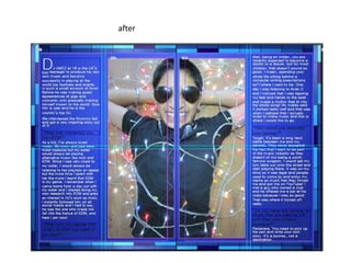
The document describes the process for designing a double page spread about DJ AMZZ in a magazine mockup. Key points:
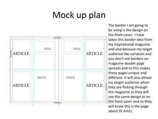
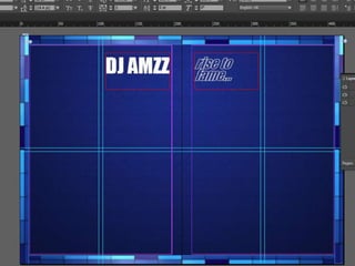
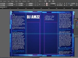
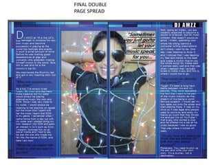
- The designer is using the border from the magazine's front cover to make the pages unique.
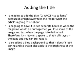
- They add the title "DJ AMZZ rise to fame" in two boxes to remain visible when folded.
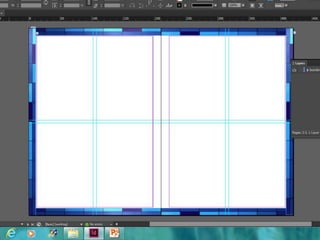
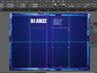
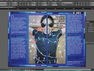
- Space is left for images which will be added later. The article is split into four columns.
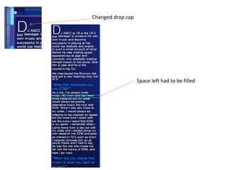
- Changes are made like removing text, changing the drop cap, and filling gaps to fit the content.
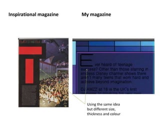
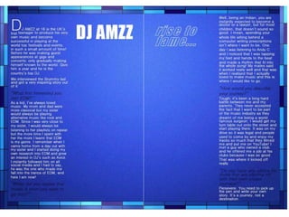
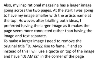
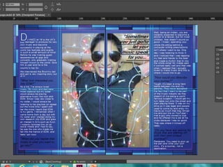
- Inspiration is taken from other magazines, like using two side columns and a large spanning image with quote.