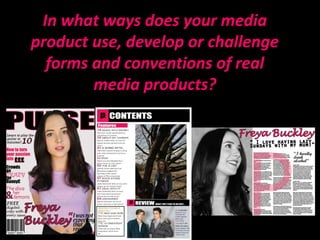
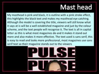
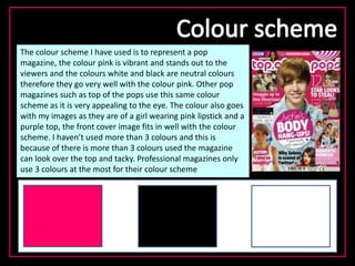
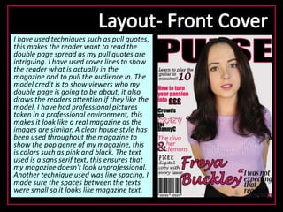
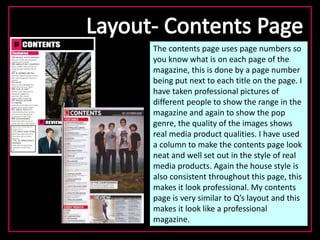
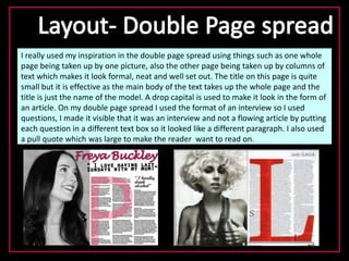
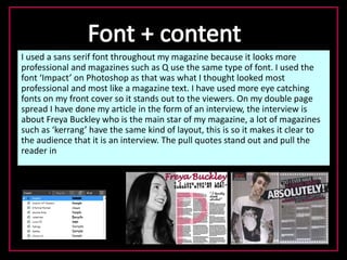
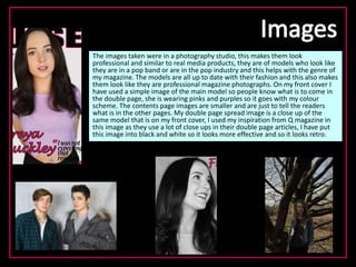
This document summarizes how the media product uses and develops conventions of real magazines. It discusses using a pink and black color scheme on the masthead to make it eye-catching. Professional photos were taken in a studio to look like real magazines. Techniques like pull quotes and cover lines were used to engage readers. A consistent sans-serif font and house style made the magazine look professional. The double page spread followed conventions like taking up a full page with a photo and columns of text. The images, layout, and techniques develop magazine conventions to create a realistic looking media product.