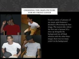
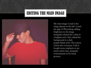
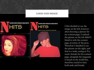
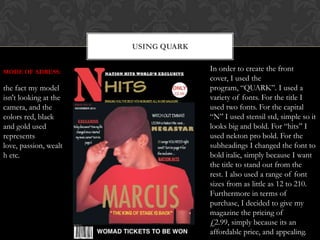
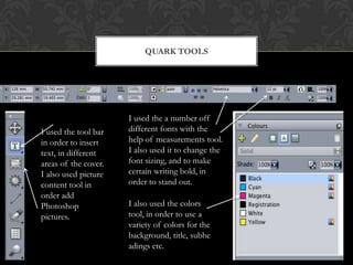
FRONT COVER
During the process of deciding my logo, I had come up with a
number of logos before I decided to stick with N-hits. The „N‟
stands for nation. The reason why I chose to have a capital N on
the front cover is because N stands for nation, therefore the
audience is instantly informed that the magazine consists of a
number of international singers. I've chosen the colors red, gold,
and lastly white simply because they don‟t make the audience
assume the magazine is only aimed at a certain age group/gender,
alongside the the N which is bright and has a large font, instantly
attracts the audience attention, alongside compliments the gold
besides it. The reason I chose to put “nation hits world‟s
exclusive” in a smaller font is because once the audience read the
obvious writing such as the large N-hits, they're eyes are instantly
then going to go on to the small font above it.
CHOOSING THE MAIN PICTURE
FOR MY FRONT COVER
I took a variety of pictures of
my music artist however i
decided to Photoshop the first
image. The reason why i chose
the first one is because it‟s a
close up alongside the
background was all black
whereas with the other three
images there was too many
color's in the background.
EDITING THE MAIN IMAGE
My main image I used is the
image placed on the left. I used
the app of Photoshop, adding
brightness to the image
alongside colored the t-shirt to
a brighter red. I also edited the
background to a dark
purple/black color. The reason
I done this is because I felt it
bought more emphasis to my
music artists face, alongside
concentrated on his hand
posture.
LOGO AND IMAGE
I first decided to use the
image on the left, however
after choosing a picture for
my content page, I realized
the picture on the left didn't‟t
blend in with the content
page, in terms of the pose.
Therefore I decided to use
the picture on the right, and
that to a male, seeing as I've
used a female for the content
page, alongside the magazine
is based on the world hits,
therefore crucial to have
both male and female.
USING QUARK
In order to create the front
cover, I used the
program, “QUARK”. I used a
variety of fonts. For the title I
used two fonts. For the capital
“N” I used stensil std, simple so it
looks big and bold. For “hits” I
used nekton pro bold. For the
subheadings I changed the font to
bold italic, simply because I want
the title to stand out from the
rest. I also used a range of font
sizes from as little as 12 to 210.
Furthermore in terms of
purchase, I decided to give my
magazine the pricing of
£2.99, simply because its an
affordable price, and appealing.
MODE OF ADRESS:
the fact my model
isn't looking at the
camera, and the
colors red, black
and gold used
represents
love, passion, wealt
h etc.
QUARK TOOLS
I used the a number off
different fonts with the
help of measurements tool.
I also used it to change the
font sizing, and to make
certain writing bold, in
order to stand out.
I also used the colors
tool, in order to use a
variety of colors for the
background, title, subhe
adings etc.
I used the tool bar
in order to insert
text, in different
areas of the cover.
I also used picture
content tool in
order add
Photoshop
pictures.
PHOTOSHOP

Music mag powerpont

  • 2.
    FRONT COVER During theprocess of deciding my logo, I had come up with a number of logos before I decided to stick with N-hits. The „N‟ stands for nation. The reason why I chose to have a capital N on the front cover is because N stands for nation, therefore the audience is instantly informed that the magazine consists of a number of international singers. I've chosen the colors red, gold, and lastly white simply because they don‟t make the audience assume the magazine is only aimed at a certain age group/gender, alongside the the N which is bright and has a large font, instantly attracts the audience attention, alongside compliments the gold besides it. The reason I chose to put “nation hits world‟s exclusive” in a smaller font is because once the audience read the obvious writing such as the large N-hits, they're eyes are instantly then going to go on to the small font above it.
  • 3.
    CHOOSING THE MAINPICTURE FOR MY FRONT COVER I took a variety of pictures of my music artist however i decided to Photoshop the first image. The reason why i chose the first one is because it‟s a close up alongside the background was all black whereas with the other three images there was too many color's in the background.
  • 4.
    EDITING THE MAINIMAGE My main image I used is the image placed on the left. I used the app of Photoshop, adding brightness to the image alongside colored the t-shirt to a brighter red. I also edited the background to a dark purple/black color. The reason I done this is because I felt it bought more emphasis to my music artists face, alongside concentrated on his hand posture.
  • 5.
    LOGO AND IMAGE Ifirst decided to use the image on the left, however after choosing a picture for my content page, I realized the picture on the left didn't‟t blend in with the content page, in terms of the pose. Therefore I decided to use the picture on the right, and that to a male, seeing as I've used a female for the content page, alongside the magazine is based on the world hits, therefore crucial to have both male and female.
  • 6.
    USING QUARK In orderto create the front cover, I used the program, “QUARK”. I used a variety of fonts. For the title I used two fonts. For the capital “N” I used stensil std, simple so it looks big and bold. For “hits” I used nekton pro bold. For the subheadings I changed the font to bold italic, simply because I want the title to stand out from the rest. I also used a range of font sizes from as little as 12 to 210. Furthermore in terms of purchase, I decided to give my magazine the pricing of £2.99, simply because its an affordable price, and appealing. MODE OF ADRESS: the fact my model isn't looking at the camera, and the colors red, black and gold used represents love, passion, wealt h etc.
  • 7.
    QUARK TOOLS I usedthe a number off different fonts with the help of measurements tool. I also used it to change the font sizing, and to make certain writing bold, in order to stand out. I also used the colors tool, in order to use a variety of colors for the background, title, subhe adings etc. I used the tool bar in order to insert text, in different areas of the cover. I also used picture content tool in order add Photoshop pictures.
  • 8.