The document describes the process of creating a double page spread in Photoshop. It involves:
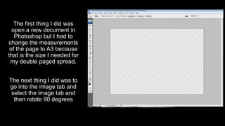
1. Opening a new document and changing the page size to A3.
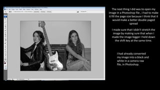
2. Importing an image, rotating it, and resizing it to fill the page.
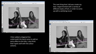
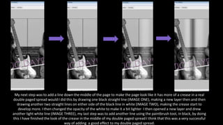
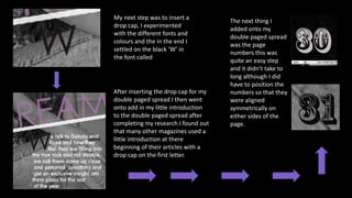
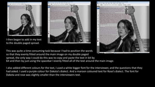
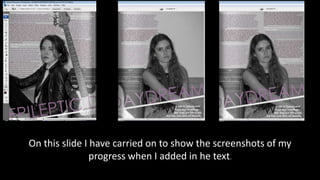
3. Creating text and adding design elements like lines and colors to divide the pages and add effects.
4. Inserting page numbers and text wrapping an image, while using different fonts and sizes for quotes.
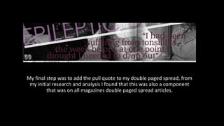
5. Adding a final pull quote to complete the double page article layout.