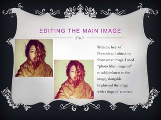
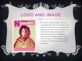
BY HALIMA KHAN
CONTENT PAGE
I decided to use the same type of page
layout as I did for the front cover. The
reason being is so the audience recognize
that the content page belongs to “N hits”
magazine
CHOOSING THE MAIN PICTURE
FOR MY CONTENT PAGE
I had taken a number of pictures I
different outfits and poses, and
edited them with the use of
Photoshop. However after deciding
to use a close up image of my model
on the front cover, I decided to use
the fourth image simply because it
was a similar pose to the front cover.
The reason why I didn't’t use the
other three and chose the fourth one
is because it would be easier for the
audience to distinguish what
magazine the image is from, seeing as
both the cover and content pose is
pretty similar in comparison to the
rest of the images.
EDITING THE MAIN IMAGE
With the help of
Photoshop I edited my
front cover image. I used
“photo filter- magenta”
to add pinkness to the
image, alongside
brightened the image
with a tinge of contrast.
LOGO AND IMAGE
 I used very simple, and light colors for the
content page. The reason being is because I used
bright, rich colors for the cover alongside double
page spread, therefore I wanted to balance it out
by allowing the audience to distinguish the
difference between the cover/double page
spread, and the content page. However, I kept
the obvious logo of “N” on both pages to allow
the audience to notify that both pages are from
one magazine.
PHOTOSHOP AND QUARK
 I also used Photoshop
and quark on my content
page, alongside double page
spread, however I have
explained in my previous
power point ( cover ) about
all the tools I used on each
program, in detail.

Content page powrpoint

  • 1.
  • 2.
    CONTENT PAGE I decidedto use the same type of page layout as I did for the front cover. The reason being is so the audience recognize that the content page belongs to “N hits” magazine
  • 3.
    CHOOSING THE MAINPICTURE FOR MY CONTENT PAGE I had taken a number of pictures I different outfits and poses, and edited them with the use of Photoshop. However after deciding to use a close up image of my model on the front cover, I decided to use the fourth image simply because it was a similar pose to the front cover. The reason why I didn't’t use the other three and chose the fourth one is because it would be easier for the audience to distinguish what magazine the image is from, seeing as both the cover and content pose is pretty similar in comparison to the rest of the images.
  • 4.
    EDITING THE MAINIMAGE With the help of Photoshop I edited my front cover image. I used “photo filter- magenta” to add pinkness to the image, alongside brightened the image with a tinge of contrast.
  • 5.
    LOGO AND IMAGE I used very simple, and light colors for the content page. The reason being is because I used bright, rich colors for the cover alongside double page spread, therefore I wanted to balance it out by allowing the audience to distinguish the difference between the cover/double page spread, and the content page. However, I kept the obvious logo of “N” on both pages to allow the audience to notify that both pages are from one magazine.
  • 6.
    PHOTOSHOP AND QUARK I also used Photoshop and quark on my content page, alongside double page spread, however I have explained in my previous power point ( cover ) about all the tools I used on each program, in detail.