1. This is the main text of the image and probably the most eye-catching thing of the
image
as it’s so impotent compared to the rest of the other texts on the posters. This text is
a very simple
Sans serif font which does exactly what it needs to do and so give out the message,
it’s convincing and
gives an impact on the reader.
The impact its probably given because of it’s colour. Red is the colour of fire and
blood, so it is associated with energy, war,
danger, strength, power, determination as well as passion, desire, and love. In this
case i think its meant to give a sense of danger
since this a poster
for donations.
The writings at the
bottom are although
very meaningful
phrases that are
powerful for who
decides to then
actually read the
poster. They are very
powerful phrases that
really I think would
convince most people
to donate, and what
then reinforces them
is the phrase just
underneath it that
says “Every year we
help thousands of
people avoid losing
their homes” or the
other two which say a
different phrase but
we the same start to
the sentence to keep
them all kinda similar.
These phrases are
very convincing for
people as they give
informations and state
the donation company
actually works.
Text Pictures
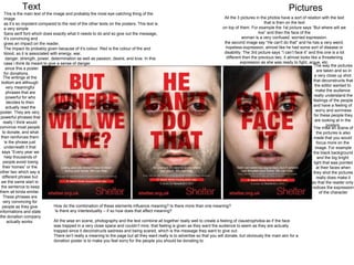
All the 3 pictures in the photos have a sort of relation with the text
that is then on the text
on top of them. For example the 1st picture says “But where will we
live” and then the face of the
woman is a very confused, worried expression.
the second image say “He can't do that” and he has a very weird,
hopeless expression, almost like he had some sort of disease or
disability. The 3rd picture says “I can’t face it” and this one is a lot
different then the previous two, it almost looks like a threatening
expression as she was ready to fight, argue, etc.
The way the pictures
are taken and so in
a very close up shot.
that deconstructs that
the editor wanted to
make the audience
really understand the
feelings of the people
and have a feeling of
worry and sorriness
for these people they
are looking at in the
posters.
The mise en scene of
the pictures is also
made that you would
focus more on the
image. For example
the black background
and the big bright
light that was pointed
at their faces when
they shot the pictures
really does make it
so that the reader only
notices the expression
of the character
How do the combination of these elements influence meaning? Is there more than one meaning?
Is there any intertextuality – if so how does that affect meaning?
All the wise en scene, photography and the text combine all together really well to create a feeling of claustrophobia as if the face
was trapped in a very close space and couldn’t mire, that feeling is given as they want the audience to seem as they are actually
trapped since it deconstructs sadness and being scared, which is the message they want to give out.
There isn’t really a meaning to the page but all they want really is to advertise so that you will donate, but obviously the main aim for a
donation poster is to make you feel sorry for the people you should be donating to.
2. This poster is very different compared to the one we had just looked at.
For example this posters doesn’t have any actual pictures apart from the hands which have been designed on. Personally it doesn’t give a strong enough effect such as the one with the pictured
The poster has again got the colour red since as we said before red is the colour of fire and blood, so it is associated with energy, war,
danger, strength, power, determination as well as passion, desire, and love. Red is also incredibly eye catching and looks very professional with a white drawing/text/icon.
The other poster is not quite comparable with it being eye catching as it’ only really got a picture as the background which don't get me wrong has a better design to it but the fact that this is fully
This poster contains more information the the previous one, for example it gives a place and time to
events about to happen regarding the company, it gives the actual company’s name with a big logo
so that people would recognise it more due to it’s popularity.
This compares to the one we deconstructed before that it doesn’t quite yet has it’s it popularity with
the logo and so the only thing included it’s the website which you will be able to donate on to.
The info at the bottom of the page although is very useful but shouldn’t of been included i don’t think.
on the previous poster they just gave a browser search bar and then the website, if anyone was to
look into something id’d think they would do a bit of research about it and go on the website. On the
website there would then be a ton of information, so the designer could’ve saved a lot of space by
just really putting the website at the bottom of the poster.
Overall I think this poster yes is eye catching, yes it’s got a better phrase, yes it’s got more
information on it, but it does’t give me that feeling of “I want to make someone’s life better by
donating” or gives me the same feeling of “sorriness” as the other poster gave me. I myself much
prefer to see the faces of the people so that I would actually get a feeling of what those people feel
like where this one really even though the red it’s a bit plane and does create much effect on the
people before they read the phrase.
If I was to give the two posters target audiences I would say the previous one with the faces is aimed
at a much younger target audience then this one would be as it’s proved that better people have
better understanding visually and emotionally rather then just reading something off a piece of paper