Retail Store Scavanger Hunt - Foundation College Park
Posters
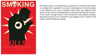
1. The poster shows a man lightning up a bomb that is inside him and which
is a metaphor of a cigarette. It is an anti-smoking advert. I think the poster
is very effective as it uses a metaphor what makes the audience think
about it more, also the red background is really eye-catching, like an alarm.
It has simple message written I bold writing also using negative spacing.
Not giving the face to the character could suggest to the audience that
anyone could be killed by smoking.
2. The poster presents a rabbit with mascara going through its eye with
bold, interesting writing text underneath. The background is pink to show
it mainly refers to females. The overall poster is effective in my opinion,
pink background cathes (mainly women’s) attention, the blood over the
cute rabbit has impact on emotions of the audience and use of such a
daily used product as mascara refers to wider range of audience. The
block colours make the image more clear and easy to understand.
3. The poster presents a terrified looking rabbit drawn in Pop art style and
a question next to it. The use of red colour makes the audience think
about blood. The used font is really simple and not fancy at all. It’s clear
that it's all about the message the poster is meant to represent not the
look of it. I think the poster is quite effective however could be better
designed s it’s not eye-catching. Adding a background or using different
font could make a big difference.
4. The poster contains a hand holding a plant and text written in bold white
font. The red background and white writing make the poster really
effective and the fist Is kind of a strong, persuasive sign. The overall
dealing is good-looking and cathes the audience attention.
5. The poster presents two small images, WhatsApp icon and a pile of
books, on red background with small writing underneath. The size of the
icons and writing make the audience come closer to the poster which is
an effective method to grab someone's attention for longer, however if
someone is in a rush they won‘t be able to see the small writing from a
larger distance. The use of a very popular app cathes people's attention.
The poster overall has quite a simple message but is kind of boring.