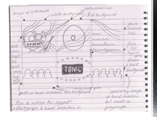
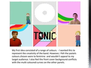
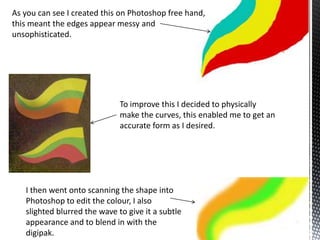
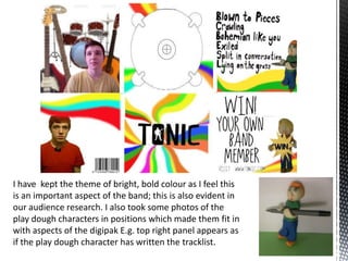
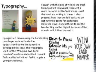
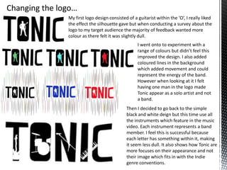
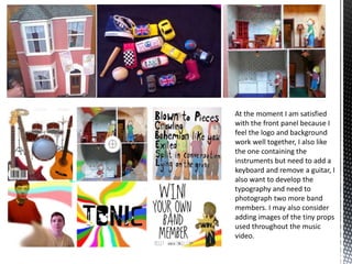
The document discusses the design process for a band's album packaging. Initially, pastel colors were chosen but deemed too feminine. Playdough characters were then photographed in positions related to the packaging. Handwriting the tracklist was difficult to read at small scale. The logo evolved from a silhouette guitarist to incorporating all instruments to represent the band members and fit indie conventions over focused image. Further refinement is needed on typography, adding/removing instruments, and including more band member photos and props from the music video.